Alternate Helvetica /a?

Evie S.
Posts: 84
in Type History
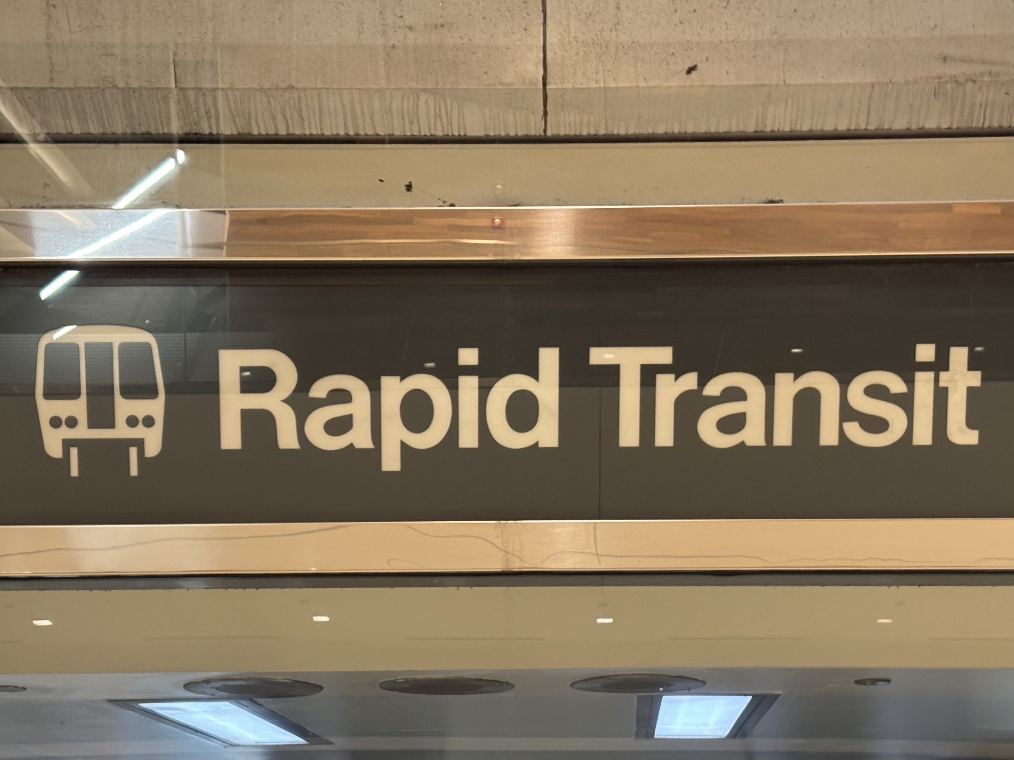
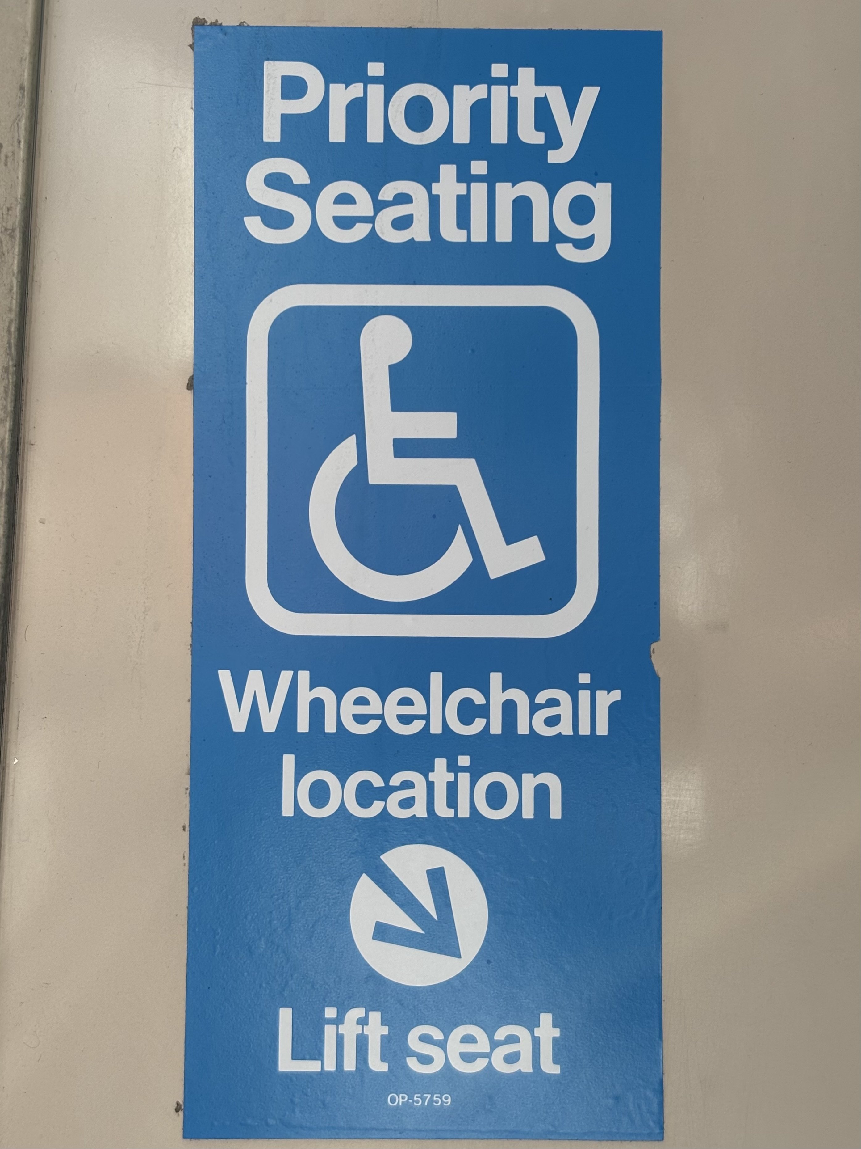
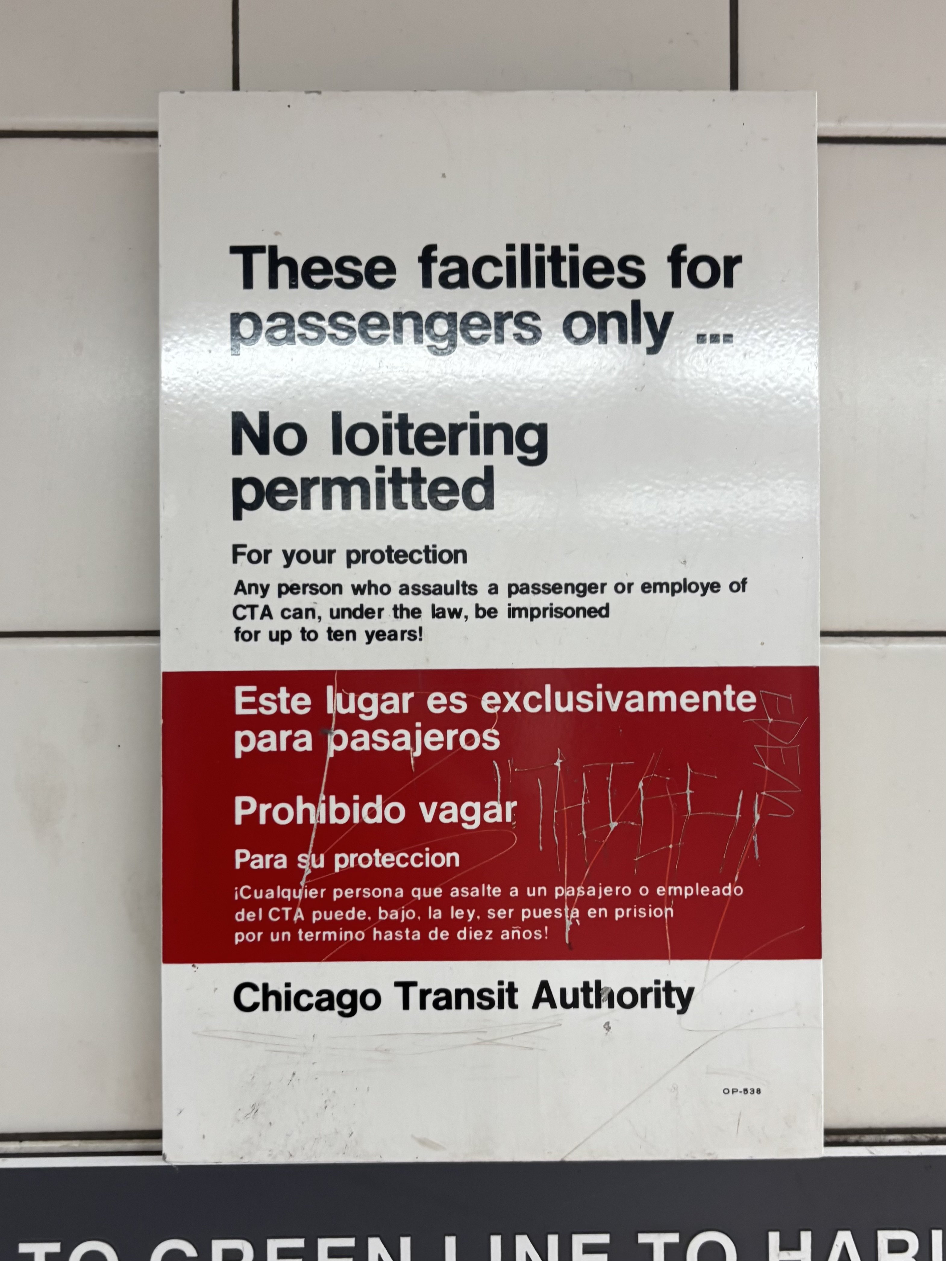
Lately, I've been documenting the typography of Chicago's public transportation, namely the CTA ‘L’. I'm used to a certain amount of variability, but I've noticed this bizarre variation on Helvetica's /a that omits the signature curve on the upper bowl.
The only solid date I can provide is that the “Priority Seating” sticker is likely original from 1992-1994—when the train (3200 series, train #3264) was built. Was this a common modification?
Also, it really appears to me that the sticker and “These facilities for passengers only…” are just part of the font, while the “Rapid Transit” appears custom-made (note the differences between the two appearances of /a).
0
Answers
-
Looks like the /a in Unica.0
-
It doesn’t look like Helvetica to me. I don’t think it is Unica either.
Look at how the terminals on a, e, s and g are all slightly off a straight vertical/horizontal cut. Also the slope on the mid-stroke of the “a”…
The “a” is reminiscent of Unica, but those off-90° angles are not. (From what I can find of original Unica samples online. They are not as common as one would like.)
Edit: clarified that I was thinking of 90° angles, vertical or horizontal.2 -
Some kind of “Standard.”
There were many typositor neo-grotesques, and Chicago was Graphic City (Oz Cooper’s stomping ground), and home of VGC for instance.
So I would connect the dots and assume the font is a local product, if not Akzidenz Grotesk.1 -
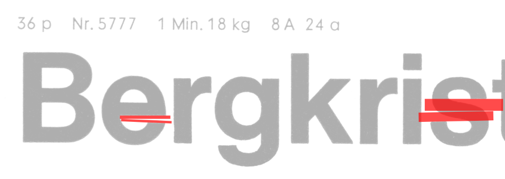
As I understand it, the perfect terminals on Helvetica are from the digital era. Here is a couple examples I could find of a similar specimen from Letterform Archive, one with obvious non-horizontal terminals (/e in general, /s in Geist), and one annotated (rather annoyingly, sorry!)

 Here's another sign I found today. The numerals scream Helvetica to me, especially with the underbite of /9:
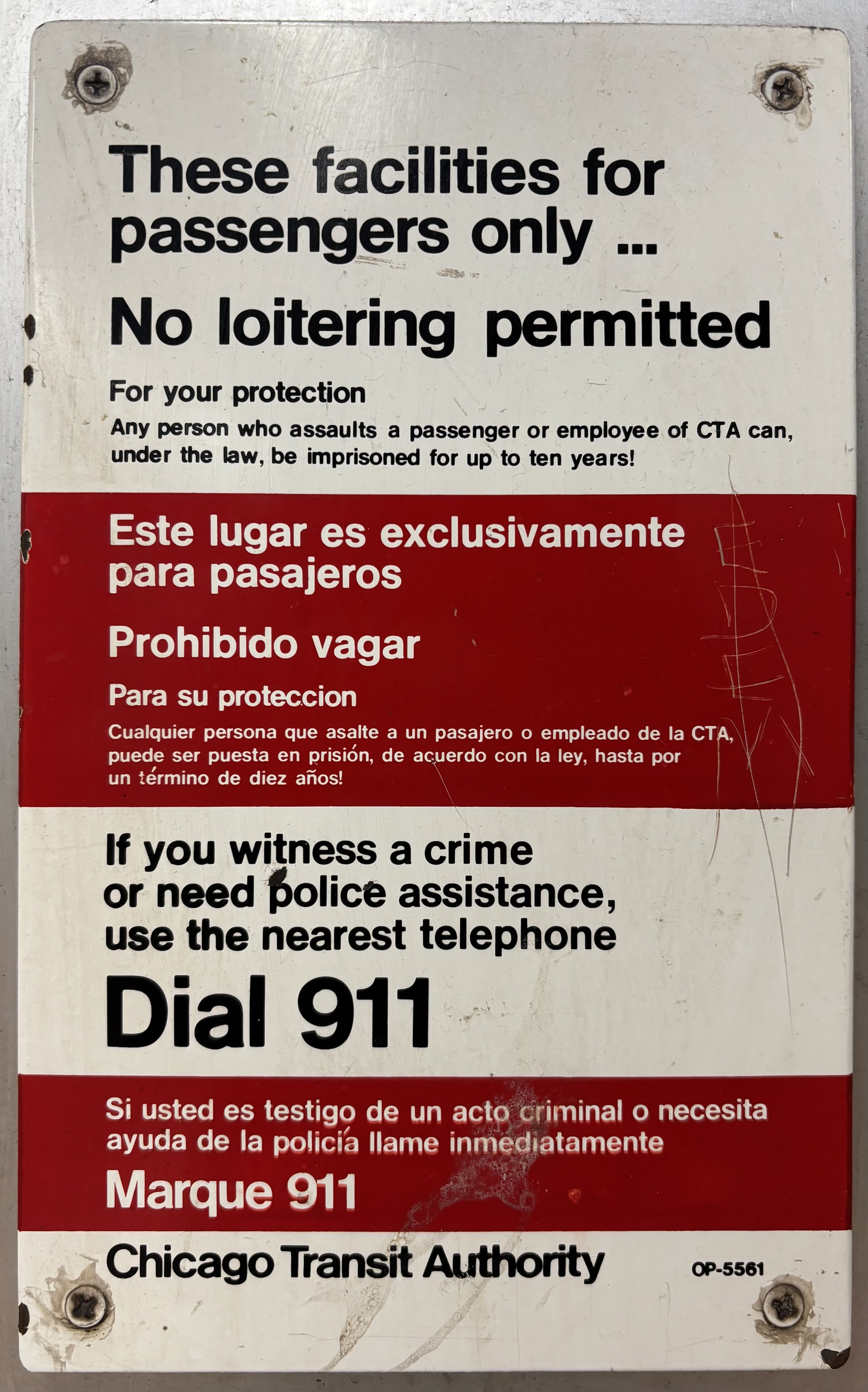 And (to me) a gorgeous example of pre-digital Helvetica, again with a slightly diagonal terminal in the /e:
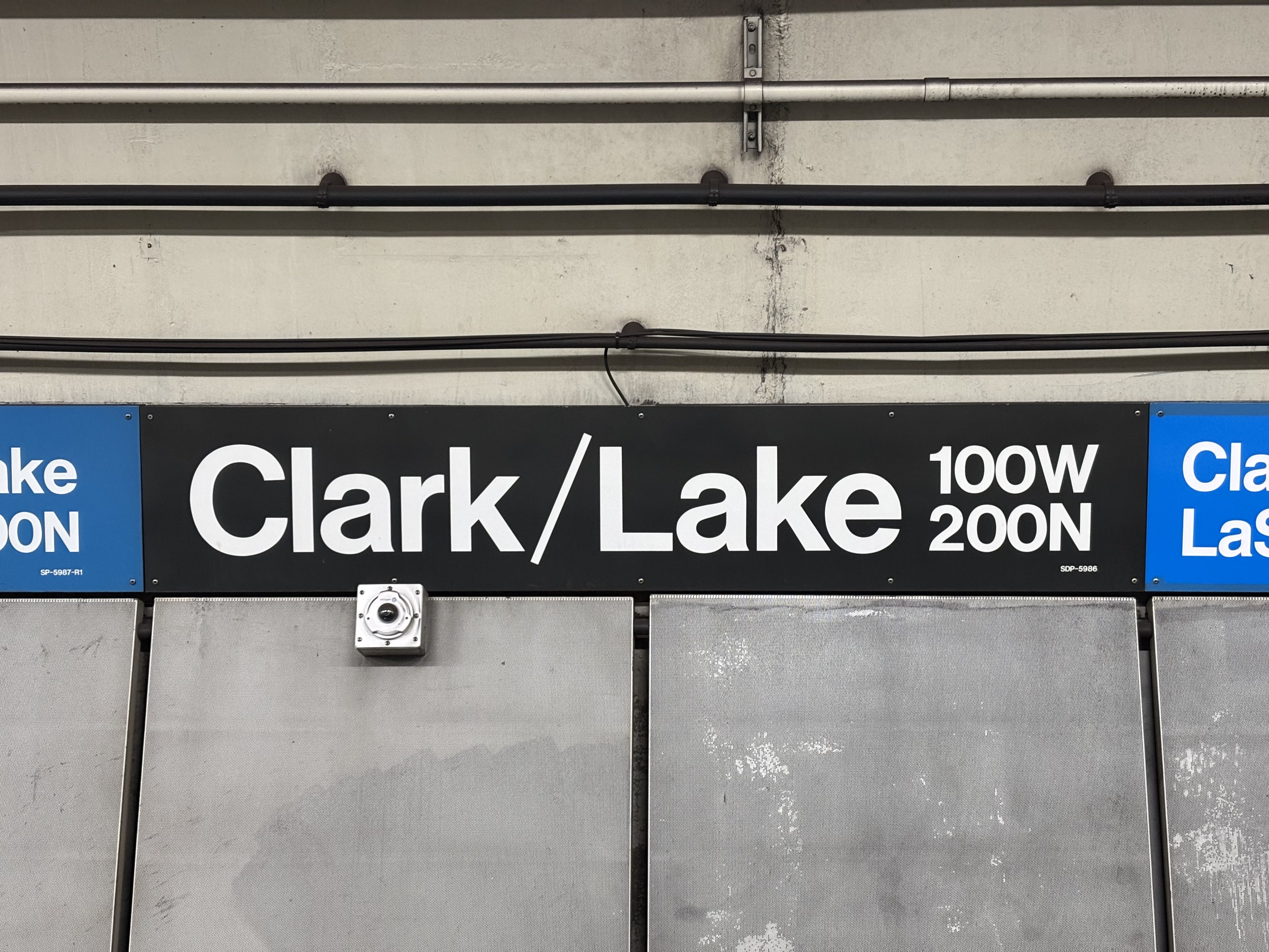 3
3 -
Depending on the method, hand-cut sign vinyl following a template was/is around at fabricators. As far as the “a” and associated typeface, the Chicago area was home to pre-PostScript era font publishers (of varying reputation) since Ludlow as Nick Shinn pointed out. It seems like a case of near-vetica.1
-
BBS had been gone a long time when those signs were produced.0
-
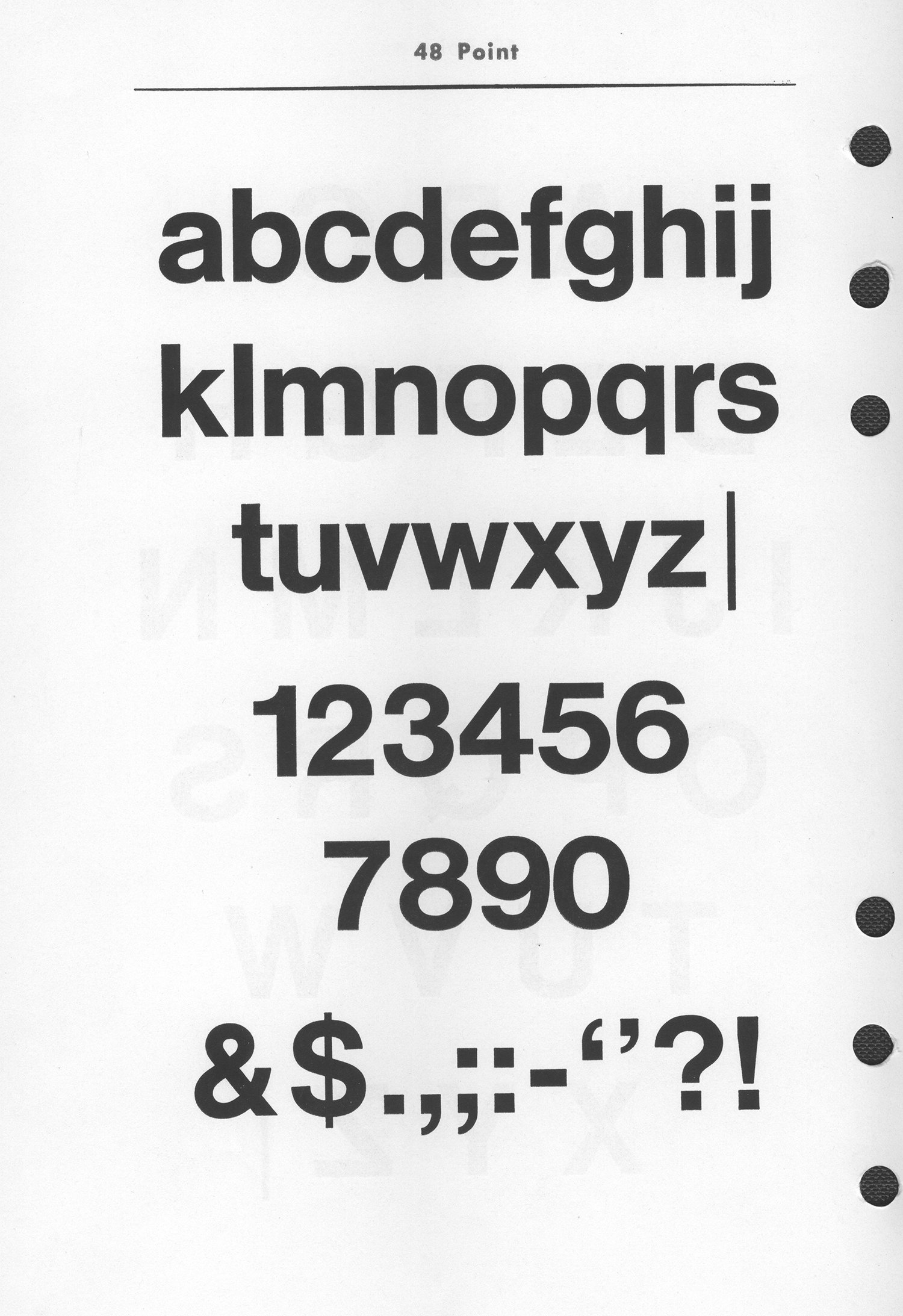 Separately, I've found an American foundry specimen for Helvetica Medium
that shows some angled terminals, in the the "e" and "s". And in some sizes the cap I and lowercase l look nearly identical. Lastly,
to reply to the OP's comment about consistent horizontal endings, they
show up in Mergenthaler VIP samples, so pre-date digital versions.
0 -
If you can’t identify it as being a particular font named “Helvetica,” it should not be called Helvetica; it is an unidentified neo-grotesque.
Over the years, many foundries have published neo-grotesques that are me-too Helveticas,—Apple’s San Francisco, for instance.
Why, I even had a go at the genre myself!2 -
https://fontsinuse.com/uses/3220/it-s-the-real-thing-coca-cola-ads-1969-74
https://fontsinuse.com/uses/6655/stevie-wonder-music-of-my-mind-album-art
All examples of early Helvetica, pre-digital, with either perfectly horizontal cuts, or very close. Certainly nothing like that crazy 9 shown above for the Chicago Transit Authority. I would believe that some of those could maybe be Helvetica, and that the terminals in e and g might not have quite perfectly horizontal cuts in pre-digital Helvetica. But at the same time, some of Evie’s examples seem way off.
Here for example is a catalog example showing the New York City Transit Authority’s Graphic Standards Manual for 1970, and the typeface is “Standard Medium”: https://www.pixartprinting.it/blog/wp-content/uploads/2021/01/Graphic-Standards-Manual.jpg and the relevant page of Fonts In Use that explains how this is another name for Akzidenz Grotesk. https://standardsmanual.com/pages/type-specimen ; https://fontsinuse.com/typefaces/217963/nycta-standard
This does indeed match Evie’s sample from NYC, I think?
(For extra confusion, Berthold also has a Helvetica-ish typeface called Standard, which is closer to Helvetica. Not sure what it’s relationship to the NYCTA Standard typeface is, just offhand.)1 -
.0
-
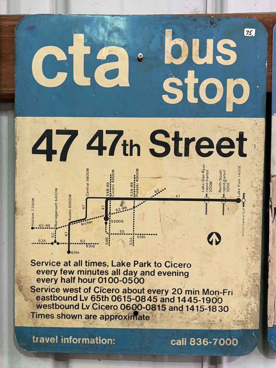
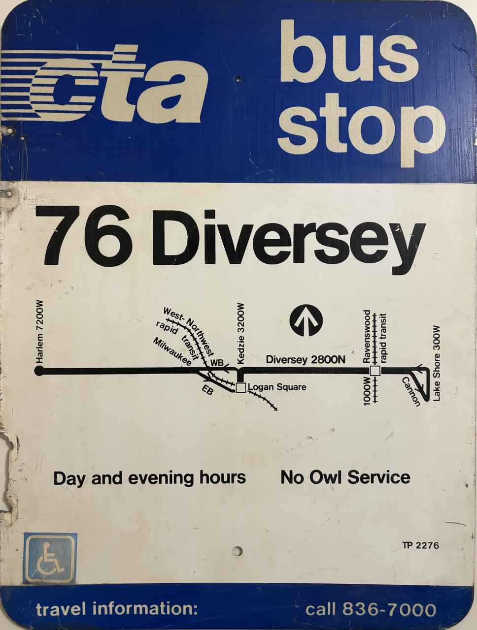
All of these samples are from Chicago, FWIW. I know New York City's MTA uses Akzidenz-Grotesk (at least historically?), but as far as I’m aware the CTA has always used Helvetica or something similar.I visited the Illinois Railway Museum, and I have some pictures. I do not want to spam: if anybody has a suggested way to host these images in an album format I can link that would be helpful! There are a couple extra pictures and examples I've collected but I'm trying to post only the most pertinent images.These are clearer pictures, and bigger sizes. Out of the now complete numeral set, /5 sticks out to me as extremely non-standard. The /6 and /9 are also non-standard, but match up with earlier photos.
 0
0 -
I have a (possibly later) sample of Alphatype's Claro for the unidentified neo-grotesque. It doesn't match.0
-
And neither does a version of Megaron Bold (Varityper), if that helps.0
Categories
- All Categories
- 46 Introductions
- 3.9K Typeface Design
- 489 Type Design Critiques
- 572 Type Design Software
- 1.1K Type Design Technique & Theory
- 659 Type Business
- 874 Font Technology
- 29 Punchcutting
- 528 Typography
- 121 Type Education
- 327 Type History
- 80 Type Resources
- 111 Lettering and Calligraphy
- 32 Lettering Critiques
- 79 Lettering Technique & Theory
- 560 Announcements
- 95 Events
- 116 Job Postings
- 169 Type Releases
- 179 Miscellaneous News
- 269 About TypeDrawers
- 53 TypeDrawers Announcements
- 114 Suggestions and Bug Reports


