Palatino in book publishing
Comments
-
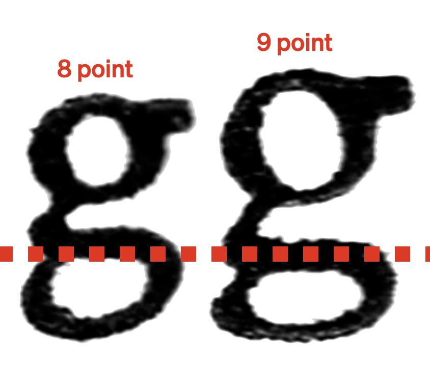
The German standard baseline went into effect during the first decade of the 20th century. One of Genzsch & Heyse’s directors had spent time working in the US as a young man during the late 19th century and learned about the American standard line from his US connections. As you mention, the position of the baseline on each body’s size was determined, in part, by Fraktur proportions, since German printers wanted to be able to mix Fraktur and roman on the same line and Fraktur traditionally has very short ascenders and descenders.John Butler said:There was a German regulation at the time that standardized baseline proportions based on Frakturschrift designs, but which did not apply to export typefaces. Zapf had, and used, his additional freedom there.After the new standard line was introduced, some type sizes—particularly 9 point—had very short descenders. Attached is an image of Genzsch-Antiqua/Nordische Antiqua, from Friedrich Bauer. It was made according to the standard line, as required. It illustrates what I mean better than I can with words. Both the 8 point and the 9 point sizes had the same descender dimension. In 8 point, that descender dimension provided enough space for a nice form. In 9 point, it could not.
It is not entirely true that the German standard line did not apply to Palatino, however. All Palatino sizes, in hand-set type from Stempel, adhere to German line. For two sizes where the ascenders were too tight (5 and 9 point), additional versions with longer ascenders were cast on larger bodies (i.e., 6 and 10 point).That was also the case for Palatino italic. The bold had just an additional 9/10 p size, not have a 5/6 p one. Michelangelo and Sistina were titling faces and their letters were cast to fill the entire body, so they had no lowercase.
I’ve taken this information from one of Stempel’s catalogs (one of the Auslands-Probe editions, it is not dated but was printed from before 1961).2 -
Whatever the thinking was, it was size dependent. In some sizes, the /q descender was shorter than the /p. So the reverse of Stephen’s image.Jens Kutilek said:
p and q having different descender depths is wild! I wonder what the thinking behind it was.Stephen Coles said:Here’s a 1960 Palatino specimen showing the default glyphs (in black) and the UK/US glyphs (in red)0 -
Isn't A760 Aldus rather than Palatino?Yes. A760 is SoftMaker’s name for Aldus. Letterform Archive has a scanned index card with the glyph set of the original foundry version. A760 has since been renamed to Alba.In a specimen for the greater Palatino family, Linotype-Aldus-Buchschrift is described as “a very important branch on the Palatino family tree [that] complements Linotype-Palatino as a book typeface [“Werkschrift”] wherever a lighter and narrower letter image is required”.Palatino was originally intended primarily as jobbing face (as opposed to a book face), and its weight ratios determined accordingly.* The lighter and slightly narrower Aldus (1954; working title Leichte Palatino) is the dedicated book version.*) Hermann Zapf, Gedanken und Probleme beim Entwurf von Werkschriften, D. Stempel AG. In “Philobiblon”, 4/1958.
3 -
Indeed! Despite this, Zapf used Palatino in a few books before Aldus was available, including the very text-heavy Gutenberg-Jahrbuch for 1950, which had 444 pages. That was set in the Linotype version, at least.Florian Hardwig said:1 -
O810-Flare was the codename for Optima.
0 -
Jens Kutilek said:Isn't A760 Aldus rather than Palatino?
I think you're right, though I looked right at it and didn't even suspect the possibility.0
Categories
- All Categories
- 46 Introductions
- 3.9K Typeface Design
- 489 Type Design Critiques
- 572 Type Design Software
- 1.1K Type Design Technique & Theory
- 659 Type Business
- 874 Font Technology
- 29 Punchcutting
- 528 Typography
- 121 Type Education
- 327 Type History
- 80 Type Resources
- 111 Lettering and Calligraphy
- 32 Lettering Critiques
- 79 Lettering Technique & Theory
- 560 Announcements
- 95 Events
- 116 Job Postings
- 169 Type Releases
- 179 Miscellaneous News
- 269 About TypeDrawers
- 53 TypeDrawers Announcements
- 114 Suggestions and Bug Reports


