Palatino in book publishing
Comments
-
-
I was under the impression that Italian publishing world was addicted to Simoncini Garamond... Nice to see that a big publisher such as Mondadori has bet on a different horse! Anyway, are you referring to a particular series published by Mondadori (Oscar, Meridiani, etc.)?
P.S. I don't think Palatino resembles Garamond.0 -
IF some people call it “the German Garamond,” that is more about ubiquity than design.
Not a phrase I have ever heard.1 -
According to a German friend of mine, "the German Garamond" should be Stempel Garamond, a very popular typeface in German book publishing.Thomas Phinney said:If some people call it “the German Garamond,” that is more about ubiquity than design.4 -
In Brazil, the huge publisher Companhia das Letras uses Palatino in all their biographies. They publish every kind of book, but use different typefaces for each category.1
-
Figaro said:I was under the impression that Italian publishing world was addicted to Simoncini Garamond... Nice to see that a big publisher such as Mondadori has bet on a different horse! Anyway, are you referring to a particular series published by Mondadori (Oscar, Meridiani, etc.)?
P.S. I don't think Palatino resembles Garamond.I just translated a recent journalistic source. I don't know if Palatino is used by Mondadori for any particular series.Other notable publishers:- Adelphi: Baskerville
- FMR: Bodoni
Generally almost all other publishers tend to use Garamond versions (Einaudi uses Einaudi Garamond).1 -
I have never – never – heard someone calling Palatino a “German Garamond”. Would be nonsense, anyway. Greetings from Germany.4
-
@ michele casanova:
If I remember correctly, Einaudi Garamond was designed by Simoncini and is very similar to Simoncini Garamond, the gold standard of Italian book publishing.2 -
I've heard Palatino's sibling Aldus described as a garalde, which is arguable in terms of proportions, but I just think of it as Luigi Palatino versus classic Mario Palatino.0
-
I don’t have a direct answer to your question, but Internet Archive’s search could be useful for finding publishers who repeatedly use Palatino.0
-
Aldus, which Hermann Zapf wanted to call Palatino Book, is, or at least was, quite common in books from Germany.0
-
Sorting that archive.org search by creator (unfortunately, publisher is not an option), you can see a few series that are consistently set in Palatino. For more from the same series, click on the author name in the metadata for these books:This doesn’t mean Palatino was the official typeface for any of these publishers, but indicates that the typeface was specified in the style guide for these series at least. This list also shows Palatino seems to have been a popular choice in books designed for young readers.
- Aladdin Mix (Simon & Schuster Children’s Publishing)
- Corgi Yearling (Random House Children’s Publishers)
- MIT Press
- Puffin Books
- Puffin Books
- Puffin Books
- Simon Pulse (Simon & Schuster Children’s Publishing)
- Tharpa Publications
2 -
Bringhurst's magnificently obsessive book Palatino: The Natural History of a Typeface has several examples of books and book series set in Palatino.1
-
I've just discovered a beautiful book set in Palatino: "Plato: Complete Works" (Hackett Publishing).I suppose this publisher uses Palatino for other books too.0
-
Also, if I remember correctly, Faber and Faber used to set all of their fiction in Palatino. This was a longstanding policy; it's mentioned in works by Rich Hendel.1
-
Andreas Stötzner said:I have never – never – heard someone calling Palatino a “German Garamond”. Would be nonsense, anyway. Greetings from Germany.Indeed. Even the name of Aldus is wrong - Palatino, and Aldus, which is derived from it as its "book" version, are not (even) Aldines (although Hermann Zapf did note that Aldus' type did somewhat influence the design).Although Palatino is considerably modernized, so as to be useful in present-day book publication, as opposed to just looking pretty as an authentic reproduction of an excellent early typeface... it is still, if my memory and poor understanding of typefaces as a mere amateur dabbler in this field, are not decieving me... a Jenson.
0 -
Aldus is the Palatino “book” face, but it has no Bold.
Not that a bold is required for a book face, but the lack does mitigate against it.
In the 1990s, I used Palatino/Aldus as the corporate face for a bank, and did end up using Palatino Bold as the “Aldus Bold.” (Nobody complained, or, I suspect, even noticed the stunted extenders!) I particularly liked the Aldus small caps and old style figures, and that a Light weight of Palatino was available. I did however re-kern Palatino to my own taste (that ability was an awesome feature of Quark XPress).
There are also more styles, with different names, in the “Palatino” family, Michelangelo, for instance. That practice certainly influenced my own font naming—several of my families have members with different “surnames.”0 -
Palatino was that rare typeface that survived relatively unscathed in the transitions from metal to film to digital. (It even survived blatant rip-offs.) What helped was its lack of very thin lines and its wide, open counters that also contributed to its genial nature. It was an oldstyle, yet something new. The tighter-fitting Aldus lacked the warmth of its big brother; it was more economical in a world that wasn't looking for economy. (Trump Mediaeval, from the same period, shares some of Palatino's general characteristics, though some felt it was too particular, too chiseled to be a go-to type.) I think the next popular book type to hit the sweet spot of Palatino was Scala.
In the 1950s-1990s, publishers of fiction preferred spacious fonts with a high x-height that could hang together with a lot of leading. This allowed publishes to “pad” the pages of short novels, stretching the page count of the book, which allowed them to add a couple of dollars to the retail price on less than a half-dollar of investment. Those were the days when paper was among the least expensive elements of book publishing—gone forever by the beginning of the next century.
P.S. For what it's worth, I've never used any of these types, which is not to say I don't admire them for what they are.
1 -
Did Quark XPress allow you to alter the kerning of a font and save that information for use locally within the app? QX was before my time so I’ve never used it.Nick Shinn said:I did however re-kern Palatino to my own taste (that ability was an awesome feature of Quark XPress).0 -
Yes, that was exactly the feature Nick is talking about.
I generally thought InDesign beat Quark typographically from version 1.5 or version 2 onwards, but I did miss this one feature.2 -
Interesting! Seems like a niche—but welcome—feature to have.0
-
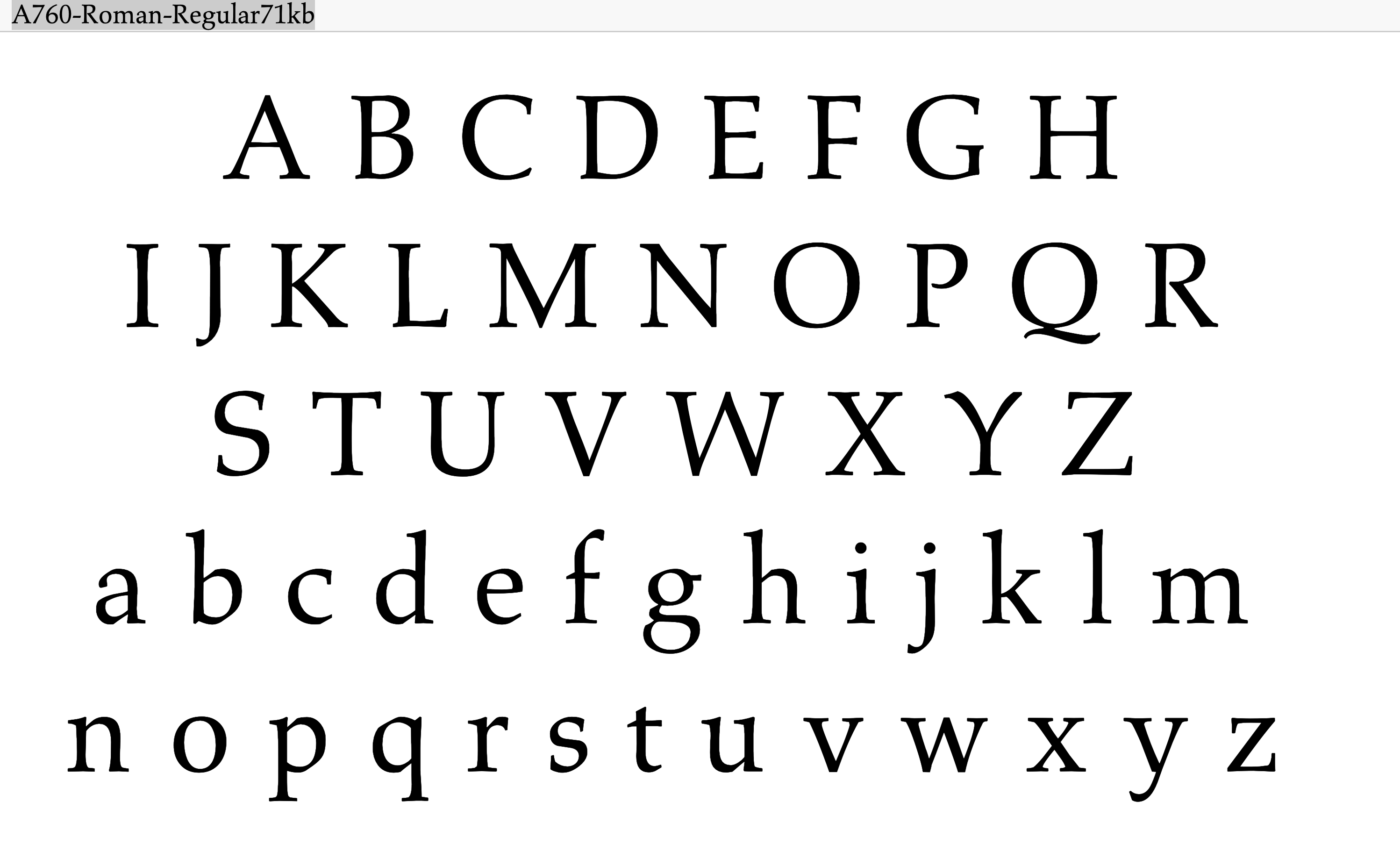
For the historical record: This is A760 (what I guess was a codename or something) and is one of the initial ikarus digitalizations by a defunct foundry. It keeps all the lovely calligraphic details of the original drawing, and the original proportions.Scott-Martin Kosofsky said:Palatino was that rare typeface that survived relatively unscathed in the transitions from metal to film to digital.
The current digital Palatino has a lot of changes, many not so good.
The original Optima digitalization can also be found by a similar codename. I don't have it at hand right now, but I remember it was much nicer and delicate than the standard version we all know.0 -
Some major features of A760 look more like Aldus than Palatino, to me. When I say that, I am looking at the crossbar on E and F, and the terminal of the a.
That said, it does not have as much extra “incised” look as Aldus on letters such as S/s2 -
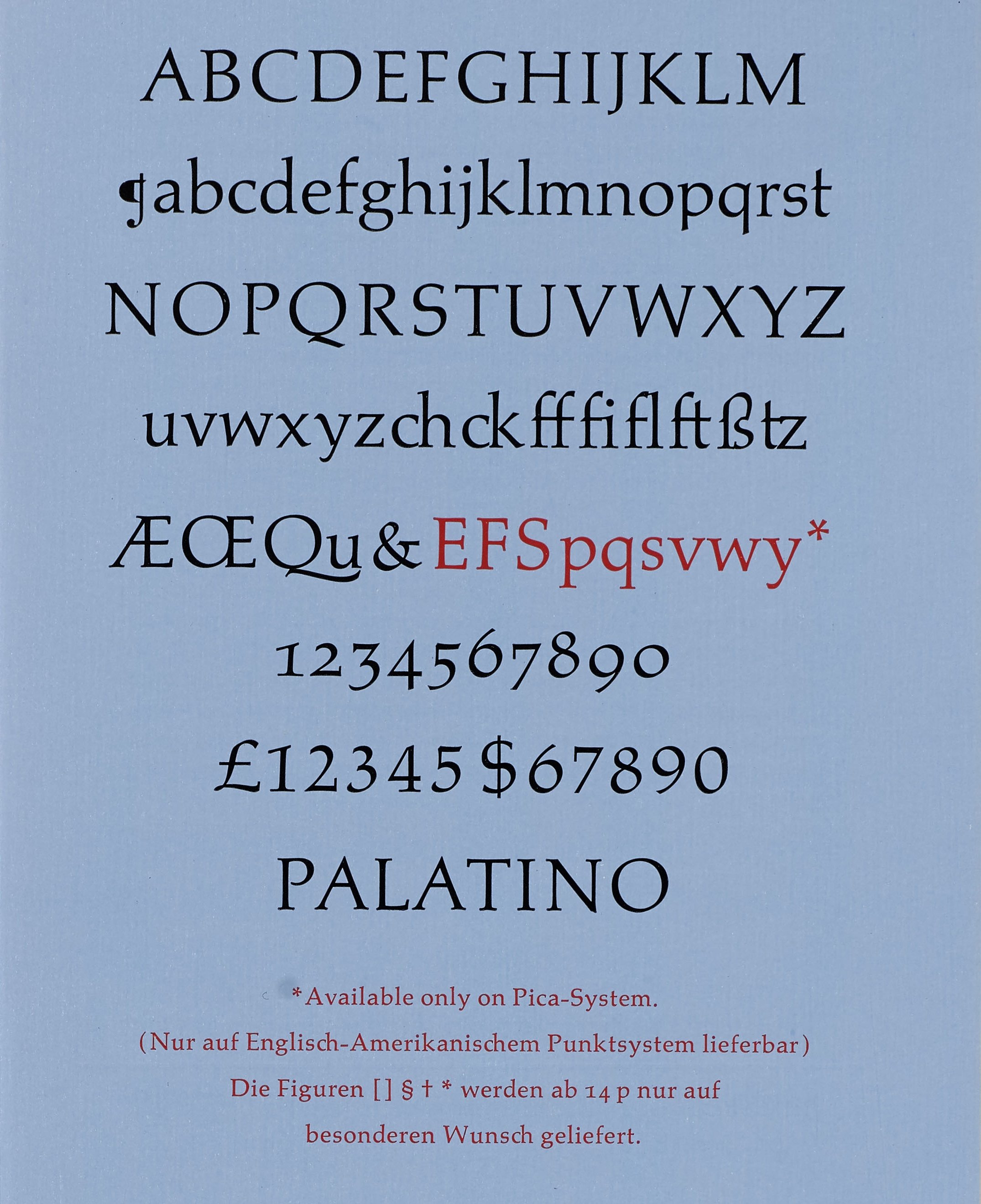
The original European issue of Palatino in metal had most of those shapes. In About Alphabets (1970), Zapf says he was advised (by folks like Paul Standard and W. A. Dwiggins) that the American market couldn’t handle his more simplified, calligraphic forms, so Stempel replaced them with more conventional stuff for the US and UK release. Here’s a 1960 Palatino specimen showing the default glyphs (in black) and the UK/US glyphs (in red):
 Image: Letterform Archive10
 -
Interesting! Seems like a niche—but welcome—feature to have.
Yes, Quark also enabled programming of tracking to font size, according to a little graph chart, where you could even curve the line. That was one reason I had to re-kern the fonts, when using them in headlines, tightened up.1 -
p and q having different descender depths is wild! I wonder what the thinking behind it was.Stephen Coles said:Here’s a 1960 Palatino specimen showing the default glyphs (in black) and the UK/US glyphs (in red)2 -
There was a German regulation at the time that standardized baseline proportions based on Frakturschrift designs, but which did not apply to export typefaces. Zapf had, and used, his additional freedom there.0
-
I find that /p/ oddly fetching. The /s/ and /w/, less so.0
-
John Butler said:There was a German regulation at the time that standardized baseline proportions based on Frakturschrift designs, but which did not apply to export typefaces. Zapf had, and used, his additional freedom there.I am astonished to hear this. In the hot metal era, of course, typefounders did standardize the baselines of their typefaces - but not to a single standard. Usually, they had three standards - one for classic oldstyle typefaces, with long descenders, one for ordinary faces with short stubby descenders for high density, and one for titling.This also suggests the story is more complicated than it at first appeared: A760 may be 'better' due to the calligraphic features left out for American tastes, but the export version of Palatino has better proportions, due to being freed from a stifling German regulation. So the 'ideal' Palatino would presumably combine both of these characteristics.0
-
Isn't A760 Aldus rather than Palatino?
The Berthold version of Palatino (~ Softmaker Palazzo) is close to what Stephen showed:
2
Categories
- All Categories
- 46 Introductions
- 3.9K Typeface Design
- 489 Type Design Critiques
- 572 Type Design Software
- 1.1K Type Design Technique & Theory
- 664 Type Business
- 877 Font Technology
- 29 Punchcutting
- 530 Typography
- 121 Type Education
- 328 Type History
- 81 Type Resources
- 111 Lettering and Calligraphy
- 32 Lettering Critiques
- 79 Lettering Technique & Theory
- 562 Announcements
- 97 Events
- 116 Job Postings
- 169 Type Releases
- 179 Miscellaneous News
- 269 About TypeDrawers
- 53 TypeDrawers Announcements
- 114 Suggestions and Bug Reports


