Elemaints - A Serif Family with Optical Sizes
Comments
-
Will the math calligraphic alphabet also function as swash caps for the italic?1
-
Here is the completion for all faces (as always all kind of feedback is welcome):
 @J@"John Butler"
Probably, yes. (The difficult part is the completion for Greek and Cyrillic.)John Butler said:Will the math calligraphic alphabet also function as swash caps for the italic?
3 -
-
Lovely! My eye catches a bit on the top right of /U. /N (and maybe /E) looks narrow to my eye.
These would be a great starting point for a spin-off baseball script!0 -
I do deeply dig. The Y seems a bit off, but I can't recommend any specific change to it.1
-
1
-
Yes, very fetching! As for /Y/, how about a descender?1
-
Yes, I think I like this newer Y.0
-
@Linus Romer Maybe this idea can be useful in some waymichele casanova said:@John Butler I agree.Maybe a shape like this? (Just a quick test)
0 -
@michele casanova I don't know if the basic shape of the Y was bad or if I just did a poor job of implementing it. In any case, thank you very much for your suggestion. I tested various shapes and I find the fourth the most convincing.1st: "original"2nd: with descender3rd: different tail4th: same tail as in 3rd but the top left is different5th: different shape6th: shape by Michele Casanova

2 -
Yeah, that /Y/ looks good.Are you happy with the thin-to-thin joint in the bottom left of /B/ and /D/? Maybe something like in /Q/ would be preferable, where the end of the top-down stroke commits to being thin and the left-right stroke gains some weight instead.0
-
@Craig Eliason You think the top right of the /U should be less extreme or not end in a serif at all? (from left to right: "original", less extreme top right and sharper top left, no serif at the top right and sharper top left)Craig Eliason said:Lovely! My eye catches a bit on the top right of /U. /N (and maybe /E) looks narrow to my eye.
These would be a great starting point for a spin-off baseball script! Altough the third /U matches the /u better, I think the second /U could have better readability.Here is a wider /N (right) compared to the original /N (left). The /n is for reference. I think the original /N is already quite wide.Yeah, the /E was definitly on the narrower side (left: original /E, right: wider /E)

@Christian Thalmann Do you mean the 4th /Y or the /Y with the shape by Michele Casanova?Christian Thalmann said:Yeah, that /Y/ looks good.Are you happy with the thin-to-thin joint in the bottom left of /B/ and /D/? Maybe something like in /Q/ would be preferable, where the end of the top-down stroke commits to being thin and the left-right stroke gains some weight instead.Despite having experimented with it a lot, I am not particularly happy with the bottom left of /B and /D. The shapes of my calligraphic maths alphabet (top row) are loosely based on some of Hermann Zapf's drawings for the Euler typeface (middle row), which was designed to be upright. The digitisation of Zapf's drawings, which are now part of the American Mathematical Society fonts, is shown in the bottom row. The spirit of the lower left was kept in the /L, but not in the /B or the /D. One possible reason for this might be the rotating pen angle in Zapf's /B: most of the time it is at around a 30° angle to the horizontal, but not for the upper arc, where the angle is almost 0°. I struggled to find the right stroke from the lower left to the right of the lower bowl. So my solution was a compromise. However, I completely agree that the lower left of the /L and /Q feel more natural. So here is a short pen experiment of today with slightly varying pen angles from glyph to glyph (but not inside the glyphs). I have also tried to rotate the angle inside the glyphs but I fear I am not experienced enough to reach satisfying results. However, one can already see that the thickness at the lower left is not always clearly thin to thick (e.g. the left /D in the lower row).
 So, here are two new attempts: the one on the left is closer to Zapf's drawing; the one in the middle is the 'original'; and the one on the right is a compromise.At the moment, I think the '/B' on the right looks better, although it feels a bit unusual.
 0
0 -
Yes, my eye is happier with that second /U than the first. As for the also-nice-looking third /U, I don't think matching the lowercase /u is that pressing. That said, depending on where you go with the /Y, it might be there that analogous forms should be expected.(I also agree that that last rightmost /B looks good!)0
-
Wow, I find the bottom left treatment of L and Q in Euler really jarring. Maybe that’s just me. Zapf’s drawings are lovely, though!0
-
Thomas Phinney said:Wow, I find the bottom left treatment of L and Q in Euler really jarring. Maybe that’s just me. Zapf’s drawings are lovely, though!Well, to be fair, it must be said that the Euler project took place in the early 1980s on the now obsolete METAFONT78 system. Due to the shortcomings of METAFONT78, which became apparent during the Euler project, METAFONT was redesigned into its current form, METAFONT84. Based on my interpretation of historical sources, the necessary software and source code adjustments took a considerable amount of time. AMS Euler had to switch from a skeleton approach to an outline approach, and the experience with this was relatively new (at least for cubic Bézier curves).
As far as I know, in the early 1980s there was no algorithm for efficiently rasterizing the interior (i.e., the fill) of cubic Bézier curves. Donald E. Knuth first developed and published a corresponding algorithm around 1982. Since he also conducted research at XEROX PARC for his studies, the beginnings of PostScript may also be linked to this research success (but that is only a strong assumption on my part).
This article may also be of interest for comparing METAFONT78 and METAFONT84. This is how the /Q of AMS Euler is defined in METAFONT84. There are two parts A (bowl) and B (tail) and those are outlined by cubic Bézier paths that pass through the points (directions of the handles are given as well):
charbegin( "Q", 2253h#, capheight*v#, baseline );
n := 11;
t1 := 0;
t2 := 2;
t3 := 5;
t4 := 7;
t5 := 9;
t6 := 10;
t7 := 12;
t8 := 15;
t9 := 18;
t10 := 21;
t11 := 23;

adj_fill.A(6, 11)                    % fixed x points
     (1, 5, 10)                    % fixed y points
     ((1,2), (11,1))                    % tied points
     ((4,7), (2,9))                    % verticals
     ((3,8))                         % horizontals
     ((1322,291){370,118}...               % 0
      (1739,548){1,1}...               % 1
      (2104,1533){0,1}...               % 2
      (2040,2032){-245,833}...          % *3
      (1859,2366){-1,1}...               % 4
      (1225,2601){-1,0}...               % 5
      (474,2347){-1,-1}...               % 6
      (168,1514){0,-1}...               % 7
      (458,792){1,-1}...{1,0}          % 8
      (930,611)--                    % 9
      (962,690){-756,178}...               % 10
      (639,841){-1,1}...               % 11
      (415,1485){0,1}...               % 12
      (485,1972){270,833}...               % *13
      (685,2318){1,1}...               % 14
      (1191,2482){1,0}...               % 15
      (1622,2333){1,-1}...               % 16
      (1785,2019){220,-803}...          % *17
      (1842,1530){0,-1}...               % 18
      (1774,940){-262,-967}...          % *19
      (1580,563){-1,-1}...               % 20
      (1124,358){-1,0}...               % 21
      (891,381){-744,103}...{-1,0}          % 22
      (717,388)--cycle);               % 23

n := 7;
t1 := 0;
t2 := 2;
t3 := 4;
t4 := 6;
t5 := 9;
t6 := 11;
t7 := 14;

adj_fill.B()                         % fixed x points
     (1, 5)                         % fixed y points
     ((3,2), (4,1))                    % tied points
     ()                         % verticals
     ((4,6), (2,7))                    % horizontals
     ((2115,483){-152,-425}...          % 0
      (1969,236){-1,-1}...               % 1
      (1824,156){-1,0}...               % 2
      (1683,180){-361,111}...{-361,111}     % 3
      (1322,291){-434,90}...               % 4
      (888,381){-341,48}...               % 5
      (717,388){-1,0}...               % 6
      (384,276){-1,-1}...{-128,-368}          % 7
      (217,-59)--                    % 8
      (295,-97){78,278}...               % 9
      (404,95){1,1}...               % 10
      (624,159){1,0}...               % 11
      (860,132){707,-155}...               % 12
      (1567,-23){707,-155}...          % 13
      (1789,-40){1,0}...               % 14
      (2000,77){1,1}...{115,533}          % 15
      (2180,448)--cycle);               % 16

endchar(0);
2 -
@Linus Romer, I find your hand-written /B/ in the top left the most convincing, where a clearly thin vertical stroke connects with a clearly thick horizontal. Maybe that would make for the best solution in Elemaints: Relinquish the idea of your current pincer-shaped corner where two strokes meet on roughly equal footing, and instead have the horizontal dominate and the vertical touch down on it?(Zapf would seem to agree!)0
-
0
-
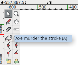
@Linus Romer You are currently axe-murdering the horizontal stroke immediately at the joint, whereas Zapf lets it terminate naturally in a thin offstroke after the joint. I would expect the latter to be preferable. You already have all that space there due to the top flourish, so it's no imposition.Look at your /Q/!0
-
@Christian Thalmann Darn, I probably shouldn't have used FontForge's new axe murderer tool after all.
")
 Joking aside, I think you mean something like this (at least, in my opinion, it's similar to the /Q)?
 1
1 -
Linus Romer said:@Christian Thalmann Darn, I probably shouldn't have used FontForge's new axe murderer tool after all.Brilliant!
 As for the /B/, I recommend decoupling the vertical stroke from the extreme corner and having it join the apex of the horizontal wave in something like a swashy T-junction. A bit like the /B/ in Brilliance:
 2
2 -
@Christian Thalmann Thank you very much! Now I finally understand what you meant, and I think it actually looks better that way. I have a feeling that the /L would also need to be corrected accordingly. That would make it a little wider (the image shows the tiny face):

How it has changed in the display face:
The new /B in action (display swash italics):
0 -
There we go!I actually prefer your old /L/... I think you can get away with a different architecture there than for /B/D/, since it implies a single stroke whereas the /B/D/ are constructed from two strokes.2
-
I have a feeling that the /L would also need to be corrected accordingly.
Not necessarily. The L is naturally written without lifting the pen, so a stroke reversal makes sense in that ductus. In the B, the right side of the bowl is usually written before the bottom stroke, so a broken construction is more likely.3


Categories
- All Categories
- 47 Introductions
- 4K Typeface Design
- 495 Type Design Critiques
- 577 Type Design Software
- 1.1K Type Design Technique & Theory
- 670 Type Business
- 885 Font Technology
- 29 Punchcutting
- 539 Typography
- 125 Type Education
- 333 Type History
- 81 Type Resources
- 113 Lettering and Calligraphy
- 33 Lettering Critiques
- 80 Lettering Technique & Theory
- 569 Announcements
- 100 Events
- 116 Job Postings
- 170 Type Releases
- 182 Miscellaneous News
- 270 About TypeDrawers
- 54 TypeDrawers Announcements
- 114 Suggestions and Bug Reports