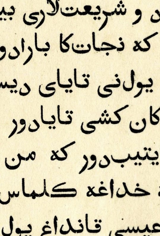
What's this old metal arabic typeface?

I often see this arabic typeface in old printing, does anyone know what's this typeface name and what's the history?
Comments
-
As per TypeDrawers rules, typeface identification queries are better directed towards specialized forum like fontid.co2
-
Yes, TypeDrawers rules discourage font ID requests, although in the case of historical metal types exceptions have been made.0
-
Thank you, i am asking this for historical and research purposes so i hope this okayJohn Hudson said:Yes, TypeDrawers rules discourage font ID requests, although in the case of historical metal types exceptions have been made.0 -
Abdurrahman Hanif said:... asking this for historical and research purposes so i hope this okayVoluntarily for historical and research purposes?!Why not coopoerate with our friend Khaled Hosny https://typedrawers.com/profile/746/Khaled Hosny to redesign the mentioned Arabic typeface?As long as I know, he makes Arabic fonts with your favorite free font editor FontForge.https://typedrawers.com/discussion/5400/which-is-the-best-free-font-editor/p1
All the best for both with flowers-2 -
Khaled commented on the design when I posted a link to typo.social
Looks like the kind of typeface cut in Europe, but I don’t immediately recognize it (not that I’m very familiar with European Arabic typefaces).
That rounded ر (and و to lesser extent), look peculiar though. Done to avoid kerning perhaps? Might be a clue that it is not foundry type.
By ‘not foundry type’, I presume Kahled means that this might be machine-set text.
https://typo.social/@khaled/1149074169862664731 -
As in hot metal typesetting (because phototypesetting did allow kerning).
I know Linotype, Monotype and Intertype all got into Arabic. Some hot metal tech such as Monotype allowed for kerning. Linotype and Intertype did not, so perhaps one of them?
0 -
Are we sure there is no kerning here? Would the Reh-Alef Maksura in the first line be a ligature in such a case? Also, the Reh-Yeh in first line is surely kerned.
My gut feeling is that this is hand set because the shape of Alef Maksura in the first line is wrong but in the 3rd line is correct, which indicates human error.
There seems to be slight wavering in the baseline and that also indicates (at least to my eyes and limited knowledge) that this is hand set and not machine made. If machine made, then the matrices were seriously wobbly!
Also good to keep in mind the text is not Arabic and the style feels more Persian in any case. Perhaps Borna might know?
2 -
Nadine Chahine said:
Also good to keep in mind the text is not Arabic and the style feels more Persian in any case. Perhaps Borna might know?I agree that this style is more Persian. This text i sent seems closer to Central Asian Arabic. I’ve also seen a similar typeface used for Jawi Arabic in Malay printing in here Southeast Asia, although I forgot to save the image. It seems this style was more commonly used outside standard Arabic contexts.
0 -
People please, please, please first learn the language and it's orthography before doing typography. This is valid for English as well!
This is not an Arabic script. It's a quasi-Arabic, Euro-Arabic, Venetian (and similar) form of amateur Arabic script replica, used to publish some of the first Arabic language books centuries ago.
I don't say this only to "westerns" (what ever "west" should mean), but to Arabic native speakers. You don't know Arabic. In schools and everywhere, you were learning from colonial programms until today. I don't say this to humiliate anyone, but to stop the missery of false Arabic script production, and the part of it in Latin scripts as well.
Foundation of latin script or languages is not in the 19. or 20. century print shops, or type foundaries. So learn the core of the language, scripture and understand where all started to fall apart.
In the same way people produced this example of quasi-Arabic, people today produce "Arabic" typefaces. Trying to mimic/imitate visually without firm knowledge and understanding, so even not producing a close reproduction of the used examples.
World would be better with few typefaces which are proper, then with hundrends of amateur variations floding publishing and digital world.0 -
adamwhite said:People please, please, please first learn the language and it's orthography before doing typography. This is valid for English as well!
This is not an Arabic script. It's a quasi-Arabic, Euro-Arabic, Venetian (and similar) form of amateur Arabic script replica, used to publish some of the first Arabic language books centuries ago.
I don't say this only to "westerns" (what ever "west" should mean), but to Arabic native speakers. You don't know Arabic. In schools and everywhere, you were learning from colonial programms until today. I don't say this to humiliate anyone, but to stop the missery of false Arabic script production, and the part of it in Latin scripts as well.
Foundation of latin script or languages is not in the 19. or 20. century print shops, or type foundaries. So learn the core of the language, scripture and understand where all started to fall apart.
In the same way people produced this example of quasi-Arabic, people today produce "Arabic" typefaces. Trying to mimic/imitate visually without firm knowledge and understanding, so even not producing a close reproduction of the used examples.
World would be better with few typefaces which are proper, then with hundrends of amateur variations floding publishing and digital world.I appreciate your perspective and understand the critique. Still, I have to admit that the way it was phrased felt a bit uncomfortable. Living in Southeast Asia, where type design education is very limited, I came here hoping for factual insights and constructive references rather than judgment.
To clarify my intention, my focus is simply to learn the name and historical background of this specific typeface or "arabic script replica". I’m not planning to design or replicate from it, just to understand its context in printing history.
Thanks in advance if you can point me to more concrete references.
6 -
Update
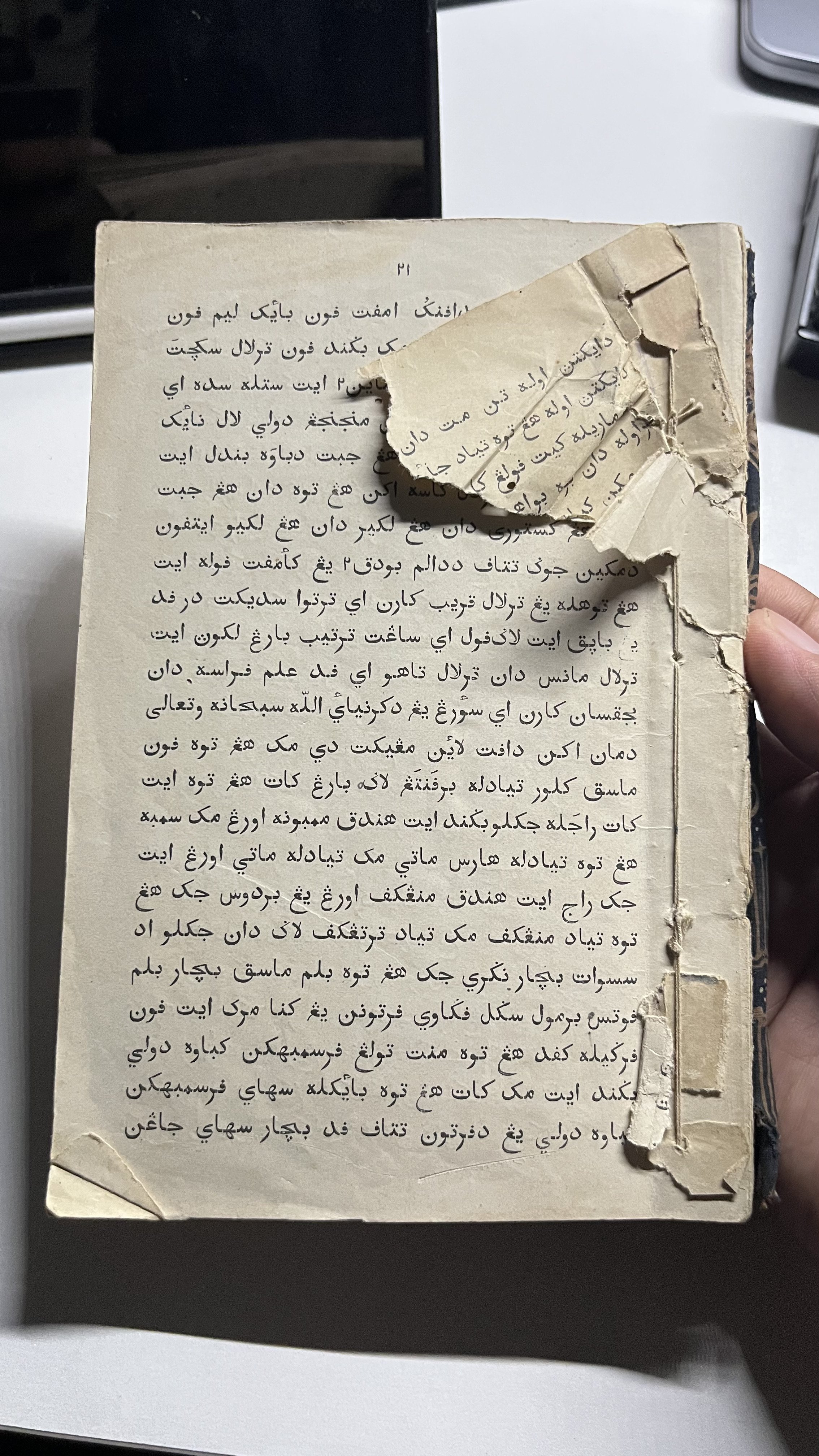
Got this book with that typeface from West Sumatra. Written in Malay (still readable as Indonesian) and seems to tell the story of Hang Tuah. Haven’t found more details about the typeface’s history yet, but I’ll enjoy reading it while practicing my Jawi.
 2
2 -
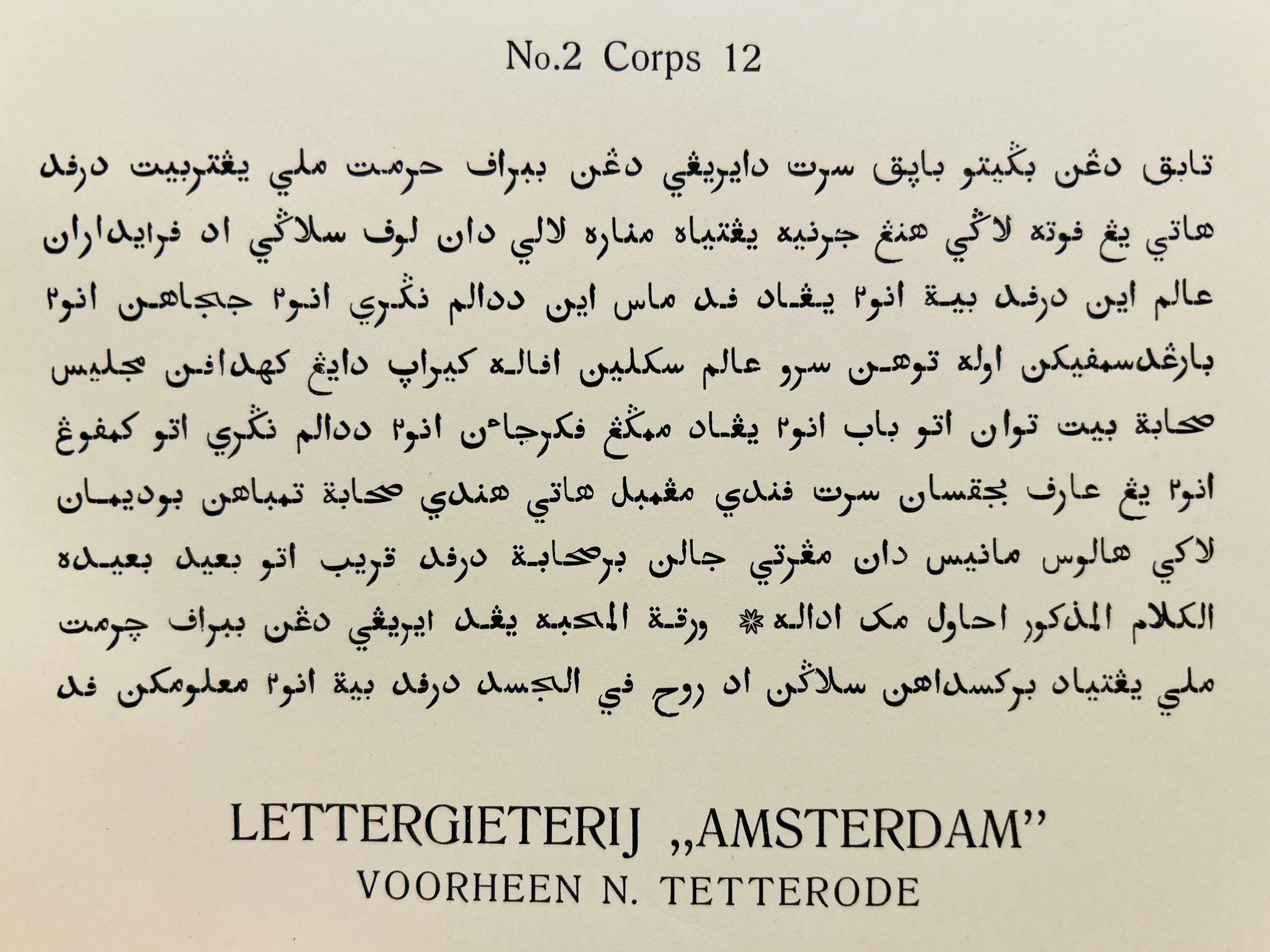
I found this page, with an old Dutch type specimen:and while the first example in the two-page spread looks to be better done, the "Maleisch" on the lower half of the right page seems to have a strong resemblance to the one discussed here.I came here hoping for factual insights and constructive references rather than judgment.If your only criticism was that the post wasn't helpful to you, that's true enough. But if that was a criticism of the post for being judgmental, then I had a different problem with it. It is a terrible thing for a language and culture when only very bad typefaces, designed by people alien to the language and culture, are available for printing the language - so being harsh and judgmental about that situation doesn't seem inappropriate to me.My quarrel is instead that the days of this situation existing for the Arabic script are long past. On Google Fonts, even, many competent typefaces for the Arabic script are available. So bad ones are no longer a danger, as they will just end up being ignored rather than doing damage.However, I have checked, and while I do see that Jawi is still very much in active use for writing Malay (I had thought that perhaps it was only written with the Latin alphabet today), it has several additional characters not in Arabic - so the selection of typefaces usable for Jawi may be more limited.1
-
I found this page, with an old Dutch type specimenGood find. I have that Amsterdam/Tetterode specimen book, and can confirm that this typeface is indeed the Maleisch No.2. It is slightly more heavily inked in the specimen book, but the shapes are unmistakable.

1 -
I found this page, with an old Dutch type specimen:
Good find. I have that Amsterdam/Tetterode specimen book, and can confirm that this typeface is indeed the Maleisch No.2. It is slightly more heavily inked in the specimen book, but the shapes are unmistakable.
In Indonesia, as far as I know, Jawi continues to be maintained in several Malay-majority provinces, where its use in public spaces is required to preserve local cultural heritage. And yes, the fonts used for it are unfortunately not many options and quite poor.This is very helpful, thank you. Since it come from Amsterdam, it makes sense that it reached Indonesia. I also believe ‘Maleisch’ is the Dutch term for Malay, which suggests this typeface was designed to support the Malay language character set
However, I have checked, and while I do see that Jawi is still very much in active use for writing Malay (I had thought that perhaps it was only written with the Latin alphabet today), it has several additional characters not in Arabic - so the selection of typefaces usable for Jawi may be more limited.
0 -
Abdurrahman Hanif said:
I also believe ‘Maleisch’ is the Dutch term for Malay,
And I thought it was just the word for "small"! But I see that you're right.As for the availability of typefaces, on Google Fonts, Amiri, Lateef, Mirza, Scheherazade New, and Katibeh, which seem to me to be competently designed Arabic typefaces in traditional style, all at least claim to support Malay in Arabic script. I even checked that they do indeed contain the six additional characters the Wikipedia article identified for Jawi.So it ought to be possible to get one's hands on a Malay typeface that is passable instead of poor.There is even Aref Ruqaa, which appears to be a Nastaliq typeface, as well. There are also numerous geometric or "sans serif" typefaces, but I am not in any way competent to determine if any of them are any good.1 -
John Savard said:So it ought to be possible to get one's hands on a Malay typeface that is passable instead of poor.
You’re right, there are quality Arabic fonts on Google Fonts, some even usable or extendable for Jawi. The main issue here is likely the lack of skilled multilingual type designers in government, so they end up using for whatever is available in their computer.
0
Categories
- All Categories
- 46 Introductions
- 3.9K Typeface Design
- 489 Type Design Critiques
- 572 Type Design Software
- 1.1K Type Design Technique & Theory
- 659 Type Business
- 872 Font Technology
- 29 Punchcutting
- 528 Typography
- 121 Type Education
- 327 Type History
- 80 Type Resources
- 111 Lettering and Calligraphy
- 32 Lettering Critiques
- 79 Lettering Technique & Theory
- 560 Announcements
- 95 Events
- 116 Job Postings
- 169 Type Releases
- 179 Miscellaneous News
- 269 About TypeDrawers
- 53 TypeDrawers Announcements
- 114 Suggestions and Bug Reports


