Most common approach to round a non-integer coordinate for Italic Angle?

Michael Rafailyk
Posts: 220
Hello. I'm working on the plugin for Glyphs that highlights the segments that are not precise (or not closest) to Italic Angle, and proposes the coordinate where the angle will be correct.
However, pretty often italic angle lies between two integer coordinates, and I have a dilemma on how to round such a decimal coordinate (marked with the red color on the image below) to the integer one, on the x axis.
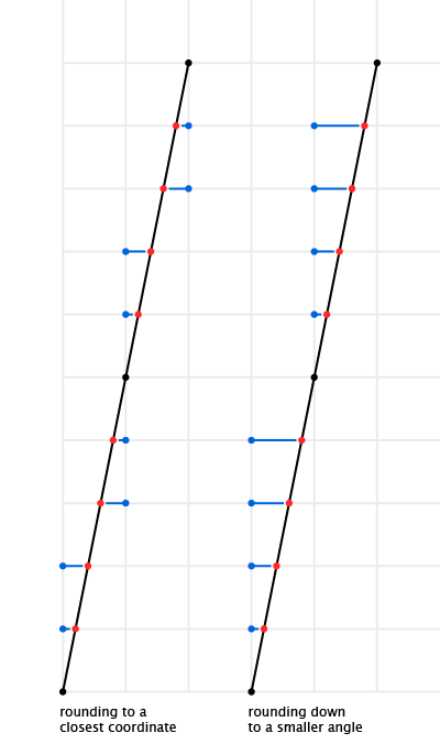
My first thought was to round to the closest coordinate (left side on the image above), so the angle could be greater or smaller (of precise) depending on which coordinate is closer. Then we talked with Tim Ahrens and he proposed to round down – to a coordinate with a smaller angle (right side on the image above). By "rounding down" I mean to move the upper node to the left integer, or to move the lower node to the right integer – to have a smaller angle. Perhaps, Tim's approach makes a sense, because for a very short segments, a smaller angle will produce less sharp shape. However I still have some doubts of what is best for everyone. So for now I implemented both approaches with an option to switch the rounding mode – to round to a closest coordinate, or to always round down.
The question is what the approach should be by default – round to a closest coordinate or round down. Please share your personal preference, if possible with a reasoning. Thanks in advance.
However, pretty often italic angle lies between two integer coordinates, and I have a dilemma on how to round such a decimal coordinate (marked with the red color on the image below) to the integer one, on the x axis.
My first thought was to round to the closest coordinate (left side on the image above), so the angle could be greater or smaller (of precise) depending on which coordinate is closer. Then we talked with Tim Ahrens and he proposed to round down – to a coordinate with a smaller angle (right side on the image above). By "rounding down" I mean to move the upper node to the left integer, or to move the lower node to the right integer – to have a smaller angle. Perhaps, Tim's approach makes a sense, because for a very short segments, a smaller angle will produce less sharp shape. However I still have some doubts of what is best for everyone. So for now I implemented both approaches with an option to switch the rounding mode – to round to a closest coordinate, or to always round down.
The question is what the approach should be by default – round to a closest coordinate or round down. Please share your personal preference, if possible with a reasoning. Thanks in advance.
0
Comments
-
The kind of rounding for OpenType Variations - where you often end up with fractional values that need to be rounded - is specified in the OpenType Spec:round the result to the nearest integer (for fractional values of 0.5 and higher, take the next higher integer; for other fractional values, truncate).
So that's what variable fonts will do; I suggest that should be the default.1 -
Hi Simon. Thanks for the spec reference.0
-
I ended up allowing to set the rounding tolerance in a slider, with the default position in the middle (round to a closest coordinate, like in the specification).

0 -
Michael Rafailyk said:I ended up allowing to set the rounding tolerance in a slider, with the default position in the middle (round to a closest coordinate, like in the specification).
How does it work?
Since there are 10 intervals, I think of subdivisions of 0.1.
At first glance I would think that, if I move the indicator to the left for example to 0.2, between 0 and 0.2 the value will be rounded to 0, while between 0.2 and 1 it is rounded to 1. So by moving to the left, I think I increase the interval in which it is rounded up.
However, reading the texts in the animation, I suspect I have misunderstood.0 -
Hi Michele!
Right, for me it was a really hard decision about how the slider should act:
1. Move the threshold – this is what you thought about initially.
2. Move the possibility to have smaller (left) or greater (right) angle – this is how I intended it.
I chose the second option. So if the slider is in 0.2 position, the threshold is in opposite position – 0.8. That means that everything between 0-0.8 will be rounded to 0, so you'll have smaller angle more often. So the logic is: left side is a smaller upper coordinate with a smaller angle, right side is a greater upper coordinate with a greater angle.
I think that both of options can be confusing for different people. That's why added the text label above, to hint the user what is happening.0


Categories
- All Categories
- 46 Introductions
- 3.9K Typeface Design
- 489 Type Design Critiques
- 572 Type Design Software
- 1.1K Type Design Technique & Theory
- 665 Type Business
- 877 Font Technology
- 29 Punchcutting
- 530 Typography
- 121 Type Education
- 328 Type History
- 81 Type Resources
- 111 Lettering and Calligraphy
- 32 Lettering Critiques
- 79 Lettering Technique & Theory
- 563 Announcements
- 97 Events
- 116 Job Postings
- 169 Type Releases
- 180 Miscellaneous News
- 269 About TypeDrawers
- 53 TypeDrawers Announcements
- 114 Suggestions and Bug Reports