A humanist grotesque (sic!)
Comments
-
Before I move to the Italics, I experimented with some binocular /g/s... I prefer the open solution, especially for its agreement with /s/, but it might be a bit too eye-catching? Then again, there's the monocular version for neutrality. The closed binocular strikes me as too humanist.
 And I think the capital Eszett has gained a little more polish since last time:
0 -
Hm, having slept over it, I now find the closed design more fitting. Maybe I should just keep both.0
-
I feel like the ears of the binocular forms don't feel as "clean" as the rest of the alphabet design. You also might try moving the link of the closed form leftward (as it looks like the open form has).
1 -
Good idea, Craig! I moved the neck outward, flattened the lower bowl to a full horizontal, gave the ear some tapering, and made the upper bowl a hair more squircular. I think it's a lot better now, and certainly superior to the open one.

0 -
In general, I think this is starting to come together nicely!
The “more squircular” upper bowl of the “g” seems a bit out of place, though—without other elements being similarly or nearly as squircular. Maybe back off of that, just a tad.1 -
Yeah, I'm starting to think this should be the default /g/. It would help set the font off a bit from other neogrotesques.I thought the new squircularity was still quite comparable to that of /o/, just a bit more noticeable due to the small counter? In any case, here's what it looks like without the increased squircularity:
 0
0 -
Or just a bit wider? The above feels a bit too slender next to the other letters.


(Before & after... I prefer the shape of before, but isn't the second /gyp/ more harmonious?)0 -
Or how about wider, but the upper counter is still narrow, with the width having gone into the ear there?Best of both worlds?
 1
1 -
Meanwhile, I've started on the Italic. I'd like to have a true Italic in that some of the Roman shapes are replaced, but then I don't want to overdo it so as not to break the typeface's style. Currently I have infant /a/ and /g/ but rational and untailed /l/ and /y/.Not quite sure about the /f/; should it descend, and if so, should the tail curl? I don't like what the straight tail does to texture, so it's pretty much between tailless and curled. I could also curl the tail of /ß/ to match, but I'd probably keep /l/ and /y/ untailed, at least in the default cut. The curly /f/ might feel a bit lonely then?

 0
0 -
Both descending /f's look really out of place to me.1
-
If doing a descending f here, perhaps a straight bottom ending, rather than a hook.
OR, tame the hook to just a slight curve away from the vertical, and switch to a horizontally-cut terminal.
But perhaps not descending is better. The descending f terminal seems like a more humanist feature, in a sans.2 -
OK, makes sense. I do think descenderless looks the most natural for this typeface.0
-
Oof, I had forgotten to manually adjust the /e/ after slanting. It looked overslanted in the sample above... fixed now. And I think I improved the /n/-type arches just a bit? New version on the right.


0 -
Are my /six/ and /nine/ too humanist? I tried a more o-shaped counter originally but couldn't pull it off convincingly (the outer contour fights it too much). I do like the overall impression from afar.
 0
0 -
> Are my /six/ and /nine/ too humanist?
Yes, I think so. Lovely, but....1 -
Here's an unfinished new version. I think it fits the style better, but it's a Frankenstein's monster up close. Those diagonal on-curve points are going to be hell to interpolate and cursify, but without them I can't reconcile the roughly circular counter and the long back.Does anyone know whether there's a way to enforce a 45° angle for anchor points in Glyphs? Something like alt-click for vertical/horizontal/slanted points. I might have to put in a feature request.


0 -
That 6/9 is more fitting, though I’m seeing a black spot at the join.
Should the horizontals of 2/5/7 be thicker? The contrast pattern (slight as it is) feels backwards to me on those.0 -
Good points Craig. Better like this?
 1
1 -
I noted my section sign looks strange next to figures, even though having it descend but not ascend seems pretty standard. I also don't want to compress it entirely into cap space. Can I get away with the tall version centered around capital space?
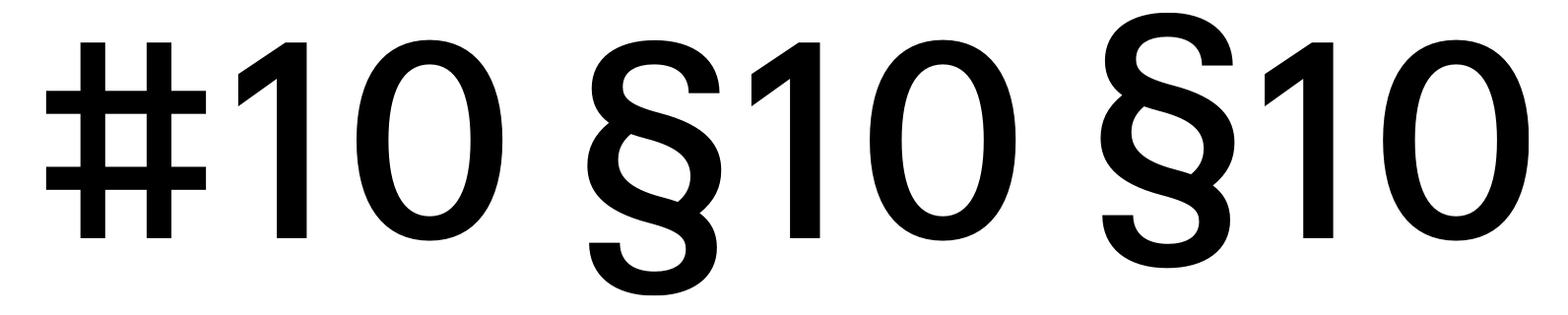 1
1 -
I do prefer that new look.2


Categories
- All Categories
- 46 Introductions
- 3.9K Typeface Design
- 489 Type Design Critiques
- 572 Type Design Software
- 1.1K Type Design Technique & Theory
- 658 Type Business
- 870 Font Technology
- 29 Punchcutting
- 528 Typography
- 121 Type Education
- 327 Type History
- 80 Type Resources
- 111 Lettering and Calligraphy
- 32 Lettering Critiques
- 79 Lettering Technique & Theory
- 560 Announcements
- 95 Events
- 116 Job Postings
- 169 Type Releases
- 179 Miscellaneous News
- 269 About TypeDrawers
- 53 TypeDrawers Announcements
- 114 Suggestions and Bug Reports