Google Fonts: Your Questions, Answered
Comments
-
WE DON'T KNOW.
Thank you John. The amount of gross oversimplification, and the reliance on some very arbitrary data in this thread seems to have reached Sarah Palin level.3 -
> Why are Microsoft ... not offering all their stuff for free?
Does MS sell any fonts?0 -
I think there's one great big misunderstanding at work here;
It is the misundertsanding that Libre Webfonts are somehow related to the same field as the typefaces and fonts designed by the 'Type Industry'. By 'Type Industry' i mean the large Type corps, larger Foundries, and anyone else who considers themselves in that same field. Libre Webfonts are just not in that same field, in my opinion. I'm speaking from the point of view of someone who actually creates Libre Webfonts, so i feel qualified to comment") unlike most others here, who seem to be mostly typeface designers.
unlike most others here, who seem to be mostly typeface designers.
Libre webfonts have so little in common with the type and fonts that normally type designers make, they are totally different objects and products. They are not designed for the same function or purposes. There's little to gain attempting to follow any logic that these two separate, distinct objects are somehow related, or worth comparing. I think people are picking up the wrong end of the stick.
It's maybe helpfull to understand Libre Webfonts better as being related, not to Type or 'design', but instead to web crawlers or webbots, or tweet/blog platforms, or the phenomena of 'farming' views on youtube, or to the 'click bait' or 'swarming' phenomena found in social networking sites, and increasingly found e.g. in online 'journalism'.
Libre Webfonts primarily exist (on the web) to freely (i.e. without hindrance) generate, manage and shape textual-based information. Libre Webfonts are not primarilly there for human purposes but are mostly there for the purposes of other software.
Personally i believe that the creation of webfonts would be much better created as part of the same software processes that generate, shape and manage textual information on the web. This would cut webfonts completely free from the notions and practices (that tend to 'get in the way') held by human 'type designers'. Ultimately, Libre Webfonts, would be best made by software, en-masse, and without any human 'type' designers needing to be involved. This would be a system that could create webfonts to better levels of diversification, at massively higher numbers, quicker, error-free, and able to adjust and adapt to shifts and trends in usage, etc etc. Don't see a downside, to be honest.
-1 -
#Libre #Libre #Libre #Libre #Libre #Libre #Libre #Libre #Libre #Libre
Libre webfonts have so little in common with the type and fonts that normally type designers make, they are totally different objects and products.
Yea. Tooottttaaaallly different.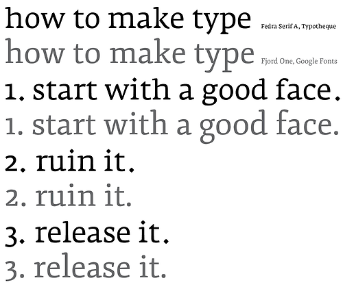 3
3 -
What's even more annoying about this argument is that it is conflating #Libre #Libre #Libre fonts with text.0
-
Does MS sell any fonts?
I was referring to the core business of the mentioned companies.
Sure, a company like Apple can now give their OS away for free, because it serves as an infrastructure of services and sales opportunities. The OS is an investment to make money.
But foundries just have fonts. It’s our core business. So in this case this idea of “give it away for free and you will actually make more money indirectly” just doesn’t work.
1 -
I am surprised that Max wrote, "I agree that pirated fonts & software can help build demand for properly licensed fonts & software"
The key word is "can". I certainly don't agree with Pablo's assumption that drastically increased piracy is good for sales. I suspect there's one or two music business folks who might disagree as well.
Pablo, I'm aware that free fonts and pirate sites have been around forever. But Dafont and the like provide, by and large, utter garbage, and pirate sites are, well, pirate sites. You go on them to steal. Most designers don't want utter garbage, and most don't want to think of themselves as thieves.
The thing about Google is, it's providing an entirely legal conduit for large numbers of webfonts, some of which are competently made and a few of which are very well made. Will that help expand the market for well-made commercial webfonts? Probably, to some extent. Will that cut into the sales of well-made commercial webfonts? That's probable, too. Will the net effect be positive or negative for designers of commercial fonts? No way of telling. Pablo, David, and Vernon have no idea. They're advocating for a client of theirs. That doesn't mean their ideas are invalid, but their arguments so far certainly seem optimistic at best, and their optimism doesn't seem to be shared by anyone who doesn't work for Google.
The one assertion of theirs I'm willing to provisionally accept is that GF might not be an extinction-level event for most type designers. Somehow, that doesn't fill me with a warm, tingly glow.0 -
Yea. Tooottttaaaallly different.
Nice example Jackson... you can also create very similar samples using commercial fonts, like Collis and Elena. Try it, just for fun 0 -
John is right. The true pirate is a thief and can never be cajoled into paying for the type they steal. What we should focus on is legitimate customers who are willing to pay for the use of type that they can recoup payment from their clients. We need to focus on what they want and need without penalizing them for what the thieves so readily do. The kind of person who steals seeks no redemption. The honest client who wants a test of the product is fair minded. As a graphic designer for over 50 years, I used to mock up layouts for which I was paid a fair rate but much of those years was pre-digital. I had to pay a per-word rate for typesetting. Sometimes, a typesetter that I worked with would set a small amount of text for a very modest fee, counting on a larger job to follow. This might happen when they were not busy and they asked me if I had something in the works with potential. The typesetter had to pay his staff anyway but I never asked a typesetter to do free work. Flash forward to today when the purchase of a font license is far less than it would cost a client to set a small job and I am lost to see why either the foundry or graphic designer should give their work away.
I don't believe that for one second, no matter what Pablo says, that free type is good for paid business. You are dealing with different people here, thieves vs. honest people. I don't want to spend my time being the police. I would rather work for legitimate clients. I have tried drastic sale prices and find that they do not work. I won't do that again. I would rather sell fewer fonts to real customers for a fair price than recoup a few pennies to make the bargain hunters happy.0 -
Nice example Jackson... you can also create a very samples using commercial fonts, like TEFF Collis and Elena
The fact that there are other examples (how clear or unclear they are) outside of your sphere, don’t make them generally accepted. Try it, just for fun.1 -
Agree Paul... My point was that showing that sample here is pointless... it does not means anything more than a diversion.
Also, Vern post was about another kind of difference, not about shapes.. it was about how Libre webfonts are infrastructure for web-services, being that the main reason why they need to be Libre, as they solve a licensing problem for those web-services. That's the same reason why Adobe created Source Sans and Source Code, they need them to be Libre in order to be able to use them for the intended purpose.0 -
The thing about Google is, it's providing an entirely legal conduit for large numbers of webfonts, some of which are competently made and a few of which are very well made. Will that help expand the market for well-made commercial webfonts? Probably, to some extent. Will that cut into the sales of well-made commercial webfonts? That's probable, too. Will the net effect be positive or negative for designers of commercial fonts?
The above is a perfect example of picking up the wrong end of the stick (it's even the wrong stick!).
How and why does the existence of large server of Libre webfonts run by google for the purposes of styling and moving text on the web, have anything to do with helping or not helping the market for commercial fonts?? What's the connection between a web search giant getting a mass of free webfonts into use on the internet, and, you (or anyone else), selling fonts? We may aswel be discussing whether the availability of free audio software on the internet will effect the demand for opera singers! (e.g. audiotool.com etc etc)
If you mean that Libre Webfonts can be taken off the web and used in place of commercial fonts, then yes, i see that connection. But... here's the bottom line... if design professionals are taking Libre webfonts off the web and sending them to their prepress bureau for print jobs, instead of buying your commercial fonts, then it's most likely it's because your commercial fonts are just not good enough. Design professionals don't use free fonts just because they are free. That would make no commercial sense.
The higher end commercial foundries and type designers are not loosing sleep over free Libre webfonts, because in their field they have a superior gain over the 'free' products. In exactly the same way that they have a superior gain over any inferior commercial fonts that could stray into their field. Should we also worry about whether the few excellent foundries and designers in the world are effecting the sales of all other commercial fonts?1 -
Should we also worry about whether the few excellent foundries and designers in the world are effecting the sales of all other commercial fonts?
Exactly! GF will not decrease TypeKit or Webtype sales... H&FJ will. Unless they get to improve their services to a similar level. In particular, the sub-setting panel is a thing of beauty.... (Subsetting and accesing OT features online are one of the biggest challenges for users, and they have found a very elegant and easy to use solution to it)
I think that currently, many web-developers/designers are going this path:
Started testing webfonts on GF --> moved to TK, WebType, etc --> Ended in H&FJ cloud service
GF is an entry point. It will not kill other services sales.0 -
WE DON'T KNOW.
No one has a crystal ball to predict the future. But there can be a good reason to speculate about the future. I speculate about the future, because I don’t want some things to happen. I want my “prophecy” to be self-defeating. “If the audience of a prediction has an interest in seeing it falsified, and its fulfillment depends on their actions or inaction, their actions upon hearing it will make the prediction less plausible.” So, I hope I’m wrong about the future.0 -
Exactly! GF will not decrease TypeKit or Webtype sales... Hoefler will.
Yep. Also remember; the real competition has all the edge; they are more talented, richer, have more employees, they have hungry young interns, faster Macs, better taste, they sleep well at night, and... they are not spending precious design time tapping away on the net moaning about libre webfonts.
Unless they get to improve their services to a similar level. In particular, the sub-setting panel, is a thing of beauty....
-2 -
Vernon:
Libre Webfonts primarily exist (on the web) to freely (i.e. without hindrance) generate, manage and shape textual-based information. Libre Webfonts are not primarilly there for human purposes but are mostly there for the purposes of other software.
I don't agree with Vernon's assessment that Libre Webfonts are somehow completely different kinds of objects from commercial fonts, but he is right to suggest that the reason why companies like Google (and organisations like Wikipedia) want Libre Webfonts has nothing to do with the reasons why companies have typically wanted fonts in the past. As I wrote earlier, I think it is very important for font makers to get to grips with the reasons why some clients want fonts with open licensing, what they want to do with such fonts, and why it is in their business interests to invest in such fonts. Apart from anything else, if we don't understand those things, how will we know how much to charge them for licensing fonts in this way?0 -
As I wrote earlier, I think it is very important for font makers to get to grips with the reasons why some clients want fonts with open licensing, what they want to do with such fonts, and why it is in their business interests to invest in such fonts.
Amen! That will be much more productive discussion to have.
Complaining is pointless. Jackson's easy jokes are cool and fun, but also pointless.
Google, Wikipedia, Adobe, Ubuntu, Firefox... the list of organizations will keep growing more and more in the future, as everything keeps moving to cloud-based solutions. This are only the tip of the iceberg, the "early adopters"0 -
John Hudson: I don't agree with Vernon's assessment that Libre Webfonts are somehow completely different kinds of objects from commercial fonts
John, you mean "i don't agree yet..." -1 -
Google, Wikipedia, Adobe, Ubuntu, Firefox... the list of organizations will keep growing more and more in the future, as everything keeps moving to cloud-based solutions. This are only the tip of the iceberg, the "early adopters"
Intel too - https://01.org/clear-sans/ - https://bugzilla.mozilla.org/show_bug.cgi?id=8772030 -
"That's the same reason why Adobe created Source Sans and Source Code, they need them to be Libre in order to be able to use them for the intended purpose."
Yes, there's a need for "Libre" fonts. No, there's no need (nor justification) for "Libre" fonts to appropriate commercial designs. (And Adobe made a point of ensuring that Source Sans and Source Code are not derivative designs.)
The "architecture" aspect of Libre is indeed orthogonal to the design aspect. But acting as though design is irrelevant is nonsense. If it were irrelevant people wouldn't need web fonts in the first place; they could go back to "web safe" system fonts & fallback.2 -
"The higher end commercial foundries and type designers are not loosing sleep over free Libre webfonts, because in their field they have a superior gain over the 'free' products."
I'm not sure where Vernon gets this notion. Monotype and Adobe are making use of Google web fonts, but I don't know of another font foundry that isn't upset about them. I challenge Vernon to name one of these "high-end" foundries, or to see what happens if he walks up to Jonathan Hoefler and identifies himself.0 -
David, you misunderstood me.
I was not justifying Fjord, and certainly not accusing Source Sans of anything.
I was simply stressing that Vernon's post was about differences in the "licensing". And that the the Libre license solves the demands of today's cloud bases services, in a way that commercial fonts are not able to do, since they can't be freely shared by definitions.0 -
Adobe made a point of ensuring that Source Sans and Source Code are not derivative designs
I continue to be curious how you conceptualise this, David You said before you didn't want to talk about what defines 'the line' between a derivative you approve of and a derivative that you don't approve of, and yet, I am again not sure how you say that Source Sans is not derivative.
Paul wrote in the annoucement blog post for Source Sans Pro, emphasis mine, "I have always been impressed by the forms of his News Gothic and Franklin Gothic, which have been staples for typographers since their introduction in the early twentieth century. While keeping these models in mind, I never sought to copy specific features from these types. Instead, I sought to achieve a similar visual simplicity by paring each glyph to its most essential form."
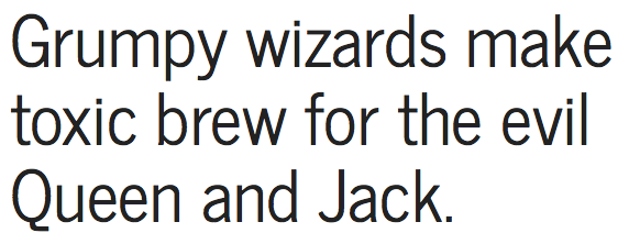
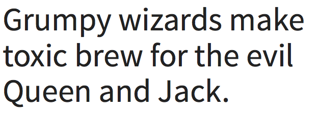
Here is News Gothic, from that blog post:
Here is Source:
Oh no, in fact, that's not source! Its News Cycle, a 'straight' revival of News Gothic also on GF.
Here is Source:
To me, when you compare News Gothic to Source, the kind of comparison that Jackson posted in this thread, or similar ones like those widely circulated by Erik Speikermann and Stephen Coles, are easy to make.
Here is Erik Speikermann explaining his approach, which is similar to Paul's statement in the blog (30 seconds): http://youtu.be/6AjVRut8fRo
Paul says he didn't copy "specific features" but from the above images I can see many specific features which are identical, and many more that are very close.
So when you say, "Adobe made a point of ensuring that Source Sans and Source Code are not derivative designs," could you tell us more about why this is so?
What am I missing?
I also have difficulty in understanding how Erik's tweet and this video go together....0 -
Monotype and Adobe are making use of Google web fonts
Yes! They are using Libre fonts to promote commercial fonts and related products!
Isn't that awesome‽ and ironic...[Chris Lozos] I don't believe that for one second, no matter what Pablo says, that free type is good for paid business.
Really, I don't know why some people still thinks that Free or Libre fonts will kill font sales.
Those are perfect examples: Monotype, the money making machine, is using Libre fonts to promote commercial fonts sales via Skyfonts and Typecast! I find that fascinating!
Again, GF is an entry point. Another example will be Fontspring, using Fontsquirrel as entry point, and seems to be selling quite well (Various people commented in other threads that Fontspring has become their #2 source of income, closely after MyFonts).but I don't know of another font foundry that isn't upset about them. I challenge Vernon to name one of these "high-end" foundries
Back to the beginning of the discussion? we have already discussed that...0 -
...from the above images I can see many specific features which are identical, and many more that are very close.
Really, Dave? Source Sans seems to me very different from News Gothic. The latter is a typeface I am very intimately familiar with, since I worked on Cyrillic and Greek versions for Heidelberg's corporate face. While there's a related idea in Source Sans, and a similar letter construction pattern, what I mostly see are the differences, beginning with the overall impact (texture) and traceable to different stresses, apertures, etc.
Mind you, what I mostly see in News Cycle is what makes it different from News Gothic too. News Gothic is an incredibly subtle typeface. Compare the evenness of texture in the specimen image with the jumpy stem weights of News Cycle.
Personally, I don't think either Source Sans or News Cycle hold a candle to News Gothic.1 -
@Mr. Lemon
I'm not sure where Vernon gets this notion. Monotype and Adobe are making use of Google web fonts, but I don't know of another font foundry that isn't upset about them. I challenge Vernon to name one of these "high-end" foundries.
Well you mention two yourself, but i would say that any foundry that's upset about a few free webfonts, isn't worth the label 'high end', so maybe standards are slipping, if you are right that so many foundries are 'upset' by these fonts. Judging some of the mediocrity that some foundries push to sell, i can understand libre fonts crossing over to print can be happening a little, but there's an awfull lot of dull and uninteresting type going up for sale in a very crowded and competitive market, and it sounds like the big mediocre bulge nearer the bottom is getting squeezed hardest. But as Pablo already pointed out, it's probably other, more commercially fitter, 'pay-for' fonts that are gaining sales from the market's overall mediocrity, rather than the small libre font usage causing these losses. For all the mass usage libre webfonts get on the web, i rarely see them used in print, so i think there's some serious flaws in the idea that libre webfonts are to blame for low fonts sales. I think the real reason for low sales is poor designs being unfit for a competitive (and changing) market.
0 -
They’re all the same typeface design, with slightly different rendering/styling.
That’s not just what I think, I believe the vast majority of graphic designers would share the same opinion.
There’s a demand for this sort of thing, because a lot of people want to use something safe and classic, tried and true or, like Paula Scher, with the novelty worn off.
I’ve never been interested in fighting for that slice of pie.
3 -
Vadams, you need to change your handle to your real name per the rules of this forum.0
-
Personally, I don't think either Source Sans or News Cycle hold a candle to News Gothic.
John, with regard to the formal language, i.e. the design that creates the 'visual appearance' of News Gothic, you are right, and i don't think many designers would disagree with that. But, how long has the News Gothic face been available for unhindered and freely movable ("Libre") usage across both the infrastructure and the interfaces of the internet? a.k.a. when did News Gothic fully join this age? We know when it joined the digital, desktop publishing age. But when did it join our internet age?
News Cycle got there first, in my opinion giving it an edge, because it is a fundamentally different object, than the 'real' News Gothic. News Cycle can move freely, News Gothic cannot. Source Sans also got there first too, giving a much more generalised approximation of the 'gothic' face, but with even more plusses than News Cycle; it has a full array of weights and brings something different 'stylistically' again, to the gothic palette.
We can discuss the formal design merits of typefaces ad infinitum, but i'm not sure that doing so has the most relevance to this discussion. The most beautiful C18th movable type sets could not be used with hot metal machines, they were simply different objects made for different systems. Font software designed and licensed for use explicitly on the personal desktop cannot be used on today's open networked infrastructure on which is built, and spreading, interfaces and services that rely on 'sharing' and 'free-to-use'. Once you have fixed the issues of licensing and paying designers, then you can go back to dealing with the forms.0 -
I agree that the discussion of individual designs isn't relevant to this discussion, which is why I was sort of surprised by Dave's interjection re. News Gothic and Source Sans. My point was that where he sees similarity, someone else sees difference, and it is differentiation in design that, all else being equal, carries value.
_____
I think you go rhetorically off the deep end, Vernon, when you start equating Libre with 'joining the Internet age'. It's this sort of talk that sometimes gives the impression that you and Dave are pushing kool-aid. There's nothing antithetical to 'the Internet age' in a software ecosystem that includes restrictive licensing as well as open licensing, and it isn't necessary for fonts to be able to go everywhere in order for them to go where they need. Open licensing is a business decision that is appropriate to specific kinds of services and operations. As I've said a few times in this thread now, understanding those business decisions and why, for those clients, they make sense, is important. I don't think that understanding is much aided by free software ideologues, who tend to alienate a lot of people.5


Categories
- All Categories
- 47 Introductions
- 4K Typeface Design
- 495 Type Design Critiques
- 577 Type Design Software
- 1.1K Type Design Technique & Theory
- 670 Type Business
- 885 Font Technology
- 29 Punchcutting
- 539 Typography
- 125 Type Education
- 333 Type History
- 81 Type Resources
- 113 Lettering and Calligraphy
- 33 Lettering Critiques
- 80 Lettering Technique & Theory
- 569 Announcements
- 100 Events
- 116 Job Postings
- 170 Type Releases
- 182 Miscellaneous News
- 270 About TypeDrawers
- 54 TypeDrawers Announcements
- 114 Suggestions and Bug Reports