Renwick Display - A Humanist Sans

Thank you to all the suggestions already offered in my introduction post. I'm open to all feedback regarding any part of it!
——
PS: InDesign changes a lowercase eszett into a double "SS" when using the case feature (TT button) instead of a capital eszett. This happens automatically for small caps too. Is this behaviour correct?
Comments
-
Tofu Type Foundry said:PS: InDesign changes a lowercase eszett into a double "SS" when using the case feature (TT button) instead of a capital eszett. This happens automatically for small caps too. Is this behaviour correct?
I wouldn’t call it correct, but the problem is Indesign and not your font.
0 -
To be able to have a chance of judging your design, it would be helpful if you would give it a regular spacing.1
-
I find it a little odd that /d and /p are spurless while /b and /q aren’t. They don’t always have to be the same, but my sense is that conventionally /b and /q are quicker to lose their spurs.Tight spacing could work in a display font like this that evokes the photo type era, but the straight-to-straight tightness is definitely producing some color issues.2
-
I think the stroke widths of the \O and the \B are much better now.
1 -
/C has an underbite. Is the top of /P a bit too small?/Germandbls is still droopy. Have you tried a version with a cap-high top right corner? It's also a bit narrow, give the extremely wide range of widths you have in your caps.Overall, the Bold strikes me as the most well-drawn of the three weights, extrapolation errors notwithstanding.0
-
Christian Thalmann said:/C has an underbite.
I gather this is intentional on Reese’s part, but perhaps it should become less drastic in heavier weights? I think it can be rather charming in the lighter weights
Christian Thalmann said:Is the top of /P a bit too small?It is perhaps a bit too narrow, but I do like the general “smallness” to it. Maybe just make it a tad wider?
Given the tight spacing, the lowercase “l” seems to become a little problematic at times. It seems you could afford to make it narrower especially in the heavier weights.
The weight of the a’s bowl in the regular style feels a little incongruent with the other two weights. As in the bottom feels too heavy, and the center too thin. It seems you could get away with a more evenly weighted bowl, especially given the lack of contrast in the “e.”
I also wouldn’t be afraid to make the top bowl of the “g” larger (across all weights) too given the tight spacing, and the large counters in the “a” and “e.”
0 -
I am actually impressed with how effective /C is in mixed case, but the fact remains that it will look strange in all caps. Once, I would have suggested alternates, but there comes a time when we have to admit that no one uses alternates.
0 -
The spacing seems very tight indeed.
What is the “design size”? That is, if you had to name one specific size at which everything should seem perfect, what would it be?
What is the smallest size at which you expect it to work well?0 -
He actually mentioned it in his first post:Thomas Phinney said:
What is the “design size”? That is, if you had to name one specific size at which everything should seem perfect, what would it be?
What is the smallest size at which you expect it to work well?Tofu Type Foundry said:This is the display cut intended for sizes of 36pt or greater.
0 -
Good point.
Basically, the current spacing makes this seem to me like a “poster” size optimized for something like 288 points (or more), not recommended below 144 point.0 -
PS: InDesign changes a lowercase eszett into a double "SS" when using the case feature (TT button) instead of a capital eszett. This happens automatically for small caps too. Is this behaviour correct?Technically, yes, it is correct, although it might not be what specific users want.
The case mapping of ß to SS has been the official standard in Germany for many decades, and it remains the default case mapping in Unicode’s special casing rules. Fairly recently, German orthography rules have allowed for the optional mapping of ß to the uppercase form of that letter, which is a 20th Century innovation. For some users, this is a stylistic preference, but in some data processing situations, e.g. where personal names are stored in all-caps, it may be critical to preserving spelling distinctions. In such situations, tailored casing rules may be applied.
0 -
When making fonts, the only OpenType feature that needs to include Eszett is c2sc:
sub uni1E9E by uni1E9E.sc ;
If you include Eszett in your font, but your “all small caps” (c2sc) feature does not include a small cap version of that character, then names that were typed in all caps, including Eszett, will not fully convert to small caps, with cap Eszett standing out like a sore thumb.
Do not, however, put uni1E9E.sc in your smcp feature, for that:sub germandbls by SS.smcp ;
—where SS.smcp is a single glyph comprising two small cap ‘s’s.
1 -
Thank you all for contributing! Since a few people mentioned the spacing tightness so I'll address that generally. I see now that the spacing might be a bit much for use at the intended 36pt size, especially with straight-to-straight letters. I wanted to emulate the tight-not-touching spacing that the phototype era is known for, and specially referring to Forma DJR Display (designed for 36–72pt) and our very own Nick's Dair TBNT Regular. I'd like to also create a Subhead version of Renwick that would be better suited for… well, subheads. I envision Display being used for oversized headlines, like this:

I guess the options are to loosen the spacing or increase the intended size range to something more like 72pt? I'm leaning towards options two because I like the tightness.0 -
@Craig Eliason Is there a reason why /b and /q are quicker to lose their spurs? I included spurs on /b and /q to help differentiate them from /d and /p while also relating to the design of /r /n and /m. Would it be less distracting without them?
@Linus Romer Great to hear! After making the changes I could see the difference.
@Christian Thalmann The underbite is intentional. I like the character it gives but am not opposed to toning it down slightly. The /P has bothered me for a while but I don't know why. As for /Germandbls I haven't tried a "sharp" top right corner yet, but I will now. Is the width of the character similar to the /H? When you mention "extrapolation errors" what do you mean? All three masters are manually drawn, although they likely include amateur errors.
@Matthew Smith You're correct; the obvious /C underbite was influenced by Gimlet Sans:
I'm curious why you suggest it could "become less drastic in heavier weights" and "think it can be rather charming in the lighter weights". Is the gap it creates strange in the bold weight because it's supposed to be a darker overall colour? And then the light is fine because the spacing is looser?
Looking at /P closer I noticed Gill Sans Nova already addressed this issue and widened their letter. I'll try something similar and see how it changes.
When you mention making the lowercase /l narrower I assume you mean the bottom terminal, and not the width of the stem? Now that you mention the regular /a being an oddity I can see it. I'll try fixing that and play around with the bowl on the /g too.
@K Pease Is there a reason it might "look strange in all caps"? Instead of alternates I could use possibly add a C.case but that doesn't sit right with me. I think it'd be better to design a /C that works for both upper- and lowercase.
@Thomas Phinney The spacing is likely be too tight for 36pt, but I feel like it could still work at a size as small as 72pt. I'll try printing it out at increasing intervals and see how it performs. Is there a specific reason you suggest no less than 144pt?
@John Hudson This is my first time being blessed with a John Hudson knowledge lesson! Is the "optional mapping of ß to the uppercase form" something handled on the program or font level?
@Nick Shinn This font doesn't have small caps, but the original Renwick Book did. I only used the .smcp feature when making it though and avoided .sc completely. Is this bad practice?0 -
Is the "optional mapping of ß to the uppercase form" something handled on the program or font level?At the data-management level, which will typically involve a tailored, data-specific casing table. So it isn’t something that a typical text processing program will provide out-of-the-box, but is something that could be scripted.
Fundamentally, it is a character encoding matter: if a user wants the uppercase eszett character ẞ, rather than SS, then he or she has to use U+1E9E in text, whether via character input or tailored case transformation. It definitely isn’t something for the font to do, because fonts deal in glyphs, not characters, and there is no way to handle the case mapping of ß in glyph processing.
1 -
I'd hypothesize that it derives from the European brush/pen tradition that tends to start stems with a left to right instroke, and stops them with a left to right outstroke. Picture an italic lowercase "el" with lead-in and lead-out serifs. I gather (from Father Catich and my own limited pen experience) that those serif-y movements are a way to "get the ink/paint flowing" and insure more substantial and clean terminals of the stems.Tofu Type Foundry said:@Craig Eliason Is there a reason why /b and /q are quicker to lose their spurs? I included spurs on /b and /q to help differentiate them from /d and /p while also relating to the design of /r /n and /m. Would it be less distracting without them?
Writing a /b with such an outstroke at the bottom of the stem interferes with the bottom of the bowl, and writing a /q with such an instroke at the top of the stem likewise interferes with the bowl. Easier in those cases to just merge stem and bowl together. On the other hand the outstroke at the bottom of /d and the instroke at the top of /p are free and clear of the bowls because they're on the other side of the stem.
Obviously in sans serif designs this "interference" issue doesn't apply, but the expectations of letterforms can still be influenced by familiarity with seriffed type. And that's especially true for a sans intended to read as "humanist" like yours.
Note that even if the spurs aren't omitted in a sans, they can differ in /b and /q compared to /d and /p: see the pared down spurs in Franklin Gothic as a good example. I think it's fair to say we expect the "stemminess" of /d and /p to be more than, or equal to, that of /b and /q, but less than seems a little weird to me.
0 -
@Craig Eliason Is there a reason why /b and /q are quicker to lose their spurs? I included spurs on /b and /q to help differentiate them from /d and /p while also relating to the design of /r /n and /m. Would it be less distracting without them?
I presume it's because of pen logic: The spurs of /d and /p occur in the direction of the strong diagonal, but those of /b and /q in the weak diagonal. See for instance EB Garamond:
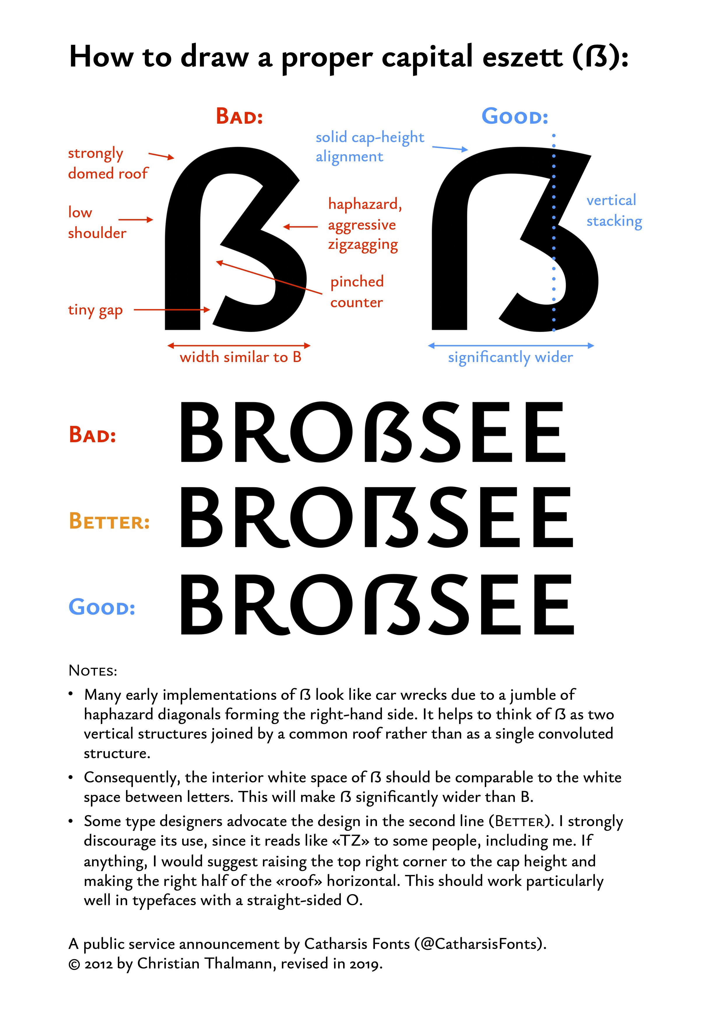
 @Christian Thalmann The underbite is intentional. I like the character it gives but am not opposed to toning it down slightly. The /P has bothered me for a while but I don't know why. As for /Germandbls I haven't tried a "sharp" top right corner yet, but I will now. Is the width of the character similar to the /H? When you mention "extrapolation errors" what do you mean? All three masters are manually drawn, although they likely include amateur errors.Your call, of course, but I personally find the underbite jarring in the combination /C + straight stem, such as in /C/H or /C/K. I like how the /C of Gill Sans perfectly fits in that context.The width of /Germandbls is tricky. In my opinion, it is an inherently wide character like /M and /W, though I tended to overdo it in my earlier designs:I do think it should be (at least optically) signiticantly wider than /B. Here's what it looks like in Ysabeau these days, after a lot more tweaking and Andreas Stötzner's review:
 I still think erring on the wide side is preferable. Ultimately you can only find out what works for your particular typeface by trying things out.0
 -
@Craig Eliason Thanks for providing that explanation. I never realized the "serif logic" in a font like Franklin Gothic, but now that you point it out the /b /q and /d /p it seems obvious. The best part about type design is that there's always more to learn!
@Christian Thalmann Seeing a visual guide like that is very helpful. I haven't found time to return to this project yet but I'll make sure to post the changes once they're done. Regarding the underbite on the /C, I've been looking a few other typefaces and none have the very obvious underbite like Renwick does. Perhaps I've overdone it in pursuit of "coolness".
PS: That's a lovely /Germandbls in Ysabeau.
0 -
I'm back with some changes! Once again I'm open to any feedback; the comments from last time were very helpful.
Revisions are explained in the PDF along with visuals, but to summarize it here:
- /b and /d have swapped spurs
- /p and /q have swapped spurs
- /l (lowercase L) tail has been slightly condensed
- /g has a larger bowl
- /a has a more evenly distributed regular weight, like the /e
- /Germandbls is now wider and has a "sharp" top right corner
- /C has much less underbite to fit flush beside straight letters
- /P bowl is slightly wider
- straight-to-straight spacing is more generous
Comments that aren't in the PDF:
- I have not fixed any spacing or kerning issues created by new design changes (yet).
- I think the new /C with less overbite works well but I'm wondering if the letter is now slightly too wide? Gill Sans Nova is also wide though.
- After printing some tests I've settled on a minimum intended size of 72pt. The spacing isn't too tight and also works at greater sizes than that. Header and subheader versions will come later addressing smaller sizes like 36pt and 18pt, respectively.
0 -
I like the look of it, particularly in the light weight. The energetic leg of /R/ is great!
- /Germandbls is certainly better than before, but perhaps a bit too wide now. Maybe try something in the middle between the two widths in the sample? Also, the strong downward slope of the roof caught my eye compared to the other capitals — maybe try to move the apex more to the middle of the roof?
- The counter of /P/ and /R/ strikes me as too square for comfort. I would suggest moving the straight-to-round transition points much closer to the stem and making the round part rounder and smoother.
- The extreme depth and narrowness of /J/ is very eye-catching. I would perhaps halve the descender depth.
- The bowls of /b/p/d/q/ strike me as uncomfortable. In particular, note how the /b/ is thin around 2 o'clock, where it should be heavy. Also, all four of the counters seem skewed in the opposite direction of my expectations — I would expect /d/ to be pointy on top and round on the bottom, and /p/ the other way round. Did you perchance just mirror your previous /b/q/ to make /d/p/?
- The /g/ stands out as wide, especially in «smuggle». Maybe tucking in the right side of the lower bowl and the ear would already help?
- Spacing still feels uncomfortably narrow overall.
0 -
Yes, /C is too wide. /H may be too. But generally our judgment of width of letters depends a lot on the interior counter spaces and their relation to each other and to the interletter space; and the crazy-narrow sidebearings/kerning of this inhibit that judgment. Take "SOCCER. PENNIES" in the specimen. The O and Cs open up space and make the first word much lighter than the tight second one—but I don't know that you could narrow the O and C enough to make the weights match.
This makes me wonder if font designers committed to super-tight sidebearings/kerning ever darken their wider letters not by narrowing them but by thickening their stroke weights for the sake of balance. Or is the idea of color balance simply sacrificed for the desired spacing effects?0 -
This is looking better, for sure!
In both weight extremes, the space is still awfully narrow. I might try increasing it by 1/3 or so and see how that looks.
In B P R the transitions from curve to straight in the tops and bottoms of the bowls are overly abrupt (all weights but maybe especially the bold).
In most pro typefaces, the bowl of the P is bigger than that of the R, at least vertically and sometimes horizontally as well. That seems true in your ExtraLight but not the Bold—Bold seems like it is maybe the reverse, the R is bigger?
The bold S seems pinched at bottom left compared to top right. That may contribute to the feeling that it is leaning backwards (to the left).
The weight progression makes the O/o in particular seem much more condensed in the bold, more than I expect given weight treatment in much of the typeface. I look at how you add weight to MN. And bdpq are given more reasonable expansion on the outside. It is OK to make O/o outer contour get a little wider as weight gets added, it does not all have to go to the interior, maybe 2/3, or 3/4 at most.0 -
@Christian Thalmann I appreciate that! The /R has come a long way since starting this project and has slowly become one of my favourites.
- The new /Germandbls width is almost as wide as the /H. I'll try making it a bit more condensed and tweaking the roof.
- You’re right, the /P and /R do seem a bit square with their bowl transitions.
- The /J goes down to the descender line to avoid awkward spacing collisions but it does seem quite deep upon review. Looking at Gill Sans Nova, their /J is close to matching the descender especially in the Bold (their metrics might be different though). The tail does not come back up which seems to help with this issue too.
[Gill Sans Nova light and bold weights]


- You’re bang on the money, I mirrored my /b and /p to make /d and /q. I’ll go back and properly craft them this time. What a great "time saver" that was!
- I was planning on addressing the double /g spacing in “smuggle” with a /g_g ligature, but perhaps the letter itself should be tweaked? Do you find the /g to be distracting when it's isolated in words like "impugn" or "logos"?
- Thanks for confirming my suspicion about /C being a bit wide. I'm not fully happy with it yet.
- I wonder if the overall letterforms would benefit from spacing the "Header" cut of Renwick first, then applying the logic from those design changes to the "Display" version later. To sum it up: could the tight spacing I'm working with distort my perception of the interior counter spaces?
- That's an interesting theory about darkening wider letters to compensate. I'd love to know if anyone here has experience with that.
@Thomas Phinney Glad to hear it's improving!- I've found it difficult to get the /space width satisfactory; adding some extra room to it might help. Some letter combinations make it appear too little and other too much. Is it bad practice to kern letters against /space? So far I haven't because it seemed wrong to do.
- The straight to curve transitions in /B /P /R do need more work.
- The bowl size in /P is inconsistent when compared to the /R. Good call.
- /S needs some tweaks too, thanks for pointing that out bottom corner.
- So far I've been adding 100% of the weight to the inside of /O because I didn't know how to handle the situation. The letter is already wide and quite circular, but I'll try widening the form slightly with weight expansion (which is what my inspiration did too)
[Gill Sans Nova light and bold weights]


0 -
That seems like a smart strategy to me.Tofu Type Foundry said:- I wonder if the overall letterforms would benefit from spacing the "Header" cut of Renwick first, then applying the logic from those design changes to the "Display" version later.
1 -
Most type designers don’t kern against /space, but some do. I am in the former category, but I think that with such tight spacing as you have, it is more reasonable than it would otherwise be. (Another option is to allow negative sidebearings for letters such as AKVWXYvwxy — I would probably go there, first, if you haven’t already.)
But either way, I think the space needs to be a bit wider.0 -
@Thomas Phinney The LSB and RSB for /AKVWXYvwxy are basically zero right now (~around 5 units). Because of how tight the spacing is, wouldn't giving those letters negative sidebearings create issues with other capital letters? Especially consecutives in words such as AARON or SAVVY?
0 -
The general rule for spacing is to fix the problem cases with kerning but make the common cases work with spacing as much as possible.
So yes, some things would overlap. But at least the TYPICAL spacing would be improved.
In many cases, those potential slight collisions are not a problem. KA or AA are fine to overlap a tiny bit. VV might start to look like W so you could kern those two apart. But VV is a rare enough combination (savvy and revving notwithstanding) that that seems livable to me.
It seems to me that this is the “right” spacing for those letters, given how tight your overall spacing is. But I won’t claim that is the One True Answer. Plenty of skilled type designers almost never do negative sidebearings. (But even they would make exceptions, I think: for example for an overhanging lowercase f.)1 -
Hello again!
I've taken a long break from this project and returned with fresh eyes. Previously, there was a common critique that overall spacing was too tight, which I can now see. It was waaay too claustrophobic. The spacing has been loosened across the board and feels a lot more comfortable now! It's still a rough job and there's zero kerning so it's nowhere near finished. I'm very curious to hear all your thoughts on this change.
Quick breakdown of glyph changes since last time:— The spurs and bowl stress on /b/p/d/q make more calligraphic sense— The tail on /J/j is far less obtrusive, both in depth and width— /C is slightly condensed— /B/P/R have consistent counters across weights, /B is the smallest and /P is the largest. The straight to curve transitions are also slightly smoother— /O has a bit more weight expanding outward making it slightly wider
— /Germandbls isn't quite so wide and I tried altering the roof according to @Christian Thalmann 's feedback
Also I have a few concerns about some glyphs that I haven't altered much yet. Specifically, the /S and /s feel like they may be leaning backwards a bit too much. The /g feels like it stands out in copy and darkens the colour. Lastly I wonder if /space is a bit wide? But before I start fiddling with those I'm interested if others feel the same.
Thanks again for all the wisdom this community has offered") 0
0 -
I like the vibe!
Spacing is still quite tight. Compare side-to-side with a typeface you like and you'll most likely see the difference.
In music production, it's very normal to use a reference track to compare to your own track, for things like sound design and mixing. I might get some pushback for this, but I think using one or several reference typeface(s) makes a lot of sense in type design as well, especially while you are still learning.
Some improvements could also be made in curve thickness. The lowercase l for example, feels like the curve is a bit pinched at the bottom-left. It could also be that your curves all follow the same stroke modulation, but I subconsciously expect a slight calligraphic tone, such that north-eastern/south-western bits are a bit thicker, and the north-western/south-eastern a bit thinner. The d, for example, has an overall pretty calligraphic shape. I see a similar problem in stroke modulation in some of the terminals, for example C.
The stem-to-curve transition in d could be moved up a little, or the curve could be pushed outward. Same (but reversed) for p.
r is a bit wide, especially compared to the elegantly narrow s (might be too narrow, though).
I'm not convinced by the g. I think especially the eye-to-loop connection should be lighter and the whole g should be wider.
t could be a bit taller.
u needs to be narrower than n to appear the same width.
S is leaning backwards.
Good luck!3 -
Commas and quotations marks should be more substantial, especially in lighter weight. The /space character is too wide I think, though the underlying issue there might be that everything else is too tight, as Jasper suggested.
1


Categories
- All Categories
- 47 Introductions
- 4K Typeface Design
- 495 Type Design Critiques
- 577 Type Design Software
- 1.1K Type Design Technique & Theory
- 670 Type Business
- 885 Font Technology
- 29 Punchcutting
- 539 Typography
- 125 Type Education
- 333 Type History
- 81 Type Resources
- 113 Lettering and Calligraphy
- 33 Lettering Critiques
- 80 Lettering Technique & Theory
- 569 Announcements
- 100 Events
- 116 Job Postings
- 170 Type Releases
- 182 Miscellaneous News
- 270 About TypeDrawers
- 54 TypeDrawers Announcements
- 114 Suggestions and Bug Reports