Abraham (working title) - work in progress

Jan Willem Wennekes
Posts: 148
Hello Typedrawers! So this is where you have all been hanging out ") I used to be active on Typophile, then got sidetracked (long story). Around two years ago I started working on 'Abraham', a letterform I have been drawing and using for illustrations and design. My background is graphic design and illustration - see www.zeptonn.nl - I'm still new to type design. I'm also still in the process of learning Fontlab and techniques such as (class) kerning etc, so very much open to suggestions and tips.
I used to be active on Typophile, then got sidetracked (long story). Around two years ago I started working on 'Abraham', a letterform I have been drawing and using for illustrations and design. My background is graphic design and illustration - see www.zeptonn.nl - I'm still new to type design. I'm also still in the process of learning Fontlab and techniques such as (class) kerning etc, so very much open to suggestions and tips.
This is my second typeface, working title is "Abraham" for now. (My first attempt at creating a typeface is here). The idea is to keep it real big, bold and solid, intended for display purposes. I want to keep the handdrawn feel of course, sort of a loose yet bold style.
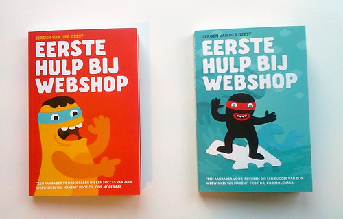
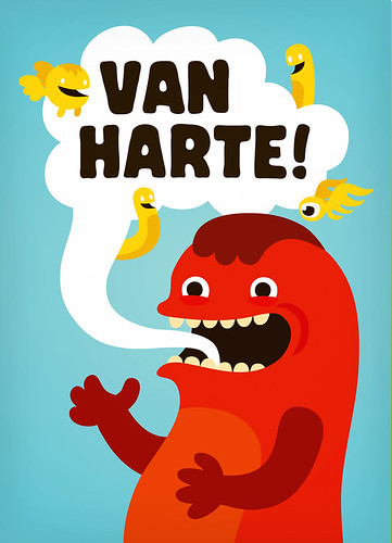
I've been drawing these for a while in cards and posters and bookcovers for example. Here are some examples of previous use:

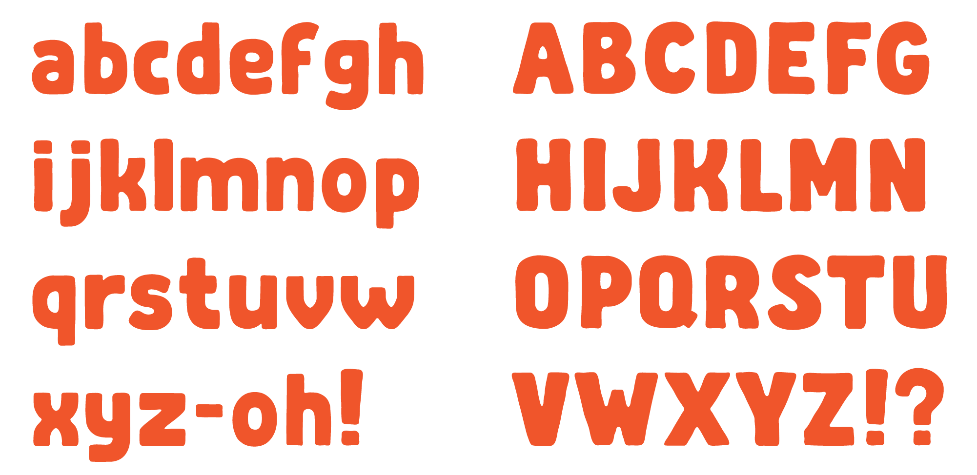
So this is where I started, and below is the glyph set as it is right now. Doubting whether to add lowercase letters - I actually planned on not doing so but I wonder if it would be a good addition or not? I also read that one can use OT features to make it so lowercase letters will be replaced automatically by their uppercase counterparts - in order to save time on kerning etc (not sure how it would work though.)
Thoughts, comments and suggestions most welcome!
This is my second typeface, working title is "Abraham" for now. (My first attempt at creating a typeface is here). The idea is to keep it real big, bold and solid, intended for display purposes. I want to keep the handdrawn feel of course, sort of a loose yet bold style.
I've been drawing these for a while in cards and posters and bookcovers for example. Here are some examples of previous use:
So this is where I started, and below is the glyph set as it is right now. Doubting whether to add lowercase letters - I actually planned on not doing so but I wonder if it would be a good addition or not? I also read that one can use OT features to make it so lowercase letters will be replaced automatically by their uppercase counterparts - in order to save time on kerning etc (not sure how it would work though.)
Thoughts, comments and suggestions most welcome!
1
Comments
-
As I'm new here: am I correct in assuming one can only insert 1 image per post? Here is the rest of the set (still working on it).0
-
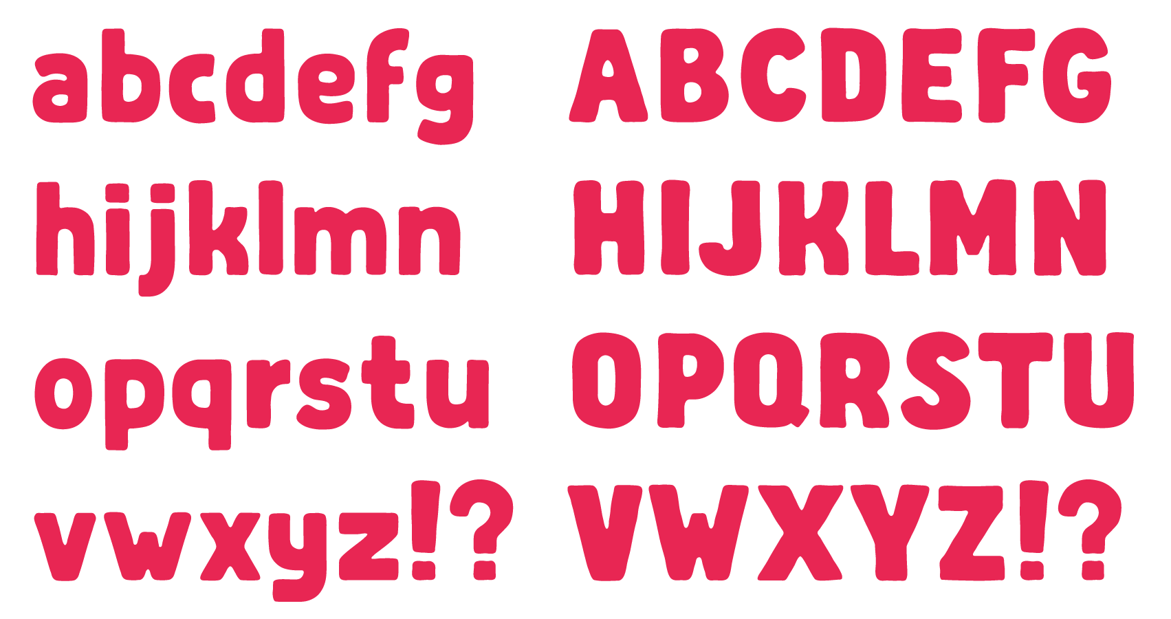
Decided to give the lowercase characters a try despite my plan to omit them possibly. First test below. They are still wobbly and need work. Any comments?
 1
1 -
Maybe soften the bend of the sides of /v/ and /w/.0
-
Hi Jan,
I think that the wobbliness is not a problem in this style. It gives some warn to it. If you refine them too much they will start to feel mechanical.
/v /w /x for example, looks like they belong to a different font, too mechanical/geometrical.
/W /m/r are looking a bit wide
/b /d /p /q are looking a bit condensed
You can also quickly generate a testing font and play around on http://www.impallari.com/testing/ This provides a quick way to see your font in use in different settings.0 -
You'll have to put the letters in words to see other problems. For example how does the tail of /j/ fit with previous letters in words like "enjoin"?0
-
Hello Craig and Pablo, thanks for your comments!
Pablo, that website is great! Works like a charm! I see you worked with Dave there, nice. He commented at the start of the development of this type on Typophile way back. Good points about the /v w/ and /x - I'm struggling a bit with the forms of those three lowercase letters. Agree with the rest - will find a way to solve those.
The wobbliness of the letters themselves is ok as is I feel - but there are some height differences that I still find a bit too strong. E.g. the /a and /e are possibly a bit too high.
Craig: the /j might be problematic I think, I'll probably have to make it a little less wide and maybe push the descender down. Space is becoming a bit of a problem though, I'm going above and below the 1000 em. I did read somewhere that it's possible to have a typeface using more than 1000 em - I should work on that. It does depend on the spacing - if the spacing is not too condensed it looks ok-ish (see below)
How about the height of the /i and /j - are the stems too high and the dots too high as well?0 -
Progress so far:

/x /v and /w are definitely better, more in line with the rest. Also changed the various heights/sizes of lowercase letters to make sure they are more in line with each other.
Pablo: is there a way to post a link to your website with the font loaded - or does the website work with local fonts (on your on computer I mean). Would be interesting for others to check out possibly?0 -
I find the new /v and /w a bit boring. Why not something in between?
The different heights of the round shapes have to be fixed. And why is the /o so oval where all other round letters are quite squarish?
If the /j is extending out of your 1000 units space, the hole font is maybe draw a bit to big? But it is not a fundamental problem. As long as you set your typoAs/Descender and winAs/Descender big enough.1 -
Hello Georg, thanks for your comment!
Spot on regarding the /o. It's become more of a small /zero instead of an /o. Changed it to be wider and more square. Thanks for pointing that out.
And you know what, I think you are right about the /v /w (and /x): they stood out a bit but now they are too bland. I was of two minds about them, and still experimenting with the forms. How about this: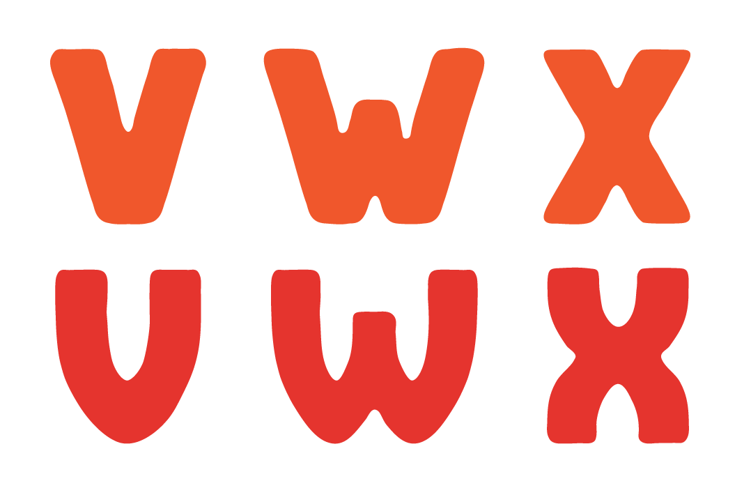
In use: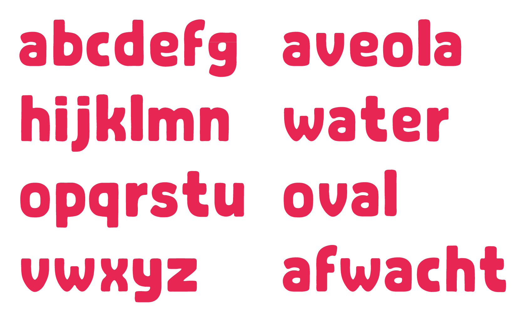 2
2 -
That's an improvement. Now go through words letter by letter and review their relative weights. For example, squinting at "water" and "afwacht", don't the /t/s look too heavy and the /w/s too light?1
-
The curved/v/w/x definitely fit better, and add interest. I like the flat top of /w.
Some of the joins might be a bit dark; compare the color of /w and /a. Then again, I'm probably looking through Helvetica-shaped lenses, and that sort of mechanical refinement seems inappropriate for this face anyway.0 -
Thanks so much for your replies Craig and Michael, very helpful.
Good point about the relative weights, this is something I have to look into. When I first started out with this typeface (almost 2 yrs ago) my plan was to create 3 versions per letter/number and look for some kind of cycling/alternating script to make sure that text set in Abraham would get a real handmade feel. A word such as BOOK or Apple would have two different /O's right next to each other, and so on. With that in mind a bit of variation wouldn't hurt - but to be honest I'm not too sure about that scheme right now. Also the start should be balanced - but also not too balanced.
Same with the joints and how much space they have: Michael is right in comparing e.g. the /w and /a (the difference in joints is maybe too large there). Then again, this typeface needs a bit of oddness, wobbliness and randomness to retain it's handmade feel. The new /v /w and /x are already a bit too clean I think... Still good points to work on! So thanks! (update soon)0 -
I totally agree with you about the wobbliness/randomness -- Abraham is a rather friendly and charming face, and a bit of randomness would make it more, err, consistent. And even if the new /v /w /y are too clean right now, they still completely belong.0
-
Still working on this. Did a bit of work on kerning classes (phew!) and started with kerning. Still need to do loads.
Here's a first type specimen. It's obvious I need to work on the relative weights as Craig suggested and the /a and /e need a little work on the joints as well.
Comments welcome!0 -
I've been working on a cycling/randomize scheme in OpenType to give the whole typeface a more wobbly and handmade effect (if Contextual Alternates are turned on).
Here's the bit of code I'm using:lookup rotate { sub @standard @standard' by @alt1; sub @alt1 @standard' by @alt2; sub @alt2 @standard' by @alt3; sub @standard space @standard' by @alt1; sub @alt1 space @standard' by @alt2; sub @alt2 space @standard' by @alt3; } rotate;@alt1 2 and 3 are currently classes with variants for all uppercase letters. It will now cycle through the 4 variants all the time, making sure that letters next to eachother are from different classes. (haven't considered punctuation just yet...)
See image for results...
0 -
Been working on the cycling some more - there's 4 glyphs for each (uppercase) character right now. The differences are subtle but they are there. Should be looking at lowercase next.
Wondering whether the difference in 'weight' between uppercase and lowercase is a problem or a treat? The uppercase letters are bigger/bolder than the lowercase. Any comments on that?
New type specimen - last page has Title Case to check the above...0 -
Anyone interested in testing the clycling maybe? Let me know here or via a message and I can send along the files...0
-
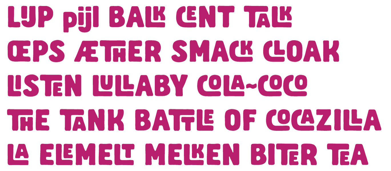
Hello. Love the idea of these alternates, but the might vary a bit too much. There's a big jump in size (height, really) between the second and third glyphs in each sequence; this might be an issue when setting uppercase/titling -- for example, the /B, /C, and /F geminates in "AFFABLE RABBLE ACCELERATION" could have unsightly inconsistencies. Then again, you could always turn off this cycling for those words, so it's probably not a big deal.
Anyhoo, I'm interested in testing this. It's a very fun face!0 -
Awesome, I'll contact you!
Good point about the height differences, it's something to consider. I was actually a little worried that the differences in glyphs weren't pronounced enough just yet. Seems like they are! It's a fine line I think, hard to tell where to stop or when to add some more variation. On the one hand I want the variation and I want it to be noticeable, so it will look handmade and altered... on the other hand, it has to stay usable and the differences shouldn't be annoying or disturbing as you'd want people to actually use those cycling glyphs.0 -
Can't really resist putting a bunch of odd ligatures in there too. Placing these in
dlig- the more 'standard' ligatures such as /fi /fl /OE /AE /IJ etc are inliga. Does that make sense? Would it be good or bad practice to include these ligatures insaltas well?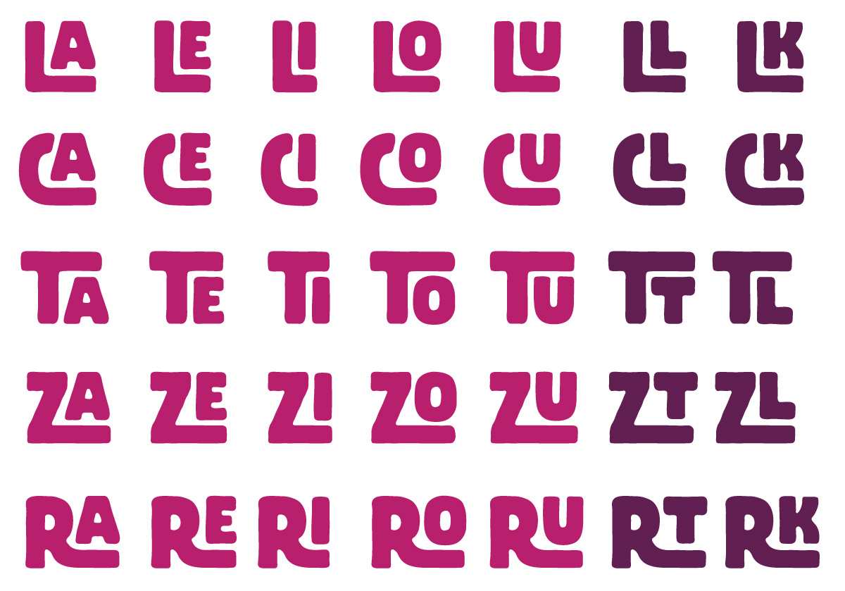 0
0 -
A few examples of their use in words:
Comments welcome!!1 -
No, those are contextual alternates. Stylistic alternates would be alternative styles of glyphs, whereas contextual alternates are glyphs as they relate to other glyphs. So you’re using that correctly.0
-
Thanks for your comment Rob!
I have them in discretionary ligaturesdligat the moment, would you suggest moving them to contextual alternatescalt?0 -
I think this is actually a matter of implementation. Are they ligature glyphs? Then I suppose
dligmakes sense. But if you compose them on the fly, like how the LE and LK combinations can be the same base L, then that’s more suitable incalt.0 -
Thanks Rob, these are all ligature glyphs indeed as they are all slightly different. /LE and /LK might look almost the same size but the second one is much wider for example. In this case I figured its both easier and more adaptable using ligature glyphs.
Thanks for the explanation!0 -
Thanks everybody for comments and suggestions! Am now getting this ready for release, here is a sampler with some images showing possible use. Hope you guys like it!0
-
Looks really good!
Last minute things to consider: Ø and ø may close up too much, and I would consider round instead of square dots in your ÷.
Good luck with it!0 -
Thanks for your help with this Craig, much appreciated. And those are good suggestions, especially the /divide - I've been struggling with that a bit as the square dots take too much space and fill up the mark. The slashed O's have benefited from a bit more space as well. Much better now - thanks!0
-
For those interested, Abraham is up for sale over at www.tendollarfonts.com/abraham
Thanks for your feedback!3 -
I'm usually not that interested in display fonts, but this is really cool. Awesome graphics as well! De jeugd als sample text, I like it 0


Categories
- All Categories
- 47 Introductions
- 4K Typeface Design
- 495 Type Design Critiques
- 577 Type Design Software
- 1.1K Type Design Technique & Theory
- 671 Type Business
- 885 Font Technology
- 29 Punchcutting
- 539 Typography
- 125 Type Education
- 333 Type History
- 81 Type Resources
- 113 Lettering and Calligraphy
- 33 Lettering Critiques
- 80 Lettering Technique & Theory
- 569 Announcements
- 100 Events
- 116 Job Postings
- 170 Type Releases
- 182 Miscellaneous News
- 270 About TypeDrawers
- 54 TypeDrawers Announcements
- 114 Suggestions and Bug Reports