Variable Fonts In Use

Mark Simonson
Posts: 1,799
I rarely notice anyone using variable fonts in real-world scenarios in any obvious way—setting aside variable font marketing animations. It's hard to tell if a variable font is used in a static way. For all I know, I'm looking at variable fonts on websites all the time without realizing it.
But I noticed a very obvious use of variable fonts when I recently upgraded to an iPhone 15 Pro. One of the features that was new to me is the "always on" display. On my previous iPhone, when it was showing the lock screen, after a few seconds it would turn off the display, fading to black. With the "always on" display, the screen dims instead, and you can still read the time and other information while it's on standby.
What I noticed was that the weight of the large text for the time changes as it dims or lights up, between a thinner weight for standby and a bolder weight for when it's lit up. The weight animates—like all those VF marketing animations—between these two states. I also recently got a new Apple Watch, and it does the same thing with its "always on" display.
Apple has been using variable fonts in its UI for a while, ever since they started using San Francisco on their devices. But this is the first time I've seen it used in a way that is only possible with a variable font.
Has anyone else noticed this, or seen any similar uses of variable fonts?
Tagged:
5
Comments
-
0
-
I agree that it's almost always difficult to perceive the difference between a vf instance and a static font. I think the changes in form provided by an opsz axis are things you and posters in this forum might be able to spot in the wild, but that too has been the case pre 2016 - many families had static sets of optical sizes.
Back in January, Google Design published this article explaining the use of weight and width axes to "fit text to box" - I believe a very common "finesse" value proposition of vf tech - and I think it's even more subtle than your AOD lock screen example (which has been seen in Google Pixel phones for a while already.)
https://design.google/library/fun-stickers-with-dynapuff
However, I think as the capabilities of text engines increase to make motion typography with gvars less computationally intensive, we will see more commonplace tweening of text along axes as responsive or interactive details.
For example, if you click on the Google Material 3 site buttons or titles, you'll see a very subtle vf tween to transition from default to active state.
https://m3.material.io
3 -
I was going to cite exactly that.
The site at https://m3.material.io uses a smooth transition to a bolder weight when one hovers on an icon in the left sidebar. Same with https://fonts.google.com/
The Material Symbols font (internal Google version: Google Symbols) is a 4-axis variable font, which also has a “Fill” axis. One can just use either the hollow or filled state, as preferred... but the point of having it on an axis is not that anybody would ever want to use an intermediate state, but to allow for an animated effect to go from hollow to filled, or vice versa. When we first implemented the fill axis, I think I found that between half a second and one second made for a nice transition time. Say 0.6s or 0.75s.
1 -
As you customize the iPhone lock screen Time, iOS 17 now allows you to change the weight of the numbers by using a slider. That is a neat use of variable fonts too that I've noticed.
3 -
Dutch tv ad:
 https://youtu.be/qoQhBKdlx28?si=1HX9ufa3gVzyRu-u 3
 -
How can one know if that’s a variable font in action, or tweening between frames, with only two static fonts, done by video editing software?0
-
It's possible, but it takes quite a bit of manual work to get that effect in After Effects (for example) with a static font. You have to tween each individual path, making sure the start points correspond, etc.
On the other hand, there are at least two third-party plugins that let you animate variable fonts in AE in a much easier and straightforward way. I would say that is more likely how it was done.
But you're right. No way to know for sure just from looking at it.1 -
That's a good point, Nick. Personally I don't really care much about the underlying technology, but more about the concept. What matters to me is that designers and consumers get used to the idea that type does not need to be static. The more non-static type we see, the more 'normal' it will become to add a dimension of movement to typography, and the more valuable variable fonts will become.
As it stands, I feel like variable fonts' main selling point is that they save memory, which is a pity if you consider the artistic possibilities.
Going on a bit of tangent here, but I am still waiting for HOI variable fonts to become normalised (i.e., implemented in type design software). That could really take 'variable' to a whole new level.2 -
@Jasper de WaardThe more non-static type we see, the more 'normal' it will become to add a dimension of movement to typography.
I had an animated gif for my web site logo 20 years ago, as did Mark.
But not any more.
I found it too distracting.
But then, I’m no fan of hyper-stimulation in the media, with fast-cutting, “sludge” and video feeds on screens all over public space, restaurants and waiting rooms.
Is that just my old age, or is their any youthful rebellion against this arms-race of the attention economy?1 -
I would say that random movement, such as in your gif, is quite distracting, simply because movement attracts attention like nothing else. You don't want people staring at your logo all the time, but you can use the attraction of movement to your benefit. In much of marketing, of course, attention is the main currency.
When used in an interface (e.g. when hovering over a button), moving type becomes much less distracting, because presumably your attention was already at the thing you were hovering over.3 -
"Huge entertainment ‘city’ in Tokyo transformed with variable typographic identity Tokyo design studio &Form developed a font that varies dramatically in thickness and motion behaviour with type designer Toshi Omagari."
https://www.itsnicethat.com/news/and-form-tokyo-dome-city-graphic-design-1710235 -
It's a little amusing that such crazily elastic letters have to depend on a monospaced foundation.Dave Crossland said:"Huge entertainment ‘city’ in Tokyo transformed with variable typographic identity Tokyo design studio &Form developed a font that varies dramatically in thickness and motion behaviour with type designer Toshi Omagari."
https://www.itsnicethat.com/news/and-form-tokyo-dome-city-graphic-design-1710231 -
At the very bottom of glyphsapp.com in the word "Glyphs" is variable based on the position of your cursor.1
-
@Typofactory , your link is messed up. (Hmm. I tried to post the link here, but ran into the same issue. Weird.)
0 -
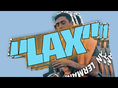
Goodhertz uses variable fonts so extensively that they developed an open-source engine that can animate them. In Tupe, they used a variable font to communicate the level of the effects. More subtly, they use it in translations of their UI to accommodate longer words.Here's LAX which Rob Stenson used Coldtype on, using Obviously Variable:
3 -
I think Vulfpeck might be the only band with with an ongoing relationship with a type designer (James Edmondson). Or maybe it's the other way around.

0 -
Tokyo Dome City's graphics in the video are built around some of the most easily perceived variations of weight and overall proportion. Not stroke contrast, or stroke position, or variations in letter widths as part of letter identity. On the contrary, conceptually and functionally, a "monospace" variable font is perfect for this application, imho.Craig Eliason said:It's a little amusing that such crazily elastic letters have to depend on a monospaced foundation.
0 -
I always understood the Japanese language itself—kana and kanji—to be inherently monospaced. Just scrolling through Japanese Wikipedia suggests that’s the case, except ironically when the Japanese text is interrupted by proportional Latin script foreign words.
0 -
Most Japanese fonts are monospaced. But Japanese calligraphy and handwriting are not monospaced, and there do exist proportional Japanese fonts!0
-
A feature of monospace fonts in animation is that the metrics don’t jump around “from frame to frame” catching and distracting the viewer’s attention, but conform to a grid matrix.
In that respect, it’s like having a constant baseline position, or x-height.
IIRC, there has been some readability speed research in which rather than the eye scanning across text, the text changes in the same position—no doubt with “typewriter” fonts.0 -
IIRC, there has been some readability speed research in which rather than the eye scanning across text, the text changes in the same position—no doubt with “typewriter” fonts.
Perhaps you are thinking of use of Rapid Serial Visual Presentation (RSVP) of text, in which words are flashed sequentially. It isn’t dependent on monospaced fonts, because each word is centred on a fixation location.
For short pieces of text, it has been shown to increase reading speed, so could be a useful tool for presenting e.g. emergency information. I think for longer texts it can be tiring and of course there is no easy possibility of regression, as in normal reading, if you miss or mis-read something.0 -
I have seen a version of this done slightly differently, where there is a static window and eye tracking, such that the text scrolling is dependent on where your eye is... and backing up with your eyes makes the text reverse.
I found it very tiring and had difficulty imagining that it would be sustainable for the person reading—at least for me. Too much effort making my eyes behave exactly the way the reading model wanted them to do.0 -
I'm having a hard time to imagine this. If the text moves when you saccade, then the saccade will never hit its target, right? Do you have a link to a paper maybe?Thomas Phinney said:I have seen a version of this done slightly differently, where there is a static window and eye tracking, such that the text scrolling is dependent on where your eye is... and backing up with your eyes makes the text reverse.
I found it very tiring and had difficulty imagining that it would be sustainable for the person reading—at least for me. Too much effort making my eyes behave exactly the way the reading model wanted them to do.0


 https://www.youtube.com/watch?v=NzxW8nxgENA


Categories
- All Categories
- 47 Introductions
- 4K Typeface Design
- 495 Type Design Critiques
- 577 Type Design Software
- 1.1K Type Design Technique & Theory
- 670 Type Business
- 885 Font Technology
- 29 Punchcutting
- 539 Typography
- 125 Type Education
- 333 Type History
- 81 Type Resources
- 113 Lettering and Calligraphy
- 33 Lettering Critiques
- 80 Lettering Technique & Theory
- 569 Announcements
- 100 Events
- 116 Job Postings
- 170 Type Releases
- 182 Miscellaneous News
- 270 About TypeDrawers
- 54 TypeDrawers Announcements
- 114 Suggestions and Bug Reports