Traction: A text font with grip and bite (in development)

Christian Thalmann
Posts: 2,059
(Cross-posted from Typophile)
Recently, I've been toying with the idea of returning to the project that brought me to Typophile in the first place: To make a characterful text font. My first attempt failed almost immediately, but I've learned a lot about type design in the meantime.
I'd like to make Traction the female hiking boot of oldstyle fonts: Sturdy and functional, a grippy all-terrain profile, yet organic and human, and within the constraints of practicality as elegant and sexy as possible. The main "bite" should come from bold, almost exaggerated serifs, reminiscent of slab serifs, and broken strokes that reinforce the glyph where it is most needed.
My main inspirations are Quadraat, Marlene, and most importantly, Satyr. I'm avoiding looking at those typefaces now in order not to plagiarize them too much. Hopefully my own take will ultimately stand on its own rather than look like an obvious derivative.
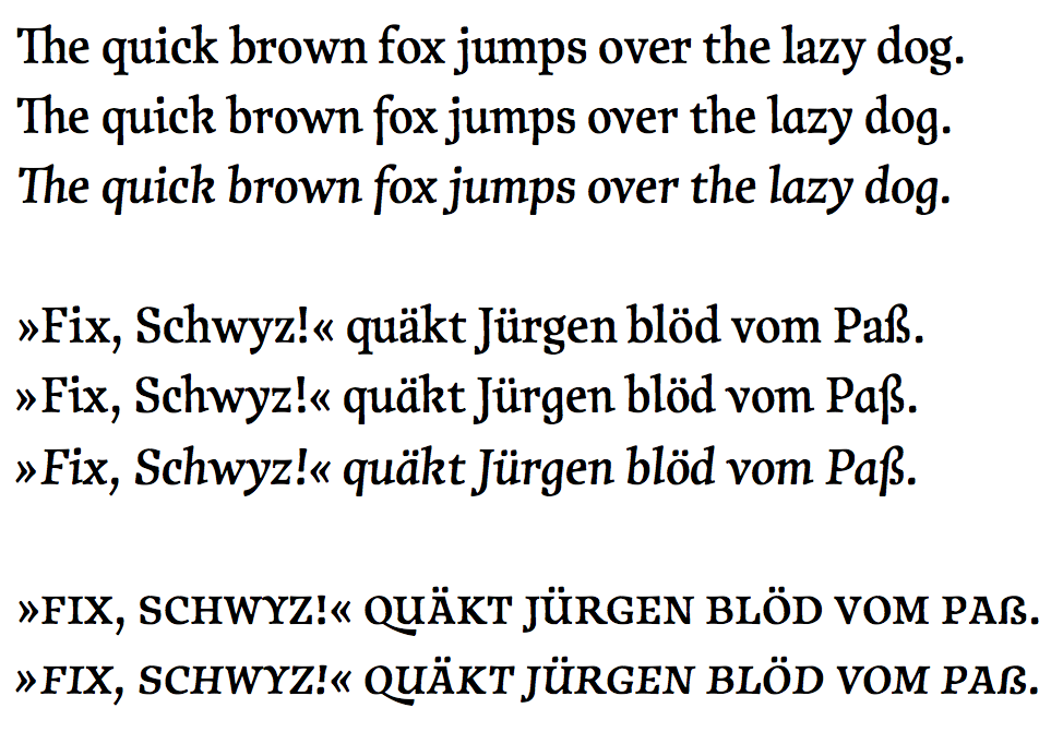
Here's the current status quo:

0
Comments
-
/b is a little too round, therefore a little too wide.
/c and /e are a little too narrow.
/q has same problem /b does although not as much.
/g /s /ß -- that sharp corner on the bottom right is contrived and does not belong; it also adds too much weight.
Otherwise I like the look. The caps should be interesting.1 -
Hi George, thanks for your comments!
I completely agree on {b} and {q}, which I've now slimmed down. I can't say {c} and {e} looked too narrow to me, but I made them slightly wider now and certainly don't mind the way they look now.
I find myself disagreeing on the {g s ß}, though... I find that corner quite natural, æsthetically pleasing, and fitting with the font theme.
As for caps, I've just started experimenting on a bunch of them...
Cheers0 -
The proportions are looking much better now, although I think you've made the top right of the revised {e} a bit too wide; try to balance the counter size better with that of the {a}. I agree with George regarding the heavy corner on the {g s ß}: it isn't the fact there is a corner that I find problematic, but the significant weight gain in the stroke, which is distracting and draws attention to these letters.1
-
Thanks, John!
I've replied to your suggestions as part of this post on Typophile:
http://typophile.com/node/104308#comment-559668
(I'll save myself the trouble of HTML-wrangling the images over here...)0 -
Beautiful! The beaks may be a bit too heavy, but they do help the color. I like how it's got this gnarled grace. The asymmetrical curves on the s are choice. Have you made any progress?1
-
@ Michael: Thanks! I have made progress indeed. One weight should now be completely finished, including ligatures, figure sets, contextual alternates, and a true Italic (plus an Upright Cursive, just for the fun of it).

I like the looks of the font at large sizes a lot, but I am not satisfied with its performance at small sizes. It's legible alright, but the overall weight of the cut I made feels too heavy for extensive reading. I guess I will have to define it as the Medium weight, with a Regular and a Book at lighter weights for body printing.
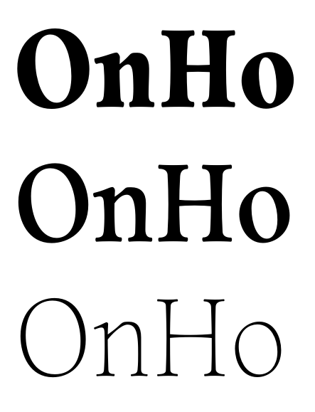
This makes the next step all the more necessary: to render a spectrum of weights down to Thin and up to at least Bold. Unfortunately, that's something I've never done successfully — the Backstein spectrum was much easier to implement, yet I wasn't fond of the results. I'm actually thinking of outsourcing this job to someone more experienced. Here's a teaser I made for reference:
Can you recommend any online resources for making different weights of a font? Briem is not very thorough in that respect — he focuses on the Bold exclusively, and leaves out a lot of information (e.g., what should happen to the sidebearings in the Bold?).
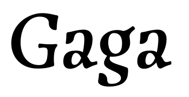
BTW, here are some alternates for {a} and {g} that I was going to use as the default in the Italic, but ended up considering too crazy:
0 -
And here's a PDF specimen:
http://www.cinga.ch/type/Traction_specimen.pdf
Anything that needs to be addressed before the work on the different weights begins?0 -
I think the italics are too subtle. If you were to italicize a word, it would probably go unnoticed.3
-
Nice work on this. I agree with Ray, the italics could use a little extra slant to make them stand out more.
I like the smallcaps too by the way. The /germandbls (Ringel S) stand out a bit though, it seems a bit to wide and the contrast appears a bit odd to me.1 -
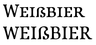
Good points, both of you. I've increased the Italic angle to 10° and reworked both the caps and smallcaps /ß a bit.
I've uploaded a new version of the PDF specimen to the old location. On page 9, I've set a few words of a Roman text in Italic to see whether it is now distinct enough. What do you think?
And here are the new /ß designs:
Furthermore, on page 10, I've taken the stylistic alternate /a of the Italic for a ride. It's rather exotic, but I like it. Maybe the right foot needs to go a bit lower, though.1 -
I'm already toying around with adding a display cut to Traction, although the work on expanding the normal cut into a spectrum of weights has only just begun.
I'll have to smooth out the /G's curve, and the beard-shaped terminals probably need sharpening, but other than than I like the first impression:
0 -
-
Christian: ‘My main inspirations are Quadraat, Marlene, and most importantly, Satyr. I'm avoiding looking at those typefaces now in order not to plagiarize them too much. Hopefully my own take will ultimately stand on its own rather than look like an obvious derivative.’

Hi Christian! As you perhaps know from this topic, I’m investigating Renaissance standardizations and systematizations of type.
One of the punch cutters I’m especially looking at is Robert Granjon. I noticed some accidental similarities between your patterns for Traction and those which show up in Times (New) Roman, and which find their (indirect) origin in type from forenamed French Renaissance master.
Your type is somewhat bolder and your pattern deviates at some points, and a bold version was never made by Granjon, of course. However, your bold and and italic seem to follow different patterns, of which some remind me a bit of the ones made for the Linotype composing machine.
As you can understand, this is very interesting stuff for a researcher!
0 -
Christian, why did you chose to include a "Th" ligature in this font? Do you think it helps the design? Or is just something people do because they see it in other fonts? I'm truly interested in your answer.0
-
@ Mark: Thanks for your interest in Traction! Interesting to see similarities to Times New Roman; I'm actually quite unfond of the latter (probably due to overexposure, but then I'm not too fond of the transitional paradigm in general). Not quite sure I follow what your conclusions are, though. Wouldn't you find this level of rhythmic similarity between just about any two text fonts, given that text fonts can't be too originally shaped lest they trip up readers?
Anyway, I was worried Traction might be a bit too tall for its own good (whereas Satyr has this soothingly wide stride), but if its proportions match those of Times, they can't be all that inconvenient.
@ Scott: I like ligatures in general, and thus just put in all the usual suspects. I also like having a ligature to use in my own name. 0
0 -
Christian: ‘@ Mark: Thanks for your interest in Traction!’
You’re very welcome, of course. My posts definitely mark my interest in the origin of sources.
‘Interesting to see similarities to Times New Roman […]’
Actually, I think the similarities are quite amazing! Obviously you took the long and tedious road, but the similarities are so striking, that you almost could have opened Times (New) Roman in a font editor, put roughly 10 units around the contours, tweaked the contrast and contours a bit, by for instance making the stems slightly hollow, and shortened the serifs. But, of course, this would have implied an infringement of the copyright of T(N)R and would have hampered the originality of your hand.
Times (New) Roman itself is subject to a similar case, in which Morison made original sketches, which Lardent claimed never to have received, and of which –according to Tracy– the resulting 327 series showed unexpected similarities with the Plantin 110 series. It’s all amazing…
‘Wouldn't you find this level of rhythmic similarity between just about any two text fonts, given that text fonts can't be too originally shaped lest they trip up readers?’
Well, there are some exceptions IMHO. For instance the for centuries dominant Jenson/Griffo/Garamont model, which shows up for instance in Adobe Garamond (mostly based on Garamont’s Parangon Romain) is a bit different, but does not seem to trip up readers.
I always had the feeling that T(N)R is related to a different set of French Renaissance ‘display’ proportions, which for instance show up in Van den Keere’s Canon Romain. I could be wrong though.
1 -
You’re very welcome, of course. My posts definitely mark my interest in the origin of sources.
Gah! Sorry, Frank, I guess your name tag was just too long for me to extract your real name. ;o)Actually, I think the similarities are quite amazing!
My impression is that the selection of letters with all those basic shapes (/l/m/n/o/p/q) overstates the similarities through repetition. The /r/s already look entirely different. Looking at the /a–/j sample above, I don't see a striking resemblance in any letter but /d.Obviously you took the long and tedious road
Yep, which is documented on Typophile (http://www.typophile.com/node/104308) down to its earliest origins in April 2012 (http://typophile.com/node/91743 if you feel like a laugh).I always had the feeling that T(N)R is related to a different set of French Renaissance ‘display’ proportions, which for instance show up in Van den Keere’s Canon Romain. I could be wrong though.
Yes, the narrower and more tightly spaced rounds certainly sounds typical for a display cut of a text font. In fact, I designed Traction at relatively large on-screen sizes throughout, so I'm not surprised it comes out narrower than classical Garamond (whose /o looks ridiculously airy up close). As the thread above documents, people's first reactions to my first designs for my first text font were "I think deep down you want to make a display font". ;o)
I see Traction's most iconic area of use at mid-to-large sizes in branding, advertising etc., where its organic curves and grippy detailing can shine, but I do want it to be functional at text sizes too. The parallels to TNR suggest that it will do just fine.0 -
Christian: ‘I don't see a striking resemblance in any letter but /d.’
Well, there are clear differences between for instance Jenson’s roman type and the ones cut by Griffo when it comes to details, but the types of the latter clearly follow the structures of his French precursor. But because you mention it specifically, let’s focus on the /d for a moment (as researcher I’m always curious, you know).
I took the /d from Times New Roman (on the left), expanded the contours with ten units (in the center) and tweaked some points. For comparison I distilled a /d from the PDF you posted on Typophile (on the right). The subsequent four steps below took me less than five minutes. I only looked at your original and I definitely did not trace it, so the outcome and your /d differ a bit still. But the differences are not larger than the ones between the different Times-versions from Monotype, Linotype, Scangraphic, Berthold, etc., I reckon.


If you were capable of coming so close to the proportions and metrics of T(N)R in Traction without even looking at T(N)R, this is absolutely amazing in my opinion!
0 -
If you were capable of coming so close to the proportions and metrics of T(N)R in Traction without even looking at T(N)R, this is absolutely amazing in my opinion!
If you say so. To me, it just suggests we have a pretty concrete subconscious model of what display-sized type "properly" looks like. Below, I've superimposed a Cambria /d on a TNR /d — fits perfectly. I'm not surprised, although the two fonts have rather different flavors in their detailing.
Note that most rounded letters were originally a bit wider in the early stages of Traction. The screenshot below shows an older instance of the /d superimposed on the current one. I tweaked it after I felt the counters of the rounds gaped too open compared to the /n-type characters (the /b was a particularly prominent offender). In the same vein, the originally extremely narrow /a relaxed a bit to fit the overall rhythm.1 -
Christian: ‘To me, it just suggests we have a pretty concrete subconscious model of what display-sized type "properly" looks like. Below, I've superimposed a Cambria /d on a TNR /d — fits perfectly. I'm not surprised, although the two fonts have rather different flavors in their detailing.’
TBH, I don’t think that the similarities between Cambria and Times New Roman are the result any ‘concrete subconscious model’ floating around in Jelle Bosma’s head, but that this has everything to do with the fact that Cambria was meant to replace TNR as default font in MS Office.
I just pointed Jelle to this discussion (I know him since 1978, you know). Perhaps he is willing to comment.
0 -
I just pointed Jelle to this discussion (I know him since 1978, you know). Perhaps he is willing to comment.
Perhaps it would be better if you moved this discussion into another thread if you plan on expanding it. I'm still not quite sure what you mean to accomplish here with your insistence, other than that it feels vaguely passive-aggressive. The purpose of this thread is to help me finish Traction, and so far I don't see how your discussion contributes to it (other than proposing a criminal way to cheaply approximate parts of my work).0 -
It is almost as if a dike separating two threads has burst. I'm sure we can get on with the crit, with another thread to continue Frankly. Traction is a fine face, and I can't wait to see more.2
-
Christian: ‘Perhaps it would be better if you moved this discussion into another thread if you plan on expanding it. […] so far I don't see how your discussion contributes to it (other than proposing a criminal way to cheaply approximate parts of my work).’

Well, now you have David’s blessing, to be Frank, I know my place and it’s time for me to be off in my not-completely original Trabant (New) Roadmobile (freely interpreting here an e-mail I received from a renowned Dutch type designer today) and to travel back to my Parallel Universe, where I will be cheaply approximating parts of different type ever after. Arrivederci!
1 -
Christian, great work! I like the female hiking boot metaphor. Please let me know if you want to be paid to release this as a libre font; I don't mind such coincidences, given a type designer's word that they worked hard to create an original design and have the months of proof(s), as you do.0
-
Cambria started by an investigation into how ClearType displays geometrical shapes. This was extended into an experiment with hinted variants of something like nnonlnoolo to select what sidebearings and character proportions worked best at ppem sizes 10 to 15. This created the starting point for a ClearType legibility font. The variant that I actually made as a possible Times NR replacement did not make the selection by Microsoft, oh irony.
Until today I never compared the proportions with Times NR. The heights are similar, with Cambria having a larger x-height. Of course the horizontal proportions and most of all the sidebearings are quite different.
When experimenting with a range of widely used ppem sizes (used around 2003), you end up with optimal pixel x-heights, and ascenders for these sizes which translates back into outline heights. Select suitable features and work your way up.
Times NR became such a widely used typeface because it was selected again and again for a wide range of usage's. Its proportions must be such that they hit a sweet spot, which allow it to be used with linefeed large and small, lines long and short, good printing and bad printing, for books and flyers. It even got selected as standard text font for laser printers and ultimately for Windows. No wonder that its heights are quite near the heights you get, if you deliberate search for heights that work well for a screen font.
1 -
Hi Jelle, thanks for this view behind the scenes! Cambria is a nice font, and well deserving of its success.0
-
So while working on the display cut of Traction (which we will likely release under the name of "Attraction" a while in advance of the text family), I did some experiments with a stencil cut. I quite like it, though I'm not sure whether it's going to be worth the effort of realizing it fully. Stencil versions seem a fairly popular addition to serif font families, but is there an actual demand for them?

Anyway, Rainer suggested the name "Subtraction", so that would work nicely. ;o)1 -
I think stencils are popular because it’s an easy way to bulk up a family.2
-
Indeed. But are they actually being bought and used?0
-
"Subtraction" is great! I really like the stencil, but then I could be a bit weird.
In your place, I would just finish it and release it, it will be seen as entirely different from the text family anyway.1
Categories
- All Categories
- 46 Introductions
- 3.9K Typeface Design
- 489 Type Design Critiques
- 572 Type Design Software
- 1.1K Type Design Technique & Theory
- 663 Type Business
- 877 Font Technology
- 29 Punchcutting
- 530 Typography
- 121 Type Education
- 328 Type History
- 81 Type Resources
- 111 Lettering and Calligraphy
- 32 Lettering Critiques
- 79 Lettering Technique & Theory
- 561 Announcements
- 96 Events
- 116 Job Postings
- 169 Type Releases
- 179 Miscellaneous News
- 269 About TypeDrawers
- 53 TypeDrawers Announcements
- 114 Suggestions and Bug Reports


