What about Crimson Text and Crimson Pro?

Manuel Fantoni
Posts: 6
Crimson Text and Crimson Pro are two free serif fonts available throught Google Fonts. I really like them and I'm courious to know what you think about them, not just as web fonts but also as desktop fonts for long Word and PDF documents:
1) Do you consider them quality fonts, comparable to commercial alternatives such as Minion?
2) Do you prefer Crimson Text or Crimson Pro? And why?
3) I would like to use them on my computer for common Office tasks. Should I download them from Google Fonts or from GitHub?
Thanks.
Tagged:
0
Comments
-
I think it's strange that they have the same name, as they are giving off pretty different vibes. Crimson Text feels more classical, like a Garamond of sorts, and I could see it being used in a novel. Crimson Pro feels more contemporary (which is not necessarily better, just different), with nods to Source Serif, and feels more like something for the body copy of a magazine to me.
Both look like they are pretty well designed but it's hard to judge without actually using them.1 -
Personally, I make a distinction between “quality fonts” and “comparable to commercial alternatives such as Minion.”
There are a lot of fonts that I think are “quality fonts” that are not at the same quality level as Minion. Robert Slimbach is one of the ~ top five or so western type designers in the world, and Minion is his all-time flagship, which he has taken multiple passes at. The question is kind of like taking a fantasy film and asking if it is “comparable to a major studio release such as The Lord of the Rings”—that wasn’t just ANY major studio release!
Leave out the “such as Minion” and that would be a very different question. All “quality fonts” would be “comparable to commercial alternatives.”
Crimson Text: yes, it is a quality font family. No, it is nowhere near the same league as Minion. it looks fine, but feels quite derivative of countless other Garalde typefaces, including Garamond and Minion itself. The weight range is very limited and no optical size variations are available.
Crimson Pro: yes, it is a quality font family. It is an ambitious reworking and definitely a step above Crimson Text. It has a significantly broader weight range than the original Crimson Text. However, it still lacks optical size variations.
Both Crimson Text and Crimson Pro have extended Latin character sets including many eastern European languages, but lack the polytonic Greek and extended Cyrillic support of Minion, as well as some other unusual characters. Minion also has optical size variation, real small caps and other typographic extras.
I concur with Jasper that Crimson Text, despite the name, is more of a display face, while Crimson Pro is sturdier and would certainly outperform its predecessor at text sizes, especially small text sizes.
1 -
I see the genetics of Adobe Text in both, but especially in Crimson Pro. I don't like derivative work which is clearly inferior to the original font because they are dangerously near lazy ripoffs.0
-
For most of the people that's not deep into typography or type design, all sans and serif (non display fonts) looks about the same. Just pick the one that YOU-YOURSELF like the most.3
-
Igor Freiberger said:I see the genetics of Adobe Text in both, but especially in Crimson Pro. I don't like derivative work which is clearly inferior to the original font because they are dangerously near lazy ripoffs.It is true that Adobe Text is also a garalde, so at least it is superficially similar in appearance to Crimson Text and Crimson Pro.Also, interestingly enough, Adobe Text has Robert Slimbach as its designer, just like Minion, which the OP used as a standard for a high-quality commercial typeface or font.But I'm not sophisticated or knowledgeable enough about type to recognize how either of these forms of Crimson is derivative of Adobe Text, as opposed to being, like Adobe Text, derivative of Garamond.Evidently, Crimson Pro in particular has some of the same design goals as Adobe Text. That, by itself, could hardly make it a ripoff, although I suppose it could still be "dangerously near" a ripoff even in that circumstance.So could you expand on how "the genetics of Adobe Text" are visible in them?0
-
Crimson Pro is very near to Adobe Text scaled down. About 88% in height and 96% in width in lowercase. This is FontLab's Overlay Fonts tool with both in 96pt. Red for Text, green for Crimson. No changes in any of them:

Note the quasi match in widths and sidebearings. And many differences are just consequences of the scale down, like the descender of y, which follows the angle of the right leg. The same with x.
There are small differences in ascender serifs, g's ear or Q tail. The a is the only letter that departures a bit more from the matrix, but Crimson seems to me essentially a modified Adobe Text. Even kerning values are similar, with the same naming schema of kerning classes.
I hope you consider this enough to prove the "genetics" I mentioned.2 -
It is true that Adobe Text is also a garaldeNo, it isn’t. Adobe Text is based on 18th Century English types: essentially, it is a Caslon with a Baskerville modulation axis.
5 -
Hi Igor,
It's a very old type designers tradition to copy each other just enough so the new typeface can play the same role as the original. The art resides on introducing a few modification on the new font, just enough to get away with it.
The Dutch:
The English: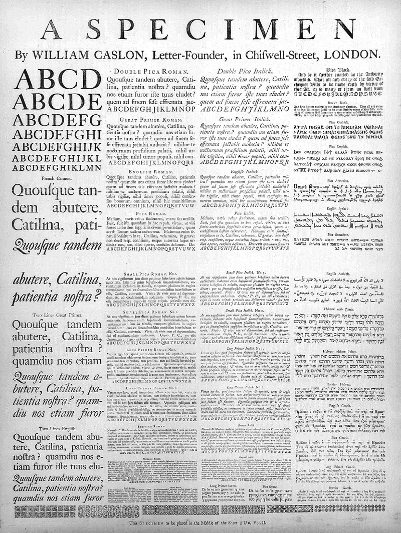
There is an old discussion about if Caslon copied the Dutch or not... I don't want to get into that as the discussion will go on and on forever and will never end... But is very obvious that it also copied the specimen format.
When putting fonts on top of each other, try to appreciate the little differences "even more" than the similarities. Its a very fun way to learn")
Try:;
- Lexicon Italic vs Requiem Italic vs Poetica
- Sauna Italic vs Tisa Italic
- Collis vs Elena
Also its q good idea to focus not only on the letter shapes, but on blocks of text (a few paragraphs) so you can see if they are similar -or different- not only on the letter shapes, but also on the way each font work, on the way they set text on a page.
A really good ripoff will have different letter shapes but similar paragraphs... once you manage to do that you can be considered a profesional type designer
If plain words: Different just enough so colleagues type designers cant complain, but similar enough so normal people reading printed text wont notice the difference.
I can't remember this quote exactly, nor the quote author, but goes something like this:
"In order for a new typeface to be good, only very few should notice its novelty"... (or something like that, can't remember now, but you get the idea)
Making fonts that are both "different & similar" at the same time is an art form in itself1 -
One thing I have a lot of experience with in my forensic work, is trying to demonstrate whether a given text is set in a known font, or to show the differences between two fonts.Igor Freiberger said:Crimson Pro is very near to Adobe Text scaled down. About 88% in height and 96% in width in lowercase. This is FontLab's Overlay Fonts tool with both in 96pt. Red for Text, green for Crimson. No changes in any of them:
(...) I hope you consider this enough to prove the "genetics" I mentioned.
I avoid the approach you have used, because it is hard to tell the real degree to which the shapes underneath are the same or different, where they are overlaid. My brain’s natural tendency is to do a kind of visual fill-in, which assumes the overlaid parts are pretty much the same, but that could well be misleading.
I believe it is much better to either do your overlay _with transparency_ in the sample overlaid on top (50% transparent plus a radically different color is good). I did this in my recent report for Gorbachev v Guriev, for example.
If the sample text is large, as in this example, I also find good results from converting the overlaid font (and the bottom one, if possible) to a lightly-stroked outline, with no fill at all. Then the similarities and differences will be especially obvious.
3 -
I designed Crimson Pro and I can asure you I didn't base it on any other typeface other than the starting point, Crimson Text.
The original assignment was to clean up Crimson Text. Sebastian Kosh, the original designer had made a newer version and we were thinking of taking the qualities of both designs to make the newest version.
During the process I made some sketches to test the scope on how far we could go. One of these sketches was very promising. Since it was too far out of scope, yet a very good addition to GF, we decided to continue with it. And it became Crimson Pro.2 -
I must apologize, Jacques. So I was wrong in my assumption, which I should do more carefully. Thanks for clarify. I also would like to thank Thomas and Pablo to taking their time to provide detailed, insightful information.0
-
If you are interested, I could show some of the progress, decisions and choices I made at the time. I still have the PDFs.1
-
Hello Jacques,first of all thanks for Crimson Pro! I'm currently involved in a family project where Google Docs is the main collaboration tool and from the outset we picked Crimson Pro as our official text font. The other candidate was Spectral, but it was discarded because its spacing looks too loose.I have two question for you:1. I suppose you designed Crimson Pro primarily as a font for screen reading (Google Fonts/Docs). Do you think it could be also excel in a traditional desktop/office environment where Microsoft Word, PDFs and laser printing are essential?2. I suppose Crimson Pro includes real small caps. Is there a way to use them in Google Docs? And in Microsoft Word? (As for Spectral, there is a separate font available in Google Fonts/Docs: Spectral SC).Thanks0
-
Hi Manuel,
I used it myself in some print jobs and it worked quite well actually.
Real smallcaps aren't included in Crimson Pro.
0 -
Hi Jacques,Since it was too far out of scope, yet a very good addition to GF, we decided to continue with it. And it became Crimson Pro.
Since the design is so far from that of the original Crimson Text, the name Crimson Pro seems strange, even confusing. ‘Pro’ suggests an extended version of a design—as Adobe established use of the term in the late 1990s—, but in this case it is really a very different design.
What was the thinking behind this naming? Was it your idea, or Google Fonts’?2 -
Hi John,
I understand the confusion due to it's name. To be honest I can't recall how the name has been chosen. I looked through my files and it actually had the working name "Crimson Text New" for almost up to the end.
0 -
I can't remember this quote exactly, nor the quote author, but goes something like this: "In order for a new typeface to be good, only very few should notice its novelty"... (or something like that, can't remember now, but you get the idea)That is Stanley Morison, “First Principles of Typography”, section II. Sadly, I don’t have the English quote at hand, but only the Spanish translation: “El buen creador de tipos se da cuenta de que, para que un nuevo corte de letra obtenga éxito, ha de ser tan bueno que solamente unos pocos sean capaces de descubrir su novedad”.
1 -
(retracted because I didn’t read subsequent posts)
0 -
"The good type designer knows that, for a new font to be successful, it has to be so good that only very few recognize its novelty. If readers do not notice the consummate reticence and rare discipline of a new type it is probably a good letter. But if my friends think that the tail of my lowercase r or the lip of my lowercase e is rather jolly, you may know that the font would have been better had neither been made. A type which is to have anything like a present, let alone a future, will neither be very 'different' nor very 'jolly.'"2
-
An opinion about typography which to have anything like a present, let alone a future, will neither be very ‘restrictive’ nor very ‘pompous’.2
-
If you are interested in the whole process, I made updates on this blog with every steps when I was working on it.
https://groups.google.com/g/googlefonts-discuss/c/lZGJqeigS3I
@John Hudson At the end of the thread you will find why we called it ‘Pro’
1 -
Hilariously gf no longer uses a glyph set called pro0
-
It's probably time to reverse the agglutinative naming distinctions between “Pro” and non-Pro. Pay full price for simply Zapfaroni, pay bargain price for Zapfaroni Lite or Zapfaroni Minus or Zapfaroni Sallie Mae. Any initial meaning to the qualifier “Pro” inevitably dissolves into a confusing exercise in branding. viz the ghastly “prosumer.”
1 -
Not ‘Lite” or ‘Minus’, but we’re making subset families out of some of our bigger fonts, recognising that not all customers need the whole shebang.0
-
John Hudson said:An opinion about typography which to have anything like a present, let alone a future, will neither be very ‘restrictive’ nor very ‘pompous’.You are one of the more knowledgeable and experienced posters here. And your statement is reasonable in itself; pompopus pronouncements about type, or anything else, are usually wrong, and the more restrictive a statement is, the less likely it is to prove true after any length of time.However, I have to assume it was aimed at the quotation from Stanley Morison.There certainly are typefaces that have been successful despite the fact that their novelty was clearly noticeable. I can think of some examples offhand: Optima, Peignot Bold, and perhaps even Mistral and Calypso!And yet... it seems like Morison's statement was very true and profound. Or is that an illusion?Century Expanded is an example of a successful typeface the novelty of which, compared to the milieu of Scotch Romans from which it emerged, would be difficult to notice.But what about Caledonia, also very successful, but which is clearly different from anything else, even to a layperson?And then there is the most obvious case in point.Didn't Times Roman look fresh, new, and modern, even to a layperson, when books started being typeset in it? I mean, I still remember the impression made on me by the typography of The Codebreakers by David Kahn in my youth (not counting how Cyrillic was mangled in it, although they got the italics right).What Times Roman does not have is any notable eccentricities, but that is far from saying that it is as indistinguishable, except to an expert, from the text types that were in use beforehand as, say, Corona was from its predecessor from Linotype, Roman No. 2.And so my attempt to criticize your take on an opinion which I felt represented an obvious truth about text typefaces... turns out to be an examination of the facts that leads to the conclusion that you are right.While the differences from what has gone before should not take the form of eccentricities or affectations in such typefaces, they need not, and usually are not, un-noticeable by the layperson, or so it seems to me.0
-
I was responding to the tone or manner of Morison’s pronouncement, more than to its substance, but yes, part of the critique is that such pronouncements lack sufficient nuance to accommodate multiple counter-examples.0


Categories
- All Categories
- 47 Introductions
- 4K Typeface Design
- 495 Type Design Critiques
- 577 Type Design Software
- 1.1K Type Design Technique & Theory
- 670 Type Business
- 884 Font Technology
- 29 Punchcutting
- 537 Typography
- 124 Type Education
- 332 Type History
- 81 Type Resources
- 113 Lettering and Calligraphy
- 33 Lettering Critiques
- 80 Lettering Technique & Theory
- 569 Announcements
- 100 Events
- 116 Job Postings
- 170 Type Releases
- 182 Miscellaneous News
- 270 About TypeDrawers
- 54 TypeDrawers Announcements
- 114 Suggestions and Bug Reports