Can you help me with my super picky typeface search?

- Noto Sans. Its regular weight its a bit lighter, making it harder to read, and medium is too heavy. Also its kerning it's looser.
- Mute Sans. Made by ITF. Same as Hind, but it doesn't has true italics.
- Itaú. Discarded because also doesn't have true italics, its kerning its either too loose with text fonts or too tight with display, and doesn't seems to be open for the public.
- Really Sans. I discarded it because of its wider letter forms, but I almost thought of buying it mainly because of its accessible license for freelancers.
- Amazon Ember Typeface. Really good reading experience, but I'm not even sure if you can use it commercially, the licensing it's not that explicit on its terms. Also the kerning is looser and the letter forms are a bit wider too.
Comments
-
What about Frutiger, which is the model from which a lot of these designs come?1
-
Stephen Coles said:What about Frutiger, which is the model from which a lot of these designs come?I did try with Frutiger Next Regular, and it looked really bad for what I'm looking for what I'm looking for.First one it's Hind and the second one is Frutiger0
-
@Cristóbal Alarcón
Use Hind for your regular weight and apply an italic that broadly matches Hind. Italics should contrast + Hind is variable in weight, so that gives a little flexibility.
For instance, Segoe UI italics with Hind. 2
2 -
I did try with Frutiger Next Regular, and it looked really bad for what I'm looking for
Independent of the question whether it’s Frutiger Next or another candidate: you will want to adjust the typographic parameters, like font size, line spacing, word spacing, tracking. In your comparison, both fonts are shown at the same nominal size (17px). In order to get a meaningful comparison, bring them to the same perceived size. That might mean very different values for different fonts.
My personal favorite in this genre is JAF Bernini Sans.
3 -
a brief look at capitals like A, M, W, N, X… of Hind – and that font is an absolute no-brainer for me.
0 -
Myriad?
Also, yes, Frutiger.
It looks like the cut of Frutiger you tried may not have been optimized for screen display. Since you're talking about reading on screen specifically, make sure you have a properly hinted version of the font or test it on a platform or display for which hinting is irrelevant.2 -
0
-
Hmm, didn't thought about it that way. Makes the workflow less intuitive but it's a good alternative. It also reduces the budget needed, and that's good in my situation.KP Mawhood said:For instance, Segoe UI italics with Hind.
0 -
I personally like how M and W are made. Like, idk but that M looks comfortable to look at.Andreas Stötzner said:a brief look at capitals like A, M, W, N, X… of Hind – and that font is an absolute no-brainer for me.
0 -
Joshua Langman said:Myriad?
Also, yes, Frutiger.
It looks like the cut of Frutiger you tried may not have been optimized for screen display. Since you're talking about reading on screen specifically, make sure you have a properly hinted version of the font or test it on a platform or display for which hinting is irrelevant.I really liked Myriad, but when I try it on my end it's a bit slightly harder to read. Its regular it's a bit thinner than Hind. I make this as a priority because I have an average screen display (consumer/office/notebook average), and Hinds thicker regular weight makes it easier to read on this kind of screen.Testing Myriad video, first one it's Hind and second one its Myriad.About Frutiger, maybe I should keep searching a version that does has hinting. Thing is, it was an OTF file. Do OTFs have hinting?0 -
John Hudson said:I forgot to say, I'm encouraging self promotions. If you have a typeface you think I could be looking for post it here.About Laconia, the spacing it's looser and and the weight its slightly thinner. Although it looks good it's not what I'm after. Thanks anyways!0
-
Florian Hardwig said:
In order to get a meaningful comparison, bring them to the same perceived size. That might mean very different values for different fonts.
My personal favorite in this genre is JAF Bernini Sans.
Oh yeah the perceived size. I did take that into account when doing my testing, although for that video I didn't because I would need separate browser tabs that are lined up at the same position.Bernini Sans also looks good, but it's not what I'm looking for either. The letter spacing its more loosen compared to Hind.I'm picky about the letter spacing because some websites won't allow me to modify the typeface kerning in ways that don't involve code. So I'm aiming to find a typeface that doesn't requires me to do some tinkering on the web code.0 -
It is a small thing, but you keep on writing “kerning” when you mean “spacing.” Kerning refers to adjustments between specific glyph combinations (such as “AV” or “To”), whereas spacing is the more general property of how letters are spaced. (And “tracking” is a global adjustment to spacing across the font.)
I am very curious as to what typeface you will end up using.1 -
Cristóbal Alarcón said:
I'm picky about the kerning because some websites won't allow me to modify the typeface kerning in ways that don't involve code
Do you mind elaborating on what your intended use for it is? I know it’s for the web, but I suppose I am a little tripped up by your sentence above. Are you just using it personally to override fonts on the web for a more pleasurable reading experience? Is there any particular reason why you don’t want to manually adjust the tracking via CSS?
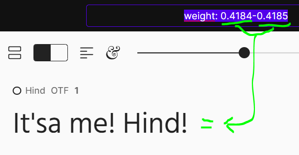
Outside of Hind not having italics, is it also an issue that you have to use a custom weight in the variable font? I am asking in case you would be open to using other variable fonts.Cristóbal Alarcón said:a slightly heavier regular weight for easier reading (around these values to be more precise)
---
Have you looked at any of the following? Gratimo Classic, Pensum Sans, Arizona Sans, Scto Grotesk B, Dover Sans Text, MD System, Kranto, Acto, Azo Sans 2 Narrow, or Novel Sans?0 -
Oh yeah. Sorry my bad.Thomas Phinney said:It is a small thing, but you keep on writing “kerning” when you mean “spacing.” Kerning refers to adjustments between specific glyph combinations (such as “AV” or “To”), whereas spacing is the more general property of how letters are spaced. (And “tracking” is a global adjustment to spacing across the font.)
I am very curious as to what typeface you will end up using.I mean with Letter Spacing. I changed the comments that say kerning for letter spacing/spacing.0 -
About Laconia, the spacing it's looser and and the weight its slightly thinner.Looser spacing is better for legibility in running text. A lot of sans serif types were originally designed for larger sizes—notably, Frutiger was designed for airport signage—, and when digitised were not adapted to text sizes. Sans serif typefaces designed specifically for running text, e.g. Verdana and Legato, tend to have looser spacing.
2 -
Matthew Smith said:
Do you mind elaborating on what your intended use for it is? I know it’s for the web, but I suppose I am a little tripped up by your sentence above. Are you just using it personally to override fonts on the web for a more pleasurable reading experience? Is there any particular reason why you don’t want to manually adjust the tracking via CSS?Yes! Exactly. So far I've tested different typefaces to override fonts on the web as you say. Once I find one after using it for some time I would want to implement it to my brand.The reason about CSS would be that currently the platform I'm using to build my website doesn't allows to edit neither the code nor letter spacing or open type features. As much I would like to edit via CSS I'm not able to at the moment.
Its not really the variable weight that I'm using. The static font has those values, but for the same reason I'm limited in how much editing I can do to the text on the platform I'm using I can't use variable fonts.Matthew Smith said:
Outside of Hind not having italics, is it also an issue that you have to use a custom weight in the variable font? I am asking in case you would be open to using other variable fonts.
AWESOME! Thanks for taking your time. I did test Gratimo and Pensum, and they werent what I was looking for. I'll be looking at your other suggestions and come back with my bandicam tests.Matthew Smith said:Have you looked at any of the following? Gratimo Classic, Pensum Sans, Arizona Sans, Scto Grotesk B, Dover Sans Text, MD System, Kranto, Acto, Azo Sans 2 Narrow, or Novel Sans?0 -
John Hudson said:Looser spacing is better for legibility in running text. A lot of sans serif types were originally designed for larger sizes—notably, Frutiger was designed for airport signage—, and when digitised were not adapted to text sizes. Sans serif typefaces designed specifically for running text, e.g. Verdana and Legato, tend to have looser spacing.I agree! Although in practice for me with tighter spacing I spend less "brain power" scanning trough more tightly spaced compared to looser spacing. That way I can focus more on the topic that I'm reading rather than focusing how I'm reading it.Of course, more spacing it's good for smaller sizes. Hind becomes hard to scan below 11px. But for the uses I'm visualizing don't go below 12-13 px.
0 -
One thing I did in response to the original post was, after following the link for Hind, look at the other typefaces for which fonts were available at the Indian Type Foundry.Since, historically, some typefaces had companion italics released under a different name, I thought there was a chance what was sought could be found near at hand.I was not successful in that search. Interestingly enough, though, here is what I did find there:Although it is stated that the Indian Type Foundry sells some fonts commercially, the link only led me to another part of the Fontshare site, so I only saw their free fonts. Hind is the only one I encountered licensed under the SIL Open Type license; all the others were under the ITF Free Font license.The fonts that I saw seem to cover a wide range of types; geometric sans-serif, modern grotesque (or whatever one calls Helvetica), an alternative to DIN and company, and then there's Bespoke Serif, reminiscent of a style that's become very popular of late - that is, similar to Fedra. So people looking for quality substitutes for certain overused commercial typefaces that aren't just imitations may be interested in the site. (Later, I did find their main site with their commercial fonts by direct Google search.)Bespoke Sans does have an italic, and is a humanist sans-serif, but of course that isn't enough to even suggest strongly that it could be a substitute for the lacking italic for Hind. (Bespoke Sans looks, to me, as though it might be useful as a substitute for Stone Sans.)I also found out that Hind is also available on Google Fonts, and from there I found out why it does not have an italic.Indian Type Foundry notes on its web site that it makes one out of every four of their Latin fonts available for free. They also make typefaces for the languages of India, of course, as might be expected.Hind, however, despite that, and as its name suggests, has 1146 glyphs total, and so has many glyphs for Devanagari within it in addition to the Latin characters. (This may also have something to do with why it's licensed under SIL instead of ITF as well.) Oddly, the designer of Hind was not named on the ITF web site, but on Google Fonts, I see that she is Manushi Parikh.She also designed their commercial sans-serif typeface Mute, which does have an italic. However, it seems to have quite wide letter spacing.Also, Hind is mentioned on Fonts In Use.The photo it shows of that book's bibliography shows Hind with an italic.And if I put Hind in a document on WordPad, and then specify italics for some part, I will also get a sloped version of Hind:
 So, just possibly, if one puts "i" or "em" tags around text specified to be displayed in Hind, without the need to edit CSS or do anything fancy, one will get the appropriate sloped version of Hind. (If one can't edit the HTML, of course, just use one's platform's default way to specify italics.)
1 -
In practice, a mechanically slanted sans italic is, in the light weights, quite acceptable at text size.1
-
I have two go-to sans serif font families for texts intended for easy, clear reading: Mark van Bronkhorst’s MVB Solitaire and Luc(as) de Groot’s The Sans. Solitaire is a masterpiece of restraint, though it doesn’t lack for warmth. Its italic is as clear as the roman. Another sans I turn to for very small texts is Robert Slimbach’s Cronos Caption. This is an interesting case: the details that make the larger optical sizes of Cronos a bit too “sugary” for anything other than commercial uses add to the readability of the Caption cut when set very small (8.5pt and under). If you’re looking for something more overtly modern, take a look at Futura Now; its text sizes are very readable and set well.
There is a very nice PDF of Solitaire on the MVB Fonts website: https://www.mvbfonts.com/mvb_solitaire/.
2 -
One issue with Solitaire is that it doesn't seem to be generally available as a web font, except through Adobe type. Not sure if that matters to you.1
-
12 styles are available at TypeNetwork.John Nolan said:One issue with Solitaire is that it doesn't seem to be generally available as a web font, except through Adobe type. Not sure if that matters to you.
Anyway, I'd try Profile Pro (Supertype, available at Adobe Fonts) and Niko (Ludwig Type).0 -
"12 styles are available at TypeNetwork."
Thanks for that...I clearly didn't search long enough!0 -
My own Ricardo comes with a slightly darker medium weight (compared to the regular) and was made for running text. Unfortunately, it has never been hinted manually, but I think it does quite well with auto-hinting.0
-
Hey guys! I'll address your comments. Life and work really got in the way.
YES! Solitaire was one of the few I could find on Adobe Fonts that felt quite what I'm looking for. Some things felt just a bit different, but I guess once I'm used to read with it the benefits far out weight those differences. Thanks for reminding me about it!!Scott-Martin Kosofsky said:I have two go-to sans serif font families for texts intended for easy, clear reading: Mark van Bronkhorst’s MVB Solitaire and Luc(as) de Groot’s The Sans. Solitaire is a masterpiece of restraint, though it doesn’t lack for warmth. Its italic is as clear as the roman. Another sans I turn to for very small texts is Robert Slimbach’s Cronos Caption. This is an interesting case: the details that make the larger optical sizes of Cronos a bit too “sugary” for anything other than commercial uses add to the readability of the Caption cut when set very small (8.5pt and under). If you’re looking for something more overtly modern, take a look at Futura Now; its text sizes are very readable and set well.
There is a very nice PDF of Solitaire on the MVB Fonts website: https://www.mvbfonts.com/mvb_solitaire/.
The Sans video test. It's not quite I'm looking for.Cronos looks good! But for now for serifs I'm happy with Crimson Pro (which I also very carefully nitpicked but not as much as with Hind)Cesare G. said:12 styles are available at TypeNetwork.
Anyway, I'd try Profile Pro (Supertype, available at Adobe Fonts) and Niko (Ludwig Type).Profile Pro looks different too different to what I'm looking for. Niko despite having different letter forms it has a very similar overall spacing, interesting find. Also, it's so pretty to look at. Definitely seeing myself using it for something else.
It's good! Altough it's not what i'm looking for. Reminds me a bit to Montserrat with the wider letter forms. Thanks for sharing tho!Jasper de Waard said:My own Ricardo comes with a slightly darker medium weight (compared to the regular) and was made for running text. Unfortunately, it has never been hinted manually, but I think it does quite well with auto-hinting.
0 -
Glad to hear that Solitaire suits your needs!0


Categories
- All Categories
- 46 Introductions
- 3.9K Typeface Design
- 489 Type Design Critiques
- 572 Type Design Software
- 1.1K Type Design Technique & Theory
- 659 Type Business
- 874 Font Technology
- 29 Punchcutting
- 528 Typography
- 121 Type Education
- 327 Type History
- 80 Type Resources
- 111 Lettering and Calligraphy
- 32 Lettering Critiques
- 79 Lettering Technique & Theory
- 560 Announcements
- 95 Events
- 116 Job Postings
- 169 Type Releases
- 179 Miscellaneous News
- 269 About TypeDrawers
- 53 TypeDrawers Announcements
- 114 Suggestions and Bug Reports