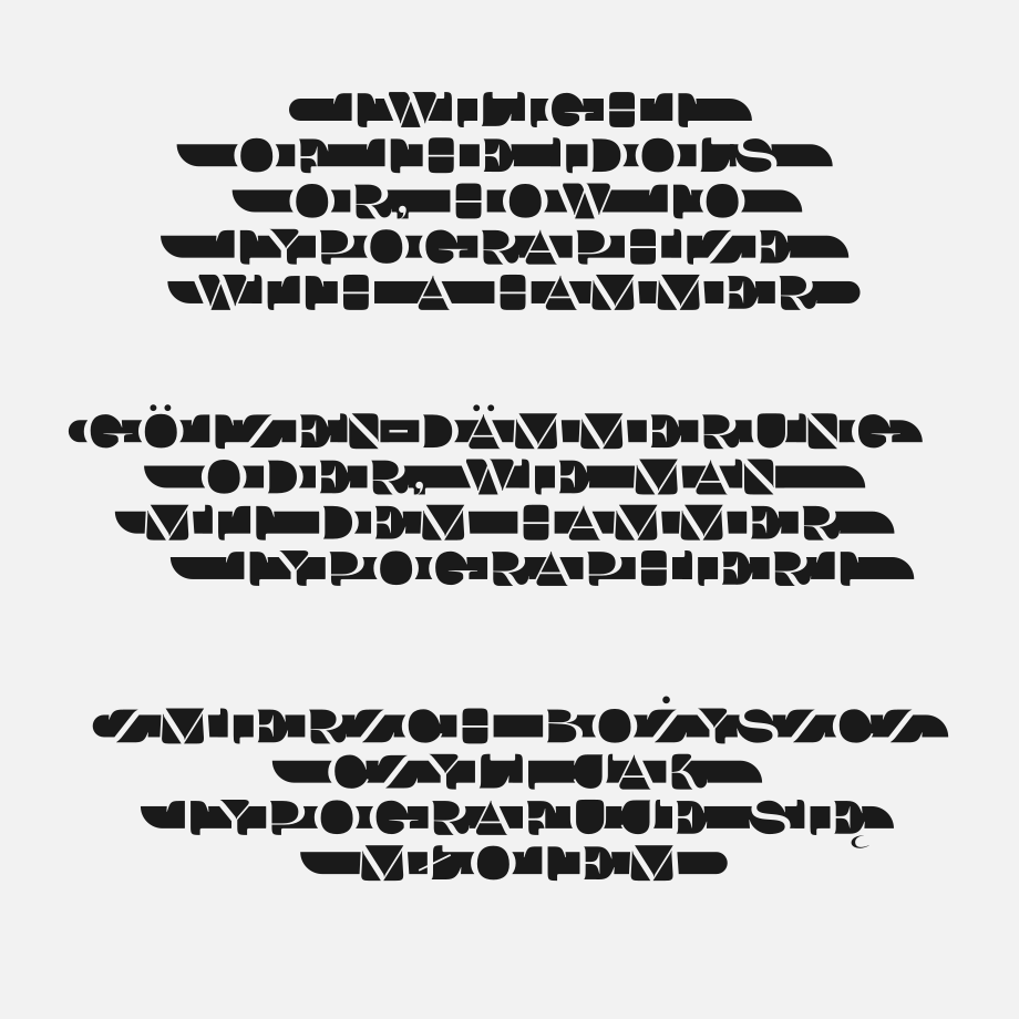
How to Typographize with a Hammer - readability experiment

Grzegorz Luk (gluk)
Posts: 168
I'm just asking you to treat the post as a joke and an interesting readability experiment 


Tagged:
0
Comments
-
Really fun! Wish there were a better solution for diacritics.1
-
It's amazing how flexible our brain is.3
-
Nice experiment.
It works not very well in my brain at the first 3 attempts, because I have a general problem with light on dark text. But when my brain recognises one of the characters, then it gets all in the line.
Interesting, that's easier for me to read the last character in the line first. That's a known effect and used in machine learning, that disturbing a hardened model is necessary to allow additional learning. We have a phrase for it in common language: opening the mind. In sports the principle is known as variability training.
After 10 times reading I adapted to it and reading speed becomes normal.
Thanks for this extreme example. I now have new ideas to solve the recognition problem in OCR, when text runs from dark on light to light on dark e.g. in advertisements or logos.1 -
Many typographers have done this type of negative space design, me included:

"Pure", c.a. 20071 -
This is very cool and surprisingly readable, especially after (as others have pointed out) the brain has a few lines to acclimate to the approach.
I find the I (capital i) consistently hard to identify. I think it's the asymmetric/varied treatment of the serifs in a letter that I expect to be essentially symmetrical.2 -
It breaks down with /I because it's the only letter without an "inside."1
-
In general, I did not find it particularly hard to read, but occasionally I did have some difficulty when it was hard for me to identify the spaces. This happened between letter pairs like MI, IE, MM and so on, where it seemed like there was a full white box around the small black square instead of it being a space with the white areas above and below it being intended to be ignored.
1 -
John Savard said:[..] some difficulty when it was hard for me to identify the spaces [...]
thank You for all comments. I reworked demo for comparisonHelmut Wollmersdorfer said:[...] I have a general problem with light on dark text. [...]
0
Categories
- All Categories
- 46 Introductions
- 3.9K Typeface Design
- 489 Type Design Critiques
- 572 Type Design Software
- 1.1K Type Design Technique & Theory
- 664 Type Business
- 877 Font Technology
- 29 Punchcutting
- 530 Typography
- 121 Type Education
- 328 Type History
- 81 Type Resources
- 111 Lettering and Calligraphy
- 32 Lettering Critiques
- 79 Lettering Technique & Theory
- 562 Announcements
- 97 Events
- 116 Job Postings
- 169 Type Releases
- 179 Miscellaneous News
- 269 About TypeDrawers
- 53 TypeDrawers Announcements
- 114 Suggestions and Bug Reports


