Critique Request for an Oldstyle multilingual typeface

Rafael Cases
Posts: 38
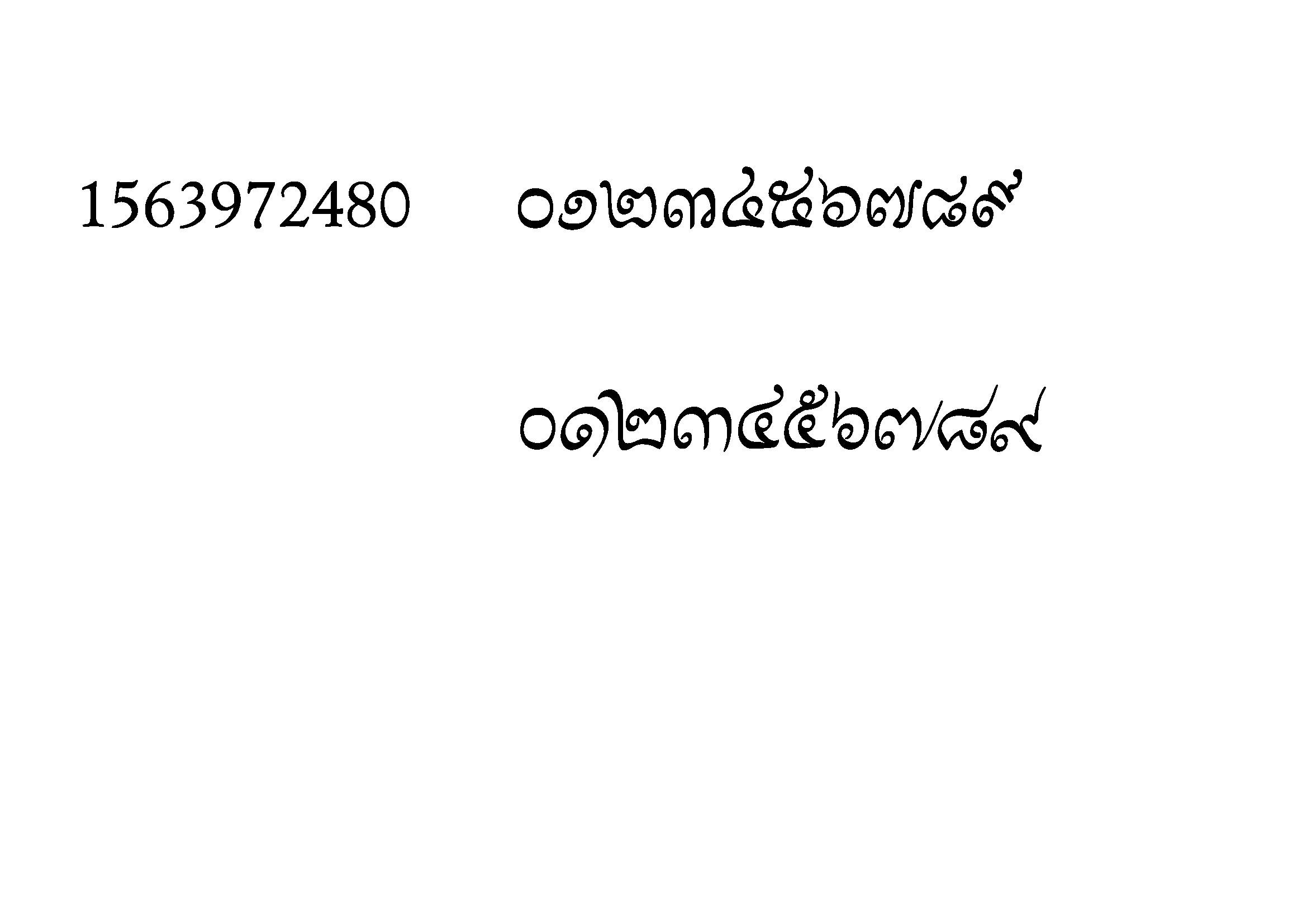
I currently have an Oldstyle Latin / Greek Elzevir / Thai Chulee+Patimok / Khmer Mul+Khom Model set work in progress. What are your critiques? In a forum last year, I tested my own suggestion of the stress rules for Latin and Greek. I received a critique from a Greek user that my apla is inconsistent, but I can anticipate the critique that the lipsias look too much like an old unconnected Syriac and Arabic. The design goal here at this stage is to create a design distance between the upright and italic. Almost all the scripts researched, but Greek and to some extent, Khmer (where this sample is found in Thailand), have a second inclined semi-cursive scribal tradition that has a rough parallel with Latin. To put these in today's context, word processor users push the "I" button and expect slanting or a ductus change, or both. This work explores this design meme spreading to other scripts.


Any critique is welcome. Thanks for your time and stay safe!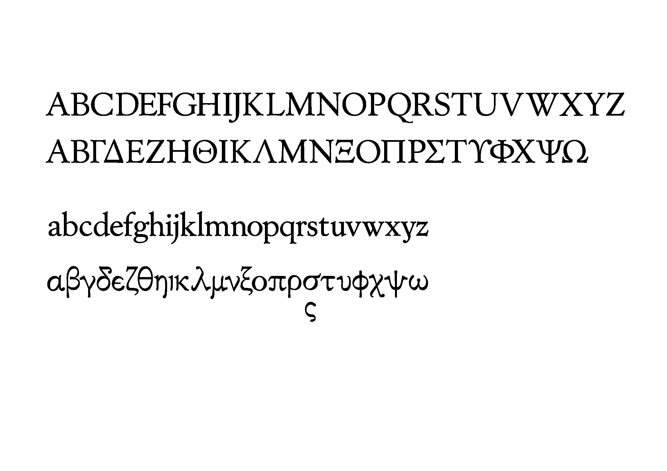


Any critique is welcome. Thanks for your time and stay safe!
Tagged:
0
Comments
-
The subversion of the expected intersection in /y is rather unusual for text, and I suspect Greek readers would find the same in /lambda even more so.
3 -
In this Latin Oldstyle, I was exploring the design space between Jenson (mid-late 15th century), Garamond (16th century), Voskens (17th century), and Fleischman (early-mid 18th century). In here, I harmonized the / y and / lambda due to the glyph construction, and also to explore ways to further violate the calligraphic conventions and separate lettering, handwriting, and typography.K Pease said:The subversion of the expected intersection in /y is rather unusual for text, and I suspect Greek readers would find the same in /lambda even more so.
For Greek, I was finding ways to separate the apla from lipsias, but I received feedback to iterate more. Designing the lowercase has been tough because it is already familiar to any Latin-script user, yet it has some subtle details that I try to get. Latinization was somewhat inevitable due to the very similar capitals that Greek shares with Latin. Unlike most scripts, Cyrillic and Greek (and to some extent, Armenian and Coptic) have a rather strong affinity to Latin in design principles.
The loopless Thai and Khmer start sharing design principles with Latin, Cyrillic, and to some extent, Greek and Armenian. If we look at modularity, Thai is arguably more modular than lowercase Greek, as Ben Mitchell wrote. If I observe Khmer, it shares a lot of design principles with Thai.0 -
@Rafael Cases, is the difference in stress between the /o and other letterforms (e.g. /b, /d, etc) intentional? The same for the different terminals for the/u?
Also, I'd expect the tails of the /ζ, /ξ, & /ς to terminate the same way.0 -
For the first 2 questions, yes and yes.Steve Gardner said:@Rafael Cases, is the difference in stress between the /o and other letterforms (e.g. /b, /d, etc) intentional? The same for the different terminals for the/u?
Also, I'd expect the tails of the /ζ, /ξ, & /ς to terminate the same way.
In this iteration, the reason / finallowercasesigma had a different-looking tail is that I changed the stress angle for / lowercasezeta and /lowercaseksi from 120° to 60° to give a better grey colour distribution for the 2.0 -
I'm not a native reader, but the Greek lowercase looks quite freaky to me, with lots of unexpected visual noise from sharp angles and fractures. The individual glyphs differ from each other significantly in terms of width, color, contrast, and formality (some look like Times New Roman while others look hand-scrawled). There's also no family likeness between the Latin and the Greek.In my experience, Greek type designers tend to have high standards concerning what constitutes Greek letterforms (more so than Latin designers, though admittedly that might just be my skewed perception), and that's all the more true about a text font.1
-
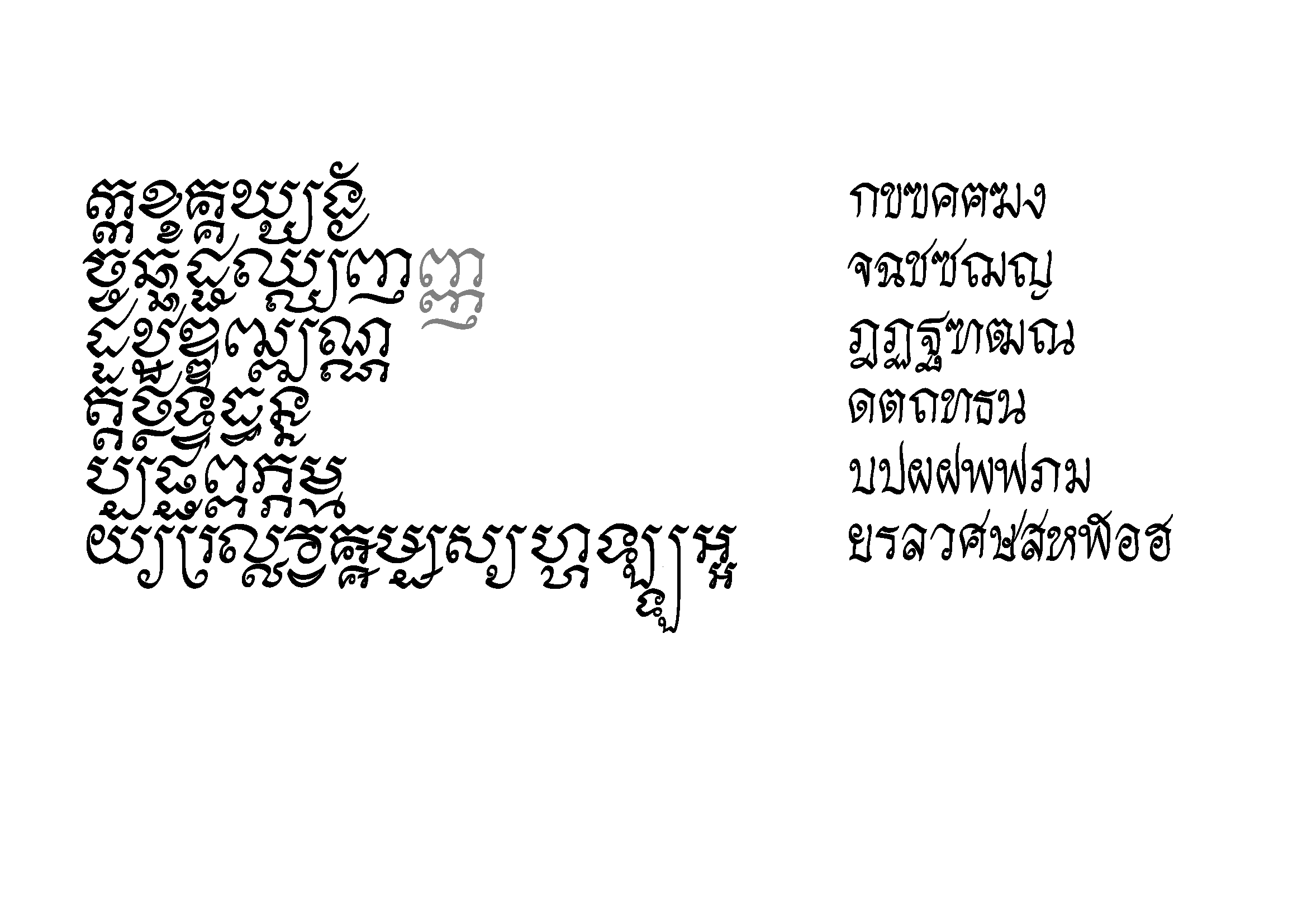
While the Greek and Latin are oldstyle type, and beautiful as far as I can tell, the Cambodian and Thai are fully calligraphic. That seems a strong contrast.
1 -
Here's my take:Christian Thalmann said:I'm not a native reader, but the Greek lowercase looks quite freaky to me, with lots of unexpected visual noise from sharp angles and fractures. The individual glyphs differ from each other significantly in terms of width, color, contrast, and formality (some look like Times New Roman while others look hand-scrawled). There's also no family likeness between the Latin and the Greek.In my experience, Greek type designers tend to have high standards concerning what constitutes Greek letterforms (more so than Latin designers, though admittedly that might just be my skewed perception), and that's all the more true about a text font.
Some instrokes were converted into semi-serifs since they do a better job in activating negative spaces or the white sheet of the paper. This was the crucial stage in Jenson's design for Latin lowercase to override the convention of the pen, built around by Augereau, Garamond, Granjon, Voskens, Jannon, and all the way to Fleischman. In this scenario, I also tried this on Greek, being cautious to keep the distribution of blacks and whites in some parts. There's a delicate balance for Greek to be settable for old texts and for it not to look too dated.
I can't mindlessly put serifs on Greek lowercase the way I can do it in Latin and Cyrillic, I've seen object lessons (or in the language of DIN 1450, negative examples) from Jan Van Krimpen and Eric Gill, where they didn't respect the contrast. This is why there was some research done before embarking on this area. In here, I saw some room for a better negative space interaction.
Considering the development, I've seen Greek get a crazy example of changing axes, where each letter gets their own rule for their stress axis. Given this context, the Latin has a fairly crazy rule for stress axis, and I've tested this.
In response to a critique outside this forum, and also to make this process slightly more transparent, I'll segregate the uprights into 2 styles, and I can see that the / lowercasedelta is the odd one out, therefore, needs reworking. I'll segregate this to Latinised and Byzantine.0 -
Rafael Cases said:Some instrokes were converted into semi-serifs since they do a better job in activating negative spaces or the white sheet of the paper. This was the crucial stage in Jenson's design for Latin lowercase to override the convention of the pen, built around by Augereau, Garamond, Granjon, Voskens, Jannon, and all the way to Fleischman. In this scenario, I also tried this on Greek, being cautious to keep the distribution of blacks and whites in some parts. There's a delicate balance for Greek to be settable for old texts and for it not to look too dated.It sounds as though you are attempting to achieve a fundamental advance in the state of Greek typography.While it would have been better if this were done by a native speaker of Greek, in my opinion Greek typography needs all the help it can get. So perhaps Greek type designers will find something of what you are doing useful.0
-
The Khmer iteration looks like there are less issues in glyph drawing when the Khmer consultants evaluated it. One of the Thai consultants found the proportion of / thothahan and / hohip too wide.John Savard said:While the Greek and Latin are oldstyle type, and beautiful as far as I can tell, the Cambodian and Thai are fully calligraphic. That seems a strong contrast.
In this scenario, if Greek changes, it affects the Latin and Cyrillic. If Khmer changes, it affects the Thai and Lao.
If I make Khmer and Thai more mechanical, I can see the Thai having less problems than the Khmer.0 -
There were 2 attempts, where I can cite Andreas Stötzner's Andron, and Giorgos Triantafyllakos's VS. typefaces. I just use these works as one of the bases to explore the italic meme.John Savard said:It sounds as though you are attempting to achieve a fundamental advance in the state of Greek typography.While it would have been better if this were done by a native speaker of Greek, in my opinion Greek typography needs all the help it can get. So perhaps Greek type designers will find something of what you are doing useful.0 -
In light of the feedback from various people, here are a few revisions.


In the previous iteration of this set, I found that the / uppercasephi was too dark, so it underwent adjustments.
The lowercase Greek had a totally different scribal history from Latin+Greek uppercase and Latin lowercase. Due to this history, the initial exploration attempts to create design distance between aplá and lípsias received plenty of feedback, where most are critical.
In light of this feedback, I followed the footsteps of two typeface designers in the debate of what is authentically Greek and what is Latinised. Seeing these forms, I took a decision to use the alternates as a way to make a similar meme to the roman-italic opposition with the aplá-lípsias opposition using available Greek designs.
What makes it tough is that both Orthodox Slavs and the rest of the Latin-script using Europeans see Greek script as an extension of their scripts, and Greeks have a different context in which they see their typefaces.

In the previous iteration, I received feedback about the width of a few glyphs, and the ductus of a few glyphs.
This model shows where some forms are gradually following the engraver's tools instead of the broadnib pen and brush.
In addition, there is an attempt to create a dynamic between khom-mul and chulee(+mool inspiration)-patimok opposition.
0


Categories
- All Categories
- 47 Introductions
- 4K Typeface Design
- 493 Type Design Critiques
- 576 Type Design Software
- 1.1K Type Design Technique & Theory
- 669 Type Business
- 884 Font Technology
- 29 Punchcutting
- 537 Typography
- 124 Type Education
- 332 Type History
- 81 Type Resources
- 113 Lettering and Calligraphy
- 33 Lettering Critiques
- 80 Lettering Technique & Theory
- 569 Announcements
- 100 Events
- 116 Job Postings
- 170 Type Releases
- 182 Miscellaneous News
- 270 About TypeDrawers
- 54 TypeDrawers Announcements
- 114 Suggestions and Bug Reports