OpenType Font Variations for Spaces

Florian Pircher
Posts: 176
I am considering adding a variation axis to my font that controls the width of spaces. The reason is that Unicode contains a broad yet inconsistent set of space characters. They differ mainly in width and whether or not to prevent a line break. When wearing my typographer hat, I find the Unicode spaces-set quite limiting and frequently wish for a non-breaking space that was a bit narrower or a bit wider. All non-breaking spaces that the universal codespace offers are U+00A0 (word space width), U+202F (narrow), U+2007 (figure width), and U+2060 (zero width).
Use cases include:
I don’t want this to be a discussion about whether any of the listed use cases are valid – that is not for the type designer to decide – but whether a variation axis for space widths is technically/semantically sound and the proposed implementation is sensible.
Use cases include:
- a comma after an en/em dash “[…] – […] – , […]”, where some want to insert a thin non-breaking space between the dash and the comma
- French quotation marks, where many strong opinions exist on exactly how wide the non-breaking space between quote and letter shall be
- other punctuation, e.g., a thin non-breaking space before the percentage “%” sign
- abbreviations such as “z. B.” where a non-breaking word space may appear a bit too wide, while U+202F is too narrow (I have seen prestige fonts that have a slightly narrow U+00A0 compared to the regular U+0020, probably to address abbreviations, but that is not a good solution)
- sentence spacing, where a single word space would be enlarged if set between two sentences (here again many strong opinions on how wide such a space shall be, in case the sentence space should differ at all from the word space)
I don’t want this to be a discussion about whether any of the listed use cases are valid – that is not for the type designer to decide – but whether a variation axis for space widths is technically/semantically sound and the proposed implementation is sensible.
Tagged:
1
Comments
-
Sounds technically viable, sure.
1 -
As far as the OT spec is concerned, that's completely valid.0
-
Thank you for the confirmation.0
-
U+2060 WORD JOINER isn't a space; it shall be purely a line-break suppressor. (Language-specific word-boundary detecting algorithms, as for Thai, might be allowed to use it as a word-boundary suppressor.) It should have no effect on the lay-out within a line beyond establishing what goes on the same line. The same goes for U+FEFF ZERO WIDTH NO-BREAK SPACE.As far as a font goes, U+200B should also have no effect, unless your font is trying to detect word boundaries.0
-
U+2060 can be used together with the other Unicode spaces, allowing for a larger set of non-breaking spaces. It’s still a limited set and the technique is not supported in all typesetting environments. U+FEFF is mostly used as a byte order mark, but changing the width of a zero-width space glyph still results in a zero-width glyph, so they will not be part of the variation anyway.0
-
People always underestimate how much work is involved in drawing those particular glyphs...Florian Pircher said:The extra drawing work and file size increases are manageable.0 -
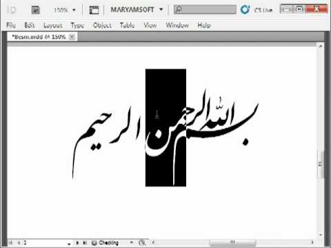
As far as Arabic is concerned, spaces are so varied that they go from zero-width non-joiner to overlapping as demonstrated here
 http://Youtube.com/watch?v=itZ66gUVVCI
Happy exploring with Flowers https://T.me/FlowerCrosswords/95 @ https://T.me/FonJawi/693
0


Categories
- All Categories
- 47 Introductions
- 4K Typeface Design
- 495 Type Design Critiques
- 577 Type Design Software
- 1.1K Type Design Technique & Theory
- 671 Type Business
- 885 Font Technology
- 29 Punchcutting
- 539 Typography
- 125 Type Education
- 333 Type History
- 81 Type Resources
- 113 Lettering and Calligraphy
- 33 Lettering Critiques
- 80 Lettering Technique & Theory
- 569 Announcements
- 100 Events
- 116 Job Postings
- 170 Type Releases
- 182 Miscellaneous News
- 270 About TypeDrawers
- 54 TypeDrawers Announcements
- 114 Suggestions and Bug Reports