Small text Granjone with Cyrillic and Greek

Hello.
This is a small text typeface based (loosely) on Granjon’s Ascendonica. (As seen here: https://search.museumplantinmoretus.be/Details/collect/206965)
(I am not sure about the name yet.)
My aim is not to make a revival. I would like to make a garalde (kind of sad Granjon is not in there… Gargranjalde?) typeface fit for long text in small (6 pt?) sizes in Latin, Cyrillic, and Greek.
So — legibility is priority.

Any comments, critiques, or suggestions are welcome.
LATIN
You will notice some clear divergences from Granjon’s type in the /a and /g, as well as, albeit less drastic, in the /e, /K, /k, /Q and /Z, /z.
CYRILLIC
How would one space the cyrillic? Is there a good rule for the proportions on the letters in relation to each other? Currently, I have made п /pe-cy the same width as the /n, but with slightly increased (and symmetrical) side bearings. /n
Some exterior opinions on the design of some Cyrillic letterforms would be welcome (though not necessarily agreed with). In particular, the д /de-cy, к /ka-cy (and ж /zhe-cy), л /el-cy, ц /tse-cy (and щ /shcha-cy), and э /ereversed-cy
Cyrillic Petrine Reform: https://www.wdl.org/en/item/561/view/1/3/
д: I don’t like the square form (see л). Now, we have two triangles to choose from: leaning triangle, and normal triangle.

к and ж: I am not convinced they should copy the latin /k. I will probably add latin-style as stylistic alternates. But I can’t help to wonder why the Petrine reform к and ж could have just been copied from the latin — but no.

л: I don’t like the square form. I understand it is better for the colour of the text, but I don’t think it is sufficiently legible (or beautiful). Now, ball terminal, or not? Both make sense to me.

ц and щ: Swooshy tail? It’s pretty. But it might be too distracting for nothing. It is not important to differentiate ш and щ to understand a word.

э: Swooshy… nose?
Also, should the capitals resemble the lowercase?
GREEK
Lowercase not done yet.
I found these wonderful little capitals by aldus (I think).

Is this shape of /Xi acceptable (legible) nowadays?

I wanted to make an aldine /Psi, but I could not find an example that didn’t require an exorbitant amount of imagination to draw from. So the current one is based on Garamont’s Parangonne Capitales Grecques.

Sorry for the avalanche.
Here is a pdf sample of the typeface.
Please ignore the invisible hyphen :-)
Comments
-
I think the typeface would be less useful if you chose to go with more eccentric characters, such as pre-Petrine Cyrillic. And I don't think the strange form of xi you have exhibited is advisable either.
1 -
Spacing-wise, feels a bit too tight for small sizes, especially in Cyrillic.
The д stands out too much — too wide / light on the left. The л blends in more naturally.
As a rule of thumb, it’s usually better to put all sorts of “opinionated” forms to style sets and go with a more neutral as a default. Just makes it useful for a wider range of projects and leaves the options for the user.
0 -
On the Latin:
S and s may read as a touch too light. I'd try to widen the top and bottom counters of k and x. Seen large, that reaching f (that I know is part of the style) may look like it's trying too hard, but in small running text it is working well--but figure out now what ligatures or other solutions you'll need esp. for ensuing letters with diacritics. (And you'll probably need some positive kerning between f and space.)
And even just the tiniest bit more descender length (even if it has to come at the expense of some ascender length to keep the interlinear spacing tight) would be welcome.0 -
I love your idea, and I support it wholeheartedly. May it turn into a great font, and then perhaps you'll decide to create a text-size sibling for it. I'm a huge fan of Ascendonica.0
-
Please note that Cyrillic Tswe and Shwe (with tail) are different letters than Tse and Shcha (with descender).

1 -
I might call the descender of /y a bit timid.My understanding of д+л is that the balanced triangle form is legible and valid even in languages like Russian where the square form is the text norm, but they must match.
1 -
These are both acceptable forms for Tse and Shcha, the ones on the right being somewhat more antiquated.Igor Freiberger said:Please note that Cyrillic Tswe and Shwe (with tail) are different letters than Tse and Shcha (with descender).
AFAIK Tswe and Schwe only exist as distinct letters in 19th Century Abkhaz orthography, which split the two ways of writing tse and shcha into separate characters to represent sounds found in Abkhaz but not Slavic.2 -
André G. Isaak said:
These are both acceptable forms for Tse and Shcha, the ones on the right being somewhat more antiquated.Igor Freiberger said:Please note that Cyrillic Tswe and Shwe (with tail) are different letters than Tse and Shcha (with descender).
AFAIK Tswe and Schwe only exist as distinct letters in 19th Century Abkhaz orthography, which split the two ways of writing tse and shcha into separate characters to represent sounds found in Abkhaz but not Slavic.I was curious, and so I looked it up. The forms on the right were used in the official Abkhaz orthography from 1909 to 1926. More recently, when the Cyrillic script was again used to write Abkhaz, Tse and Shcha were instead followed by a letter that looked like a schwa but with also an upper-case form. Those forms are in Unicode; the ones on the right do not appear to be there (although maybe by now they're at some high code point seldom implemented except in fonts with historical coverage).However, I was unable to find any recent examples of any form for Tse and Shcha other than the one on the left, even though I do remember seeing them with a curved tail, although not nearly as pronounced as on the right.However, that form is indeed found in Russian if one goes back to the 1700s: or, in context:
 1
1 -
They're in the Cyrillic Extended-B Block, A68E, A68F and A696, A697, but these codepoints should only be used for Abkhaz, not for forms with tails in other languages.John Savard said:
I was curious, and so I looked it up. The forms on the right were used in the official Abkhaz orthography from 1909 to 1926. More recently, when the Cyrillic script was again used to write Abkhaz, Tse and Shcha were instead followed by a letter that looked like a schwa but with also an upper-case form. Those forms are in Unicode; the ones on the right do not appear to be there (although maybe by now they're at some high code point seldom implemented except in fonts with historical coverage).
However, I was unable to find any recent examples of any form for Tse and Shcha other than the one on the left, even though I do remember seeing them with a curved tail, although not nearly as pronounced as on the right.However, that form is indeed found in Russian if one goes back to the 1700s:
I’m sure you'll find examples of these in Russian that are far more recent than the 1700s, though in recent designs they'd only be used in display faces which are attempting to be deliberately archaic.1 -
John, I create fonts supporting old orthographies and I always search the proposals to Unicode. They use to be an excellent source of information about these less known characters.
Regarding the Abkhaz sequence in Cyrillic Extended B, the N3194R proposal includes samples from 1912 (real use) and 1964 (reference for transliteration).
0 -

In Fontesque, I used the swash-tailed forms of tse and shcha for fanciful effect.
And so that be’s brush won’t be quite so lonely.
But not a good typeface for long text at 6 pt.2 -
John Savard: I understand. I do wish to make multiple forms for the user to choose from. How about, I make two stylistic sets; a boring one, and a crazy one, and the default lies between the two?
Alex Visi: I agree. I am rethinking the spacing. I made the д quite a bit narrower.
Craig Eliason: I made /S /s slightly heavier. I gave /k /x /ж /к more room to breathe. I plan on making a contextual alternate f with no extrusion for the diacritics. Would that solve the issue? For the descender length, I'm not convinced. I think it best to sacrifice descenders more than ascenders for legibility. If I decrease the ascenders, I'd have to wrestle some shapes into submission a lot more (such as the /f /б and /β). And the short descender-ness is part of the charm, don't you think?
Look at the cute g!
Konrad Ritter: Thank you. I do wish to make optical sizes... but I'm nowhere near that point yet.
Igor Freiberger and others: Fascinating. I was not aware of those letters. Would that mean that, if the ц were to have a tail, you would need to cut it off as a localised form for Abkhaz? I would like give this typeface extensive Cyrillic support. Do you know of a list of languages that use Cyrillic and their respective required glyphs?
My favourite Cyrillic glyph I found so far is 'CYRILLIC CAPITAL LETTER YAE' (U+0518).0 -
The amazing compilation below was made by Kent Lew. Note that these are alphabets in current use. Historic additions, like the one for Abhkaz, are not listed here but will be needed if the font targets also historical studies or transcriptions. The same is valid for liturgical use. Also note that Kazakhstan is changing from Cyrillic to Latin, but this is still in progress and not fully consolidated.Slavic LanguagesRussianА Б В Г Д Е Ё Ж З И Й К Л М Н О П Р С Т У Ф Х Ц Ч Ш Щ Ъ Ы Ь Э Ю Яа б в г д е ё ж з и й к л м н о п р с т у ф х ц ч ш щ ъ ы ь э ю яBelarusianА Б В Г Д Е Ё Ж З І Й К Л М Н О П Р С Т У Ў Ф Х Ц Ч Ш Ы Ь Э Ю Яа б в г д е ё ж з і й к л м н о п р с т у ў ф х ц ч ш ы ь э ю яUkrainianА Б В Г Ґ Д Е Є Ж З И І Ї Й К Л М Н О П Р С Т У Ф Х Ц Ч Ш Щ Ь Ю Яа б в г ґ д е є ж з и і ї й к л м н о п р с т у ф х ц ч ш щ ь ю яRusynА Б В Г Ґ Д Е Ё Є Ж З И І Ї Й К Л М Н О П Р С Т У Ф Х Ц Ч Ш Щ Ъ Ы Ь Ю Яа б в г ґ д е ё є ж з и і ї й к л м н о п р с т у ф х ц ч ш щ ъ ы ь ю яSerbianА Б В Г Д Ђ Е Ж З И Ј К Л Љ М Н Њ О П Р С Т Ћ У Ф Х Ц Ч Џ Ша б в г д ђ е ж з и ј к л љ м н њ о п р с т ћ у ф х ц ч џ шBulgarianА Б В Г Д Е Ж З И Ѝ Й К Л М Н О П Р С Т У Ф Х Ц Ч Ш Щ Ъ Ь Ю Яа б в г д е ж з и ѝ й к л м н о п р с т у ф х ц ч ш щ ъ ь ю яЍ ѝ – for disambiguation of feminine possessive pronounMontenegrinА Б В Г Д Ђ Е Ж З И Ј К Л Љ М Н Њ О П Р С Т Ћ У Ф Х Ц Ч Џ Ш ́а б в г д ђ е ж з и ј к л љ м н њ о п р с т ћ у ф х ц ч џ шMacedonianА Б В Г Ѓ Д Е Ѐ Ж З Ѕ И Ѝ Ј К Л Љ М Н Њ О П Р С Т Ќ У Ф Х Ц Ч Џ Ша б в г ѓ д е ѐ ж з ѕ и ѝ ј к л љ м н њ о п р с т ќ у ф х ц ч џ шЀ Ѝ ѐ ѝ – for disambiguationOther Indo-European languagesMoldovanА Б В Г Д Е Ж Ӂ З И Й К Л М Н О П Р С Т У Ф Х Ц Ч Ш Ы Ь Э Ю Яа б в г д е ж ӂ з и й к л м н о п р с т у ф х ц ч ш ы ь э ю яIranian languagesKurdishА Б В Г Д Е Ә Ж З И Й К Л М Н О Ö П Р С Т У Ф Х Һ Ч Ш Щ Ь Э Ԛ Ԝа б в г д е ә ж з и й к л м н о ö п р с т у ф х һ ч ш щ ь э ԛ ԝOssetianА Ӕ Б В Г Д Е Ё Ж З И Й К Л М Н О П Р С Т У Ф Х Ц Ч Ш Щ Ъ Ы Ь Э Ю Яа ӕ б в г д е ё ж з и й к л м н о п р с т у ф х ц ч ш щ ъ ы ь э ю яTajikА Б В Г Ғ Д Е Ё Ж З И Ӣ Й К Қ Л М Н О П Р С Т У Ӯ Ф Х Ҳ Ц Ч Ҷ Ш Щ Ъ Ы Ь Э Ю Яа б в г ғ д е ё ж з и ӣ й к қ л м н о п р с т у ӯ ф х ҳ ц ч ҷ ш щ ъ ы ь э ю яЦ Щ Ы Ь ц щ ы ь – loanwords onlyUralic LanguagesKildin SamiА Ӓ Б В Г Д Е Ё Ж З И Й Ҋ Ј К Л Ӆ М Ӎ Н Ӊ Ӈ О П Р Ҏ С Т У Ф Х Һ Ц Ч Ш Щ Ъ Ы Ь Ҍ Э Ӭ Ю Яа ӓ б в г д е ё ж з и й ҋ ј к л ӆ м ӎ н ӊ ӈ о п р ҏ с т у ф х һ ц ч ш щ ъ ы ь ҍ э ӭ ю яCombining macron may be requiredKomi-PermyakА Б В Г Д Е Ё Ж З И І Й К Л М Н О Ӧ П Р С Т У Ф Х Ц Ч Ш Щ Ъ Ы Ь Э Ю Яа б в г д е ё ж з и і й к л м н о ӧ п р с т у ф х ц ч ш щ ъ ы ь э ю яMeadow MariА Б В Г Д Е Ё Ж З И Й К Л М Н Ҥ О Ӧ П Р С Т У Ӱ Ф Х Ц Ч Ш Щ Ъ Ы Ь Э Ю Яа б в г д е ё ж з и й к л м н ҥ о ӧ п р с т у ӱ ф х ц ч ш щ ъ ы ь э ю яHill MariА Ӓ Б В Г Д Е Ё Ж З И Й К Л М Н О Ӧ П Р С Т У Ӱ Ф Х Ц Ч Ш Щ Ъ Ы Ӹ Ь Э Ю Яа ӓ б в г д е ё ж з и й к л м н о ӧ п р с т у ӱ ф х ц ч ш щ ъ ы ӹ ь э ю яUdmurtА Б В Г Д Е Ё Ж Ӝ З Ӟ И Ӥ Й К Л М Н О Ӧ П Р С Т У Ф Х Ц Ч Ӵ Ш Щ Ъ Ы Ь Э Ю Яа б в г д е ё ж ӝ з ӟ и ӥ й к л м н о ӧ п р с т у ф х ц ч ӵ ш щ ъ ы ь э ю яKhantyА Ӓ Ә Ӛ Б В Г Д Е Ё Ж З И Й К Ӄ Л М Н Ӈ О Ӧ Ө Ӫ П Р С Т У Ӱ Ф Х Ц Ч Ш Щ Ъ Ы Ь Э Ю Яа ӓ ә ӛ б в г д е ё ж з и й к ӄ л м н ӈ о ӧ ө ӫ п р с т у ӱ ф х ц ч ш щ ъ ы ь э ю яNenetsА Б В Г Д Е Ё Ж З И Й К Л М Н Ӈ О П Р С Т У Ф Х Ц Ч Ш Щ Ъ Ы Ь Э Ю Яа б в г д е ё ж з и й к л м н ӈ о п р с т у ф х ц ч ш щ ъ ы ь э ю яCaucasian LanguagesAbkhazА Б В Г Ӷ Ҕ Д Е Ҽ Ҿ Ж З Ӡ И К Қ Ҟ Л М Н О Ҩ П Ҧ Р С Т Ҭ У Ф Х Ҳ Ц Ҵ Ч Ҷ Џ Ш Ы Ьа б в г ӷ ҕ д е ҽ ҿ ж з ӡ и к қ ҟ л м н о ҩ п ҧ р с т ҭ у ф х ҳ ц ҵ ч ҷ џ ш ы ьKabardianА Б В Г Д Е Ж З И Ӏ Й К Л М Н О П Р С Т У Ф Х Ц Ч Ш Щ Ъ Ы Ь Ю Яа б в г д е ж з и ӏ й к л м н о п р с т у ф х ц ч ш щ ъ ы ь ю яChechenА Б В Г Д Е Ё Ж З И Ӏ Й К Л М Н О П Р С Т У Ф Х Ц Ч Ш Ъ Ы Ь Э Ю Яа б в г д е ё ж з и ӏ й к л м н о п р с т у ф х ц ч ш ъ ы ь э ю яTurkic LanguagesAzerbaijaniА Ә Б В Г Ғ Д Е Ж З И Й Ј К Ҝ Л М Н О Ө П Р С Т У Ү Ф Х Һ Ч Ҹ Ш Ыа ә б в г ғ д е ж з и й ј к ҝ л м н о ө п р с т у ү ф х һ ч ҹ ш ыTurkmenА Ә Б В Г Д Е Ё Ж Җ З И Й К Л М Н Ң О Ө П Р С Т У Ү Ф Х Ц Ч Ш Щ Ъ Ы Ь Э Ю Яа ә б в г д е ё ж җ з и й к л м н ң о ө п р с т у ү ф х ц ч ш щ ъ ы ь э ю яKazakhА Ә Б В Г Ғ Д Е Ё Ж З И І Й К Қ Л М Н Ң О Ө П Р С Т У Ү Ұ Ф Х Һ Ц Ч Ш Щ Ъ Ы Ь Э Ю Яа ә б в г ғ д е ё ж з и і й к қ л м н ң о ө п р с т у ү ұ ф х һ ц ч ш щ ъ ы ь э ю яKyrgyzzА Б В Г Д Е Ё Ж З И Й К Л М Н Ң О Ө П Р С Т У Ү Ф Х Ц Ч Ш Щ Ъ Ы Ь Э Ю Яа б в г д е ё ж з и й к л м н ң о ө п р с т у ү ф х ц ч ш щ ъ ы ь э ю яВ Ф Ц Щ Ъ Ь в ф ц щ ъ ь – loanwords onlyKarachayА Б В Г Д Е Ё Ж З И Й К Л М Н О П Р С Т У Ў Ф Х Ц Ч Ш Щ Ъ Ы Ь Э Ю Яа б в г д е ё ж з и й к л м н о п р с т у ў ф х ц ч ш щ ъ ы ь э ю яBashkirА Ә Б В Г Ғ Д Е Ё Ж З Ҙ И Й К Ҡ Л М Н Ң О Ө П Р С Ҫ Т У Ү Ф Х Һ Ц Ч Ш Щ Ъ Ы Ь Э Ю Яа ә б в г ғ д е ё ж з ҙ и й к ҡ л м н ң о ө п р с ҫ т у ү ф х һ ц ч ш щ ъ ы ь э ю яTatarА Ә Б В Г Д Е Ё Ж Җ З И Й К Л М Н Ң О Ө П Р С Т У Ү Ф Х Һ Ц Ч Ш Щ Ъ Ы Ь Э Ю Яа ә б в г д е ё ж җ з и й к л м н ң о ө п р с т у ү ф х һ ц ч ш щ ъ ы ь э ю яAltaiА Б В Г Д Е Ё Ж З И Й Ј К Л М Н Ҥ О Ӧ П Р С Т У Ӱ Ф Х Ц Ч Ш Щ Ъ Ы Ь Э Ю Яа б в г д е ё ж з и й ј к л м н ҥ о ӧ п р с т у ӱ ф х ц ч ш щ ъ ы ь э ю яKhakassА Б В Г Ғ Д Е Ё Ж З И І Й К Л М Н Ң О Ӧ П Р С Т У Ӱ Ф Х Ц Ч Ӌ Ш Щ Ъ Ы Ь Э Ю Яа б в г ғ д е ё ж з и і й к л м н ң о ӧ п р с т у ӱ ф х ц ч ӌ ш щ ъ ы ь э ю яSakhaА Б В Г Ҕ Д Е Ё Ж З И Й К Л М Н Ҥ О Ө П Р С Т У Ү Ф Х Һ Ц Ч Ш Щ Ъ Ы Ь Э Ю Яа б в г ҕ д е ё ж з и й к л м н ҥ о ө п р с т у ү ф х һ ц ч ш щ ъ ы ь э ю яTuvinА Б В Г Д Е Ё Ж З И Й К Л М Н Ң О Ө П Р С Т У Ү Ф Х Ц Ч Ш Щ Ъ Ы Ь Э Ю Яа б в г д е ё ж з и й к л м н ң о ө п р с т у ү ф х ц ч ш щ ъ ы ь э ю яUzbekА Б В Г Ғ Д Е Ё Ж З И Й К Қ Л М Н О П Р С Т У Ў Ф Х Ҳ Ц Ч Ш Щ Ъ Ь Э Ю Яа б в г ғ д е ё ж з и й к қ л м н о п р с т у ў ф х ҳ ц ч ш щ ъ ь э ю яUyghurА Ә Б В Г Ғ Д Е Ж Җ З И Й К Қ Л М Н Ң О Ө П Р С Т У Ү Ф Х Һ Ч Ш Ю Яа ә б в г ғ д е ж җ з и й к қ л м н ң о ө п р с т у ү ф х һ ч ш ю яChuvashА Ӑ Б В Г Д Е Ё Ӗ Ж З И Й К Л М Н О П Р С Ҫ Т У Ӳ Ф Х Ц Ч Ш Щ Ъ Ы Ь Э Ю Яа ӑ б в г д е ё ӗ ж з и й к л м н о п р с ҫ т у ӳ ф х ц ч ш щ ъ ы ь э ю яEvenkiА Б В Г Д Е Ё Ж З И Й К Л М Н Ӈ О П Р С Т У Ф Х Ц Ч Ш Щ Ъ Ы Ь Э Ю Яа б в г д е ё ж з и й к л м н ӈ о п р с т у ф х ц ч ш щ ъ ы ь э ю яMongolian LanguagesBuryatА Б В Г Д Е Ё Ж З И Й К Л М Н О Ө П Р С Т У Ү Ф Х Һ Ц Ч Ш Щ Ъ Ы Ь Э Ю Яа б в г д е ё ж з и й к л м н о ө п р с т у ү ф х һ ц ч ш щ ъ ы ь э ю яК Ф Щ Ъ к ф щ ъ – loanwords onlyKhalkhaА Б В Г Д Е Ё Ж З И Й К Л М Н О Ө П Р С Т У Ү Ф Х Ц Ч Ш Щ Ъ Ы Ь Э Ю Яа б в г д е ё ж з и й к л м н о ө п р с т у ү ф х ц ч ш щ ъ ы ь э ю яKalmykА Ә Б В Г Д Е Ё Ж Җ З И Й К Л М Н Ң О Ө П Р С Т У Ү Ф Х Һ Ц Ч Ш Щ Ы Ь Э Ю Яа ә б в г д е ё ж җ з и й к л м н ң о ө п р с т у ү ф х һ ц ч ш щ ы ь э ю яSino-Tibetan LanguagesDunganА Ә Б В Г Д Е Ё Ж Җ З И Й К Л М Н Ң О П Р С Т У Ў Ү Ф Х Ц Ч Ш Щ Ъ Ы Ь Э Ю Яа ә б в г д е ё ж җ з и й к л м н ң о п р с т у ў ү ф х ц ч ш щ ъ ы ь э ю я3
-
Thank you for the list. I will be sure to include all of these glyphs.
K Pease: I increased the size of the /y ball terminal. As for the д and л, I have seen 3 possibilities so far (in decreasing order of popularity):
Both square forms,
Both Isosceles triangle forms,
Isosceles triangle л and Right triangle (trapezoid) д.0 -
Leonid T. said:John Savard: I understand. I do wish to make multiple forms for the user to choose from. How about, I make two stylistic sets; a boring one, and a crazy one, and the default lies between the two?While compromise is a good idea in general, I'll have to admit that I'm generally disinclined to support compromise in this type of situation.Why?Not all word processing applications support fancy OpenType features like stylistic sets. So this would just make the alternate forms of characters inaccessible.So it's all right to put the different versions in separate fonts, but if they're merged into one font by the 'stylistic set' feature, then boring has to be the default to make the font useful to more people.However, that's just my opinion. If there are plenty of other fonts people can use instead of your boring one, maybe the crazy one or the in-between one is the more valuable one, because it brings something new to the table. That's something you would have to decide yourself.Incidentally, it may be noted that the swooshy E oborotnoye dates from about the same period as the Tse and Shcha with the long tail.EDIT: On further reflection, I see that there's a general principle that may be abstracted from the preceding discussion.The version of a typeface that should be chosen as the default stylistic set, given that many word processing programs do not support stylistic sets, and only let the default one be used... is the one that is the most valuable.Whether that's the boring one, which is useful in more contexts, or the crazy one, which is more unique and distinctive.0
-
True. For this typeface, as legibility is priority, I believe the more common square forms of д and л, for example to be less valuable. The swooshes, however, are not. This goes for the rest of the letterforms, two considerations will be made — its legibility, and its extravagance. The most legible and least extravagant (in that order) will be chosen as the default.
I refit the Latin lowercase. Here is a pdf (in 12pt). Is it still too tight?
(You can also check out the new /k /s /x and /y mentioned previously.)0 -
Leonid T. said:I refit the Latin lowercase. Here is a pdf (in 12pt). Is it still too tight?No, it is not too tight. In fact, it's letterspaced. Don't do that; don't be a sheep stealer! (From a famous quote from noted type designer Frederic W. Goudy, although it is now claimed to be a misquote)Looking at the original Ascendonica, the English lower-case did not look too tightly spaced to me. However, I am not a professional type designer, and so if someone that is says it is too tight, I will defer to that judgement.However, the necessary correction, in that case, would be about one-tenth of that which you applied to obtain your second specimen. (Perhaps I am over-reacting, and you could try one-fifth.)0
-
This spacing is good for the intended very small use, but the /space itself needs to be bigger to go with it. It would be tightened for actual 12pt use but that's on the setter.
0 -
Not the sheep!
I did some testing, and printed at 6pt on a household inkjet printer with my new spacing. It is pretty tight, but I think it is comfortable, no? I am also worried about space economy.
It is supposed to work well at 6pt, but due to its large x-height, it is very similar in size to Garamond Premiere Pro Caption 8pt, for example.
0 -
When I commented on the spacing, I forgot that it was intended for use at 6 points. Even then, I think the spacing would be a little too wide in your corrected form; looking at specimens of 6 point type from old ATF specimen books, available free online, would give you a feel for what is appropriate there.
0 -
Thank you for the resource. I'll work on it.0
-
Hello again!
Just a quick update, as I have finished my first draft of all the Latin and Cyrillic characters. (Except for Bulgarian and Serbian characters.)
Any opinion on the letterforms, especially the more unusual Cyrillic ones, would be nice.
Specifically, I have questions on the following:
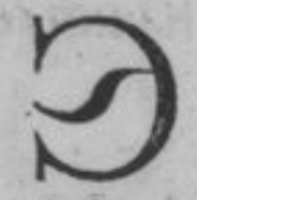
The /kahook-cy: should the hook be rounded, similar to that of /ghemiddlehook-cy?
The Cyrillic tail: What is it supposed to look like? Where does it come from? What on Earth is it, and why is it different from the "descender"? Is this good?
The /kaverticalstroke-cy: I separated the /ka-cy in two, to decrease its colour. How do I put a stroke through a joint that does not exist? Like this?
The ударение (or наголос in Ukrainian?): I made Ligatures with the /acutecomb, in case the user's software is less cooperative. I have yet to see a font with this for Ukrainian and Belorussian. Is there a reason? With a quick google search, I found that, in Ukrainian, the stress is often marked as we would expect, with bold or a change in size. But I also found the /acutecomb, used with varying degrees of success (the і and ї are problematic). Can I use the same shape as a /dialytikatonoscomb for the ї ?
Here is the pdf Specimen.0


Categories
- All Categories
- 47 Introductions
- 4K Typeface Design
- 495 Type Design Critiques
- 577 Type Design Software
- 1.1K Type Design Technique & Theory
- 671 Type Business
- 885 Font Technology
- 29 Punchcutting
- 539 Typography
- 125 Type Education
- 333 Type History
- 81 Type Resources
- 113 Lettering and Calligraphy
- 33 Lettering Critiques
- 80 Lettering Technique & Theory
- 569 Announcements
- 100 Events
- 116 Job Postings
- 170 Type Releases
- 182 Miscellaneous News
- 270 About TypeDrawers
- 54 TypeDrawers Announcements
- 114 Suggestions and Bug Reports