Numerals and distinction between capital O and number 0

Eryk Kosinski
Posts: 72
There are typefaces that have lower case glyphs the same height as capitals as well as ones which have them higher. Is making number 0 the height of higher lowercase characters an ideal solution to make a bigger distinstion between capital O and 0? Also, would it be ideal for old style figures as well?

0
Comments
-
Usually context will clearly disambiguate, which means the disruption of too much height (and thereby size, considering the hefty shapes of many numerals) is overkill; a width difference is plenty. For extreme cases (where æsthetics becomes largely secondary anyway) it's less disruptive to give the zero an extra feature: a dot, forward slash or backslash (and I favor the last, to avoid confusion with the "Ø"). For OS numerals the issue is with the lc "oh", and you have less room for narrowness, so the extra feature becomes a stronger option (although it's very rare to need disambiguation between a lc "oh" and a zero).
BTW if the design has weight contrast you can do things to the zero that are usually unacceptable in the "Oh"/"oh"; some people give the zero horizontal contrast, but I prefer giving it weight only on one side – and I generally favor the left side, like in Whittingham: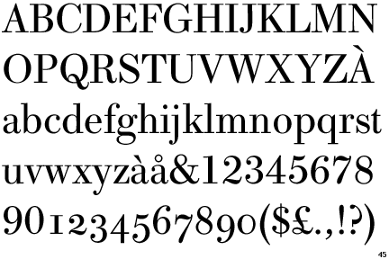

4 -
If your zero reaches up to the ascender height, then all your lining numbers must have that height, right? And the purpose of having lining numbers is mostly for them to line up with the caps. There are many different schemes for numbers: lining; old-style; hybrid—somewhere between cap height and x-height, and possibly with some old-style features; the alternate old-style scheme with the three and five reaching up; but I have yet to see an ascender-height set of figures.
2 -
Well you could say their main purpose is to line up with each other... When they do need to line up with the caps is where disambiguation becomes important = add an extra feature to the zero.Adam Jagosz said:the purpose of having lining numbers is mostly for them to line up with the caps.0 -
Most regular fonts for reading text ("book") have letter \O and number \0 visually the same height, i.e. maybe the letter \O has an overshoot (2-4 % of x-height) or an undershoot. In most cases number \0 has exactly caps-height (typically \H).
In most cases the aspect (=height/width) of letter \O is 1.1 (nearly quadratic) and of figure \0 1.6 (narrow).0 -
Are there any fonts where all numbers are of ascender and not cap height? And if so is it a good idea to do so?0
-
In the Cadman font I wanted everything to be as legible as possible so it has a dotted zero by default and a bit narrower than the /O. This can be changed to a slash zero or a blank zero by stylistic alternatives.Usually I make the zero narrower than the /O.For Kelvinch the numbers 0,1 and 2 were bigger than lower case but smaller than upper case, the numbers 3, 4, 5, 7 and 9 descended to the descender level and the number 6 and 8 went up to the cap height.1
-
Are there any fonts where all numbers are of ascender and not cap height? And if so is it a good idea to do so?Not to my knowledge.
Usually it’s in the other direction, with default lining figures being “three quarter” (shorter) than caps.
But precedent is no reason not to pursue a novel idea!
Give it a try, test it in various typographic scenarios, see if you can make it work, and decide for yourself.
3 -
Eryk Kosinski said:Are there any fonts where all numbers are of ascender and not cap height? And if so is it a good idea to do so?I don't know of any. I'm not sure it would be a terribly bad idea, but I suspect that it would be better, given how numerals are used, and drawing some inspiration from the existence of oldstyle numerals, if instead one made the digits slightly shorter than the cap height - perhaps by the same amount as ascender height is higher.Also, some typewriter fonts have digits that are almost like oldstyle numerals, except that the 'short' digits are around cap height, and the oldstyle ascenders and descenders only go beyond the normal top and bottom slightly.Here is an example:
 Here is another example of the same typeface, but with 0, 1, and a capital letter for comparison:
 0
0 -
 This four is the tallest figure I’m aware of—lining, cap height, plus descender!
The style is Scotch Modern Italic.1 -
In OCR-B, Adrian Frutiger made the numbers taller than cap height. This was to enhance the differentiation between letters and numbers needed for machine reading at the time.Eryk Kosinski said:Are there any fonts where all numbers are of ascender and not cap height? And if so is it a good idea to do so?
6 -
I simply put a slash inside the zero.0
-
@Vasil Stanev A backslash, I hope.0
-
0
-
Øh.1
-
I generally make the zero as either with different weight modulation or with squarer curves (or rounder curves, in case the typeface has superelliptical curves).
In a typeface I kept reworking, I made the numerals with superelliptical curves, while the letters had more rounder ones.0


Categories
- All Categories
- 47 Introductions
- 4K Typeface Design
- 493 Type Design Critiques
- 575 Type Design Software
- 1.1K Type Design Technique & Theory
- 668 Type Business
- 884 Font Technology
- 29 Punchcutting
- 537 Typography
- 124 Type Education
- 332 Type History
- 81 Type Resources
- 112 Lettering and Calligraphy
- 32 Lettering Critiques
- 80 Lettering Technique & Theory
- 567 Announcements
- 99 Events
- 116 Job Postings
- 170 Type Releases
- 181 Miscellaneous News
- 270 About TypeDrawers
- 54 TypeDrawers Announcements
- 114 Suggestions and Bug Reports