Setting Sidebearings
Comments
-
Shifting sidebearings in an asymmetric way would lead to fonts that would not center quite right in centered text, and would not relate as expected to the bounds of their text box. You might think that is fine as long as it is consistent, but people do sometimes mix fonts (e.g. headings, subheadings, body) and having them align differently would be troublesome.
I am also noticing that the only people advocating this are not type designers.4 -
Indeed, I am not a type designer. And so I overlooked the fact that it would affect how all-capitals text is centered, because it is the bounding box that is used for that purpose.
0 -
Nonetheless one must offer deep gratitude to outsiders who keep the establishment thinking.3
-
I usually work at a 700 pt cap hight, which means my sidebearings for O are about 40 and for the H - 60. The sidebearing for n and o are proportionally as tighter as the lowercase is smaller, which is usually 5/7ths of the uppercase.
Sidebearing for A I usually make to be 1-5 pt, for the right hand side of K - 2-10, for the same side in L - 20. This varies according to style.
I use a master InDesign document (with all possible combinations of letters, including Eth, Eszett, ampersand and so on) to check periodacally for inconsistencies. Sometimes I have to go back to fix some design but this happens more and more rarely as I develop further and further as a font designer.
Also, I print the indd file on an A3 or A2 sheet of paper and look at the design from all 4 sides. Then I print a mirrored version and do the same.
Think of it as the martial tournament Chuck Norris went through at one point - with a judge at each corner of the ring.
Others hang the specimen on the wall and stare at it until they see their mistakes. Chuck Norris isn't a font designer so he doesn't have to read - he beats the sh- outta books until they they tell him everything they know.") 2
2 -
Just a quick question hopefully not off-topic. Is InDesign any better for font proofing/testing than Illustrator?0
-
@Igor Petrovic I personally feel InDesign is better for proofing than AI. For one, the search and replace tools are better. The type tool nuances are better, and I even think the export to PDF is better. Also, making multiple pages with enough length for language coverage and weight comparison.
6 -
If you can't see it, and you can't feel it, what does it matter what the number is? As I see it, the problem with too much precision is that tools don't always do subpixel advance, even proofing tools.Hrant H. Papazian said:@Vasil Stanev Numbers do provide a foundation that saves time... because even one's eye isn't fully unreliable.
Maybe wire up the old Griffin PowerMate[0] and stop seeing the numbers.
[0] 0
0 -
Side bearings are an inherently misleading concept.
The bounding box of a contour can only guarantee your contours don't interfere, it says nothing about how they look.
I ignore side bearings, and think only of advance, and clearance/interference at a given level.0 -
@Aaron Muir Hamilton "If you can't see it, and you can't feel it" is something Sophia the robot would say. :-) The truth is subvisible things bypass the consciousness to get to our insides. That said, definitely do let go of the numbers... but only at the point where *that* makes sense.
https://typedrawers.com/discussion/comment/51830/#Comment_51830
Guarantees are anti-Design, it's about how the notan looks, or rather, might look.Aaron Muir Hamilton said:The bounding box of a contour can only guarantee your contours don't interfere, it says nothing about how they look.
I can try to guess what that means but since it's frankly not very flattering :-) I'd rather ask you to please illustrate what you mean.Aaron Muir Hamilton said:I ignore side bearings, and think only of advance, and clearance/interference at a given level.0 -
Hrant H. Papazian said:I can try to guess what that means but since it's not flattering :-) I'd rather ask you to please illustrate what you mean.
I can't offer a grafik right now, but I just mean I think of the contours as simply sitting in the glyph's advance. If you add a swash to your Q, but there's nothing for it to interfere with, because anything that could follow it has sufficient clearance, the edge of the bounding box is entirely the wrong way to think of spacing it. You expand the swash, and your rsb will just become more negative, and more meaningless.
HIC SVNT my infinite ignorance.0 -
@Aaron Muir Hamilton But that assumes a glyph's advance is a given, which is only true in a monospace design. And even in a monospace design, it assumes a glyph's body does not "negotiate" with its sidebearings. To me both of those are false. So in a non-predetermined advance, figuring out where the black body "sits" (more like how it nestles into it) is essentially the same as determining its sidebearings. Coupled with the general desirability of (nominally) identical sidebearings for glyphs that share a profile (for example the left sides of "O" and "Q") setting sidebearings is the most direct way of working... as long as one keeps the maleability of the black bodies (for example the tail of the "Q") in mind while working.
BTW a negative sidebearing is not meaningless; it's part of the –nebulous– "negotiation".1 -
I guess this is just the frame of mind that I get from staring at UFO glif files in a text editor. There at least, the advance is the fixed number, and the "bearings" are sums of the bounding box and the advance; purely conceptual. The way you would "increase the left side bearing by n" is to translate the contour n units and then add n units to the advance.Hrant H. Papazian said:But that assumes a glyph's advance is a given
In any event, it's pure semantics at some point, because the side bearings are an abstract concept expressed relative to the advance and the contour, but the advance can also be considered an abstract concept expressed relative to the contour and the bearings.
The distinction I'm trying to make here, and trying to be careful to avoid semantics with, is that when you think of the advance as a chosen number, changing the width of the contour doesn't change the metrics; whereas when you think of the bearings as the chosen numbers, changing the width of the contour appears to change the bearings or the advance, but never neither.0 -
@Erwin Denissen How would asymmetrical sidebearings on a symmetrical glyph result in more even color?
0 -
Very hypothetical:Consider a symmetric "o" in a font that mostly contains glyphs with swashes on the right side while the left side more or less look like vertical strokes. In this case the "o" might be better of with slightly asymmetrical side-bearings.3
-
To get an idea of what you can do with Indesign get my proofs from https://github.com/DunwichType/DTF_Proofs/archive/refs/heads/master.zipIgor Petrovic said:Just a quick question hopefully not off-topic. Is InDesign any better for font proofing/testing than Illustrator?
1 -
Aaron Muir Hamilton said:The distinction I'm trying to make here, and trying to be careful to avoid semantics with, is that when you think of the advance as a chosen number, changing the width of the contour doesn't change the metrics; whereas when you think of the bearings as the chosen numbers, changing the width of the contour appears to change the bearings or the advance, but never neither.At this point, I think I understand enough of what you are saying to comment.It seems to me that what you refer to as the "advance" of a glyph is nothing more nor less than its "bounding box" as usually thought of by conventional typographers.It, too, doesn't automatically change if, say, you modify a glyph to make it bolder.What does change in such a case is "clearance/interference at a given level".All I can really take away from what you are saying is that you want to carefully avoid thinking of how to space letters in a rigid framework that might prejudice you so as to lead to incorrect kerning decisions. Even if I don't understand quite how you are going to go about that, this doesn't seem like anything I or anyone else would have a valid reason to object to.But if Hrant thought that any attempt on his part to describe what you were doing would be "unflattering", and if he then concluded that your scheme could only work for monospaced typefaces (I couldn't see why, except perhaps that if advance is a "given", it must precede drawing the character... and even then, I could point him to the IBM Selectric Composer) then it may be true that there is an issue with how effectively you are communicating your ideas.The major objection I have is that any typeface designer who includes kerning instructions in the fonts he or she makes is already taking, shall we say, a holistic approach to glyph spacing that transcends the rigid uniformity of the bounding box... and you risk giving the appearance that you alone are the first to have thought of how to do it. Now, that is unflattering, but I think it is highly unlikely to be your intent.Of course, this line of reasoning is unfair to you in one important way: it denies the existence of lazy type designers who only include a bare minimum of kerning instructions in their fonts to cover the cases they absolutely have to.And this leads me to think that the most pressing need is not for a new, more creative paradigm for letter spacing, but instead a simple technical innovation: the ability to define a bounding box that is not just a rectangle, so as to reduce the amount of effort required to space a font properly. If you can define the peculiarities of each individual character within that character most of the time, then you would have only a small handful of kerning pairs, instead of having n squared kerning pairs for an uncomfortably large n.1
-
John Savard said:
the ability to define a bounding box that is not just a rectangleToshi Omagari has actually been working on something called BubbleKern which allows you to define a "bubble" around a glyph that determines how it ends up abutting against another glyph (well, its bubble). But AFAIK it's just to generate a set of conventional kerning pairs. Any deeper application of that idea would require a rewrite of all text-rendering algorithms...
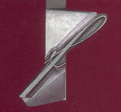
BTW metal fonts could have non-rectangular bounding boxes too... :-) This is from my 60pt Pascal. 0
0 -
@Hrant H. Papazian -- That type appears to have been cut down on a saw. Not factory at all.
1 -
In metal fonts it's called something like undercut or overlap.Hrant H. Papazian said:
BTW metal fonts could have non-rectangular bounding boxes too... :-) This is from my 60pt Pascal.
And they also used rhombic bodies for italic with wedges at begin and end of line, or change to upright font.1 -
Oh indeed. My letterpress teacher (Gerald Lange) always said you could tell how good a printer was by how much they mutilated their sorts. :-)George Thomas said:That type appears to have been cut down on a saw. Not factory at all.
@Helmut Wollmersdorfer Yes!
https://www.flickr.com/photos/36794629@N00/7525143030
Although the most dedicated ones used rectangles with *massive* kerns. Here's another cool thing from my collection:
2


Categories
- All Categories
- 47 Introductions
- 4K Typeface Design
- 495 Type Design Critiques
- 577 Type Design Software
- 1.1K Type Design Technique & Theory
- 671 Type Business
- 885 Font Technology
- 29 Punchcutting
- 539 Typography
- 125 Type Education
- 333 Type History
- 81 Type Resources
- 113 Lettering and Calligraphy
- 33 Lettering Critiques
- 80 Lettering Technique & Theory
- 569 Announcements
- 100 Events
- 116 Job Postings
- 170 Type Releases
- 182 Miscellaneous News
- 270 About TypeDrawers
- 54 TypeDrawers Announcements
- 114 Suggestions and Bug Reports