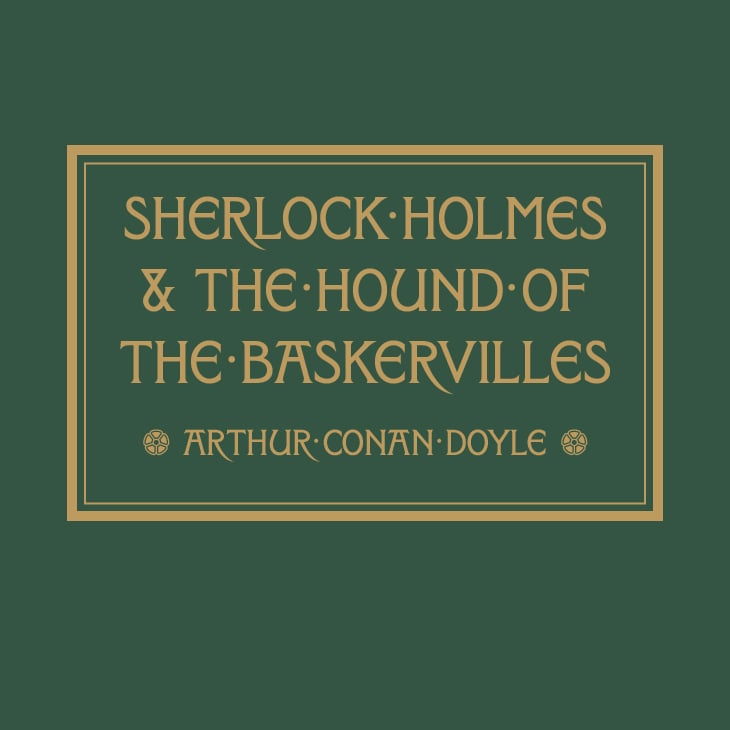
My first font... Show no mercy!
Ben Noe
Posts: 12
Just "finished" my first font and would really love your feedback.
Here's the backstory: In the 1890s, A.A. Turbayne designed several covers for the “Peacock” edition of illustrated novels published by Macmillan, You can view his work here:
Here's the backstory: In the 1890s, A.A. Turbayne designed several covers for the “Peacock” edition of illustrated novels published by Macmillan, You can view his work here:
https://drive.google.com/drive/folders/1H6E-LFDCvTb3bYjsfVoUT1yYJCqfdf4n?usp=sharing
A.A. Turbayne was a prestigious book designer working in London around the turn of the last century. In 1900 he won a bronze medal for bookbinding at the Exposition Universelle in Paris. An art director of the time asserted: “the designs of A. A. Turbayne come nearest to perfection”.
So… no pressure. This is my attempt at a digital revival of A.A. Turbayne's lettering. It's an all caps serif display face I call Turbayne Regular. (I'd like to add a few more widths and make this a family, but wanted to get these shapes right first) I couldn't find examples of several characters beyond the basic alphabet... so your direction here is most appreciated! And please don't hold back, I'd like this typeface to "come nearest to perfection". And if the great Thomas Phinney is reading this, I would cherish your sage wisdom above all!


0
Comments
-
Nice work!
A few thoughts:
1. U is relatively very wide. That's not necessarily a problem, but if you want to keep it this way, I'd consider making some other letters wider, to have more variability in width and so that U doesn't stand out so much. Natural candidates: C, D, G, O & Q.
2. Crossbars are quite high, and while I think that works in A & F, I don't think it works in E; it looks out of balance.
3. The G corner is too soft for such a sharp design, especially the inner part.
4.a. Diagonals in the directions of / (including the not-exactly-diagonal spine of 2) are too thick, while diagonals in the direction of \ are possibly too thin, at least in some cases. At the very least they should optically look the same thickness, which isn't the case at the moment (most notable in X).
4.b. Diagonals need some tapering in order to look right. Look at Y, for instance; it looks as if its arms are becoming thinner as they go up.
4.c. Usually the diagonal is the thinnest stroke of 4. Have you deliberately decided to break this rule?
2 -
In searching elsewhere, I finally found an example of Turbayne's ampersand, in "Macmillan & Co." on the spine. Indeed the top part was a triangle, but it seemed smaller than in your typeface. Otherwise, I can find little to criticize in your beautiful revival.Ah, the one I saw was from the spine of Gryll Grange; but your photos have ampersands too, which you followed.0
-
The "W" is a bit overbearing.1
-
Hello Ben,Wonderful work, in my opinion.I was wondering if the illustrations you provide are from your work or if some, like the "Sherlock" one are from Turbayne. I suspect they are yours.I'm revived several similar fonts from the same period. I found them in a book in Prague (Typo Ornament). For the moment, I'm finishing a third one.So, I know it's difficult to maintain the original design of these fonts, while applying the "rules", like they are sometimes defined by some "gurus".It's true we need some rules for good optical results but one can choose to be more faithful to the author of the original font. That's my choice. And maybe yours for the U.Otherwise I agree with the remarks of the other commentators and specially for the crossbar of the E which I should center a little bit more and why not completely.It's difficult to see on the "Macmillan's Illustrated..." image but I find some differences in the stroke endings of C, L and S.Good luck for the lowercases!

0 -
Excuse me but I was interrupted while joking with the lowercases.But with my present revival, it was also Caps only and incomplete like some of the alphabets of this period.And I began to create the missing letters, of which the lowercases. Nice exercise even if it's longer!0
-
This is lovely. Makes me feel like I’m browsing the rare books room at the Strand.
0 -
Exclamation points are ill-fitting--too rounded. I'd try widening the ampersand. Tails of commas/apostrophes/etc. need to be longer and more substantial. Ori's comment about diagonal thicknesses is spot-on.
And I'll say it: Obviously the /A is the signature glyph here, but I would look for ways to dial it back a bit. To me it interrupts every word in which it appears. Perhaps making the sides a little steeper would open up the top counter and reduce the top serif/bar's extension while allowing you to keep the high crossbar?0 -
Thank you everyone... you've given me a lot to think about and play with.
Ori Ben-Dor: I'll try lowering the crossbars, but also I don't want to lose the personality higher crossbars bring. I will play with the diagonal thickness, and will thin the diagonal on /4 for sure. And I'll play with the other suggestions you made.
Yves: To answer your question, the illustrations in this thread are not Turbayne originals, I designed them using the revival font. And thank you for your advice about staying true to the original! I'll take a look at those stroke endings.
Hrant- How would you make the W less overbearing?
Craig- I agree the ampersand needs to be widened and tails need to be longer and more substantial. Would you just to a straight cut on the top of the exclamation point? I referenced Turbayne's "Westward Ho" cover for this glyph: https://drive.google.com/file/d/1z7HxiEJJH3t8HKvDz3RkleW1e8F75AdT/view?usp=sharing
Also, thank you for the specificity in changes to the /A… this is an invaluable education to me! I'll try it out.
0 -
Either by cutting off one of the short arms in the middle (the right one if you want things conventional, the left՝ funky) or by making the middle an upside-down "v" (probably not reaching all the way to the top).Ben Noe said:How would you make the W less overbearing?0 -
A felicitous and apposite addition to the Universe of Storybook Fonts—one of my favorite genres. I cannot quibble with any of the thematic consistency constructive critiques put forth so far, but this particular genre shines rather than suffers from a somewhat naîve non-rigid formalism, which is common for this kind of typeface design twenty or so years either side of the turn of the twentieth century.After all, the subject matter is fanciful.0
-
Yes, charming!I agree with Ori on /U/ being wide and the high crossbar in /E/ not quite working out.I would add that the bowl of /R/ looks a bit droopy/flabby right now and could use some toning up.0
-
W: consider the lyre.1
Categories
- All Categories
- 46 Introductions
- 3.9K Typeface Design
- 489 Type Design Critiques
- 572 Type Design Software
- 1.1K Type Design Technique & Theory
- 664 Type Business
- 877 Font Technology
- 29 Punchcutting
- 530 Typography
- 121 Type Education
- 328 Type History
- 81 Type Resources
- 111 Lettering and Calligraphy
- 32 Lettering Critiques
- 79 Lettering Technique & Theory
- 562 Announcements
- 97 Events
- 116 Job Postings
- 169 Type Releases
- 179 Miscellaneous News
- 269 About TypeDrawers
- 53 TypeDrawers Announcements
- 114 Suggestions and Bug Reports


