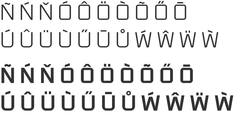
Sexy diacritics
Craig Rozynski
Posts: 29
Haha made you look :P
Worked on diacritics over the last few days trying to get an even balance. I found positioning of the mark so it's close enough to appear as one with its letter, but separate enough not to get clogged at small sizes quite challenging.
Some of the better resources I used:
'How not to draw accents' by David Jonathon Ross https://www.youtube.com/watch?v=-N--5Wg-2p4
'On Diacritics' by David Březina https://ilovetypography.com/2009/01/24/on-diacritics/
Pangrams in various languages http://clagnut.com/blog/2380/
And http://diacritics.typo.cz

For the capitals I'm foregoing consistent vertical positioning, shifting the mark up or down on a letter by letter basis. I have to do some proper proofing to see if this actually works or not.

All comments welcome
Worked on diacritics over the last few days trying to get an even balance. I found positioning of the mark so it's close enough to appear as one with its letter, but separate enough not to get clogged at small sizes quite challenging.
Some of the better resources I used:
'How not to draw accents' by David Jonathon Ross https://www.youtube.com/watch?v=-N--5Wg-2p4
'On Diacritics' by David Březina https://ilovetypography.com/2009/01/24/on-diacritics/
Pangrams in various languages http://clagnut.com/blog/2380/
And http://diacritics.typo.cz

For the capitals I'm foregoing consistent vertical positioning, shifting the mark up or down on a letter by letter basis. I have to do some proper proofing to see if this actually works or not.

All comments welcome
Tagged:
0
Comments
-
the c-ogonek is new to me … ?
3 -
@Andreas Stötzner Doesn't exist! Well spotted.0
-
Your /tilde, /ring, and /breve feel too organic for a mechanical/rigid typeface. I would borrow more shapes from the basic characters to produce those accents. The /breve, /macron and /tilde seem too inconsistent in width
The cedilla could use a little adjusting as well, perhaps so the the terminal and stem do not align vertically. Another solution could be to have terminal finish horizontally, like the /a or e/ does? /cedilla can follow which ever solution you choose.
/Macron and /Tilde sit a little low it appears on the Caps... maybe align more closely to the top of the dieresis accents?0 -
As this is not a text typeface, the clogging at small sizes may not be relevant.
I think the color of the diacritics is a bit uneven, e.g. the ring, dot, dieresis and hungarumlaut seem too light. (The dotaccent should usually be the same as the dot on the i, could you show a comparison, maybe together with descending and ascending letters?)
I like what happens with acute and grave, the vertical cuts. I would expect similar treatment in circumflex and caron.
Overall the accents should be more in style with the letters, for instance the ring could have the same construction as o. circumflex, caron, tilde and breve could be more geometric or mechanical.
For cedilla and ogonek, maybe consider a more simplified, geometric form.0 -
The accent and grave should be in the same style as the hungarumlaut, it should have better balance (the two acutes play off each other, so they should not be exactly the same). The macron is too heavy, the ogonek and cedilla not of the same color, the tilde needs more work, the breve is too big... try to squint your eyes and get an even gray picture. Also, the top diacritics are too close to the top part of the letters. In a font with a cap hight of 700 pt, I usually place them at 50 pt above the cardinal north point. I would slant the connector of the cedilla.
0 -
It has some use for the unencoded 'c with descender' that was used in Abkhaz and related languages. (It denotes an ejective affricate.)Andreas Stötzner said:the c-ogonek is new to me … ?
1 -
Overall the feedback was to bring the marks' style closer to the typeface. The update below is quick and dirty but hopefully is heading in a better direction.
@Joe Elwell Thanks for that well considered feedback
I've edited the tilde, ring and breve to suit the typeface better.
I've improved consistency in width for the breve, macron and tilde.
@Jens Kutilek Thanks Jens (big fan of Hertz).
I've fixed the dot accent positioning to match that of the i and used that as a base for vertically positioning the other marks. Unfortunately lost the acute and grave, thinking consistency with the umlaut more important.
@Vasil Stanev Thank you for that machine gun feedback
Lots of good points there. I've made the acute, grave and umlaut consistent and thank you for the advice on uppercase positioning, I will take that onboard.
1
Categories
- All Categories
- 46 Introductions
- 3.9K Typeface Design
- 489 Type Design Critiques
- 572 Type Design Software
- 1.1K Type Design Technique & Theory
- 659 Type Business
- 874 Font Technology
- 29 Punchcutting
- 528 Typography
- 121 Type Education
- 327 Type History
- 80 Type Resources
- 111 Lettering and Calligraphy
- 32 Lettering Critiques
- 79 Lettering Technique & Theory
- 560 Announcements
- 95 Events
- 116 Job Postings
- 169 Type Releases
- 179 Miscellaneous News
- 269 About TypeDrawers
- 53 TypeDrawers Announcements
- 114 Suggestions and Bug Reports


