MT Fournier, II
konrad ritter
Posts: 204
Dear experts,
I greatly value your knowledge and experience, and so I turn to you for advice. A bit of background. I'm a total novice, and I'm looking to very slightly change a font for my own, purely personal use in private. As I age, I've come to think I need to use fonts that are darker, and sharper against the white paper.
I have a question about MT Fournier. I like it, but would like to give it a bit more heft. To help explain what I mean, think of a text face that comes in 'grades' (e.g., Aria Text or Mercury Text). Let's say MT Fournier is Grade 1. I'd like to beef it up to a Grade 2 or 3.
I must rely on crude, rustic methods. Like, using the Effects action in Fontlab 5. Thicken the strokes by a few points, and that's it. (Go ahead, laugh. It's ridiculous, I get it, but I'm not looking to do art here. I'm just trying to change a leaking faucet in my kitchen, as it were. So, laugh away.)
Now for my question. Suppose I use the Effects/Bold action above. Should the number of points for the Vertical scale be the same as for the Horizontal scale? I mean, if I wish to thicken the stroke by 2 extra points on the horizontal, should I thicken it by 2 points vertically as well? Or is there some secret formula -- for ratios between H and V scales -- that I should learn?
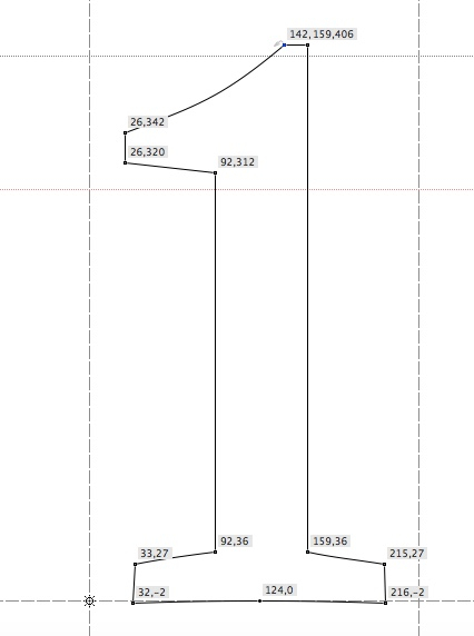
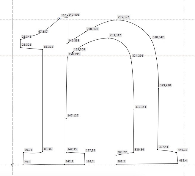
Again, my aim is to get something with the same average contrast as MT Fournier, just a bit darker. For edification, here's what the numbers look like, in the version you buy from MyFo. (BTW, the irregularity in the glyph position is theirs, not mine.)


Thank you kindly for any advice you may have for me!
I greatly value your knowledge and experience, and so I turn to you for advice. A bit of background. I'm a total novice, and I'm looking to very slightly change a font for my own, purely personal use in private. As I age, I've come to think I need to use fonts that are darker, and sharper against the white paper.
I have a question about MT Fournier. I like it, but would like to give it a bit more heft. To help explain what I mean, think of a text face that comes in 'grades' (e.g., Aria Text or Mercury Text). Let's say MT Fournier is Grade 1. I'd like to beef it up to a Grade 2 or 3.
I must rely on crude, rustic methods. Like, using the Effects action in Fontlab 5. Thicken the strokes by a few points, and that's it. (Go ahead, laugh. It's ridiculous, I get it, but I'm not looking to do art here. I'm just trying to change a leaking faucet in my kitchen, as it were. So, laugh away.)
Now for my question. Suppose I use the Effects/Bold action above. Should the number of points for the Vertical scale be the same as for the Horizontal scale? I mean, if I wish to thicken the stroke by 2 extra points on the horizontal, should I thicken it by 2 points vertically as well? Or is there some secret formula -- for ratios between H and V scales -- that I should learn?
Again, my aim is to get something with the same average contrast as MT Fournier, just a bit darker. For edification, here's what the numbers look like, in the version you buy from MyFo. (BTW, the irregularity in the glyph position is theirs, not mine.)


Thank you kindly for any advice you may have for me!
0
Comments
-
I think of "grades" as isometric additions or subtractions of heft (think of following the contour around its path but moving that contour a touch in or out). In the terms of Glyphs (the editing software I use), performing an Offset Curve. Changing the "weight," on the other hand, to me would involve more dramatic changes to the stems than to the hairlines.
So if you're really thinking about a change in grades, a mechanical effect that doesn't distinguish between horizontal and vertical should get you most of the way there.
I don't know, though: whether subtle parts of the design might get mangled in the process; whether vertical metrics would need to be reset; whether hinting would get thrown off; and whether such editing violates your EULA.
1 -
Thank you, Mr Eliason. I'll keep all of that in mind.0
-
If the editing of MT Fournier is not possible due to EULA restrictions or the work is too extensive for yourself I would check out Quinn. It is a modern interpretation of Fournier and it comes in two optical styles (display: 7 weights; and text 5 weights). In regards to color, I am not sure how the two would compare printed on a page but this could be a good alternative if this would be an option for yourself. It could be that the Semibold weight of the text style is what you are looking for?
https://www.boldmonday.com/typeface/quinn/
1 -
Thank you, yes. That's a great suggestion!0
-
-
Thank you, Mr Nolan. I have PS Fournier Petit, and I like it. Corundum is even better. It's in my regular rotation. But, there's something about MT Fournier that appeals to me above these alternatives. It's got a calmness to its presence that later revivals don't quite match. A sort of pleasingly being helpful.
For the fellow enthusiast: SwissTypefaces used to sell their own revival, New Fournier, no longer available. I expect they'll bring it back one day, in an upgraded form. A sample, below.
0 -
Also, Corundum seems to me a tacit hommage to Mathieu Cortat's Helvetius, which is an unorthodox Fournier he found in old books. Except for the lowercase J, which Cortat alone had the inspiration to give it a proper terminal.0
-
The concept of "grades" is new to me and I would like to learn more about it.
I also relied on FontLab's in-built effects (now in version 7) for changing weight. I find them to do a pretty good job and to be able to get one pretty far, of course later I have to manually clean and fine-tune the result.
I use the offset function, besides for Bezier sculpting in the everyday process of work, only in special cases like monoline fonts or more detailed characters like the @ symbol. In FL7, under the Tools/Actions menu path, there is an advanced type of bolding developed by the FL team, and a simple one used by other font editors, as displayed on the below screencap:
I think the two options with the offset and other ones could be quite enough to perfect your work. In all cases, the eyegauge is the best and most indespensible tool, and if this get's changed by age, then you're in the same class as some of the greatest typographers of all time. If memory serves, Bodoni was "accused" of using extremely white paper, to which he replied that, in this way, his printmaking will age better with all the centuries it has ahead of itself (smile)
You could find somebody younger to check the specimens but I see no mistakes thus far from what you've shown 1
1 -
Thank you, Mr Stanev, this is very helpful. I wasn't familiar with all the extra fancy new features in FL 7. Looks like that's what I need first.
And, yes, the eye must be the ultimate judge. Was it G.G. Lange who said, the real test for a new font is whether it looks right at 8 pts.0 -
Corundum seems to me a tacit hommage to Mathieu Cortat's HelvetiusNo. Corundum Text was designed before 2006 and was awarded a TDC award that year. Helvetius was released a full decade later, in 2016. I can’t rule out that Darden looked into similar sources as Cortat.2
-
Thank you for setting me straight. I take it back. Also, having looked at Helvetius recently, I see that Corundum is not really similar to it.
I think Cortat said he based it on an edition of Helvetius' De l'esprit. Must have been quite rare, I haven't been able to find it. OTOH, Helvetius made such a splash with that book, that it went through many editions and translations, so...0
Categories
- All Categories
- 46 Introductions
- 3.9K Typeface Design
- 489 Type Design Critiques
- 572 Type Design Software
- 1.1K Type Design Technique & Theory
- 659 Type Business
- 874 Font Technology
- 29 Punchcutting
- 528 Typography
- 121 Type Education
- 327 Type History
- 80 Type Resources
- 111 Lettering and Calligraphy
- 32 Lettering Critiques
- 79 Lettering Technique & Theory
- 560 Announcements
- 95 Events
- 116 Job Postings
- 169 Type Releases
- 179 Miscellaneous News
- 269 About TypeDrawers
- 53 TypeDrawers Announcements
- 114 Suggestions and Bug Reports


