MT Fournier digital, I

konrad ritter
Posts: 204
in Type History
I have two questions about MT Fournier. I'll ask here one, and post the other under another category, where it belongs.
I really like MTs version of Fournier. But, recently I took a closer look at its outlines, and I was struck by how irregular they are. For instance, here's the bottom half of the lowercase M:
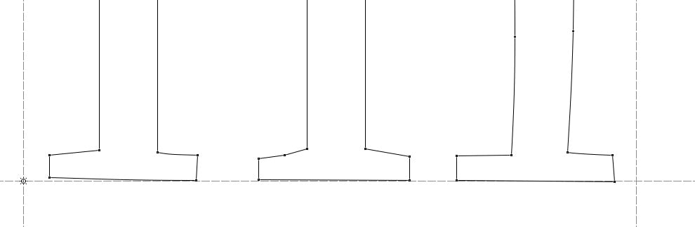
And here's the FI ligature glyph.

I was wondering, is this by design -- did Monotype mean to make them so unlike and irregular? Or is it just sloppy digitization? I saw some of that in old Berthold types, and I just assumes they were desperate to transfer things to digital before they'd go under. But, what gives, Monotype?
I really like MTs version of Fournier. But, recently I took a closer look at its outlines, and I was struck by how irregular they are. For instance, here's the bottom half of the lowercase M:
And here's the FI ligature glyph.
I was wondering, is this by design -- did Monotype mean to make them so unlike and irregular? Or is it just sloppy digitization? I saw some of that in old Berthold types, and I just assumes they were desperate to transfer things to digital before they'd go under. But, what gives, Monotype?
Tagged:
0
Comments
-
sloppy digitization
I have seen similar in fonts from other respected vendors. It's almost like they had anyone available, highly skilled or not, digitizing type so they could get them out the door quickest.
2 -
To play devil's advocate: do such inconsistencies lend a warm effect to the face, evoking hand-engraved and -punched fonts?0
-
I don't particularly mind them. There's a chance they do just that. (I think Mr Blokland saw that, when he and his crew cut DTL Van den Keere).
I was just curious about whether it's intentional or sloppy. Purely theoretical interest.0 -
I love the appearance of Fournier when properly typeset in a book, especially on soft uncoated stock where ink spread gives it a bit more heft. I always assumed the inconsistencies were deliberate, to give it the face its character, but then I'm only familiar with the digital version. If it was sloppy digitization, then the result was a happy accident. It would be interesting to "fix" it and compare the typeset result.
0


Categories
- All Categories
- 47 Introductions
- 4K Typeface Design
- 501 Type Design Critiques
- 592 Type Design Software
- 1.1K Type Design Technique & Theory
- 675 Type Business
- 908 Font Technology
- 29 Punchcutting
- 544 Typography
- 129 Type Education
- 333 Type History
- 82 Type Resources
- 114 Lettering and Calligraphy
- 33 Lettering Critiques
- 81 Lettering Technique & Theory
- 580 Announcements
- 101 Events
- 116 Job Postings
- 176 Type Releases
- 186 Miscellaneous News
- 270 About TypeDrawers
- 54 TypeDrawers Announcements
- 114 Suggestions and Bug Reports