Georgian Italic

Comments
-
Browsing this article on wikipedia, which seems representative, you see italic, but only a little. So it's not like you are the first to do it (no accidental invention), but it probably would not be a tremendous loss if you didn't include it.0
-
Daniel Benjamin Miller said:Browsing this article on wikipedia, which seems representative, you see italic, but only a little. So it's not like you are the first to do it (no accidental invention), but it probably would not be a tremendous loss if you didn't include it.Yes but aren't the articles on Wikipedia direct translations of English articles ? In which case wouldn't the emphasis have been copied from the original article ?I was hoping someone who knows the language and the culture could give me some insight.Whilst I was designing Kelvinch I looked at the website of an Iranian guy who had travelled in Georgia and took a lot of photographs of his travels, the site was in arabic (which I don't understand) but the photos showed a lot of signage and writing in Georgian on buildings, shops and delivery trucks.Among the photos of scenery, buildings and people there were many photos of a local market and each seller had signs painted in bright colours on what appeared to be small blackboards. I copied the style of the lettering from this but I don't remember seeing any examples of italic.Unfortunately the link to this site no longer works, it seems to be offline.1
-
Whether/how to provide a supporting style in a given script is a big question in non-Latin type, and remains unresolved (not necessarily a bad thing :-). Armenian for example doesn't have an "Italic" tradition, not least because we have a floating emphasis mark that can be placed on any vowel. And I haven't included one in Nour&Patria (yet :-). But Minion3 (which I was fortunate to consult on) does have it, and it's certainly not useless. The situation with Georgian is necessarily different, but the central issue for any script is this:
It's not a wasted effort, because: if you build it, they will come... The question is really: is it respectful towards Georgian? Because to me making anything is a responsibility, not simply a way to make money or express oneself.
If one does decide to add a supporting style, the question becomes: what should it look like? The first thought might be to parallel the difference between the Latin's Roman and Italic, but if one was doubting the necessity of an "Italic" for the non-Latin script to begin with, this is very unlikely to make sense. If one has paraphrased a different marking method for the Latin's Italic, the rationale for simply applying the same method to the non-Latin is very weak; just like the weakness of the rationale for applying the construction of the Latin's Roman to the non-Latin's primary style. This opens up interesting possibilities for supporting styles, unfettered by Latin. Possibilities that might even migrate back to Latin, enriching –even improving– its Italic traditions.1 -
I'd like to see the concept of italic unpicked, and reimplemented based on a conceptual rather than a stylistic understanding (which might in turn result in calling it something other than italic).
The fundamental thing about italics isn't that they're slanted, or that they're horizontally compressed, or that they exhibit cursive construction — all of which are accidents of speed inherited into type from Italian chancery script — but that they are a distinct, secondary style of type, conventionally used to articulate several different kinds of embedded textual information: emphatic stress, citation, foreign words. [Other scripts may already have different conventions for articulating some of these kinds of information, as Hrant notes with regard to emphatic stress in Armenian.] So what matters is that italics are distinct from the primary style of type in which they are embedded.
Now, if we have this idea of primary (surrounding) and secondary (embedded) styles — instead of the idea of roman and italic — then we can begin to see how typographic tools might be implemented in a different way. So, for example, we might have blocks of text marked up in terms of primary and secondary styles, rather than nominally roman and italic, such that they could be displayed using any suitable distinct styles. For example, if the primary style of text were displayed in italic type, the secondary style — for Latin script — could automatically be displayed in roman type, following established convention and/or user preferences. Or, if the text is set in blackletter type, the secondary style could automatically be letterspaced.
Instead, we have the I button, and people all over the world dutifully click it and expect their text will be slanted.6 -
My understanding of bold and italic are that they are two distinct forms of emphasis.Bold draws the readers eye to it because of the change in colour it stands out from the surrounding text.This is different from italic, if the type designer has done their job correctly it is the same colour as the surrounding text and does not draw the eye towards it, instead it sneaks up on the reader unnoticed until they are almost upon it.Perhaps styling the glyphs differently but something which is sympathetic to the style of the roman would be the way to go.There is certainly some mileage in this idea.1
-
On the one hand the "I" button is unfortunately named. On the other hand I think virtually all users of Latin type expect the text to slant (and really not necessarily much else) when they hit the button (even if it were labeled something else) and one would need a really good reason to go against that expectation. Also, few would want the headache of multiple buttons for different flavors of secondariness (although a "long-press" that exposes... secondary flavors is tantalizing) so I would say making the Italic of a Latin font slant is pretty solid.
The opportunity/risk/responsibility with non-Latin scripts is that most don't seem to have a firm expectation as with Latin (although those that are structurally similar arguably inherit the expectation of slant due to Latin's dominance filling a void) and in practice it's really up to the type designer to decide whether hitting "I" should do anything at all*, and if so, whether it should slant, or something else, or slant & something else. For example for Armenian I feel slant is fine (although cursiveness makes even less sense than in Latin) but for Ethiopian I remember @John Hudson stating that traditionally the color red is used for emphasis, and if color font technology is now reliable enough, that seems like a great option. Georgian is a hazier one for me.
* In FF Ernestine it doesn't affect the Armenian at all.1 -
@Paul Miller The typical Bold (especially since the precedent set by the MS Core Fonts in the late '90s) is indeed way too dark to serve for emphasis in running text, causing errant saccades from anywhere remotely near an application of it. A good Italic (at least one that relies on slant) can indeed reliably mark emphasis (or more accurately, secondariness) without distracting the reader, but I've long thought the cursiveness typical of conventional Italics introduces an arbitrary skew in the Roman's voice, generally going against the reason the typeface was chosen by the designer; this is why I prefer a (well-designed) oblique, like the wonderful one in Berthe. Even better in my mind however is choosing a demi (now far easier with variable fonts), which neither skews the voice nor distracts. Typo magazine did this to great effect; here's a sample from issue #13 using Patria:

Reining this all back on-topic, what I myself value in non-Latin "Italics" is an unbiased consideration of things like oblique and demi, where the latter might serve well for Georgian. And come to think of it, weight might also serve well as a secondary style for Thai, which is traditionally quite light in color (in addition to not having a tradition of slant).0 -
Paul Miller said:Daniel Benjamin Miller said:Browsing this article on wikipedia, which seems representative, you see italic, but only a little. So it's not like you are the first to do it (no accidental invention), but it probably would not be a tremendous loss if you didn't include it.Yes but aren't the articles on Wikipedia direct translations of English articles ? In which case wouldn't the emphasis have been copied from the original article ?I was hoping someone who knows the language and the culture could give me some insight.Whilst I was designing Kelvinch I looked at the website of an Iranian guy who had travelled in Georgia and took a lot of photographs of his travels, the site was in arabic (which I don't understand) but the photos showed a lot of signage and writing in Georgian on buildings, shops and delivery trucks.Among the photos of scenery, buildings and people there were many photos of a local market and each seller had signs painted in bright colours on what appeared to be small blackboards. I copied the style of the lettering from this but I don't remember seeing any examples of italic.Unfortunately the link to this site no longer works, it seems to be offline.
I am obviously not an expert. But no, they're not direct translations; all the different language versions of Wikipedia are independently written. They may be translated content at times but if so this is done manually. And the Georgian version is almost entirely written by native speakers, one assumes. So I take their usage as correct. But here for instance you only see sparing use in citations for example.
0 -
Looking at the style of Cadman I think an oblique might be appropriate. Thank you all for your comments.
") 1
1 -
Hi everyone,
I have read the full discussion and I wanted to share my opinion and the real situation about Georgian italic.
As I see there was some questions:1. Is italic actually used in Georgia?Well, the short answer is: of course yes.
Nowadays there are many magazines or other design materials where you can see italic. Everyone knows, even the children that there are Bold, italic, and these basic stuff.2. Is italic widely used in Georgia (we see less italic on wikipedia)Using italic is design decision and nothing more, it has nothing to do with grammar or spelling. I cannot say I see italic at many stuff but I can say the same for other languages which are using Latin script. Italic is not so important as weights for example. Of course it has another meaning for emphasis. But it is the same for Georgian as in Latin script. So italic is used but not so much, and same is in Latin. We can't judge it with Wikipedia articles, Wikipedia articles have also less italic if we see English or other Latin script articles.
3. Situation in Georgia in terms of italic typefacesThere are not many typefaces which include italic style, that's because of laziness. That is also because of modern apps, I mean some people use the automatic italic function and for Regular people there is no difference if your design italic and they will use it or they just click italic button and get the cursive forms. The regular people cannot see differences, that's true, whether we want to believe it or not. But it is not the Georgian specific issue. It's the same in other countries as well.
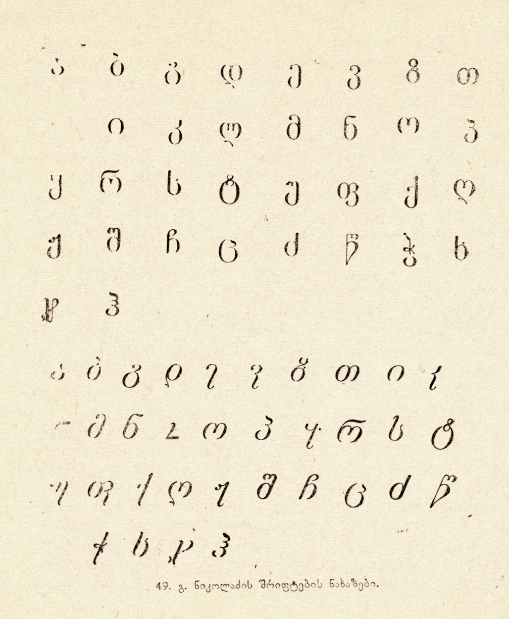
4. Historical insightsUntil 1801 there were only a few printing houses in Georgia, they had 2-3 typefaces without any variations, Only regular and some sizes. At that time it was very difficult to have many styles and variations. After that time, Russia invaded in Georgia and occupied the whole country, so the development has even delayed. At the and of the 19th century, there was ca. 8-10 typefaces, but only one of them had a bold weight. This typeface was used until 1980s. So because of large amounts of costs it was not a good idea to develop other styles for russian empire. In 1920s one designer Giorgi Nikoladze created italic forms for his typeface, it was truly italic forms, when characters forms are changing based on calligraphic principles, but Soviet regime does not liked it. They said it was capitalistic move and Soviet people does not needed any further costs. This is his typeface: https://i.imgur.com/bSTCLpg.jpg
5. What should Georgian italic look like?As we know there are basically 2 types of italic: The truly italic and just slanted, when it is just slanted everything is clear, but when it comes to truly italic, there are also some examples: https://www.fonts.com/font/linotype/sabon-georgian# This is the Georgian Sabon what I have designed for Monotype. Georgian characters maintain the historical practice, as well as the design style which Sabon has.
FiraGO is another example: https://bboxtype.com/typefaces/FiraGO
Now back to the question:
- If I do then would it be wasted effort to make an italic version for the italic members of the family?
If I would have an idea to make one complete typeface with every possible combinations, with weights and so one. I would make italic as well. But if I would have limited time and resources, I would make some weights and nothing more. But when I say that, it means not only for Georgian but in General and I mean the Latin script too.
If this typeface has different combinations including italic and you want to crate Georgian analogue of it, you should definitely create all these styles, otherwise it would be missing part of Georgian.
Hope it helps you all.8 -
Thank you @Akaki Razmadze for your comprehensive explanation, this is exactly what I wanted. 0
-
I thank you very much for the information; with the design by Georgi Nikoladze, at least there is a valid historical model for a "true italic" for Georgian.
0 -
Here's a blog entry from Ben Mitchell, who went to Thailand. He shows a slanting manuscript written on palm leaves. This gives a good precedent to create something like an Italic. The same thing happens to Khmer.Hrant H. Papazian said:'And come to think of it, weight might also serve well as a secondary style for Thai, which is traditionally quite light in color (in addition to not having a tradition of slant).'1 -
0


Categories
- All Categories
- 47 Introductions
- 4K Typeface Design
- 493 Type Design Critiques
- 575 Type Design Software
- 1.1K Type Design Technique & Theory
- 669 Type Business
- 884 Font Technology
- 29 Punchcutting
- 537 Typography
- 124 Type Education
- 332 Type History
- 81 Type Resources
- 113 Lettering and Calligraphy
- 33 Lettering Critiques
- 80 Lettering Technique & Theory
- 569 Announcements
- 100 Events
- 116 Job Postings
- 170 Type Releases
- 182 Miscellaneous News
- 270 About TypeDrawers
- 54 TypeDrawers Announcements
- 114 Suggestions and Bug Reports