Automated kerning by word image discrimination

Simon Cozens
Posts: 835
Many of you know I have been obsessed with the idea of automated spacing and kerning for the past couple of years, and in particular trying to train a neural network to kern a font. A few weeks ago, armed with the tools and knowledge I'd acquired over the different experiments, I tried a new approach, and I think it's giving interesting results. But I would like other people to try playing with it and letting me know if it's worth developing.
Here is the concept behind this latest approach: the idea of kerning is to create a word image with good rhythm and texture. And we can tell when a word image has good rhythm and texture and when it doesn't. So: create a huge number of word images, of the form "OH<left glyph><right glyph>HO". For some of these images, use the correct spacing from the font and label the image as "well kerned". This is image 219 from my corpus, which is labelled well kerned:

(I am only using a restricted set of letter pairs that I think have a good chance of being correctly kerned. Some of them still won't be perfect even then, but I'm hoping that over several hundred thousand word images, it'll average out.) For other images, alter the pair's spacing by a random amount, while keeping the "OH<left>" and "<right>HO" distances the same, and label the image as either "too loose" or "too tight". This is image 223, which is artificially made "too loose".

Next, feed these word images (and their labels) into a neural network until it can discriminate between pairs which are too loose, too tight or well kerned. I am also feeding the amount of perturbation into the network as well, so it can tell me how much it thinks the image has been perturbed (and therefore how much perturbation the other way will be needed to fix it).
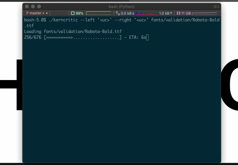
Once the network has been trained, you have a program which can look at a word image and tell you if it thinks it needs kerning and if so by how much. Here's a sample session with that program:
Obviously the next step, if we trust this thing, is to have it automatically make all the adjustments to the font that it finds necessary, rather than make the user go back to their font editor and do it by hand.
To me, that looks like it's making an improvement, but heck, what do I know; the reason I want automated kerning is because I'm really bad at seeing this stuff. What I would like is for people to try out the system on their fonts and let me know if it's helpful or if it's spewing out madness.
I've tried to make it easy: you will need Python 3, and then to clone or download the repository at https://github.com/simoncozens/atokern and follow the instructions in the README. Getting all the libraries installed may take a while but you only need to do that once.
I've identified a small bug in the rendering of the word images where there's a bit of "ink bleed", meaning that the network will think some images are tighter than they really are; so it might err on the side of suggesting things are too loose. I've fixed that but it will take a while to train a new model. It's currently trained on Latin a-zA-Z, but if it genuinely has learnt what makes a "good" word image and what makes a "bad" one, it should work for other glyphs which follow the Latin model.
Any feedback would be welcome!
Here is the concept behind this latest approach: the idea of kerning is to create a word image with good rhythm and texture. And we can tell when a word image has good rhythm and texture and when it doesn't. So: create a huge number of word images, of the form "OH<left glyph><right glyph>HO". For some of these images, use the correct spacing from the font and label the image as "well kerned". This is image 219 from my corpus, which is labelled well kerned:
(I am only using a restricted set of letter pairs that I think have a good chance of being correctly kerned. Some of them still won't be perfect even then, but I'm hoping that over several hundred thousand word images, it'll average out.) For other images, alter the pair's spacing by a random amount, while keeping the "OH<left>" and "<right>HO" distances the same, and label the image as either "too loose" or "too tight". This is image 223, which is artificially made "too loose".
Next, feed these word images (and their labels) into a neural network until it can discriminate between pairs which are too loose, too tight or well kerned. I am also feeding the amount of perturbation into the network as well, so it can tell me how much it thinks the image has been perturbed (and therefore how much perturbation the other way will be needed to fix it).
Once the network has been trained, you have a program which can look at a word image and tell you if it thinks it needs kerning and if so by how much. Here's a sample session with that program:
Obviously the next step, if we trust this thing, is to have it automatically make all the adjustments to the font that it finds necessary, rather than make the user go back to their font editor and do it by hand.
To me, that looks like it's making an improvement, but heck, what do I know; the reason I want automated kerning is because I'm really bad at seeing this stuff. What I would like is for people to try out the system on their fonts and let me know if it's helpful or if it's spewing out madness.
I've tried to make it easy: you will need Python 3, and then to clone or download the repository at https://github.com/simoncozens/atokern and follow the instructions in the README. Getting all the libraries installed may take a while but you only need to do that once.
I've identified a small bug in the rendering of the word images where there's a bit of "ink bleed", meaning that the network will think some images are tighter than they really are; so it might err on the side of suggesting things are too loose. I've fixed that but it will take a while to train a new model. It's currently trained on Latin a-zA-Z, but if it genuinely has learnt what makes a "good" word image and what makes a "bad" one, it should work for other glyphs which follow the Latin model.
Any feedback would be welcome!
0
Comments
-
Dear Simon,
your input, dedication and hard work are applaudable. I feel that many people from all walks of life would do good to take note and see the well-earned positive results!")
However (there is almost always a 'however'), I believe this is the kind of work that needs a trained artisan and professional and not machines. On your '219' image, the /g should definitely be more to the left, tucked underneath the /V. Type design is, at least for me, still an art, and kerning is inextricably bound to the letterforms. Since to draw letters is an art, it follows that so also is kerning.
Not being yet able to distinguish right from wrong kerning does not mean you have some sort of "negative space blindness". I also made mistakes once, like the classic one of kerning too tight, but with practice I reduced them to a passable, if not good degree. These things take time.
I see the advantages of your method in it being a stepping stone for tasks that really do need machine input. For example, I would really like to be able to keep an eye on kerning patterns across a family. It may be this technology already exists, I haven't checked. But kerning is and remains an art, and machine kerning can bring you a long way, but the final stretch of the road to the goal must be covered by skill. IMPO.0 -
Thanks, Vasil.
The thing is, image 219 used spacing from the font, not my spacing. I agree that the /g could be tucked under the /V a bit more, but the designers at Paratype (who designed and kerned the font used in that image, PT Serif) clearly think that it's acceptable - these things are always a little subjective. So I am using designs created by trained artisans and professionals. As I mentioned, I think over hundreds of thousands of images, the subjective differences will average out.1 -
Also, I did not quite understand if the source model is actual kerning from a real font or not. Because there are certain omissions and even mistakes in some fonts. For example, a Vg is an atypical letter combination in English, so it is fully possible the designer omitted kerning it, much like how most people do not kern lowercase to uppercase, or only some kern combinations like xf, yj, zx to save on the file size. My point is the model could be flawed. And, even deeper than that, kerning can very depending on context and purpose. One version of the font can be tightly kerned for display and commerce, some other one - for reading, where other principles apply. How do you know you are looking at the right one? ☺0
-
(Vanilla stuck your answer between my posts)
So it is a real font - OK, but I still think my points about omissions and context/display size have something to them. Not sure if averaging out is the best strategy - eager to see what the testers will have to say!0 -
much like how most people do not kern lowercase to uppercase, or only some kern combinations like xf, yj, zx to save on the file size
I said:
I am only using a restricted set of letter pairs that I think have a good chance of being correctly kerned.1 -

I think I know how to solve this, but in general I find github scripts assumes A LOT of prior knowledge that can quickly get a novice stranded. In this case, key information like where to place the script folder and fonts is not provided.0 -
FWIW, since Vg is an uncommon sequence, I would be more inclined to expect it not to be “correctly” kerned — either because the designer figured it didn’t matter, or because there are no good real-world contexts in which to verify the spacing.This particular detail shouldn’t have a bearing on your concept. But to the extent that the network may not be broadly trained yet, feeding such examples could skew the testing results in a way that would undermine the conceptual approach.
2 -
Vganda is a moſt beavtifvl covntry.0
-
Vganda is a moſt beavtifvl covntry.

0


Categories
- All Categories
- 46 Introductions
- 3.9K Typeface Design
- 491 Type Design Critiques
- 572 Type Design Software
- 1.1K Type Design Technique & Theory
- 667 Type Business
- 878 Font Technology
- 29 Punchcutting
- 533 Typography
- 122 Type Education
- 330 Type History
- 81 Type Resources
- 112 Lettering and Calligraphy
- 32 Lettering Critiques
- 80 Lettering Technique & Theory
- 563 Announcements
- 97 Events
- 116 Job Postings
- 169 Type Releases
- 180 Miscellaneous News
- 270 About TypeDrawers
- 54 TypeDrawers Announcements
- 114 Suggestions and Bug Reports