Ligatures for Cyrillic

Bhikkhu Pesala
Posts: 210
Someone on the High-Logic forums is asking how to create ligatures for Cyrillic. This can be done easily enough, though it is not automated yet. In FontCreator one can generate the common Alphabetic Presentation forms as composites of existing glyphs. Many less common Latin ligatures like ct, ck, it, ip, fb, etc., can also be generated.
How common are ligatures in Cyrillic Typography and which letter pairs or triplets are found in existing fonts.
How common are ligatures in Cyrillic Typography and which letter pairs or triplets are found in existing fonts.
0
Comments
-
Aren't they common (if not necessarily touching) in Vyaz?0
-
As far as I know, coming from a non-native Cyrillic designer, the /ї_ї pair could be made into a ligature by having 3 dots instead of 4. Having said that I know that there is some controversy over whether or not this is the best solution.0
-
The user asked how to create ligatures for сс, вд, др, etc.0
-
I remember something about this, but can't tack it down. I recall the usual museum guards were exclaiming: "Verboten!"Connor Davenport said:As far as I know, coming from a non-native Cyrillic designer, the /ї_ї pair could be made into a ligature by having 3 dots instead of 4. Having said that I know that there is some controversy over whether or not this is the best solution.1 -
Hrant, you may be remembering a discussion of Latin ïï, which by itself is a common word somewhere, if I recall correctly.It sounds to me like the user is making a cursive. Cursive always brings up a lot of unexpected pairs. I don't think modern "roman" Cyrillic demands any ordinarily, but a ligature you may see sometimes is ДД/дд which can share one long base with just the spur on each end.1
-
Thanks for the feedback. It does not seem worthwhile implementing any automation for Cyrillic ligatures as they are not a common or standard requirement. Those who want to use them can do it manually however they wish.0
-
The following applies to the Cyrillic of European countries that I know best:
Cyrillic ligatures are not terribly common, except, of course, when you make swashes and/or cursive and have to connect letters or, more commonly, tone down a wild swash of some .alt. Or you have special forms for the end of the word, like an /a with a long tail. So it's translates mostly to "how can I make a ligature between two .alts or an .alt and a letter that will work in most cases". This is a coding question, outside of this special case, I can momentarily think of no everyday examples.
Hrant, Вязъ is a liturgical style and already developed enough in a small family of fonts you can look up. Discussing it is like discussing the problems of Carolingian minuscule or the project for Medieval ligatures - broad but niche.
2 -
Absurd Weird. Where have you seen this??K Pease said:ДД/дд which can share one long base with just the spur on each end.
https://wordhelp.ru/contains/%D0%B4%D0%B4
In Russian (I am not a Russian) such words are either of foreign origin (Buddha, luddite) or such that a prefix ending in -д is followed by another morpheme starting with д-. Mashing the two together contradicts this basic principle and would actually slow down reading as the brain tries to figure it out. It would be like removing the periodcentered from Catalan. A disservice.1 -
It exists in vyaz, of course, but I was sure I'd seen it in contemporary things too. Until I find such a thing again I defer to your greater knowledge.
0 -
I do not know much about Cyrillic. For this reason, I asked Sergiy Tkachenko from 4th February Foundry in Ukraine, to add Cyrillics to a font of mine—when I had a request for this. The ligatures he added for Cyrillic, may be helpful for this discussion.
He added only these three ligatures:
uni0457_uni0457
uni0407_uni0407
quoteright_uni0457
He added this OpenType feature code for these ligatures:
sub uni0457 uni0457 by uni0457_uni0457;
sub uni0407 uni0407 by uni0407_uni0407;
sub quoteright uni0457 by quoteright_uni0457;
sub quotesingle uni0457 by quoteright_uni0457;
 1
1 -
Not sure about that third one...
For one thing it looks like a ceiling panel hitting a guy. :-)1 -
Good point, punctuation and non-alphabetical glyphs have to also be taken into consideration.Ben Blom said:sub quotesingle uni0457 by quoteright_uni0457;
1 -
Do they? I don't think I've ever seen a compelling example of a letter-to-nonletter ligature.
0 -
Almost exclusively in scripts, almost never outside of them. Sometimes the letter intrudes over the period and into the word space, sometimes it will fight with the question, punctuation or quatation mark, or the other symbols. These are special cases, so they are rarely obvious. The below is perhaps not the best example but I am too lazy to search for the really weird ones I remember from back when.

0 -
https://www.fonts.com/font/paratype/pushkin/script-high
________
An upright д_д ligature seems as weird to me as a d_d ligature. But I could be wrong.
0 -
Well of course it's largely a matter of taste, and you might mean in running text which is harder to pull off, but the old Jeni's ice cream logo for one had a wonderful fusion of the tittle and apostrophe. Sadly the redesign did away with it. Also, imagine if the below were a Vietnamese food business... :-)Craig Eliason said:Do they? I don't think I've ever seen a compelling example of a letter-to-nonletter ligature.
0 -
It could be useful for making warning signs.Hrant H. Papazian said:Not sure about that third one...
For one thing it looks like a ceiling panel hitting a guy. :-)
André1 -

0 -
I wonder what people do in handwriting? Just a single slash above two stems?
0 -
That’s logo design, not type design.Hrant H. Papazian said:
Well of course it's largely a matter of taste, and you might mean in running text which is harder to pull off, but the old Jeni's ice cream logo for one had a wonderful fusion of the tittle and apostrophe. Sadly the redesign did away with it. Also, imagine if the below were a Vietnamese food business... :-)Craig Eliason said:Do they? I don't think I've ever seen a compelling example of a letter-to-nonletter ligature.1 -
Indeed, but it does show what might be just as possible in type.Craig Eliason said:
That’s logo design, not type design.1 -
Quite right, in Cyrillic fonts there is no tradition to use ligatures. However, in the last harm Cyrillic designers are gradually experimenting with this. Accordingly, we are not talking about standard ligatures. It is better to pay attention to the correct spelling of Cyrillic characters.Vasil Stanev said:Cyrillic ligatures are not terribly common")
0 -
There are two letters in Bosnian, Macedonian and Serbian Cyrillic alphabets—Љ, љ (U+0409, U+0459) and Њ, њ (U+040A, U+045A), that originated as ligatures (Л+Ь, Н+Ь) in 1818.
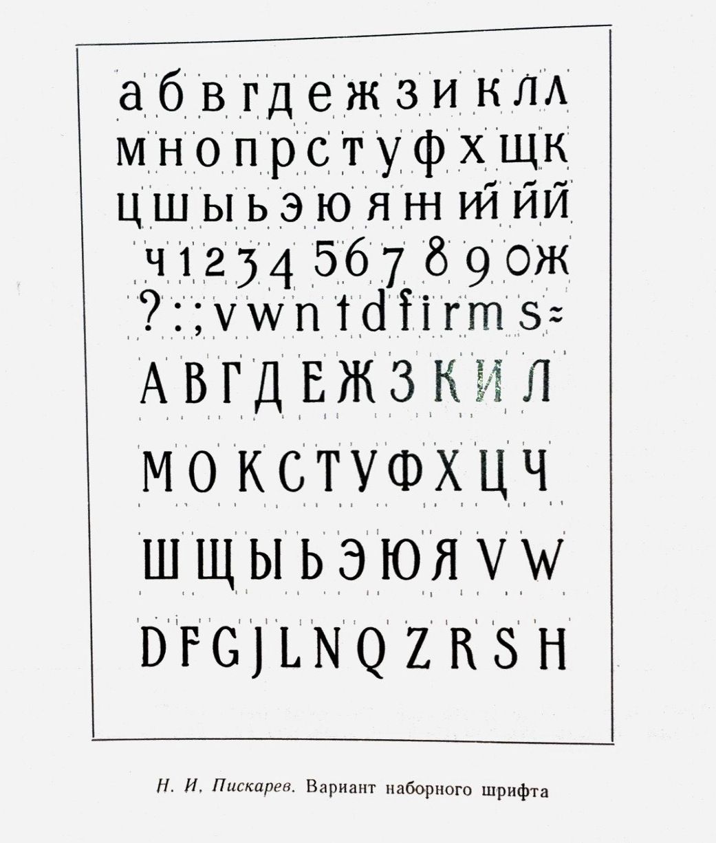
There had been some occasional attempts at introducing stylistic ligatures into Russian typography, e.g. ий and нн. This one ⬇︎ dated 1928–1929, was proposed by Nikolay Piskarev: And, predictably, there are quite a few stylistic ligatures in Cyrillic version of Avant Garde Gothic. Go to: Glyphs > No Unicode.
The three-tittle Ukrainian ї+ї is there too.5 -
See samples for cyrillic ligatures in ITC Avant Garde Gothic, Big City Grotesk and Belladonna here - http://typoholic.ru/type/ligatures.htmlAnd about ’ї - some words in Ukrainian have this combination, as example - пір'їна.However, ligatures are used very rarely. Unfortunately, our designers have no culture of using ligatures. They pay little attention to these things - they can only beat them in advertising. And many customers need to separate the Latin ligatures, because they can not read.
2


Categories
- All Categories
- 47 Introductions
- 4K Typeface Design
- 493 Type Design Critiques
- 575 Type Design Software
- 1.1K Type Design Technique & Theory
- 669 Type Business
- 884 Font Technology
- 29 Punchcutting
- 537 Typography
- 124 Type Education
- 332 Type History
- 81 Type Resources
- 113 Lettering and Calligraphy
- 33 Lettering Critiques
- 80 Lettering Technique & Theory
- 569 Announcements
- 100 Events
- 116 Job Postings
- 170 Type Releases
- 182 Miscellaneous News
- 270 About TypeDrawers
- 54 TypeDrawers Announcements
- 114 Suggestions and Bug Reports