Parametric vs Interpolated fonts

Ana Fernandes
Posts: 13
Hi,
I'm currently studying about parametric fonts and interpolated fonts, and there's something that I can't quite understand. In his article, James Shimada (2006*) says that Multiple Master and TrueType GX fonts are a form of parameterized outlines. These are the same as parametric fonts?
Parametric fonts are a sort of automated design, but can be Multiple Master and TrueType GX parametric fonts either?
Thank you
*https://courses.cs.washington.edu/courses/csep590/06au/projects/font-wars.pdf
Tagged:
1
Comments
-
Parametric means the outlines are a result of calculations based on variables. Interpolated is at a lower level: outlines are "canned" instances between designed masters.2
-
Parametric fonts are not really “automated design,” in my opinion. They are a label for a group of technologies.
An individual parametric font is a font which can be varied within some parameters. Although no doubt some day the design portion will be automated, today there is still actual design done by a human to create each parameterized font.
In some parametric technologies (for example, Font Chameleon), an individual font once set up can then be varied even in ways beyond what the designer explicitly dealt with in detail. But even then it is only because that capability was baked in from the beginning. In most parametric technologies, the designer has to explicitly create each design axis. (Yes, slight simplification. One can for instance use a weight axis plus anisotropic interpolation to create a first draft of a width or contrast axis. But most axes are not so easy to get to—and even when they are, they usually need fixing after the initial creation.)
Depending on the model, it is sometimes possible (for example in GX and OpenType Variations) to have axes that interact beyond what the designer has explicitly explored and controlled. However, absent great care by the designer, this may result in corners of the design space that have... problems.
I have worked a fair bit with parametric fonts, going back to my Master’s thesis in this area twenty years ago. Currently wrestling with a five-axis parametric font. It is simultaneously fun and painful!5 -
Thank you both for the answers. They were helpful
") Depending on the model, it is sometimes possible (for example in GX and OpenType Variations) to have axes that interact beyond what the designer has explicitly explored and controlled.
Depending on the model, it is sometimes possible (for example in GX and OpenType Variations) to have axes that interact beyond what the designer has explicitly explored and controlled.
GX and OpenType Font Variations are both hint-based, right? The designer designs a single master and establishes a maximum value for point positions and then the values are interpolated to get instances. How can the designer have axes that interact beyond what he has explicitly explored and controlled?0 -
The designer designs all the masters they want to, and designates one as the default. In the compiled font, the other masters are represented by deltas to the point positions. Values are in essence interpolated (or created by vector addition if not between the master designs, for example if the masters are not in the corners of the design space).
Most parametric font technologies don't really abstract a whole lot of font things as parameters without also having some more concrete handling of font outlines as vectors, which at least some of the time is in effect using interpolation.
Sure, the reality is that GX/OTvar is all vector addition, with appropriate weighting factors. But that is hard for most of us to wrap our brains around. So I like to talk about interpolation in those situations where the two are synonymous.
So what that means is that in GX/OTvar, if I design a regular master in the middle, and also:
- Condensed
- Expanded
- Thin
- Black
... then a “black condensed” can be created by vector addition. You could call it extrapolation, but it is within the design space defined by the black and condensed masters.
As for what I mean by the designer not having explicitly explored/controlled... maybe they didn’t test every single glyph carefully in every corner of the design space. Let's say the x-direction width of the top counter of the three.sups glyph (superscript 3) is 100 in the regular, 45 in the black (a -55 delta), and 40 in the condensed (a -60 delta). How wide will that counter be in a black condensed style formed by the vector addition? Well, 100-55-40... = -15. So, it will have turned inside out and there won’t be a counter. Oops.
Now, with just two axes, probably the designer will have seen and tested all four corners of the design space. But what if, as I am right now, the designer is working in a five-axis design space? That's like a 5-d hyper-hyper-cube, and has 32 corners. That is an awful lot of testing. Good chance something could be missed.
A couple of side notes on wording:
I am not clear on what you mean by “hint-based” but I am pretty sure it has little to do with hints as I know them. Hints are a nice feature in variable fonts, but have the same effects they do in non-variable fonts—they do not drive the technology, nor are a critical part of any parametric font technology that I know of. In theory, they could have been at one time. People might have even written about the idea, 20 years ago. But the use of hint information by rendering systems has become massively variable due to advances in, and differences between, rendering systems. So I think opportunities in that area are mostly gone.
Also, the actual title of this thread seems like it might reflect a different usage or understanding of the main words involved: “Parametric vs Interpolated fonts.” Interpolation is one type of parametric font capability: interpolated fonts are a subset of parametric fonts. Not so much a “versus” situation, to me.
6 -
I talked about "hint-based", because I read that TrueType GX technology used hinting and instructions to move points:
"(...) Our initial attempts to create variations from a default font were to use the TrueType instructions themselves. The thinking was that most of the features we wanted to vary between (a Regular and a Bold, or a Regular and a Condensed) were captured in the instructions that controlled elements like stem weights, serif lengths and thickness, heights and alignments, and so on. But while we could create variants that looked bolder, or more condensed, the designers among us always wanted to tweak something in the shape in a way that the basic TrueType instructions did not allow. Then Mike considered the Delta instruction. (...)" Tom Rickner, 2016*a
and in the conference he gave in Typo Berlin, he said:
"We tried to create Times Bold out of the Roman. And we tried to do this with hints, with instructions. So, code. We are not drawing this. We are trying to describe the changes in certain parameters.” Tom Rickner, 2016*b (This was one of the things that confused me with parametric fonts)
So, if I understood correctly, first, they started using the hints and then considered the delta instruction that move points in any direction (not just x or y) with vectors. But isn't the delta instruction considered a hint?
So:The designer designs all the masters they want to, and designates one as the default. In the compiled font, the other masters are represented by deltas to the point positions. Values are in essence interpolated (or created by vector addition if not between the master designs, for example if the masters are not in the corners of the design space).
(...)
So what that means is that in GX/OTvar, if I design a regular master in the middle, and also:
- Condensed
- Expanded
- Thin
- Black
... then a “black condensed” can be created by vector addition. You could call it extrapolation, but it is within the design space defined by the black and condensed masters.
- Besides the master, that needs to have complete outline data, the designer has to provide the extreme values, and then the values are interpolated.
- And if the designer needs a black condensed, values from the master, the black and condensed versions are interpolated.
I'm correct?
And is the same process in GX and OTVar?
*a https://www.monotype.com/resources/articles/part-1-from-truetype-gx-to-variable-fonts/
*b https://www.typotalks.com/videos/truetype-variations-past-present-and-future/0 -
There were occasional radical things done with hints way back in the early 90s though. There was a decorative kind of inline-blackletter in one of the Microsoft TrueType Font Packs that suppressed its inline effect at smaller sizes. That was nicely done.
What I understand Tom Rickner as saying was that they tried doing other font styling changes (e.g. weight) with hints, but did not get results they were happy enough with. Again, this was 20+ years ago.
As I said above, since modern rasterizers do things such as selectively ignoring all hints in one direction (some versions of ClearType), or ignoring all hints whatsoever (Apple at most sizes), using hinting to achieve font variation is not a viable solution today, and hasn't been for ~20 years.
Yes, delta hints are a form of hinting.- Besides the master, that needs to have complete outline data, the designer has to provide the extreme values, and then the values are interpolated.
There needs to be one master that has complete outline data. From a design perspective, other masters are also handled as outline data. From a data storage perspective, they are done by means of deltas to the default master.
Values may be either interpolated, or determined by vector addition; see below.- And if the designer needs a black condensed, values from the master, the black and condensed versions are interpolated.
I would have thought that is not interpolation, but vector addition. Certainly in this example, the black condensed is not in between the other masters.And is the same process in GX and OTVar?In broad aspects, very much so. OTVar is based on what GX did, with some tweaks and additions.
0 -
I've heard of those old efforts of hinting to make optical sizes, which I've always thought made superb sense. Shame if there really is a hitch.0
-
Well, they would always have been screen-only. And wouldn't work at all on OS X and some flavors of Android. So I think there is more than one hitch.2
-
I didn't find any visual software to do these fonts (MM and TTVariations). To create interpolation between masters, exist softwares like Superpolator, MutatorMath, etc, and actually font editing softwares like Glyphs and Robofont also allows interpolation between masters.
MM and TTVariations had some visual software to create the variations?
0 -
Multiple Master fonts are/were supported by older versions of FontLab (4 and 5) and Fontographer (3.5 and 4) and other apps.
I am not sure which you mean when you say TTVariations.
The TrueType flavor of OT Variations are supported by FontLab VI and Glyphs.
GX Variations, which were generally TrueType, would have been supported by some of Apple’s old tools. They were generally command-line based and not visual, in terms of building the fonts. One would have had to test them separately from what one used to build them. (That was generally true for just about anything to do with Apple’s tool chain for fonts.)
0 -
I am not sure which you mean when you say TTVariations.
(...)
GX Variations, which were generally TrueType, would have been supported by some of Apple’s old tools. They were generally command-line based and not visual, in terms of building the fonts. One would have had to test them separately from what one used to build them. (That was generally true for just about anything to do with Apple’s tool chain for fonts.)
I frequently find the two terms: TrueType GX and TrueType Variations. And that GX Fonts are not necessarily TrueType. I thought that TrueType Variations was part of TrueType GX that resulted from a combination of this variation technology with layout technology, the QuickDraw GX model.0 -
Like OpenType, TrueType GX is an extension of TrueType. Both have additional tables to extend functionality. In the case of TrueType GX, the format was only supported on Apple devices, not cross-platform. TrueType Variations adopts the TrueType GX tables related to font variations.
QuickDraw GX was a page description language intended to be an alternative to PostScript that debuted along side TrueType GX.1 -
There are a couple of things.
"GX Variations" is a small subset group of all "GX Fonts." GX Fonts in general could have either TrueType or PostScript outlines. But GX Variations I think were strictly for TrueType outlines. If I recall correctly. So, TrueType Variations would be a reasonable label....
GX typography, later re-branded Apple Advanced Typography (AAT) was about a wide range of advanced typographic functionality, rather like OpenType (except initially without cross-platform font files). It took advantage of fonts with the GX tables, in either flavor.
It may be that GX Variations were re-labeled as TrueType Variations at the same time GX Typography got re-branded as AAT. Since development of the Variations fonts was pretty non-existent after that point, and the format was spottily supported, I might have missed it.0 -
Thank you all, it was a precious help 0
-
@Thomas Phinney There's just one thing I can't quite understand yet. Sorry to ask this again, but just for sure, when we talk about TrueType GX, we talk about gvar deltas (as used in OTVar) or TT Delta instructions? Or are they the same?0
-
They are different. In fact, they have very little to do with each other.
Normal TT delta instructions are a type of hinting. They are hints that are specific to a particular pixel-per-em (ppem) size or sizes or range of sizes, which move a point at that size. Some renderers or rendering modes ignore them entirely, or ignore them at normal sizes, notably Apple.
gvar deltas are essentially the mechanism for how the master designs of each glyph are stored in the variable font (whether GX or OT). Instead of storing a complete glyph in a duplicate glyph table, the gvar table stores the difference between the default version of that glyph and a particular alternative master. They do so by storing the “delta” between the point position in the default master, and the desired position in the new/current master being defined. Points that are not specified will be interpolated, so not every single point needs to be specified. All this makes for compact storage of the data.
TrueType GX fonts could be Variations fonts (with gvar table) or not.
A variable font with TT outlines, whether the old GX flavor or a new OpenType flavor, will have a gvar table. A non-variable font, including a non-variable TT GX font, will not.
1 -
Thank you!0
-
At the Typo Paris 2018 conference, David Berlow introduced the term panametric type, noting that he used the OpenType Font Variations technology to get axes that support one variation at a time. And by changing one element at a time, you can join those changes, allowing the user to go anywhere in the design space. From this perspective were born Decovar and Amstelvar.Since in this technology all the changes have to go through the complete set of outlines, and the instances are obtained from these outlines plus deltas, how is it possible to have independent variations that can be combined in ways like Decovar in which changes do not interfere with each other?
Thank You0 -
It is just a question of how you choose to design a given axis. If you have a weight axis that keeps advance width or outside-of-contour black width constant, that is up to you as a designer. Of course, in Berlow's case, he has special names for this approach where an axis carefully only changes one thing: x-transparent, x-opaque, y-transparent, y-opaque. Amstelvar (but not Decovar) exemplifies this approach.
I think the little animation from Dave Crossland (davelab6) on Dec 18, 2017 in this thread shows nicely how the Berlovian approach differs from, say, a traditional x-height axis: https://github.com/Microsoft/OpenTypeDesignVariationAxisTags/issues/22
Quite separately from this, Decovar uses axes to do a bunch of independent decorative effects. This is really entirely unrelated.
I am sorry I simply don’t understand the “how is it possible” question, here.
Put most simply, the delta approach works geometrically geometrically and mathematically. You start with a point at a given coordinate. Going to the max on axis 1 might move it +50 in X and -20 in Y. And then going to the max on Axis 2 might move it -100 X and -100 Y. So going to the max on both axes would move that point -50 X and -120 Y.
If you have an x-height axis that does not affect width, and a width axis that does not affect x-height, but you then change values on both axes, then yes, both x-height and width will be affected.
Those changes are much more interactive with each other, often affecting the same points, than some of the Decovar axes—which are often doing deltas on unique points that are unaffected by other axes.0 -
(...) than some of the Decovar axes—which are often doing deltas on unique points that are unaffected by other axes.
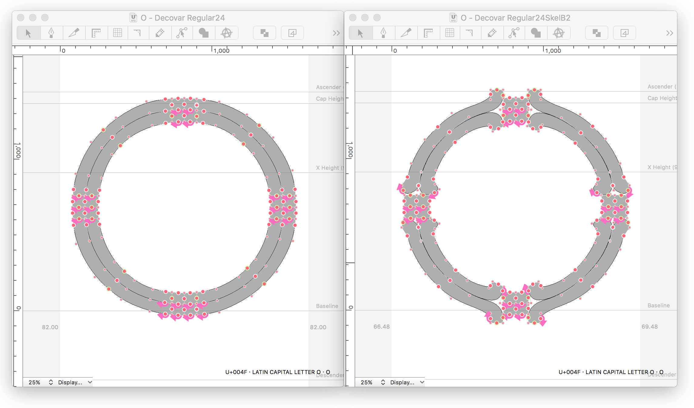
The structure is divided in two parts: skeleton and terminals. Of course as with every variable font is just not a case of fishing with the axes. There should always be weighted choices. But in Decovar its not just a case of bad choices. Some of the axes can be in conflict with each other:
This happens because the axes are not related? (i.e. It's not like when we have a weight axis that does not affect the width and width axis that does not affect the weight but when someone choose an instance somewhere in the design space, like a bold condensed, these are obtained through combined values - the associated deltas and vector addiction)
In Decovar is a bit different. The structure of the glyphs was specially created thinking in this type of singular variations and basically for each independent variation axis (Inline, Sheared, Rounded slab, etc) he has the points he needs and the associated deltas that move points through vectors. But in Decovar case, all (or a large part) of the variations are independent from each other (i.e the variations are not combined like in the bold condensed case, they are added). Am I correct?
1 -
Decovar — like Amstelvar — is a proof of concept, showing what it is possible to do in the design space using a parametric approach. It exposes, as you have noted, limitations in the current OT variations model in that there is currently no way to map the relationships between low-level parametric and high-level non-parametric axes. This means that it is easy for a user to manipulate the parametric axes in ways that produce visually bad results; whereas, what one wants is for the user to manipulate the higher level axes to affect the parametric axes in constrained relationships.1
-
This is also a consequence of having axes whose masters each fall in the middle of one side of the design space, instead of in the corners.
On the plus side, masters-in-the-corners can be done with as few as n + 1 masters, where n is the number of axes. But it is much trickier to control the interactions. You cannot really, you can just limit how extreme your changes are for each master, and what they affect.
A powerful but “expensive” alternative is to use masters in the corners of the design space. This gives vastly more control over axis interactions! But the cost is in the number of masters: it requires n^2 masters.
For 3 axes it is just 4 masters vs 8. But for 4 axes it is 5 masters vs 16. With 10 axes it is 11 masters vs 1024. Clearly one of these approaches is more scalable than the other.2 -
Unlike the "slide-o-maniacs" that have emerged with the technology of variable fonts, David Berlow (2019) refers "Today, I can make fonts that help". Thus, on the part of the type designers, Berlow reinforces the importance of controlling what is delivered to the user, noting that some of the variations should happen automatically.On the other hand, who compose the type professionally, the graphic designer, is only accustomed to decide within some variables such as body size, weight and width. One of the problems of this kind of technology, as happened with Multiple Masters (which also bet on these "more basic" variations) is the lack of knowledge on the part of the graphic designer/user to be able to make effective use of the graphic possibilities, that ended up using the instances pre-defined by the type designer.- What do you think should be the attitude on the part of graphic designers in face of these new possibilities that this technology allow? Should there be collaborative work? Should the graphic designer be taught in any way?- Will these technologies bring any advantage to graphic designers? Or are these advantages only for programmers, web designers and the final user (not designer)?0


Categories
- All Categories
- 47 Introductions
- 4K Typeface Design
- 495 Type Design Critiques
- 577 Type Design Software
- 1.1K Type Design Technique & Theory
- 670 Type Business
- 885 Font Technology
- 29 Punchcutting
- 539 Typography
- 125 Type Education
- 333 Type History
- 81 Type Resources
- 113 Lettering and Calligraphy
- 33 Lettering Critiques
- 80 Lettering Technique & Theory
- 569 Announcements
- 100 Events
- 116 Job Postings
- 170 Type Releases
- 182 Miscellaneous News
- 270 About TypeDrawers
- 54 TypeDrawers Announcements
- 114 Suggestions and Bug Reports