Too much tracking in Google Material Design?

J Brian Crain
Posts: 4
I am currently working on an enterprise-scale web app and my team lead is wanting to follow Google's Material Design System verbatim. I think the Material system is a good starting point, but there is one specific typographic guideline that doesn't sit right with me, and I need to "prove" that we need to make an adjustment.
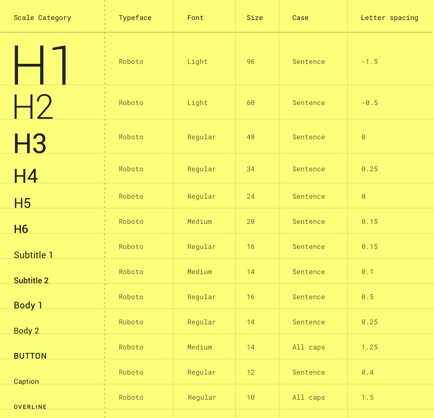
So in Material's type guide they offer this type system. For the most part, I think it works pretty well, but there are several instances where I think way too much tracking is added. Specifically, for Body 1, it is specified as 0.5 for letter spacing (tracking). I'm not sure the exact dimension tied to that, but it's the measurement used in Sketch. Below is a mockup showing Roboto 16 px text set with the Material tracking dimension (0.5) on the left and no additional tracking on the right.

So in Material's type guide they offer this type system. For the most part, I think it works pretty well, but there are several instances where I think way too much tracking is added. Specifically, for Body 1, it is specified as 0.5 for letter spacing (tracking). I'm not sure the exact dimension tied to that, but it's the measurement used in Sketch. Below is a mockup showing Roboto 16 px text set with the Material tracking dimension (0.5) on the left and no additional tracking on the right.
Edit: Screenshot is displayed smaller than actual size, so be sure to click on it for viewing at actual size.
In my experience the Material tracking is way too spaced out. You could drive a few small barges up through there. No tracking appears to be best to me. Additionally, my understanding of adding tracking to sentence case text is only when it’s at very small sizes. This does not seem like a very small size — especially since it’s their recommended size for body copy.
So to sum up my questions:
- Does the 0.5 tracked out text in my example look incorrect, thus making it less legible?
- What are you basing your answer on? Bonus points for links to definitive resources.
- Finally, why did Material Design suggest so much tracking?
Tagged:
0
Comments
-
It depends what size the font is intended for. It's certainly pretty nasty to start with the assumption that the type designer doesn't know how to space... I guess Material Design wants to play it safe with clearer rendering, but (paradoxically) this can come at the expense of high readability (because letters work together, not individually).
That said, slightly looser tracking in smaller-size settings of a font not meant for that does make it less bad. Although ideally one would use the best optical size (when available, like in the incomparable Sitka). BTW using a slightly darker weight, as well as one that's slightly larger on the body also helps.1 -
There are some significant inconsistencies in the tracking decisions between different sizes in that chart—inconsistencies that, at least on the surface, seem to make no sense.
The smaller Body 2 uses less positive tracking than the larger Body 1. This seems odd. You would expect it to be looser, not tighter.
H3, H4 and H5 all use Roboto Regular at different sizes, but the middle size has (slight) positive tracking, and the other two have zero tracking.
(Perhaps if I studied the entire system I would learn about differing use cases that would make sense of the above.)2 -
Thanks for the input thus far, much appreciated. At least I can confirm that I'm not losing my damn mind.3
-
I guarantee you that Google thoroughly tested those settings and went with what worked best.0
-
Read: what the focus group monkeys claimed was pretty.1
-
My guess is a "consultant" came up with these numbers to justify their huge fee.3
-
So this is part of my issue with the current state of UX testing/validation that I've recently been exposed to. I agree @James Puckett that they were most certainly tested and validated, but HOW were they test and validated? Did they just ask a user "Which one is easier to read, or did they do some type of comparative test to see at what speed users were reading through the text, or something else? How a test is set up has a lot to do with the outcomes.
1 -
On a sidenote: This also begs the question of 0.5 what, em, px, mm, vw, %?
1 -
@Johannes Neumeier yeah, I'm not 100% certain, but they do note that their measurements are compatible with Sketch, so that's what I used to do my mock-up shown in the original post.
0 -
I quite like sans fonts, when set small, to have generous interletter spacing. I'm more of a Frutigeriste than a Meidingeriste. (below, Helvetica vs. Univers with built-in spacing)

2 -
From what I found elsewhere online, I believe that Sketch uses px.J Brian Crain said:@Johannes Neumeier yeah, I'm not 100% certain, but they do note that their measurements are compatible with Sketch, so that's what I used to do my mock-up shown in the original post.
0 -
First of all, I think it is absolutely fine to take Material Design as a solid foundation for design work to not reinvent the wheel. On the other hand it isn't a religion. So it is also no black magic to patch the system with own amendments unless it fits to your projects needs, if you don't intend to document everything from scratch.
You can consider even exchange the font basis Roboto and you can override text-styles as well. Google might employ tens of thousands of talented people, but there are only a tiny fraction of them working on Material Design guidelines and only an even smaller bunch of people finally making a decision about a certain tracking value in a design token. I don't think Larry Page is signing off each design decision in detail") This means down to that level, knowledge is limited again and whether each tiny detail is really backed by heavy research I am at least in doubt.
This means down to that level, knowledge is limited again and whether each tiny detail is really backed by heavy research I am at least in doubt.
To my surprise about Sketch, @Thomas Phinney seems to be absolutely right, that they use absolute pixel measures. This is weird, as every other application I can think of uses some sort of em-square related relative measure, because this allows to keep the measure static across different font sizes. I just did the test comparing Illustrator, Sketch, Figma on some text samples.As a quick overview, Adobe uses (apparently postscript inspired) basis of 1000 for tracking. It does not deal with the actual font units used (2048 units in font Roboto), what makes sense from a user perspective.In CSS it is possible to use absolute pixels (as far as the measure pixel can be considered absolute in the context of CSS), but I would consider it best practice to use fractions with the unit em, not generally for CSS, but especially to encode letter-spacing property. So the Sketch-focused guideline does not convert easily to code, and I am actually wondering why Google used exceptionally this context for reference.Figma uses percent (of em square) what does not align with CSS possibilities, but is easy to convert (divide by 100) and generally is also a very reasonable choice. After doing the math, we can say, just looking at the numbers without looking at the actual effect in a example layout, that h5 stands out in a strange way. Also as already mentioned body 2 is inacceptable unless knowing good reasons / additional context for that design decision. In my humble opinion, the overline with 10px, even if spaced out very wide, is also considerably (too) small.1
 -
I think the main debate is whether it is that...seb.friedrich said:I think it is absolutely fine to take Material Design as a solid foundation for design work0


Categories
- All Categories
- 47 Introductions
- 4K Typeface Design
- 493 Type Design Critiques
- 575 Type Design Software
- 1.1K Type Design Technique & Theory
- 669 Type Business
- 884 Font Technology
- 29 Punchcutting
- 537 Typography
- 124 Type Education
- 332 Type History
- 81 Type Resources
- 113 Lettering and Calligraphy
- 33 Lettering Critiques
- 80 Lettering Technique & Theory
- 569 Announcements
- 100 Events
- 116 Job Postings
- 170 Type Releases
- 182 Miscellaneous News
- 270 About TypeDrawers
- 54 TypeDrawers Announcements
- 114 Suggestions and Bug Reports