Scrunch!


Some major phototypositing, back in 1972.
Note also the chopped off ascenders.
I wonder if the art director insisted that the copy have no descenders…
Comments
-
I think it's more likely that it's a display cut of Futura, with the caps artificially made taller, as I did in this quick 'n' dirty recreation using Futura Maxi.
 2
2 -
Possibly, such as Futura Modi (Techni-Process), Neo Mini Futura (Headliners) or Futura Mite (Type Masters). Those are quite close but not exactly the same.
The cap S may have been taken from an adjacent weight.
However, I do suspect that cut-work was done on the galley—note how the tittles of line two are at slightly different heights.3 -
Could this have been done with dry transfer lettering?3
-
Looking at the e at exist, it could well be dry transferRay Larabie said:Could this have been done with dry transfer lettering?0 -
I think it's unlikely to be transfer lettering.
First, as someone who used transfer lettering heavily in the '70s and '80s, it doesn't look like any version of Futura (which is what this appears to be) that was available as transfer lettering. The closest match I'm aware of would have been the knock-off of Neo Mini Futura published by Transfer Tech, but that was in the late '70s. This is from '72.
Second, this was clearly made by an ad agency. My impression back then was that ad agencies almost never used transfer lettering, except maybe for comps (a.k.a. comprehensive layouts, which were meant to look as much as possible like the finished ad). Using transfer lettering on the final mechanical would have been unheard of. Instead, they worked with type houses for all their typesetting needs.
My guess is that this would have been created at a type house, following the instructions of the art director or type director at the agency, who had the idea to set it like this. The headline would have been set on a Typositor or similar machine, and possibly altered by hand to match the ad agency's comp layout.
Transfer type was for comps or for designers like me working with small budgets who couldn't afford to work with a type house.5 -
The art director seems to have had a marvelous good time with this. Stelazine is an anti-psychotic drug, and if any typography ever reflected psychosis, this is surely it. If you look at the type long enough, you might even be able to induce the condition! Short ascenders and no descenders seem to mean “no great ups and—God forbid—no downs."
This was likely done on a photo headline setter such as the VGC Typositor or the Berthold Staromat, on which it was quite easy to do this sort of thing. It was far easier to set type very close than it was to set it rhythmically—it was all done by eye, one letter after the other. There were spacing guides (little crop marks that set below the line) on the better-made film strips, such as Berthold's, but they weren't very useful and were invariably ignored. PhotoLettering, Inc., the bog New York City film headline company made their own film strips and never included spacing guides. The TNT style of the 1960s and 1970s was the byproduct of this kind of equipment—and the fact that close type could be set much faster than loose type. It was the tail of production wagging the dog of design.
4 -
Would typositor have produced the inconsistent baseline of “invent”?2
-
Looks straight to me.1
-
Hmm... I take back the part about it not matching any Futura available in transfer lettering. I just realized I was looking at Marc's recreation using Futura Maxi when I wrote that, forgetting that it was not the original. Sorry about that.
In fact, the type in the original ad does match Letraset's version of Futura Demi Bold closely enough.
My second point still stands, but I don't think it's strong enough by itself to rule out transfer type. It's possible, and the baseline issue Nick points out is further evidence.2 -
Notice also the e in “exist”. (Again, be sure to look at the original, not Marc’s re-creation.)
2 -
Oh, whoops, I was looking at the wrong image too.
0 -
I worked at a variety of ad agencies in Canada in the 1980s, two of which were business-to-business (trade), into which category this ad belongs. At one, we could afford to send out for headlines, but at the other I sometimes used Letraset, which was cheaper and faster. This Stelazine ad, with its 13-word headline, paid for by the word, would have been expensive to buy from a type house.2
-
Yeah, the more I think about it, the more I think it's transfer lettering.1
-
My experience at Fonts In Use has shown that transfer lettering was far more common in final, published artwork than I previously believed. I concur with Mark that most ad agencies relied on phototype shops to set their type — they had the funds to do it. That said, we’ve seen so much transfer lettering on albums and book covers of the 1960s–80s it seems likely that some ad designers used it too.0
-
My working career as a designer dates back to the '70s too, and I'd almost be willing to bet money that this was done in-house at an agency with a Photo Typositor or its equivalent. Rubdown letters were always a bit uneven with slightly wavy edges and imperfect corners. They were good enough for most boilerplate work, but not good enough for higher-end ads like this one. (They also had a tendency not to stick to each other when overlapped).
A stat could have been made from the transfer type and cleaned up with a Rapidiograph pen, but it would have been far easier just to photoset the type to begin with. It could have been sent out to a type house, but I wouldn't have done it that way since the overlapping letters would have gone against the grain of most every typographer.
For what it's worth, specing and ordering type galleys from a type house was not especially expensive. It was the standard way of setting body copy for almost everything. We would routinely order galleys to be set almost daily. It would usually take the type house a day or two, then we'd pick it up and the tedious process of waxing, cutting and paste-up would begin.4 -
Rubdown letters were always a bit uneven with slightly wavy edges and imperfect corners.I sense a bit of confirmation bias here. When applied correctly and skillfully, rubdown lettering—particularly Letraset—was nearly as high in quality as Typositor. But you wouldn't tend to notice when it was, only when it wasn't.1
-
As this thread has veered into discussion of dry transfer lettering, I hope these comments aren’t too off-topic:
**
It was really annoying when, working with Letraset, I’d be in the middle of setting some type, and run out of a particular letter. That meant I’d have to waste time zipping down to the art store to buy a whole extra sheet—for $10—perhaps for only one letter, unless…
…flip the sheet over, pop in a fresh scalpel blade, and lightly score, say, an E (lots of those on a sheet), enough to cut through the ink-film layer, but not the backing sheet, between the main stem and the bottom bar, then rub down the large part of the letter et voilà— F (not many of those on a sheet).
**
I had an eclectic variety of typefaces in my Letraset cabinet, but I recall visiting the Gottschalk & Ash studio and being impressed by the severity of their cabinet. There must have been 10 or so boxes dedicated to each of Helvetica and Garamond, and one other at the bottom, “Miscellaneous”.
1 -
As one who did not know what dry transfer lettering was before reading this thread, I hope this video showing it for others who didn’t know doesn’t impede too much. What a neat process. (Also, the demonstrator does acknowledge in comments it would be done with a tool, not a pen.)
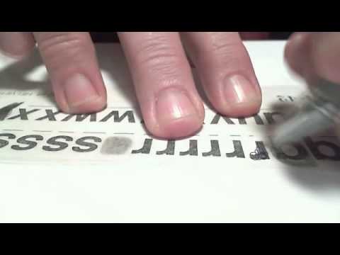 https://www.youtube.com/watch?v=ed6iXQW_O1U
0
https://www.youtube.com/watch?v=ed6iXQW_O1U
0 -
At the risk of belaboring this a bit, I'm not really suggesting this couldn't have been set with Letraset, I'm suggesting that there are several things about it that, instead, point to a photo typositor.
1. The designer could have used 72pt Letraset (the largest size, if I remember right), but when the image is viewed at full size, there is an absence of the tell-tale signs of Letraset or other transfer lettering use. If one was very careful with the burnisher and if it were a new sheet of the stuff with the waxy backing paper just removed, it could be rubbed down quite cleanly without squishing it out a bit or having bits of raggedness on the edges where it didn't stick. But maintaining this kind of consistency over 50–60 characters would have been difficult.
2. Letraset didn't like to stick to itself. Overlap the letters and it would often pull up a piece of the letter underneath. This could have been filled in with a technical pen, but when viewed at full size, there's no sign of this kind of thing in the image. Letraset was difficult to cleanly remove once it was rubbed down. It could be scrapped off with an X-Acto (especially on Chromecoat) and it could have been pulled up with Scotch tape if an error was made, but given the overlaps, one mistake would have meant redoing most of the entire word. Again, all this would have been doable to the level of quality the full-sized image shows, but it would have been somewhat time-consuming and difficult.
3. This ad was for Smith Kline & French — a large pharmaceutical company that seems likely to have hired a well-equipped ad agency — one with a photo typositor. During the late '70s and early '80s I worked mostly doing production work and some graphic design. Letraset use was an everyday thing and most of the agencies I worked or interned with had photo typositors — we even had one at the design school I attended. I became quite familiar with both. The headline quality and overlaps in the ad would have been considerably easier to produce using a photo typositor than Letraset.
4. There are almost no Letraset artifacts in the image except one: a slight inconsistency in the vertical positioning of each letter. If you view the full-sized image, many of the letters have moved up or down by a point or two off the baseline. This could be explained by the use of Letraset type, but given that no other signs of Letraset use are present, it seems a bit odd. However, it wasn't at all unusual for these small baseline shifts to occur on a photo typositor. I don't know if it had to do with the font film strip moving a bit or imprecise positioning of the glyphs on the film strip, but it was a common typositor thing.
5. Finally, this kind of experimental (at the time) typography was the very kind of effect that typositors made easy to do, so people started doing it. New technology made new things possible and cost effective, so we did them. Similarly, when desktop publishing took off in the mid and late '80s, things like gradients became popular since what had previously required an airbrush and a drum scan became easy and cheap.
Here's something interesting — a PDF of the VGC photo typositor typeface directory (which includes Futura): http://luc.devroye.org/vgccatalog.pdf1 -
I don't know if it had to do with the font film strip moving a bit or imprecise positioning of the glyphs on the film strip,
It could have been caused by not backing off the reels a little so the strip would lose its tension and relax into the channel it was in, thus giving better base alignment. It also could have been caused by a typesetting company using a cheap knock-off font which wasn't well made.
0 -
That's all really insightful and I agree with a lot of it, Cory, but I would add one thing: Letraset's Futura Demi Bold is a perfect match, whereas VGC's Futura Demibold is not:

1 -
I didn't bother to look for comparisons like you've done, but you've found a good counterargument.
") 0
0 -
the Letrastet burnishing tool tended to have more friction than a ball point pen. 19¢ Bics were the best best for the job, but pens were too pointy so it was easy to stretch and distort the carrier sheets which could cause the letters to crack. Never the less, I preferred the Bics.Jacob Casal said:... the demonstrator does acknowledge in comments it would be done with a tool, not a pen.)
I worked in a small screen printing shop, where we'd never have done a job like that with press-down type, unless it was to be printed at much larger size... In which case we might have done the layout in Letraset then scaled it up with an over head projector, traced the letters, cleaned them up and hand-cut the film positive.
1 -
@Cory MaylettLetraset didn't like to stick to itself.
I forgot about that. Yeah, that was a pain. To make a letter stick to another letter, I'd rub the underlying letter with a fingernail and pray.
Since this is turning into a dry transfer lettering thread I wanted to mention to @Nick Shinn that improvising dry transfer letters was my childhood. At the CMHC in Ottawa, it was policy to discard Letraset sheets when they ran out of any particular letter because...government. All those discarded sheets all ended up coming to me. I rarely got to see an actual O...it was always a Q with the tail scratched off. Lowercase q was usually available when I needed a b. X became Y. It was an endless supply of Helvetica, Univers, Microgramma, Clarendon, Futura, Franklin Gothic, Souvenir, Optima, Compacta. Stacks of identically sized white Helvetica. Everything in my bedroom was covered in Letraset. I used all the parts of the buffalo, including the Letraset logo with Instant Lettering in reverse Mistral and all that tiny patent boilerplate. When I got older and had to buy my own sheets I was shocked at how expensive it was.
2 -
There were two Letraset burnishing tools that I remember. One was plastic with a metal rolling-ball tip that was really good at warping the carrier sheet (in other words, it was bad). And then there was the black aluminum one with the nylon tip (below). This one worked beautifully, and I still have it (photo taken a few minutes ago). It's about the size and weight of an X-acto knife holder.

3 -
I thought I still had an old transfer type burnisher around here somewhere, but I seem to have thrown it away in one of my periodic cleaning frenzies. I found a photo online like the ones I typically used. The wide end was good for getting everything rubbed down evenly.The ball end was good for making sure the corners and details got an extra firm pressing down.

A quick spray with fixative would sometimes help too.Ray Larabie said: I forgot about that. Yeah, that was a pain. To make a letter stick to another letter, I'd rub the underlying letter with a fingernail and pray.
1 -
☝ That's the bad one with the roller ball that warped the sheets. I still have mine somewhere. Goodness knows why I've kept it all this time.
Edit: Found it. It was made by Chartpak. No wonder it wrecked Letraset sheets.0 -
You're right, it would warp the plastic sheets and distort the letters if pressed too hard, but like I mentioned, it was the other end that was most useful. The ball end was only for pressing down the details. With some finesse, between the two ends, they worked just fine.
I hadn't thought about Chartpak in years, but I liked Letraset sheets better for some reason that I no longer remember. There was also Formatt. I still have one of those sheets. The letters were printed on a thin film that needed to be cut from the sheet with an X-Acto and positioned onto the mechanical. I didn't like them at all.
0 -

The power-user kit.
5 -
I still have my Letraset burnisher. Still have my Chartpak burnisher, too. The corners of the flat end are all rounded off from decades of use. I still use it for burnishing collages and stuff.(The other end can be useful for scoring folds on cover stock.)
 I had a spoonbill burnisher like the second from the left in Nick’s kit, but I haven’t seen that one in years. Can’t swear that I still have it.I suspect that for a whole generation of us, making missing letters out of others on a Letraset sheet was the gateway to becoming interested in type design itself.2


Categories
- All Categories
- 47 Introductions
- 4K Typeface Design
- 495 Type Design Critiques
- 576 Type Design Software
- 1.1K Type Design Technique & Theory
- 670 Type Business
- 884 Font Technology
- 29 Punchcutting
- 537 Typography
- 124 Type Education
- 332 Type History
- 81 Type Resources
- 113 Lettering and Calligraphy
- 33 Lettering Critiques
- 80 Lettering Technique & Theory
- 569 Announcements
- 100 Events
- 116 Job Postings
- 170 Type Releases
- 182 Miscellaneous News
- 270 About TypeDrawers
- 54 TypeDrawers Announcements
- 114 Suggestions and Bug Reports