Setting BlueValues suggested by FontLab
Comments
-
Maximum is 12 for both (24 total) including StdStems. So you can set StdHV + 11 HStemSnap and StdHW + 11 WStemSnapV. The thing is that your stem values should not be too close to each other. If they differ by several units, it is better to take the average between them.mauro sacchetto said:I do not understand instead the criteria of assignment of StemSnapH and StemSnapV, nor how many values should be inserted. Any suggestions?
Yes, but you can set any if it gives better results.mauro sacchetto said:And should be the StdHV and StdVW the most statistically frequent values?
1 -
you can set anyBut drawn from the infinite set of numbers?
") In a guide by Roboto I read that they indicate «the thikness of the stroke to be regularized by hinting».There will be some criteria to follow ... Assuming that the most frequent 3 or 4 or 5 etc do not give perfect results, how do I get to find the best ones?
In a guide by Roboto I read that they indicate «the thikness of the stroke to be regularized by hinting».There will be some criteria to follow ... Assuming that the most frequent 3 or 4 or 5 etc do not give perfect results, how do I get to find the best ones?
Since I have a bad rendering only for some glyphs, like the "m" and the "v", do I have to take into consideration some specific aspect of those glyphs?
0 -
On practice. Experiment and find a result that more or less satisfies you.mauro sacchetto said:But drawn from the infinite set of numbers?There will be some criteria to follow ... Assuming that the most frequent 3 or 4 or 5 etc do not give perfect results, how do I get to find the best ones?
Don't expect much from PostScript hinting, it can allow your font to look relatively normal, but nothing more. If you really need good readability on low sizes on Windows you need TrueType hinting which is more complicated and time consuming, but much more useful because you can manually move pixels in different sizes independently.mauro sacchetto said:Since I have a bad rendering only for some glyphs, like the "m" and the "v", do I have to take into consideration some specific aspect of those glyphs?3 -
FYI: That almost certainly is all about blue zones and nothing to do with stem snap. You need to check how the points and overshoots in those glyphs are interacting with the blue zones (and their bluefuzz).mauro sacchetto said:you can set anySince I have a bad rendering only for some glyphs, like the "m" and the "v", do I have to take into consideration some specific aspect of those glyphs?
I did offer to take a look....1 -
I proceed to try and make mistakes, but in the absence of certain fees it is an awkward job.
@Thomas PhinneyI did offer to take a look....thank you for your kind and competent availability.
I had included a link to the font in a previous post. I insert it here again
https://www.dropbox.com/s/c87by619icm1kj1/TestPro.otf?dl=0
0 -
I suggest you try the following:
Set your x-height blue zone to 416, with a top overshoot at 460 (44 units)
Set your cap blue zone to 693, with a top overshoot at 728 (35 units)
Set your descender blue zone to -215, with an overshoot to -221 (6 units)
Set your blue fuzz to zero.
Also, set your vertical metrics to match the font better:
- x-height 416 (not 459)
- typo ascender 750 (not 800)
- cap height 693 (not 728)
- descender -215
0 -
I'm experimenting also touching the field of metrics that I had never before taken into consideration.Question: should the sum of ascenders and descenders not be 1000? Instead according to your indications I have 750 + 215 = 965, where 965 is the em dimension.I leave it like this? Is the 1000 not binding and / or mandatory?0
-
https://help.fontlab.com/fontlab-vi/Font-Info-Dialog-Box/#family-dimensions
Ascender and Descender here refer to typographic values. (sTypo metrics in an output OpenType font.) They don’t have to sum to exactly 1000. In fact, from the current OpenType spec: “It is not a general requirement that sTypoAscender - sTypoDescender be equal to unitsPerEm. These values should be set to provide default line spacing appropriate for the primary languages the font is designed to support.” (You can also correctly infer that this was a recommendation in days gone by.)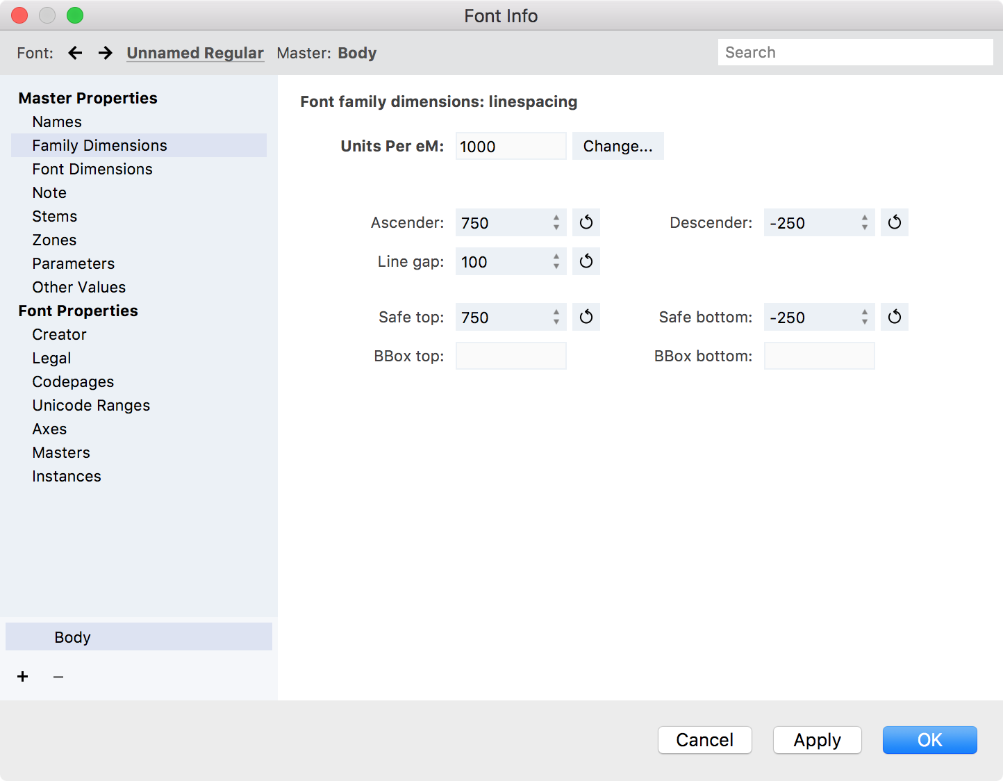
"Safe" top and bottom is the usWinAscent and usWinDescent numbers. Usually there is nothing wrong with auto-calculating these.
Line Gap is up to you. Set something that produces results you like, in those apps that respect it (like most word processing apps that have a generic "single line spacing" concept). Try a value such as 100 or 200 to start. Or make it the amount that, when added to the absolute values of Ascender and Descender, equals 1000. (Note: must be positive.)
If you really want to get into it, Here is a good previous discussion on TypeDrawers: http://typedrawers.com/discussion/1705/webfont-vertical-metrics-strategies
Also of interest: the Glyphs tutorial on this subject covers three different approaches to setting vertical metrics, without suggesting that one of the three is “right.” https://glyphsapp.com/tutorials/vertical-metrics
0 -
Ok, thanx a lot.
A last practical request:
the program gives me the possibility to carry out a series of glyph operations (simplification, cleaning, rounding to integer). Is it appropriate to carry them out automatically?
Finally: what is the correct order of the operations?
First: set the metrics
Second: cleaning etc. of the glyphs
Third: I do autohinting.
Or is it better make cleaning before set the metrics?
0 -
It is generally best to make good outlines as early as possible. To the extent that there are inconsistencies or points not at extrema, it might even affect the sidebearings slightly.0
-
0 -
You've got a primary alignment zone at -21, -2 which places many of your hints outside of this zone. Try changing it to -21 0. You'll want to similarly adjust the zone at the x-height.2
-
I've done numerous experiments, but I don't go out.However: italics (and even bold) with the original settings work fine. With Adobe Acrobat Reader on Windows (with the default resolution of 96 pixels / inch) they don't have any rendering problems, not even with the zoom, where instead the Roman has a bad rendering (<and> 100%).Can it not then be that the problem is due to some "error" in the design of the glyphs, the usual ones that are badly seen and that is "m", "n", "v", "x", and "z"? And that consequently it is necessary to intervene not in the parameters of the Private PostScript, but in the glyphs themselves?Here you can see the new settings for the roman:0
-
mauro sacchetto said:they don't have any rendering problems, not even with the zoom, where instead the Roman has a bad rendering (<and> 100%).

and a bunch of others0 -
Wow! From an immediate point of view, that is from 75% to 300% on the screen, it seemed to me that all was well seen.How do you get that view? What can you see?(This is a very large world, one never stops learning ...)0
-
0
-
I think I finally managed to find the correct values, also thanks to your precious help.
The default setting of Adobe Acrobat Reader is 96 pixels / inch and is correctly viewed from 75% to 300%.
Two last questions.
1)
A good hinting needs the points at extrema. I have instructed FontLab in this sense with the appropriate command, but in the end I find about twenty glyphs without such points. What can this gap be imputed to? And above all, how is it solved?
If I give the same command to generate points at extrema after having done autohinting, the glyphs without points at extrema are reduced to very few, but I don't know if this "inverted" procedure is correct.
2)
Most glyphs are not centered within the bearing. It should be so for glyphs that are completely symmetrical like that of "o", but is it appropriate or wrong to center them all?
Thank you0 -
If a given distance/feature is to be hinted, then points at the relevant extrema are quite important.
If you have autohinting, you should clear and redo the autohinting after adding the points at extrema.
Spacing is a complex subject. I did a video on it some years back, using FontLab Studio 5, but almost all the concepts apply across font editors. https://www.youtube.com/watch?v=tbc_O7bNROs0 -
If you have autohinting, you should clear and redo the autohinting after adding the points at extrema.
Yes, but why in certain cases FL fails to create these points? In these case, what's the strategy to solve?
Thanks for letting me know about the video. I look at it as soon as possible!
0 -
You are trying to do nodes at extrema automatically, I take it? And in some cases FL doesn't get them? We would have to look at the particular case(s)—there isn’t just one reason. Feel free to submit a support ticket at https://support.fontlab.com Generally, the automatic function (Countour > Nodes at Extremes) is not intended to completely substitute for good drawing habits. It is just clean-up assistance when you have outlines that are not ideal.mauro sacchetto said:If you have autohinting, you should clear and redo the autohinting after adding the points at extrema.
Yes, but why in certain cases FL fails to create these points? In these case, what's the strategy to solve?0


Categories
- All Categories
- 47 Introductions
- 4K Typeface Design
- 495 Type Design Critiques
- 577 Type Design Software
- 1.1K Type Design Technique & Theory
- 671 Type Business
- 885 Font Technology
- 29 Punchcutting
- 539 Typography
- 125 Type Education
- 333 Type History
- 81 Type Resources
- 113 Lettering and Calligraphy
- 33 Lettering Critiques
- 80 Lettering Technique & Theory
- 569 Announcements
- 100 Events
- 116 Job Postings
- 170 Type Releases
- 182 Miscellaneous News
- 270 About TypeDrawers
- 54 TypeDrawers Announcements
- 114 Suggestions and Bug Reports