Word for Mac style linking behaviour

Artur Schmal
Posts: 74
I've been at war again with Word for Mac for a while now. I don't remember coming across this particular issue before.
The issue seems to occur with weights above weightclass 400.
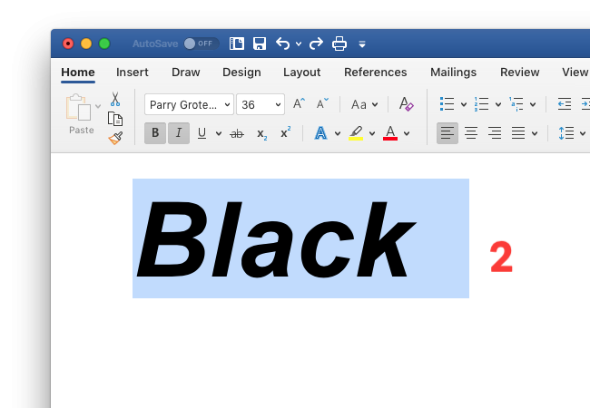
Here's the issue:
I've seen this happening also in several other font families from other foundries. For instance to the UltraBlack weight of Adobe's Acumin Pro SemiCondensed family, but strangely enough not to the same weight in the Acumin Pro normal width family.
I've been editing the nametables in various ways to see if there's anything there that could solve it, also the fsSelection settings, but to no luck.
Does anyone have experience with this issue?


The issue seems to occur with weights above weightclass 400.
Here's the issue:
- I'm selecting the Black weight from the font menu. That goes well, but I notice it activates the Bold button, even though this weight is not style linked as Bold of another weight. It is only style linked with Black Italic.
- Then I'm enabling the Italic button, but this gives not the desired result. It shows a fallback font.
- If I disable the Bold button after that it shows the correct Black Italic style
I've seen this happening also in several other font families from other foundries. For instance to the UltraBlack weight of Adobe's Acumin Pro SemiCondensed family, but strangely enough not to the same weight in the Acumin Pro normal width family.
I've been editing the nametables in various ways to see if there's anything there that could solve it, also the fsSelection settings, but to no luck.
Does anyone have experience with this issue?


1
Comments
-
Did you check the Panose values?1
-
I have not seen this happen unless the font was linked as the "bold" of another style, or the weightclass was below 250.0
-
Artur allowed me to have a look at the font data in question and the unexpected behavior was caused by a naming issue. Also the fsSelection settings left some room for improvement. So, the problem has been solved. However, I had a look at the specs again and noticed some differences between the latest and older versions. For example, the construction of the Full font name was quite strictly defined in 2008 and allowes more freedom today:
OpenType specification version 1.5 (2008):
‘Full font name; this should be a combination of strings 1 and 2. Exception: if the font is “Regular” as indicated in string 2, then use only the family name contained in string 1.’
OpenType specification version 1.8.3 (2018):
‘Full font name that reflects all family and relevant subfamily descriptors. The full font name is generally a combination of name IDs 1 and 2, or of name IDs 16 and 17, or a similar human-readable variant.’
The original exception for the Full font name for Microsoft platform strings for CFF OpenType fonts has been removed. I recall that there were some discussions about the necessity of this rule here on TD. However, I wonder why specs are changed if things work: after all, aren’t specs not meant to secure proper and consistent handling of the matter on both the short as the long term? There was no real necessity to change the Full font name definition, except perhaps for some cosmetic reasons in case of the Windows-CFF entry, I reckon.
3 -
Thanks again for looking into that Frank. To elaborate a bit on the naming issue: the "RIBBI" scheme that Glyphs auto-calculated was not picked up by Word on Mac very well. Frank did some tweaking on that and that solved the issue.Artur allowed me to have a look at the font data in question and the unexpected behavior was caused by a naming issue. Also the fsSelection settings left some room for improvement. So, the problem has been solved.
0 -
Worth noting for the Google machine if someone comes across this problem: the more recent versions of Word get really screwy with style linking (more so than older versions) if the Postscript name is over 31 characters (nameid 6). I know @Mark Simonson has found that 30 or less is better at times also.
0 -
More and more reasons for making linking families only when clients ask for them.
0 -
Eh. Link all your italics (or obliques). In most cases, link the regular to the bold as well. But definitely don’t do more than that.
The old Adobe habits of making the Semibold the "bold" style of the Light, and that sort of thing... I definitely would NOT do today.
3 -
>>Eh. Link all your italicsWhy?
0 -
Doesn't linking establish the relationships between fonts that allow the [I] button or Cmd-Shift-I etc. to work?1
-
Exactly, Craig. At least, for normal apps that use system calls for font handling.
(Adobe, as oftentimes, may be an exception here.)
And if your fonts might be used by non-designers, outside Adobe apps, or in older Windows apps, it is especially important.0 -
It's convenient for users to have acces to the italic through a short cut. I use the cmd-shift-i a lot in InDesign for setting italics.Ramiro Espinoza said:>>Eh. Link all your italicsWhy?2 -
Nearly all of my own fonts are useless as body text so I'm bias but I don't bother with this at all. The behavior is too inconsistent across apps & platforms. It has its place but seems problematic even in that place. Bold & Italic seem to be the only cases in which it makes any sense. Please point out if I'm horribly wrong.0
-
> Nearly all of my own fonts are useless as body text so I'm bias but I don't bother with this at all.
Dealing with this as a product manager, across entire libraries of thousands of fonts, I came to different conclusions. Style linking is moderately important for display fonts, and very important for body text fonts.
Or to put it another way: people expect it to work even on display fonts, if those fonts have the relevant family members that would make it possible. So if you have an upright and an italic, style linking will be expected.
The styling metadata is extra work, but compared to the work involved in designing the fonts in the first place, it’s hardly anything.
> The behavior is too inconsistent across apps & platforms.
That has not been my experience at all. Virtually all major platforms and major apps support bold and italic style linking.
> Bold & Italic seem to be the only cases in which it makes any sense.
That part we agree on.
1 -
Thomas Phinney said:
Are you saying this simply because you don't view it as necessary, or can this create actual problems for some applications?The old Adobe habits of making the Semibold the "bold" style of the Light, and that sort of thing... I definitely would NOT do today.
0 -
I view it as unnecessary, and potentially confusing. I don’t think there is a general user expectation that selecting a weight other than regular, and then hitting the bold button, will do something specific/useful.
And even if the existence of additional style links were not a surprise, I don’t think there are common/standard expectations as to which weights will link to which other weights, outside of the “Regular > Bold” link. Medium to Extrabold? Semibold to Black? And if you link Light to Semibold, you can’t then link the Semibold to something else. So I don’t even know what the “right” choices would be in some of these cases.
No actual problems as far as I know. EXCEPT (edit) for the “vanishing style-linked fonts on Windows), as Mark S points out below, which is definitely a potential point of confusion. I remember hearing the support issues back in the day. Sigh.
(Note: In old Mac resource-fork based fonts, you could actually link Light to Semibold and also Semibold to Black. But not with current formats.)1 -
I think the biggest problem with linking weights other than regular and bold is that on Windows the "bold" style is hidden from the font menu. So if a family has six weights, all paired as "regular/bold", only the "regular" half of the pair will appear in the font menu. Back when I used to do this, I would periodically hear from Windows users who couldn't figure out what happened to Extrabold or Black, thinking there was something wrong with the font.6
Categories
- All Categories
- 46 Introductions
- 3.9K Typeface Design
- 489 Type Design Critiques
- 572 Type Design Software
- 1.1K Type Design Technique & Theory
- 663 Type Business
- 875 Font Technology
- 29 Punchcutting
- 529 Typography
- 121 Type Education
- 328 Type History
- 80 Type Resources
- 111 Lettering and Calligraphy
- 32 Lettering Critiques
- 79 Lettering Technique & Theory
- 561 Announcements
- 96 Events
- 116 Job Postings
- 169 Type Releases
- 179 Miscellaneous News
- 269 About TypeDrawers
- 53 TypeDrawers Announcements
- 114 Suggestions and Bug Reports


