nonlinear kerning in VF

Rafał Buchner
Posts: 16
Is the problem illustrated in Just's tweet solved somehow?
If not: Any good tricks and tips how to solve similar issues?
Tagged:
0
Comments
-
Could switch the T to an alternate glyph (with separate spacing and kerning) at the point in the design space where it starts to clash.2
-
You can have four masters, where the middle two are very close.1
-
Rafał Buchner > Any good tricks and tips how to solve similar issues?@ OpenType format wasn't designed to handle nonlinear kerning in VF. That's why we developed Qalambartar to handle not only the nonlinear kerning in Arabic script, but the overlapping and swashing too.
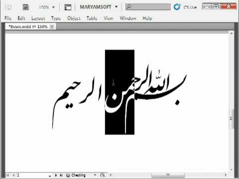 https://www.youtube.com/watch?v=itZ66gUVVCIHappy watching & exploring!
1 -


Categories
- All Categories
- 47 Introductions
- 4K Typeface Design
- 497 Type Design Critiques
- 591 Type Design Software
- 1.1K Type Design Technique & Theory
- 674 Type Business
- 906 Font Technology
- 29 Punchcutting
- 544 Typography
- 129 Type Education
- 333 Type History
- 82 Type Resources
- 114 Lettering and Calligraphy
- 33 Lettering Critiques
- 81 Lettering Technique & Theory
- 579 Announcements
- 101 Events
- 116 Job Postings
- 175 Type Releases
- 186 Miscellaneous News
- 270 About TypeDrawers
- 54 TypeDrawers Announcements
- 114 Suggestions and Bug Reports