Komik Ohne: A casual brush-pen blackletter
Comments
-
I wonder if those (or other) caps could be set up for ALL CAP SETTINGS (which seems like a common form of emphasis in casual-face typography).0
-
And who's 2-11bert? :-)1
-
If you are aiming at the Fraktur, I would not expect those slashes. They are more an American blackletter thing.
1 -
Craig Eliason said:I wonder if those (or other) caps could be set up for ALL CAP SETTINGS (which seems like a common form of emphasis in casual-face typography).In the CASE feature? That's an idea. I'd want them to be accessible in the role of regular caps as well, though, so maybe an SSxx is still preferable. Though the CASE feature could just refer to the SSxx glyphs.I put a set of narrow plain caps in the SMCP slot of my other font Brilliance. That allows them to be used with the decorative caps as smallcaps, or as replacement caps via C2SC. They look a bit small in that second role, though. In the case at hand, I guess they'd conversely be too large to be useful as smallcaps.0
-
The slashes are now a stylistic set. Anyway, I use the term fraktur loosely here (more or less as the informal German term for blackletter). I'd rather make something pretty than historical.Georg Seifert said:If you are aiming at the Fraktur, I would not expect those slashes. They are more an American blackletter thing.
0 -
How about this style for the low-profile caps?
 1
1 -
I like the simple caps!
Also, I know you were exploring a two-story /a before—have you considered an approach like this?
0 -
Matthew: Thanks, I'll look into that!Meanwhile, the simple caps:I wonder whether I could get away with a design for /Z that mirrors that of /z, even in these supposedly easily legible caps. Maybe I should, and then have yet another SSxx that replaces all of /X/x/Z/z with Antiqua architecture.

0 -
I've made /T and /Z more blacklettery and added a series of alts to replace all of the overtly blacklettrey caps with Antiqua ones:

 0
0 -
The latter also changes /x and /z:
 0
0 -
Looking good.
Did you try a serifless /I/ for the simplest caps?
For that simpler /Z/ you might forego the stroke in the middle. My hunch is that that stroke usually exists to fortify the thin diagonal in a modulated design—it feels more extraneous in this monolinish context.
The blacklettery /Z/ is very threeish. I would try moving the reversal in the middle leftward (and maybe down) to see if that helps. But it’s definitely at a different level of strangeness than its peers.0 -
Hmmm, I tried out your suggestion, but it still looks very 3-ish. See below!

 EDIT: Full descender better...?
0 -
Meanwhile, that /G/ looked very Antiqua to me. Maybe something like this should go in the Blackletter cut?

1 -
Capital /Germandbls...
 0
0 -
Hm, that /Germandbls was a bit too wide and too round.
 I drew some figures as well. Maybe a bit too round as well?
 Maybe I should keep those for the most Antiqua end of the stylistic spectrum and make some more broken forms for the other cuts...Oh, and that deltoid /d/ stood out in the Antiqua cut, so I added a variant for it as well:
 0
0 -
I really like how this is shaping up! The numerals are def a bit round, but not too bothersome in my opinion. I'll be interested to see what other solution you're thinking of.
I wonder if the /U/ is a tad wide, or if the /A/ and /E/ are a slightly narrow? (Could also be a mixture.) What do you think?1 -
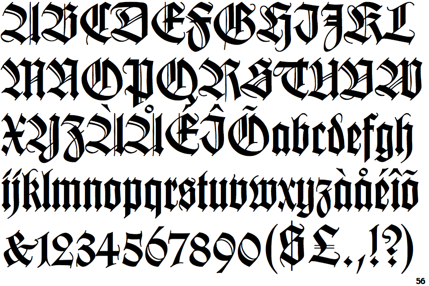
It's not so unusual to have relatively unbroken numerals in a blackletter... here's Wilhelm Klingspor Gotisch:
 Good point about those caps, I'll look into it!EDIT: Yeah, that's better.

 1
1 -
The left leg of /A appears heavier to me because of the crossing. But maybe my mind is playing tricks on me, idk
0 -
I think I'm going to go out of character and do completely without standard ligatures. That lonesome /f_f/ is going into DLIG. The rest is just a bit of positive kerning. Gaps just work better than fused letters here.Also, I'm slowly convincing myself to promote the single-storey /a/ to default, as Craig suggested all along.
 1
1 -
I was dreading having to make all those boring punctuation marks and symbols, but some of them came out quite charming:

0 -
I feel this is ready for publication. Any last remarks?(BTW, note the /dd/ in «cuddly»... the juxtaposition of two blackletter /d/ has long been bugging me in this typeface. I've finally made a subtle alternate to use for the second /d/ to break the effect. )


 0
0 -
I love this typeface.2
-
I, too, love this!
If these are your specimen/promo images, then I will be honest in saying that they do an injustice to the typeface itself.
If you're interested in design help, please feel free to reach out to me.3 -
Es sieht so aus, als wäre es aus Würstchen gemacht.Seriously, I love it. And it's making me hungry.1
-
Thomas Phinney said:I love this typeface.
1 -
Matthew Smith said:If these are your specimen/promo images, then I will be honest in saying that they do an injustice to the typeface itself.
If you're interested in design help, please feel free to reach out to me.While waiting for this feedback, I've had another go at the poster design. Hope these are better.


0 -
The type is vivid, complex and dynamic, so it kind of begs for a calm background. With this heavily-textured wood background there's too much going on. I'd go with a solid color.2
-
I rather find that the robust, simple strokes that make up the letters hold their own against the background. I do have a flat background for the later slides, where the details count. Having nothing but flat color sounds horribly boring for a decorative font.
Then again, I am aware that ad posters should please the target group rather than me...0 -
If you're afraid of boring, then how about something like out-of-focus picture for background + different colors, more glowing and contrasting? Currently the background makes it hard to focus on the text/type.0
-
More glowing and contrasting colors? That sounds more distracting to me, rather than less...Does it help if I place all text on a ribbon of flat background color? I've also toned down the secondary text color to better match the wood.


 1
1


Categories
- All Categories
- 47 Introductions
- 4K Typeface Design
- 493 Type Design Critiques
- 575 Type Design Software
- 1.1K Type Design Technique & Theory
- 669 Type Business
- 884 Font Technology
- 29 Punchcutting
- 537 Typography
- 124 Type Education
- 332 Type History
- 81 Type Resources
- 113 Lettering and Calligraphy
- 33 Lettering Critiques
- 80 Lettering Technique & Theory
- 569 Announcements
- 100 Events
- 116 Job Postings
- 170 Type Releases
- 182 Miscellaneous News
- 270 About TypeDrawers
- 54 TypeDrawers Announcements
- 114 Suggestions and Bug Reports