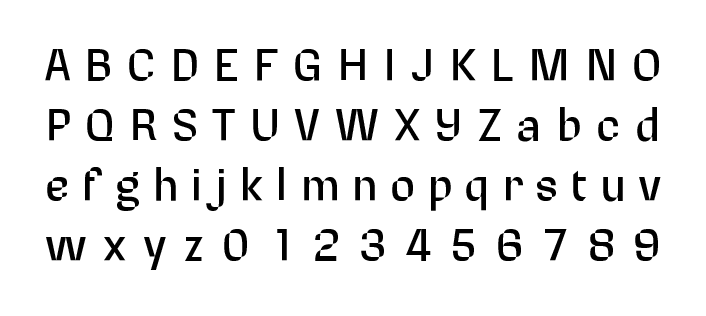
Experimental Sans With Overlapping Paths
Options

Nathan Metzler
Posts: 9
Hi all,
The concept started off by offsetting some shapes and then treating the resulting overlapping elements as strokes. I tried to recreate some of those extreme connection points in the capitals by having diagonals barely touch. Primary purpose is a display face. That said, I noticed that some of the weird curves don't actually look that terrible when scaled down so I'm going to try and tweak them so I could use this for some small bodies of text too.
Aside from general critiques I'm also curious about the originality of this design. I haven't seen anything similar to it (yet) and maybe for reasons that I still need to learn.

1
Comments
-
I love this. It reminds me of a pixel font. I don’t think I’ve seen this done before. I do think you need to resolve your overall concept. Most of the characters have a neo-grotesque feel. But you’re also dipping into multiple categories to make a frankenfont: wood type gothics (R), geometric sans (Z, z), funky 70s (Y), and humanist sans (b, d, p, q). Decide what language you really want this typeface to speak and resolve that.1
-
Ok some I'm going to try and push this towards a grotesque/neo-grotesque direction. I liked those humanist characters (b, d, p, q) because the worked well with the construction method I was using—copying the "bone paths" and offsetting them at a 30° angle or so—but you're right, the rest of the font has a different style and these guys don't quite fit. Here's some changes/alternates.
 0
0 -
I've seen a few designs recently with these 'twirls' - eg, Cristian Vargas just published Salvaje (t[m page, homepage, foundry) which has just one 'twirl' in some of the letters, and his classmate Tézzo Suzuki had Groq Display
A Sans would be a nice addition to the genre 0
0 -
Wow. Groq Display is something else... I'm very curious how those shapes/overlaps came to be.
Here's a little bit of the logic behind what I'm trying to do. One of the happy coincidences that came from using this shape as a base is that it already has natural spaces cut out of it for merging with other masses and not getting too heavy. 0
0 -
Those humanist shapes work better within the constraints than the grotesque ones — not surprising, really, given that you're basically emulating a broad nib. I wouldn't try too hard to force it into an unnatural genre.1
-
Damn, this is nice. Nicely proportioned, too. It's not the only face that uses intersecting paths, as Dave said, but it's certainly original enough, and doesn't look like anything else I can think of. Well done.
1 -
Here's a quick test with some shapes changed towards a more humanist feel. Increased the contrast slightly, softened the curves, and made the terminals angled.
I'm running into a slight issue where I can open up some of the forms successfully but have to leave others more enclosed in order to preserve my precious "twists". I'm not quite ready to part with those yet but I am curious to discover what all would need to be changed in order to make this a successful humanist font.
1 -
Now the letters are falling apart... that DIN-like blockiness was part of the attraction of the original, I’m afraid. My suggestion was meant to preserve your humanist solutions for /b etc., not revamp the whole typeface...
If anything, it’s the harsh diagonals (e.g. in /W) that need rethinking.4 -
Yeah, I totally agree with Christian, you should definitely rollback to the original version.1
-
Ok so I kept the original b, d, p, and q bowls while tweaking everything else to be a little more cohesive. Also added in some basic punctuation.

0 -
I like this a lot. That f looks like a rough neighbor and I don't see it used in the sample.0
-
Nice
 W, w look too wide to me. And the 4 is a bit black, you could perhaps work on its top more.
Since it looks like a techno humanist pixel font ( ) you could perhaps try a version without straight terminals on the p, q etc., similar to Cocon. Your font is round by design, so straight lines like on the k, h, B, M and others are perhaps a tad too heavy. 0
 -
Have you considered the possibility of letting the terninals of a c e f j r s end horizontally? I.e., have the bottom of c mirror the bottom of d without the stem.0
-
Could you perhaps find a way to use those nice rounded turns from /S etc. instead of the current brutalist juxtaposition in the sharp joints of /M and related diagonal letters?0
-
Ray, the f hasn't been too tricky yet but I'll keep that in mind. Also thanks!
Vasil, I'll probably keep the terminals as simple as I can since there's already a lot going on. That's a very cool idea though and I'll keep it in mind for any future, similarly styled, fonts. Also good point on the straights, I didn't quite "see" that until you mentioned it.
Jasper, I tried that very, very early on and wasn't a big fan. Letters were a bit too open and I like the attitude that the little "pixelesque" terminals give off.
Christian, something like this? It's actually more in line with the loose construction guidelines I have for this font and I'm liking the quirkiness.
2 -
I don't think new /M fits.
Its skeleton has rounded corners, an element not found in any other glyph.
0 -
The proposed /M is perhaps a tad too round, as Ori says, but I do like the general direction. Maybe you could cheat a bit and keep the kissing points horizontal and flush with the guidelines and just apply the rounding on the outside of the joins?
0 -
All in all, I see a family of 3-4 fonts here
 maybe even variable. 0
 -
I've been experimenting with a variable font but I need to figure out some technical things first. The way the strokes overlap their "direction" changes and pretty much every app renders it some different, but equally terrible way. Counters are particularly difficult and right now I have to split up the paths to make it work even while in Glyphs. Also removing overlap before I interpolate messes with the consistency of some curves. I'll figure it out eventually though. Has anybody run into similar issues before with the flipped path directions and/or overlaps?Vasil Stanev said:All in all, I see a family of 3-4 fonts here maybe even variable.
0 -
A few options showing what some corner styles would look like when next to other characters. The initial "rounded skeleton" corners I experimented with are growing on my quickly. I've had trouble finding other fonts that have rounded elements mixed with relatively traditional letter construction so if anybody knows of anything similar I'd be curious.

0 -
Another possible construction model for the top of the M, allowing you to maintain the same offset corner treatment as in other letters. More of a challenge in terms of overall balance, though.
 4
4 -
I'd stick with the initial, non-rounded version.
But here's another option: having just one side rounded.
1 -
Ooh very cool. I used this very idea for some cursive lettering awhile back. Looks even better for a sans serif, dunno why I never thought of it. I think it's expected where you'll run into issues with letters like A,M which may look slightly different that doesn't fit with the overall theme but I think with a bit more of sketching and research there's prolly a few ways to address it. For R and A something like [this]? I think so long as you force letters to overlap you'll find solutions for every letter, although for a handful of them you may have to cut corners to fit with the theme. Letters like E, F could end up with too much space if you followed the idea of overlapping so I guess you'd have to find some middle ground. lc 'x' could easily be resolved with the top left overlapping the bottom right and do the same for the other side. I guess that's one way to do but I'd definitely sketch more.0
Categories
- All Categories
- 46 Introductions
- 3.8K Typeface Design
- 476 Type Design Critiques
- 555 Type Design Software
- 1.1K Type Design Technique & Theory
- 640 Type Business
- 831 Font Technology
- 29 Punchcutting
- 508 Typography
- 120 Type Education
- 313 Type History
- 75 Type Resources
- 109 Lettering and Calligraphy
- 30 Lettering Critiques
- 79 Lettering Technique & Theory
- 533 Announcements
- 86 Events
- 110 Job Postings
- 167 Type Releases
- 169 Miscellaneous News
- 274 About TypeDrawers
- 53 TypeDrawers Announcements
- 119 Suggestions and Bug Reports


