What is the point in naming a few completely different fonts "Futura «Something»"?

Adam Jagosz
Posts: 690
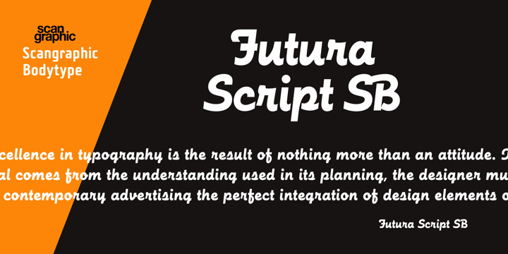
In the way of educating myself about the great and famous designs, I noticed that the Futura family includes some odd members, like Futura Black and Futura Display. What is the reason behind naming such drastically different fonts this way? Is it just because they were designed by Renner, or did he himself include them in the family? Are their proportions similar? Does this mean they are compatible and should be used alongside? Then I stumbled upon Futura Script, designed in 2004 by an entirely different person. This one is pretty obviously not based on anything near Futura. Can I use it as a fancy italic to go with the regular Futura⸮


How does it happen? Can I release a font I produce as Helvetica Ultracompressed, even if it is a relatively regular brush script face? How do I go about it? Do I need to pay someone to allow me to do that?
This is another thing I've been wondering about, how is it that a design done 90 years ago is sold today by 20 companies? I get it that the subject of the trade is the digitization, so that's fair. There's a great deal of extra work that can be done to make the outcome even more versatile, completing character sets, programming, hinting, etc. But what about the name? Am I free today to release Futura XYZ if I digitize it on my own? I noticed that some makers add a ® trademark sign to the name, so I guess they must have arranged it with some other entities to use that name? Who registered it in the first place?
1
Comments
-
Futura is a trademark of Bauer. Futura Script credits Bauer's trademark. So no, you can’t just put Futura in the name of your typeface without permission, unless you want to invite legal action.
I suspect that like Futura Black, Futura Script was a typeface branding decision made to try to cash in on the popularity of Futura. It is a design from the 1950s, not something completely new.
This sort of naming exercise has a long history in type marketing. Caslon Antique was originally named “Fifteenth Century,” and was re-branded in the mid-1920s to try to cash in on the popularity of Caslon. It is not a particularly related design.
Futura Black and Futura Script are at least compatible with Futura, I mean one could imagine seeing them paired with “real” Futura styles. I am not convinced that makes them part of some mega-extended family. I wonder if the Futura name was envisioned before/during the design, or only after the fact?
5 -
Linotype did something like this not too long ago. Adrien Frutiger designed a typeface released in 1957 called Meridien. When Akira Kobayashi did an expanded and updated version of it in 2008, they renamed it Frutiger Serif, seemingly retconned as a companion to Frutiger, the sans serif. Pretty clear it was a marketing decision.4
-
This is quite common, I suppose. But with the Lucida family, it just looks ‘right’, you know, the fonts having similar advance widths for particular glyphs, similar color (maybe except Blackletter, but even this one just feels cohesive with the rest). While with Futura, the ‘Black’ cut seems like a playful experiment compared to the real Futura and seems just out of place next to it, like an ugly younger or older sister. What do you make of its /e?
0 -
Bauer’s Futura series evolved over time, without a masterplan. Futura Black (1929) was an early addition, preceding any of the italic or condensed cuts, for example.
Futura and Futura Black are related beyond the name, but maybe more in their shared vanguard constructivist mindset than in specific letterforms or proportions. (Having said that, there are a few peculiar details that are maintained across the various members of the series, like the straight j.) Futura and Futura Black were advertised together, and used together. Neues Bauen in Berlin (1931) is a prime example. I wouldn’t say Futura Black looks out of place there, rather like a contrasting yet complementary counterpart.
Maybe it’s the “Black” name that sounds confusing today. It’s not to be understood as a weight name within a linear progression, of course (although it is indeed quite heavy). Chances are it would be named “Futura Display” today, but that name was used for another extension. From a marketing perspective, it would have been foolish not to cash in on the insane popularity of Futura in some way. By the way, it’s the only German face to be named “Black”, indicating that the name was chosen with the international market in mind.
9 -
I like the cut of your jib, Adamski.
I trust you’ve read Never Use Futura?
0 -
I have a similar question concerning several revivals of Auriol Labeur I made some years ago because I found that Monotype's Auriol was made from a 48 pt optical size of Auriol and isn't well adapted for text. I made 8 pt, 10 pt and 12 pt from the Labeur and one 11 pt from the very first Auriol used to print a bibliophile edition of Huysmans "À rebours" novel in 1902 (or 1903 ?). Because Monotypes owns the Auriol Trademark I couldn't use the name Auriol for my fonts, despite I would diffuse them for free. At the moment I call them "George" but I would make it more explicitly related to George Auriol's work. Could I call them for example "George Auriol" ?
0 -
Short answer: you can, but you shouldn’t. You would probably regret it.ivan louette said:At the moment I call them "George" but I would make it more explicitly related to George Auriol's work. Could I call them for example "George Auriol" ?
Long answer: you can do whatever you want, and there are several separate questions.
Note that Auriol is the trademark. A name that incorporates somebody else’s trademark can be considered infringing.
1) Would the trademark holder give you trouble, such that it would not be worth your while to do this? Suing, or threatening to sue, for example.
2) Could the trademark holder win a lawsuit against you in court, forcing you to change the name?
3) Would other people treat you differently, resulting in your fonts not being shared more, among other consequences? (For example, Google not being willing to put them in Google fonts? Although not sure if they would anyway, given that they are directly based on a commercial design with a clear provenance.)
I expect the answer to #1 is “yes.” I would imagine the answer to #2 is also “yes,” though I am not a trademark lawyer. And I also suspect the answer to #3 is “yes,” at least for some people.
So, I think it is wisest not to call them “George Auriol.”1 -
'Auriol' is a trademark of D&P (now Monotype), but AFAIK 'Huyot' (Auriol's birthname) is not.0
-
You could call it 'Les labeurs de Huyot qui lit'.1
-
@Thomas Phinney Thanks for the detailed reply. Of course I wouldn't infrige any trademark. The particular case is that if I remember well a trademark was already taken for Auriol at its beginning and that trademark was acquired by Monotype afterwards. That's the cause of the problem. Auriol's drawings aren't protected by copyright but if you draw revivals of Auriol's typefaces and you would credit George Auriol for his original drawings it's risky to do it.
But on the other hand I saw that even Uncial is a Monotype trademark, and for me putting a trademark to Uncial is a little bit like putting a trademark onto italic or any historical kind of typeface…
I don't have anything against trademarks or copyrights but sometimes they could be abusive.
2 -
There is also a terrible font named Textura Quadrata, which I also find to be just as generic as Uncial. Naming fonts simply after handwriting styles, without any further specification (here is where I would love to see the foundry's initials or whatever!) is one thing that irritates me. Another is taking fancy names and assigining them to totally bland and neutral faces (e.g. Robusta). But I guess that happens all the time in marketing of any product and there's not much we could or should do about it, we can only try to be first.
@joeclark Regrettably, I haven't. :'(0 -
@ivan louette-- Even though you may not be able to pay tribute to the original designer in the name, you can put the information in the designer information within the font. In some cases you may be able to get away with a variation of the name, such as "Auriol XYZ", with the "XYZ™ " being the initials of your foundry.
0 -
@George Thomas Thanks ! I have thought at the idea "Auriol XYZ". Perhaps that's a good one. i saw some Auriol typeface somewhere whith this kind of naming.
0 -
Given that Auriol is a trademark, I for one would not assume you could get away with calling a new typeface “Auriol XYZ.” Indeed, my assumption would be the opposite, unless I either got the OK from the trademark holder, or consulted a lawyer.
(Also: remember that an opponent does not have to *win* a lawsuit against you for it to be financially disastrous for you.)2 -
It may be best to call it George, instead of George Auriol or Auriol XYZ. Or to come up with another name altogether. Surely there is some term from c.1900 French art, craft, or design that you could use? It may not seem fair that font companies have all the good names trademarked, but it is the way the font business landscape currently operates.1
-
Thomas Phinney said:Given that Auriol is a trademark, I for one would not assume you could get away with calling a new typeface “Auriol XYZ.” Indeed, my assumption would be the opposite, unless I either got the OK from the trademark holder, or consulted a lawyer.
(Also: remember that an opponent does not have to *win* a lawsuit against you for it to be financially disastrous for you.)
Just curious, how far a new typeface’s name should be from the trademark, so it’s safe to use? Futur? Futra? Futtura?
What about those Libre fonts by Pablo Impallari, like Libre Caslon, Libre Clarendon etc? Did he buy the rights to use the name and the design?
0 -
Just curious, how far a new typeface’s name should be from the trademark, so it’s safe to use? Futur? Futra? Futtura?
In the past, similar names for knock-off fonts were common, even for major typesetting machine manufacturers such as Compugraphic and Alphatype. It successfully skirted around the trademark issue as far as I can tell. Some examples:
Helios ~ Helvetica
Mallard, Medalion ~ Melior
Palacio, Palladium, Patina ~ Palatino
Caledo, California ~ Caledonia
Versitile ~ Univers
One company (Star Graphics) called them Helvestar, Meliostar, Palastar, Caledonstar, and Unistar.
This kind of thing is rarely done today, if only because it would be such a blatant indication of a knock-off.
(Back then, fonts were not interchangeable between different manufacturers' equipment, so it kind of made more sense. You knew you weren't getting the real thing, and it made the original trademarked version all the more desirable. Frustrating if you didn't have the right equipment.)
4 -
This kind of thing is rarely done today, if only because it would be such a blatant indication of a knock-off.Some of those are still around, e.g. FontSite Inc. sells Kessler Script (= Künstler Script), Fuego (= Flamenco), Bellhop (= Belshaw), Langdon (= Horndon), along many other clones with tell-tale names.
0


Categories
- All Categories
- 47 Introductions
- 4K Typeface Design
- 493 Type Design Critiques
- 575 Type Design Software
- 1.1K Type Design Technique & Theory
- 669 Type Business
- 884 Font Technology
- 29 Punchcutting
- 537 Typography
- 124 Type Education
- 332 Type History
- 81 Type Resources
- 113 Lettering and Calligraphy
- 33 Lettering Critiques
- 80 Lettering Technique & Theory
- 569 Announcements
- 100 Events
- 116 Job Postings
- 170 Type Releases
- 182 Miscellaneous News
- 270 About TypeDrawers
- 54 TypeDrawers Announcements
- 114 Suggestions and Bug Reports