Panose: is there a purpose for it nowadays?

AbrahamLee
Posts: 263
I've looked over all the relevant messages in this forum and done a fair bit of research online and I have yet to conclude that the PANOSE value for a font is really all that useful, but I certainly don't claim to even remotely be an expert on the matter. It seems like it had good intentions, such as helping to categorize fonts and make them more searchable, but beyond that, I'm not sure I understand the value of putting it together. Is there a really good reason to calculate it? Or can I just select the "Any" value for each category and move on? I would really appreciate hearing the thoughts of anyone who understands it better.
Tagged:
0
Comments
-
Panose would be useful if it wasn't for the many typefaces which just have 'any' for all the categories.
Because there are a huge percentage of typefaces with no useful information in the Panose numbers people tend not to use it.
Because people tend not to use it typeface designers question the usefulness of putting any useful information in there.
Chicken and egg!
4 -
I stopped putting Panose values in fonts when I realized that those which FontLab generates automatically can cause mistakes, as some layout applications use this data for things like weight, rather than what I intended and entered elsewhere. Sorry, but I forget the exact circumstances.1
-
I have never met a graphic designer who has even heard of PANOSE (or at least never mentioned it). Nor has anyone ever complained to me about not having PANOSE values in my fonts.6
-
My suspicions have been confirmed. Thanks all!1
-
I use Any for all fields since I have absolutely no idea how to apply PANOSE to Arabic (or Latin for that matter, but I don’t do Latin).
0 -
I remember a case where style-linking from Regular to Bold wouldn’t work in MS Office if the PANOSE weight values weren’t set correctly. It was not fully obvious, but only when printing or reopening a document, I don’t remember exactly, and it was probably about 10 years ago.2
-
Arabic was never done. I commissioned Ben Bauermeister to make a Devanagari edition, and he had done Cyrillic and Japanese at HP, as I recall (maybe wrong)Khaled Hosny said:I use Any for all fields since I have absolutely no idea how to apply PANOSE to Arabic (or Latin for that matter, but I don’t do Latin).1 -
I know people who use a font manager might appreciate font properties like Panose, font family classification, and vendor id.


1 -
PANOSE is important for any designer/programmer who has enough knowledge of python to think "I can probably script this!" and emerges days later with 800 lines of worthless code and a deep anger at the spec. Welcome to the club.7
-
 But how can you disregard PANOSE,> It gives that special Professional Touch to your fonts.albeit> “similar” is in the eye of the “Panoser.”(https://forum.high-logic.com/viewtopic.php?t=941, 2005)
0 -
I think Office is still using it somewhere -- maybe for monospace font detection.0
-
@Belleve Invis is correct.
Importantly—at least this was true years ago, no idea if it is still so today—if you give a font a monospace flag in Panose, Microsoft Word will ignore the actual advance widths and treat it as monospaced.
0 -
Good point. But isn't that the job of a font editor to set this when I set the Monospaced flag otherwise?Other than that, is it viable to just set the most basic entries that you know what should be set in... wait what. FontLab doesn't even have a Panose GUI. I've seen one in FontForge, though. Is there an external “Panoser” program?0
-
You can edit PANOSE numbers in FLS 5.2 (can't say about FLS7...)
Alternatively, you can use OTMaster to edit the entries (under OS/2 table).0 -
Perhaps because there are no clear documentation of it. The current PANOSE classification is far from being user friendly or useful, and often inapplicable. I believe, to populate the PANOSE usage, its documentation need:Paul Miller said:Because there are a huge percentage of typefaces with no useful information in the Panose numbers- To be rewritten for people, not for robots. All the calculation parts are okay, and I talk about an approach to writing the text. There are a lot of description that doesn't explain much, and after reading it you'll have even more questions instead of answers, that mean the documentation needed another documentation to explain something.
- There should be a visual examples for every option of every category. I want to see how some option looks in the case when its name or description isn't clear. There are a pictures that explain how to measure the numbers, but they do not explain an important thing - what the letterform looks like, which refers to this category/option. And some comparisons will be useful too.
- Some categories and its options should be revisited. There are Latin options, but what an Arabic or Indic developer should select? There are a lot of Serif Style options, but what to select for Sans Serif typeface? It isn't clear.
- An options should have meaningful names. Modern proportion is hard to understand without reading the documentation, and even after that – is the modern proportions more compact or mode wide and why, how much modern, will it be modern after 100 years? Or the Even Width option that is confusing with Monospaced, however it mean different thing of course.
- Weight category is hard to apply because it should applied for every font style individually, but in a type design applications PANOSE is usually set for the whole font family. Besides of that, there are the Book weight but no Regular one, while the font family could contain both. And there are Demi, but demi what – demi bold or demi light?
1 -
Demi was short for Demibold. It went out of use after the seventies. It was mostly an ITC thing and never really caught on.2
-
When people say PANOSE would be useful if not for the huge amount of inaccurate or incomplete data in fonts, I always wonder 'Useful for what?'
It's often described as a classification system, but it's actually a description system. What you end up with if you bother to do the work of calculating accurate PANOSE data is a set of numbers that, together, describe some proportional and stylistic features of a typeface or, more likely today, of a part of a typeface. Yes, the system assigns names to those numbers, but those name are post facto labels applied to the numbers, and not category assignments: the names are arbitrary and meaningless independent of the numbers.
So considering the numbers as a description system, what is the usefulness of PANOSE now? Historically, it was devised to enable font substitution in printers, which is no longer an issue. The closest parallel would be something like font fallback on the Web. I can imagine a scenario in which something like PANOSE could be used to select the most similar local font to display characters missing from a webfont. Any other potential uses for PANOSE in today’s environments?4 -
I agree that the most potential current usefulness would be for webfont fallback.An open-source parametric font that had axes calibrated to Panose values could make use of those descriptive parameters when available to provide emulation. On the other hand, if the font is not present, then where do the Panose values get read from?While it all sounds nice, doesn’t seem practical. Which seems to describe Panose on the whole.0
-
An open-source parametric font that had axes calibrated to Panose values could make use of those descriptive parameters when available to provide emulation.Similar to what Adobe did for font fallback in Acrobat with multiple master Adobe Serif and Adobe Sans.
It is far from clear that PANOSE per se would be the best data to use for such a purpose, though. A better data set specifically tailored to parametric variable matching could be defined, and wouldn’t carry the bad data baggage of PANOSE (which is not to say it wouldn’t accumulate baggage of its own).On the other hand, if the font is not present, then where do the Panose values get read from?I was considering the scenario where specific characters are unsupported, rather than the whole font failing to load, so a fallback mechanism that avoids .notdef glyphs while doing a best-fit matching to the weight and style of the font.
I can also imagine the data being defined within CSS, in which case one might achieve best-fit even if the font is unavailable.
I can also imagine the W3C saying ‘Thank you, but no.’") 3
3 -
Is there any tool which can check whether the PANOSE value I have set in my font editor like Fontforge is correct? Or if it is wrong what is the correct value? A sort of PANOSE validator?0
-
Font checking tools such as Fontbakery and CompareFamily do *some* checks on *some* PANOSE digits. Sometimes these are looking for consistency with other data in the font. (example: you set this monospaced bit over here, so presumably PANOSE should also say the font is monospaced.)
But there are no general publicly-available tools that seriously check all PANOSE digits. (If there were, there would also be tools to **set** PANOSE numbers automatically....)1 -
Many years ago, Dave Opstad (Apple, then Monotype) told me that he was working on a tool to automatically calculate correct PANOSE data for a font. Some years after that, I saw him again and asked if he had ever finished it. He told me he had given up, so I figure it probably isn’t possible.0
-
I’m not aware of any automated tools that can verify a font’s Panose data. We considered adding a Panose-calculation feature to FontCreator but never implemented it. Over the past two decades, users of our font editor have discussed Panose at our forum, and they even came up with a diagram:

Panose Chart
Even though Panose isn’t as widely used nowadays, it’s still best practice to include some basic Panose data—such as the Family Kind—if you can. Just be careful not to provide incorrect or, worse, invalid information*. One more thing: Panose does remain relevant for monospaced fonts. In that case, set the font’s Family Kind to 2 (Latin Text) and its Proportion to 9 (Monospaced).
*) Not all font designers realize that the first byte—“Family Kind”—determines how the rest of the bytes should be interpreted. Some fonts in the wild only have a non-zero value for the third byte, assuming it always indicates Weight, which is an error.
6 -
Well, only if it IS a Latin Text font! A Proportion value of 3, 5 or 9 for Proportion can potentially mean Monospaced, depending on the Family Kind.Erwin Denissen said:
...
One more thing: Panose does remain relevant for monospaced fonts. In that case, set the font’s Family Kind to 2 (Latin Text) and its Proportion to 9 (Monospaced).
Monospaced Latin Script: Family Kind 3, Proportion 3 (Monospaced)
Monospaced Latin Decorative: ?
Monospaced Picture/Icon font: Family Kind 5, Proportion 5 (Monospaced)
(mostly accurately captured in the lovely diagram Erwin provided)0 -
Thanks, Thomas—you’re right that the spec technically allows multiple ways to mark a font as monospaced. However, I’ve never actually seen such fonts in the wild using anything other than Family Kind 2 with digit 4 set to 9.
Also, the chart I shared is missing the Aspect value 9 (Monospaced) for Latin Decorative fonts. By the spec, you can set a font as monospaced with:
- Family Kind 2 (Latin Text) with digit 4 (Proportion) = 9 (Monospaced)
- Family Kind 3 (Latin Hand Written) with digit 4 (Spacing) = 3 (Monospaced)
- Family Kind 4 (Latin Decorative) with digit 4 (Aspect) = 9 (Monospaced)
- Family Kind 5 (Latin Symbol/Pictorial) with digit 4 (Spacing) = 3 (Monospaced)
It’s worth noting that some software—particularly code editors that let users choose a monospaced font—may only list fonts that have Panose Family Kind 2 (Latin Text) with digit 4 (Proportion) set to 9 (Monospaced).1 -
Well, it isn’t like you are going to need to choose an icon font (nor probably a decorative font) in your code editor, so that part isn’t a big problem. Probably not a display font, either.
So if you want the font to work in a code editor you may have to declare it a Latin Text font. But otherwise, unless it is to meet the particular needs of a known app limitation, putting in bogus values seems unwise.
FWIW, Google’s Material Symbols is a reasonably well-known icon font that declares itself correctly as Family Kind 5 (Latin Symbol/Pictorial) with digit 4 (Spacing) = 3 (Monospaced), and has since it shipped in spring 2022.
(Its precursor, Material Icons, had a fairly bogus PANOSE that declared it to be a Latin Text font, but not monospaced.)1 -
The PANOSE values are a set of vaguely documented attributes without any specified algorithm for their utilization. (I'd say an incomplete set, except that would presume a clear usage.) Historically, IIUC, they were created as a mechanism for matching printer device fonts and display fonts, but even if that had been clearly spec'd it would be long obsolete.John Hudson said:When people say PANOSE would be useful if not for the huge amount of inaccurate or incomplete data in fonts, I always wonder 'Useful for what?'
1 -
Can someone pelase explain the arms section? I can't picture vertical arms.
0 -
That is SO not your fault. The Arm Style section you are looking at is using a single digit to categorize two different things. (This kind of thing is why people find PANOSE confusing!)
“The Arm Style category classifies two attributes of a glyph design: special treatment of diagonal stems and termination of open rounded letterforms.”
The first part is figured out by analyzing the cap A, and the second by analyzing the cap C.
So for example “4-Straight Arms/Vertical” the Straight Arms part has to do with the A, and the Vertical part has is referring to terminals on the cap C. (Vertical is defined as 83° < CutPitch < 112°):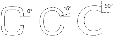
So, the Vertical part has and the Straight Arms part refer to separate measurements.
(Edited to fix the degree symbol; the Panose spec had used ordmasculine instead.)
2 -
@Thomas Phinney Got it! I wasn't picturing a C.0


Categories
- All Categories
- 46 Introductions
- 3.9K Typeface Design
- 489 Type Design Critiques
- 572 Type Design Software
- 1.1K Type Design Technique & Theory
- 665 Type Business
- 877 Font Technology
- 29 Punchcutting
- 530 Typography
- 121 Type Education
- 328 Type History
- 81 Type Resources
- 111 Lettering and Calligraphy
- 32 Lettering Critiques
- 79 Lettering Technique & Theory
- 563 Announcements
- 97 Events
- 116 Job Postings
- 169 Type Releases
- 180 Miscellaneous News
- 269 About TypeDrawers
- 53 TypeDrawers Announcements
- 114 Suggestions and Bug Reports