Old-style (minuscule) zero in Black weight serif

Dmitry Goloub
Posts: 10
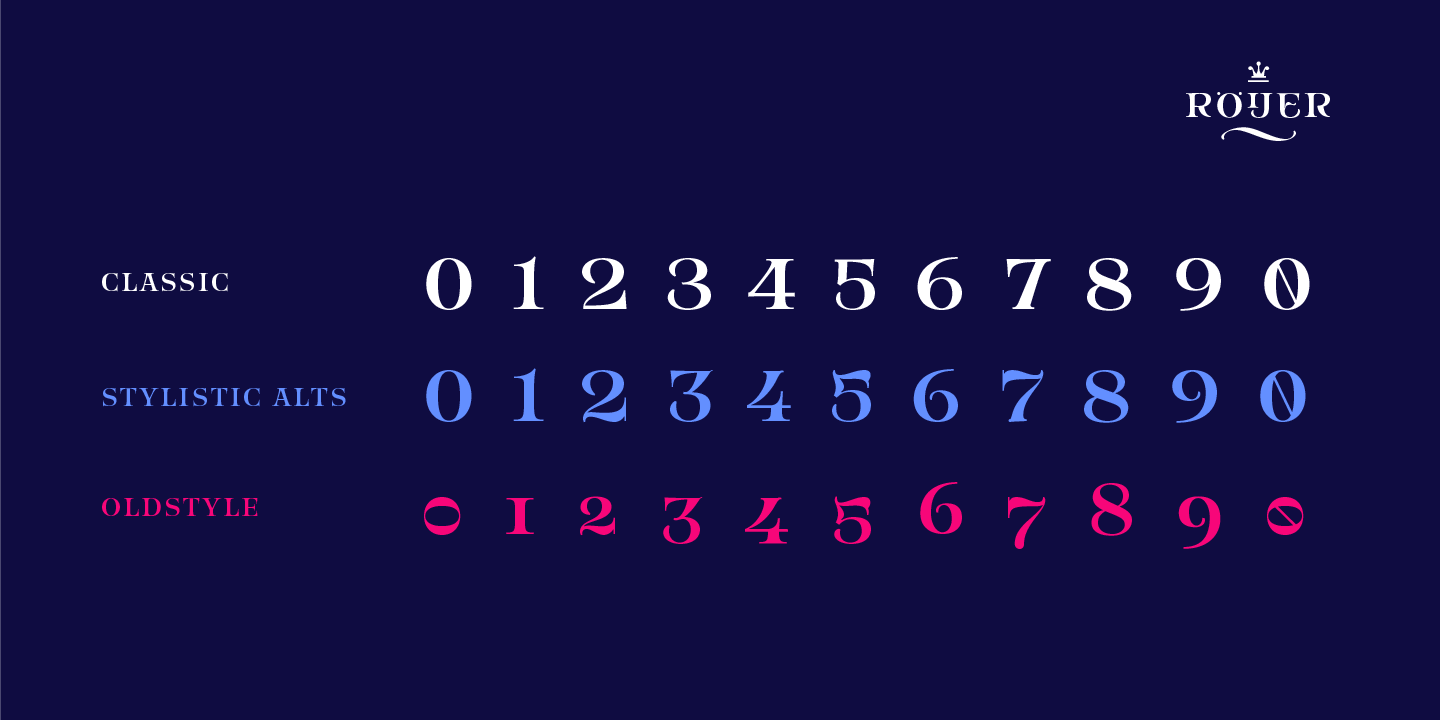
Hello everybody. I'm designing a contemporary, Elzevier-inspired serif typeface and now I've come to a rather interesting point—old-style figures. Normally you'd expect a stressless zero that's almost monolinear, but that it relevant for the basic "Regular-Bold-Italic-Bold Italic" model. I have a Light and a Black master—that's a kind of a problem, because in black, such monolinear stressless zero is too light and too out of style. I suppose that I could use other solutions for old-style zero such as bottom point raised above the baseline and/or reversed stress. What do you think?
0
Comments
-
can you show us a sample?
0 -

Well, the contours are yet nowhere near to the final release quality, but for now I need at least to elaborate the ideas of the glyphs.
0 -
your e, o, s, (a?) are too small, and so are the figures. Due to the experience of many, os figures (as well as small capitals) are good when slighly larger than lc x-height. The direction of your zero-design seems viable to me.
2 -
Maybe it's a side-effect of the overshoot suppression kicking in at a surprisingly high ppem size, but it seems like you have no (or not enough) overshoot of your round shapes, both at the baseline and the x-height.
That makes it harder to judge things like the size/effectiveness of the oldstyle zero, although the design direction seems viable.0 -
The monoline zero is almost never a good idea, in any style. Historicism is for historians, not designers.
My own preferred form of the OS zero is where the left side is thick while the rest is thin. Example: http://www.identifont.com/samples/berthold/Whittingham.gif0 -
Yes, that's right. The overshoots are actually ok.Thomas Phinney said:Maybe it's a side-effect of the overshoot suppression kicking in at a surprisingly high ppem size, but it seems like you have no (or not enough) overshoot of your round shapes, both at the baseline and the x-height.
That makes it harder to judge things like the size/effectiveness of the oldstyle zero, although the design direction seems viable.
Hrant H. Papazian said:
That's an interesting idea, I think I'll try it as well. Although its for modern serif and I've got transitional one, I think it's better to design all possible versions and then to choose.The monoline zero is almost never a good idea, in any style. Historicism is for historians, not designers.
My own preferred form of the OS zero is where the left side is thick while the rest is thin. Example: http://www.identifont.com/samples/berthold/Whittingham.gif0 -
That little curve on the left side of that foot needs fixing.0
-
My own preferred form of the OS zero is where the left side is thick while the rest is thin.The opposite is also viable, and I think creates a stronger impression in sequences such as

I originally designed the Brill text 0 with the heavy side on the left, but was unhappy with how feeble it made 00 look at the end of a number. Since 0 occurs at the end of a sequence far more commonly than at the beginning, this seemed better, at least in this typeface. [With regard to historicism, both forms occur in 17th and 18th Century writing manuals, but the form with the heavy stroke on the left is much more common.]
Of course, if one cares about consistency in modulation patterns, this form of 0 is only viable in typefaces with this kind of pattern. If you're building a typeface design around a modulation pattern that doesn't involve this model of thinning and thickening, this form will stand out at least as weirdly as a monoline 0.
[See how I did all that without mentioning the word 'stroke', Hrant. Just for you.]2 -
That form is also nice; the heavy-left model simply generally harmonizes better with the prevalent thick-stem-plus-rightward-augmentation pattern in Latin (especially in the caps). Another good approach is horizontal contrast (at least in a conventional numeral set where contrast is all over the place anyway), like here: https://us.v-cdn.net/5019405/uploads/editor/x6/5tm5vy5z5id3.png
Certainly in a monoline design a contrasty zero is rarely good, but to me no worse than the classical "thin ring" model.
[Thanks. :-]0


Categories
- All Categories
- 47 Introductions
- 4K Typeface Design
- 493 Type Design Critiques
- 576 Type Design Software
- 1.1K Type Design Technique & Theory
- 669 Type Business
- 884 Font Technology
- 29 Punchcutting
- 537 Typography
- 124 Type Education
- 332 Type History
- 81 Type Resources
- 113 Lettering and Calligraphy
- 33 Lettering Critiques
- 80 Lettering Technique & Theory
- 569 Announcements
- 100 Events
- 116 Job Postings
- 170 Type Releases
- 182 Miscellaneous News
- 270 About TypeDrawers
- 54 TypeDrawers Announcements
- 114 Suggestions and Bug Reports