Favourite Figures?


I love a nice scotch set of figures! What does everyone else fancy‽
Comments
-
I like:
— Rational contrast distribution sans wonky thin verticals and thick horizontals.*
— OS numerals where the "3" and "5" (and even the "2") ascend.
— In contrasted fonts I like OS zeros that are thick only on the left.
— Minor: for a slashed zero I like the slash to be a backslash.
BTW, the "5" always comes out the sexiest. Examples upon request.
* Look at the work of Catich, Harvey, Gürtler, Bouwsma, Jelesijevic... and yours truly.0 -
The user and all related content has been deleted.1
-
 6
6 -
I see your Casio and I raise you Soviet:
Շատ մի խարներ՝ քաքը կ'ելլէ:James Montalbano said:Come dite la merda infuriate in vostro linguaggio?
1 -
Related:
Saw this stamp in an old @NOLALibrary book and am curious about why the 7s are the way that they are. Surely you library or font nerds know. pic.twitter.com/8VWMaJZ6nA
— Kevin1 -
These are the figures in Matthew Carter's Mantinia font. The letters inspired by the lettering of Andrea da Mantegna and the inscriptions on facades of the Boston Public Library. The figures are entirely original and exceedingly handsome.0
-
Sorry, here they are:
 8
8 -
Anyway, I should have mentioned why these are my favorite numerals these days. I think that particular configuration produces the most beautiful segmented figures I've ever seen. Sure I can find lots of quirky segmented digits but these are, in my opinion, as good as it gets. The 2, 3, 5 and 9 end up with a tidy, square end on the bottom. The left side of the four is square and short while the right is high and chamfered. It's too bad they didn't use matching numerals on the top. The leftmost numeral is narrower which is only an issue on the stopwatch, timer or after 8pm in 24h format. The bottom matrix can display the day of the week in kanji too. I threw a NATO strap on mine.2
-
One of the major reasons I decided to revive the Scotch Modern was its magnificent figures—especially as I would be doing umpteen versions of them for various OpenType features.
I’ve no idea why the italic 4 has a descender, and I did briefly consider removing it as an “upgrade for contemporary usage”, but a better hand than mine designed it that way, so that’s the way it stays!
Well, one theory about the 4: along with the 2 and 3, it represents a quite different look to the roman, which is what occurs between roman and italic lower case letters anyway.
I wonder if there are many other typefaces that have a significant roman/italic structural difference?
7 -
I’m quite fond of these numerals from my mom’s 1970s typewriter:

2 -
Hybrid nums rule.0
-
ITC Modern no. 216 is also quite beautiful.

I think @Nick Shinn Scotch Modern a little more cheerful, what was the restoration based on? I wish I had more knowledge of historical restorations—but can I assume they were similar specimens?—Or am I way off? I guess that begs to ask, was Benguiat's based on a historical rational serif or his own iteration...?
1 -
Hrant H. Papazian said:I like:
— Rational contrast distribution sans wonky thin verticals and thick horizontals.*
Something like this?0 -
No, mind that "sans" (= without). Like this, from Harvey's Strayhorn:

0 -
Simon, here is a page from the book, published in Albany, New York, in 1873, from which I restored the Scotch Modern. A scientific work, which proved very useful in providing a large sort of characters! I haven’t come across this particular cut in any type foundry specimen, but it appears to be exemplary of a style that is quite generic.
 3
3 -
Found a beauty today whilst doing research.

0 -
I remain quite delighted with the ranging numerals I made for Gabriola.
 5
5 -
Sorry, John, but it appears to me that these figures are struggling to find their balance. The generous lower stories of the 3 and especially the 5 seem out of balance with the 6 and the 9. Yet, in the example 1297, the 9 seems quite wide, indeed. The foot joint of the 2 is too acute, perhaps because the upper part isn’t wide enough (it duplicates the upper story of the 3, which is unusual and, I think, undesirable—note the differentiations in the Modern faces, above, and in most other types). The open-top 4 is suggestive of italic figures in the Fournier style, though in that era it was often the custom to make the italic 5 an ascending figure, which provided better balance for it.
-1 -
Maybe numerals are best when unlike. Even more so than letters. I would make that zero less of an "o" though (for example by making it thick only on one side, probably the left).1
-
There's a tipping point in the increase of the extender space where the normally elegant ranging figures become very difficult to balance.2
-
I remain quite delighted...8
-
I like the Tamil numbers the best... ௦௧௨௩௪௫௬௭௮௯4
-
Another designer of numerals with "rational" weight distribution:
https://www.myfonts.com/fonts/typesketchbook/morl/
0 -
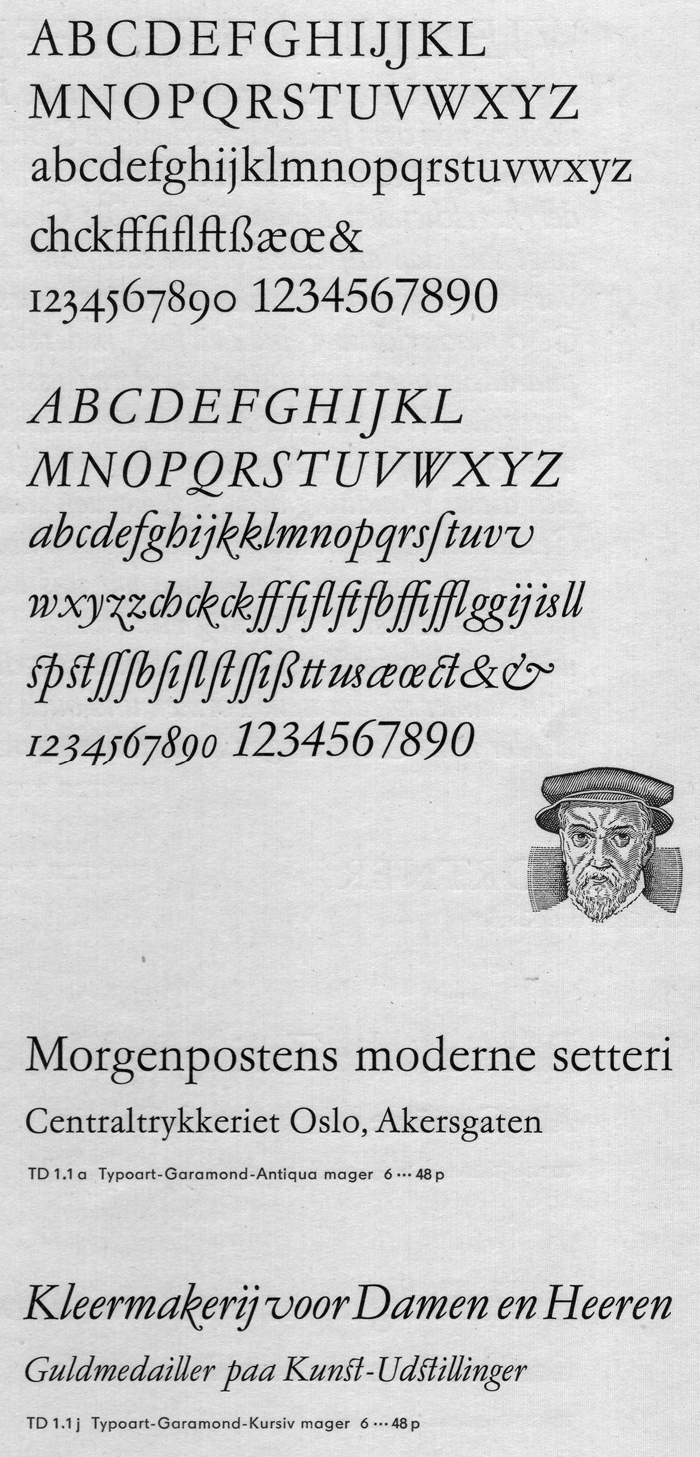
My newest crush is Typoart Garamond, roman upright:

... and generally any oldstyle 5 with its flag tilted up.4
Categories
- All Categories
- 46 Introductions
- 3.9K Typeface Design
- 489 Type Design Critiques
- 572 Type Design Software
- 1.1K Type Design Technique & Theory
- 663 Type Business
- 876 Font Technology
- 29 Punchcutting
- 530 Typography
- 121 Type Education
- 328 Type History
- 81 Type Resources
- 111 Lettering and Calligraphy
- 32 Lettering Critiques
- 79 Lettering Technique & Theory
- 561 Announcements
- 96 Events
- 116 Job Postings
- 169 Type Releases
- 179 Miscellaneous News
- 269 About TypeDrawers
- 53 TypeDrawers Announcements
- 114 Suggestions and Bug Reports


