Type Identification (Historical)

I need to identify this typeface from a print in 1808. It's from the first printing office in Brazil (Impressão Régia).
The printing office was brought from Europe in that same year, some say that the typeface and the press was sent from England. On this piece the typeface didn't have a 'W', they use 'VV' instead.
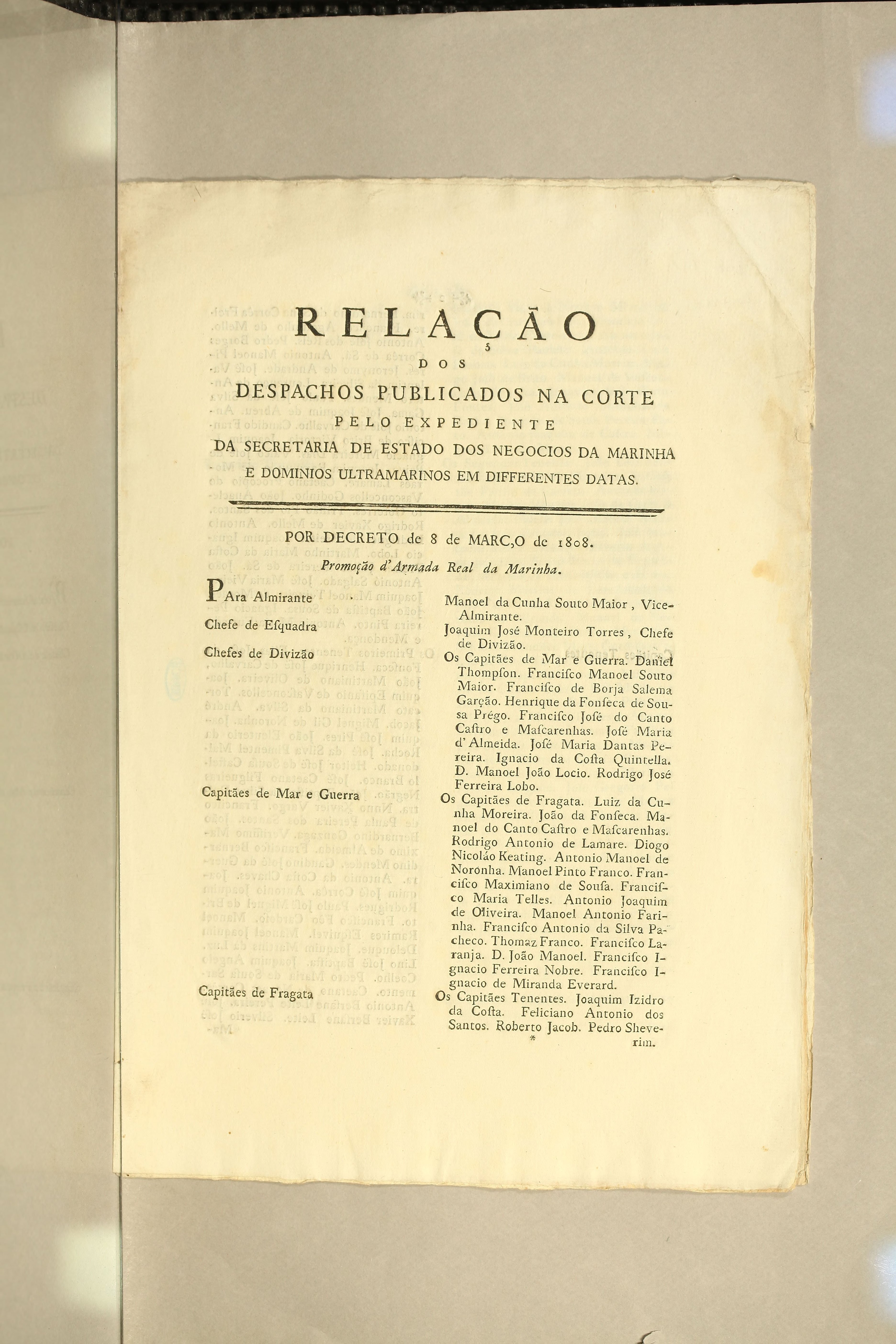
Any ideas? The Q, J, g, 4, look particular.
1.jpg
2.jpg
Thank you!
PS: Here is the whole document:
https://archive.org/details/relaodosdespacho00port
Comments
-
Should have posted it on History of Typography, but can't seem to do that now, sorry.0
-
There are two typefaces here.
Body text is Elzevir 14pt. Some subtitles also use it.
Main titles and some subtitles use a transitional font without tilde or cedilla —booth are made with other pieces. It is an transitional English typeface from early 1700s also used in books printed in Portugal. Unhappily I cannot find its name.
Although this is the first book printed by Imprensa Régia, the very first printed in Brazil is from 1747, composed in Rio de Janeiro under especial license by Inquisition.1 -
Igor, thank you for your answer. Yes, I should have said that Impressão Régia was the first to publish a newspaper, it was not the first printing office, sorry.
Where can I find a type catalogue with the original Elzevir?
How do you know it's 14pt?
What do you mean by 'both are made with other pieces'?
Is there any book or articles about the typography of Imprensa Régia?
This information is for an upcoming book, about typography in Montevideo,
Thank you!
0 -
I don’t know what these types are, but they are not English types. Igor's claim is incorrect, yet I can see how he came to it. These types' relationship to "Elzevir" has nothing to do with the 17th-century Dutch types, but rather with their similarity to the loose-fitting “Elzevir Revival” types that became highly popular in France from the mid-1840s (beginning with the types made by Francisque Rey for the Lyon printer Louis Perrin) and into the early 20th century. (In the U.S. these types were known as "French Elzevir.") But the types you show are only coincidentally like the later French ones. I would suggest you look at Portuguese type specimens of the time. This is coarse work, with some oddly wide capitals (A, E, F, and especially M), yet the lowercase, for all its oddities, is even in color.
2 -
Scott,
Thanks for the advice. It's hard to find Portuguese type specimens, but I will try.
You think that there are several different typefaces mixed in the uppercase?
Thank you
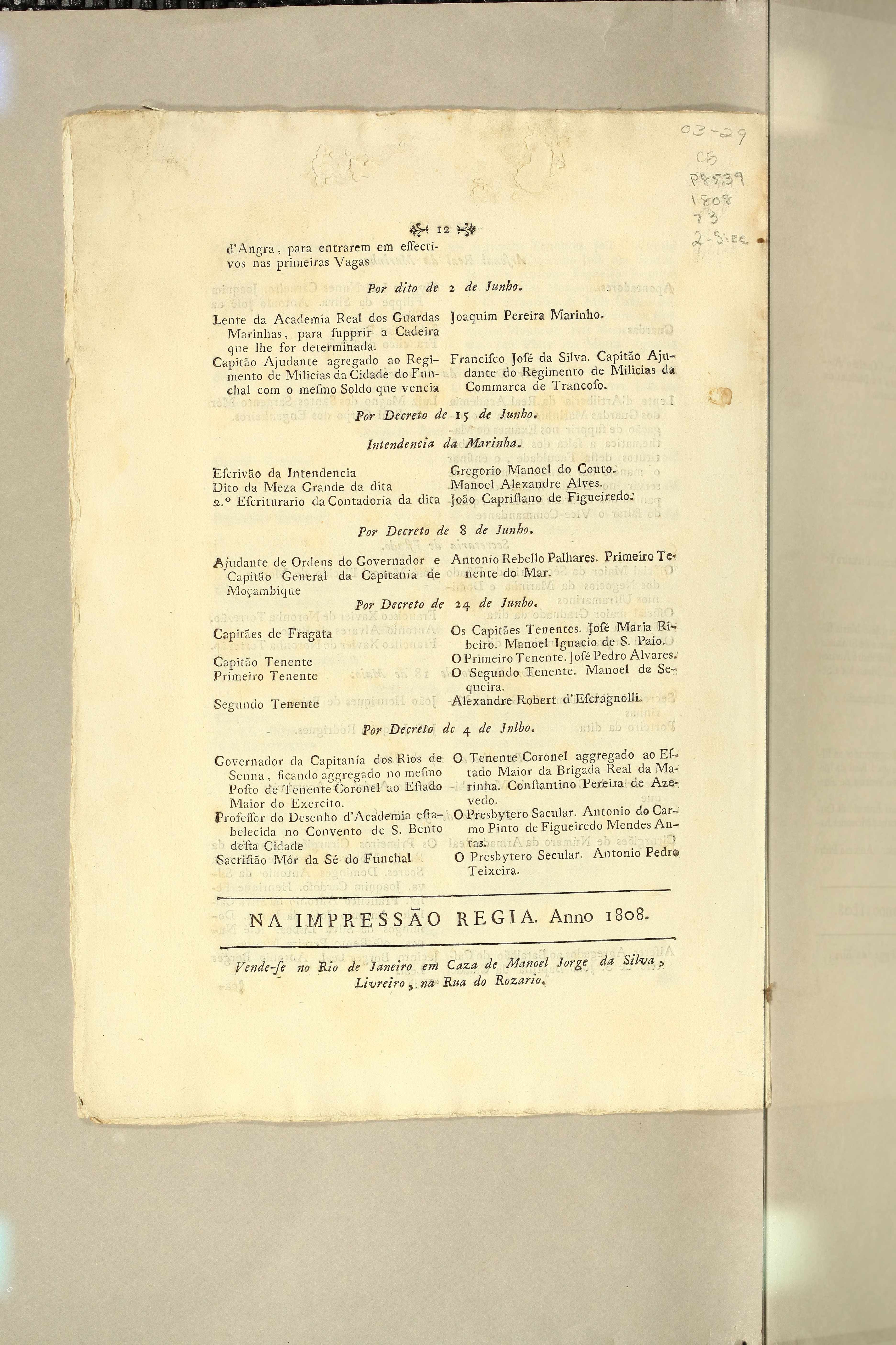
PS: The 'K' is very particular, and there seem to be two types of '2'0 -
In the larger type at the bottom of the second image, the M has reversed contrast. That might be a clue that could help you find the specific face if specimens can be dug up.0
-
Firstly, a brief historical background.
In January 1808 the Portuguese royal family escaped from Lisbon to Rio de Janeiro. Portugal refused to take part in Napoleon's continental block against England. Portuguese decision was not only due to the close partnership both countries had since 1700s, but especially because a broke with England would cause the Portuguese colonies to be taken by London. Napoleon answer was to invade Portugal.
Just before the royal trip, a set of typographical equipments came from London. They were destined to Lisbon's Imprensa Régia (Royal Press). The purchase of a press office was reported by Hipólito José da Costa in the newspaper Correio Braziliense, printed in London due to Portugal censorship. Laurence Hallewell, in O livro no Brasil, goes beyond and report that the purchase included 28 type sets and one or two presses, all at the cost of 100 Sterling Pounds.
Due to the royal escape, the typographical set was sent to Brazil together with a large group of people, ships and goodies. A total of 10,000~14,000 people followed D. João VI, Portugal's Emperor, protected by English navy. Type machinery were used to mount the new Imprensa Régia in Rio de Janeiro, in May 1808.
The book referred by Fernando was the very first one made on this office. Before it, they printed some royal decrees, including the late war declaration against France. Until then print was prohibited in Brazil and the only books available here were imported from Portugal under strict permission by Catholic Inquisition and Portuguese government. A huge contrast from Spanish America.
There was only a precedent. In 1747, the printer Isidoro da Fonseca came from Lisbon and established an early press in Rio. But just after the production of four small books —and even considering they were authorized by local Inquisition censors— Portuguese government dismantled the office and Fonseca was deported back to Lisbon.
It is reported that Imprensa Régia (also called Impressão Régia, Royal Printing) was using good quality type and paper. In a historical research published in 1977, Hallewell points that José Conceição Mariano Velloso, a well experienced composer who worked in England and London, was working in the new press. The historian Rubens Borba de Moraes remarks the quality of these first printings was very high, what is endorsed by the research of Marcia Abreu. She tracked down the commercial activities of Paul Martin, a book producer from Lisbon who regularly did order books to be composed in Impressão Régia — although it was easier to make them in Lisbon.
Back to the book Fernando refers, it was printed in a large format (29,5 cm tall) in 14pt. This is registered by Hallewell and by a historical book made in Imprensa Régia to celebrate its 150 years. The Elzevir reference comes from that:
Is it really Elzevir or, like Scott-Martin pointed, another type barely derived from the Dutch model? I believe we need more comparisons to get an answer. Some images would surely help. And we also need to consider there isn't one Elzevir but several cuts made during several decades.
Anyway, the information above came directly from the print house. And most books printed there until ~1815 also are reported as using Elzevir. An interesting question.
Note this other sample from the book:
Italics are compatible with most Elzevir samples I saw. And here there is no M with reversed-contrast. Actually, this odd M should be disregarded as a clue to identify the typeface because it just appears in the front page. In all the remaining pages, body text is composed with a proper M:
To get more visual information, here is a sample from another book printed by Imprensa Régia, in 1809:
This is also reported as using Elzevir, in 10pt and 8pt:
As I said before, there is a second typeface here. You can notice it in the line "NA IMPRESSÃO REGIA" two images above. Odd M, clearly different R, and no tilde! It may be not an English design, but came from London, show a transitional style and lacks Portuguese accented characters. This was a typical problem in early printings made in Portuguese language, visible in the book title:
This is what I mean by "made with other pieces". The display size typeface has no tilde or cedilla. Ã was built with a small J and Ç is made with an upside-down small ç. This seems to indicate a typeface cut to be used only in English texts. A French set would never lack Ç as it is part of French alphabet. This kind of improvisation was also present in the aforementioned 1747 book:
Of course, when historians and researchers talk about quality, they refer to body text. These adaptations in display sizes cannot be regarded as good quality and were strangely common since early 1700s. See again the lack of proper Portuguese characters in this book printed in Lisbon in 1717, making Ç and Õ with other pieces —here, with C and (:
Sorry for the large post. Hope this would be useful.
Please let me know if you want PDF version of these books or further information.10 -
igor, thank you for this information, is extremely valuable to me.
I would appreciate the PDFs so I can quote them on my investigation.
(you will be thanked in the book )
)
I'm specially interested in:
•Hallewell and the reference to the purchase of 28 cases of english type
•Hallewell and the Elzevir 14pt reference
Many thanks!
PS: Hopefully with help from other TypeDrawers we will be able to identify it.0 -
Igor, thank you for this very impressive piece of bibliographic research. Searching for the identity of this “Elzevir” type may prove difficult. In early 18th-century England, “Elzevir” became a generic name for any number of types, without reference to their specific origin or to their Dutch namesake. What it meant in the English book trade was something like “small and crisp.” James Mosley, a more serious historian than any of us, had long been curious about how and when the term came into use, and published this interesting entry on his “Typefoundry” blog:
http://typefoundry.blogspot.com/2011/11/elzevir-letter.html
It’s difficult to believe the text roman is English, despite the circumstantial evidence. It doesn’t look like anything English I have ever seen, especially with such primitive capitals. (Could it have been apprentice work being sold off for cheap?) The italic, on the other hand, might have been cast from some very old matrices, though some of the late 18th-century Spanish typefounders (Merlo, Espinoza, Monfort, et al.) had revived similar forms—a curious stylistic regression after a more progressive and inventive period.
2 -
0
-
Thank you, George.0
-
Not sure if I can help, but here it goes.
The first printing types originally developed in Portugal, were designed by the french typographer Jean de Villeneuve (João de Villeneuve, in portuguese) in 1732. He published a small type specimen explaining the process and reason why Portugal should have it's own type founders. The book is entitled "Primeira Origem da Arte de Imprimir dada à Luz pelos Primeiros Caracteres" and was dedicated to the king D. João V, which financially supported the production of the matrices and types.
Here is a link where you can download the pdf: http://purl.pt/220
This said, in my opinion only a couple of letters resemble the fonts created to be used by the Regia Officina Typografica. Until the early XIX century they systematically used this fonts in all sort of publications, as can be seen in one of my books from 1802:
The mentions of the misuse of the cedilla and tilde are true, but Villeneuve produce them all:
Regarding my dear colleagues opinions, is mostly sure that:
- No way a Portuguese foundry would use any Spanish types.
(Portugal was a part of Spain from 1580 until 1640, year when Portugal regain the independence, so Spain was persona non grata for several centuries)
- Until the 1st Napoleon invasions, France was a model of development to the Portuguese kings, even the idea of Illuminated Despotism, so probably the fonts have a lot borrowed from France. Have a look at Fournier types and compare.
- The king D. João VI escaped the Napoleon troops and went to Brasil taking all the matrices and types. But we went on a rush, as the coward he was and surely no one had enough time to perfectly organise all the types.
The result will probably be a mixture of of several types of the same size, used in the same publication.
Best,
Dino dos Santos
5 -
Thanks, Dino. Your information is valuable. You probably know that Paulo Heitlinger designed a font named João Quinto which is based on Villeneuve's types. He also reproduced the adapted cedilla and tilde, although he did this even for lowercase.
Regarding the titling face, I believe many press offices kept using older all-caps sets fulfilling the line size. These types with no room for diacritics were quite common during 1600s as most books were wrote in Latin —so no diacritic was needed. Later, instead of purchasing new sets just for titles, printers chose to use the existent ones with adaptations. If this is correct, the title of this 1808 book used a set not purchased from England in early 1800s.
Regarding the body face, D. João VI's rush was an invitation to chaos and is quite possible the press material had became a mess. Anyway, I don't think this exact typeface is a mixture. It is very coherent through the whole book. The same could be said about the italics. What seems possible is to have roman and italic from different fonts use in body size. In other hand, we agree about mixtures for the other sizes, as the odd M and different R shows.
Still trying to identify it, there are several similarities with many typefaces from 1700s and even 1600s. As Scott-Martin already argued, it is not a legit Elzevir, although it follows part of its design. I tried to track Dutch heritages into England (from Fell types and later development) and also into France. One of my clues is the larger bowl of lowercase a, clearly departed from old style types.
The more similar font I found is 1776 Independence, by GLC. This is based on an early Caslon (!) used in USA. But it is just similar, not the real thing. Other similar fonts, also by GLC, are 1786 GLC Fournier and 1790 Royal Printing. But the criminal is still unknown.
The italic resembles 1589 Humane Bordeaux, although this "old" design for italics lasted well into 1800s, what makes it less informative about dates.
I made a folder in Dropbox with a set of materials about the "Imprensa Régia mystery".
Fernando: the Hallewell book is partially digitized and available online on Google. If you need a full copy, try this store of used books. This other book is also a reliable reference. In Porto Alegre there is a newspaper and magazine museum with printed material since 1822. It is closed now, but may be a good visit next time you come to Brazil. Please PM me for any further question.1 -
This is all very interesting, thank you Dino, Igor and the rest for your valuable help.0


Categories
- All Categories
- 47 Introductions
- 4K Typeface Design
- 493 Type Design Critiques
- 575 Type Design Software
- 1.1K Type Design Technique & Theory
- 669 Type Business
- 884 Font Technology
- 29 Punchcutting
- 537 Typography
- 124 Type Education
- 332 Type History
- 81 Type Resources
- 113 Lettering and Calligraphy
- 33 Lettering Critiques
- 80 Lettering Technique & Theory
- 569 Announcements
- 100 Events
- 116 Job Postings
- 170 Type Releases
- 182 Miscellaneous News
- 270 About TypeDrawers
- 54 TypeDrawers Announcements
- 114 Suggestions and Bug Reports