LibreOffice 5.3.0 adds OpenType Layout feature support

- OpenType layout is now supported on all platforms, and default OpenType features are enabled for all languages.
- Graphite layout is now supported on macOS as well, not only Linux and Windows.
- OpenType layout features can be controlled using the syntax previously only supported for Graphite fonts.
- Improved Kashida justification for Arabic script.
- Improved vertical text layout for CJK scripts to use HarfBuzz instead of the home grown solution(s).
- All text layout now goes through HarfBuzz, there is no longer any distinction between so-called simple and complex scripts.
- Many Windows-only and macOS-only text layout bugs have been fixed.
- Improved and consistent calculation of inter-line spacing across platforms
- Enable vertical “left to right” block direction, needed for traditional Mongolian and Manchu
The OpenType Layout features in LibreOffice are controlled by appending a suffix to the font name in the "Character" font dropdown list. For example, if I select some text and choose the font "EB Garamond" from the font list, I get the default features applied (e.g. "liga"), but I can edit the font name in the dropdown list and change it to "EB Garamond:dlig=1", then the "dlig" feature will also be applied, or I can specify: "EB Garamond:dlig=1&lnum=1&hlig=1" as the font name to have more features enabled. See this in action: http://recordit.co/wWIOisqkQ0
Comments
-
Are they going to add buttons for the OTL features? This seems like a rather odd way to activate OpenType features given it’s in a major release and not an alpha.0
-
Buttons?! Didn't need no stinking buttons in WordPerfect 5.1.4
-
You can also just select the feature without any assignments, and the hyphen-minus sign before the feature tag disables it, e.g. "EB Garamond:-liga&dlig" disables standard ligatures and enables discretionary. That is a little bit more concise, but I find the ampersand the bottleneck: it would be so much easier to just type another colon.
Stinking buttons? I would even go for checkboxes, with the current state of affairs it is hardly possible to set features for arbitrarily chosen fragments of a passage of text and then change the font. And that's something I would like to do with my Blackletter design consisting of two layers, of which one is used for rubrication. If I want to customize the text to include ligatures and scribal abbreviations for some words and not for others (e.g. replicating a manuscript) and then copy the text and overlay the copy but only change the font to the rubrication font then LibO will erase all my work from the copy.
Okay, I know that's not something a lot of people need or care about... But still.2 -
It's great that the support is there, and a pity that it is implemented so poorly that I see no reason to bother getting LibreOffice to play with it, as yet.

This is a fine example of how and why average software users might get the impression that Open Source software is not for them.2 -
To give some context, the switch to HarfBuzz was done mostly by a Google Summer Of Code Student and me (contracted by The Document Foundation). The work I was doing was originally intented to provide a way for doing text layout tests in a cross-platform way, but I convinced them that switching all text layout to HarfBuzz is the best way to achieve this. Typography or OpenType feature was not actually a goal, but rather a byproduct. I ended up doing much much more work than what I was paid for.
The syntax for enabling optional features existed for years (actually it existed since old OpenOffice days) to support Graphite fonts. LibreOffice 5.3 enabled it for OpenType fonts as well just for backward comparability since all text layout now goes through the same engine (previously we had 8 of them!). It wasn’t supposed to be prominently advertised, but people just “discovered” it. It has always been just a hack.
Better UI and file format support (ODF does not have support for optional font features, though OOXML does) is planned at some point in the future (but it really depends on either someone volunteering or financing it, as it seems that existing customers for companies contributing to LibreOffice have little to no interest in typography).
7 -
Does this include variable fonts?
0 -
No, variable fonts weren’t even announced yet when this work was being finished.
0 -
I have been waiting ten years for this, so I am happy, even if it is not yet user-friendly.
If you're willing to edit a few styles to enable features that you need, e.g. Small Capitals in headings, Ordinals and/or Alternative Fractions, etc., in Body Text, then it is not difficult to apply those styles to text as required.
I have added a few notes to my review page for LibreOffice to get non-geeks started.
Hopefully, within another year or so, someone will volunteer to do the necessary work to implement a GUI to make this more convenient to use for ordinary users. Ordinary users think that the Private Use Area is something entirely different to a set of code-points set aside for OpenType Glyph Substitutions or whatever else the font designer might want to use it for.2 -
I think it is time for OpenType/Open Font stakeholders, and volunteers, to organize an effort to produce an open, standardized reference UI for font features.
2 -
There are a lot of registered tags for OpenType features. It would take a long time to arrive at any consensus.SiDaniels said:I think it is time for OpenType/Open Font stakeholders, and volunteers, to organize an effort to produce an open, standardized reference UI for font features.
0 -
Bhikkhu Pesala said:
There are a lot of registered tags for OpenType features. It would take a long time to arrive an any consensus.
Many features can be grouped by commonalities in how they work and apply. Aside from language-related features that should happen automatically and need no interface at all, the number of distinct groups that need different treatments is not very large.
Simply defining and enumerating such groups is itself a key part of the work (call it stage 1), and I don’t think consensus would be hard for that.
That said, arriving at consensus on interface (stage 2) might indeed be hard. But I don’t know that the reference UI itself needs to be driven by consensus.1 -
The problem with an OpenType UI as a volunteer project is that there's no money for user research and testing. Without that we could end up with lots of developers implementing a design users hate, and the situation would be no better.0
-
On the one hand, I have to agree that user research and user-based testing would be very helpful.
Yet, despite that.... Absent a designed interface, you'll get a menu-driven monstrosity users hate anyway. The interface can't get much worse than what happened in Office and Creative Suite.
Plus, compiling the stage 1 info is independent of the actual UI, but important to have prior to defining that UI.1 -
yes, it is user research, interaction design and user testing that is needed, on multiple UI platforms (desktop, tablet and mobile).
it is UI infrastructure work (‘just deal with everything for everyone’) which makes most people’s head explode when just contemplating it. I guess that is reflected in that no one wants to talk about enabling (i.e. budgets) these kind of projects. I have experienced that before; it is typical for infrastructure.
so although it is 21 months ago that I got involved (by request) in this, and did last year preliminary work for TYPO-labs—getting a good feel for the complexities and the disgust in the font designers and typographers world that this is still an open issue—I have not been able to get the stars aligned (i.e. a budget) and make this a serious project.
I look forward to seriously work on this, I would appreciate any help in getting towards that goal.1 -
If you take a look at how OpenType features work in Affinity Designer for Windows (or Mac), it might give you some inspiration. Since it's a new program, designed by Serif who implemented OpenType support many years ago in PagePlus X5, their developers have some experience to base the design on. Dave Harris is the man when it comes to typography.peter sikking said:I would appreciate any help in getting towards that goal.
His response to one of my threads.
However, so far it does not support Complex Text Layout for Asian scripts.0 -
sure I can look at how program X, Y or Z does otf UI… there is a time for that in any structured design process.
my request for help was for enabling such a project—for instance by getting the main players at one table and get each to chip in their share of a design budget.0 -
I might be inclined to start by contacting Vlad at Monotype and suggesting that a subgroup be established under the umbrella of the Open Font Format working group to work towards developing reference UI(s). Perhaps with a meeting set up at TypeCon or ATypI where interested parties could get together and come up with an approach. That would likely draw the main players to the table, where funding would be one of the issues to discuss.2
-
TypeLab in Berlin is coming up in early April, seems like the next good venue for this3
-
hey SiDaniels, thanks for that initiative.
TYPO labs takes place literally at the end of the (short) street where my studio is. joining the discussion should not be a problem.1 -
I had some conceptual input on the UI implementation of OT features in Affinity Designer, in Corel Draw X5, in Mac OS X and in the CSS3 Fonts syntax.
I think the advent of variable fonts means that there is a chance app developers will be revisiting their font selection UIs. I think the best community effort would be to debate and prototype UI for font selection in general.
Discussing a UI only for OT features is a bit like discussing a UI for color brightness and saturation without ever thinking of color swatches or different color models.
I think most users are interested in **getting the desired type**, not applying OpenType Layout features.
Whether the desired type is specified via picking a family, picking a static style or a dynamic variation, applying a feature or specifying an external numeric parameter such as size, leading or tracking, is somewhat secondary.
Also an important aspect is glyph input. For example, today, keyboard layouts seem to be completely disconnected from any notion of typography. There are virtually zero methods to input combining marks on any platform, and entering 90% of Unicode characters is extremely difficult.
If I typeset a text in Russian, in a bold sanserif font, and I want to use a horizontal rightwards arrow that visually matches the text, I don't really care if that arrow comes for the same font as the Cyrillic letters, or from a completely different one. But currently, it's virtually impossible to find and enter such a matching arrow, in all systems and all apps (or it requires you to use several apps). The fact that it's then tricky to choose the OpenType swash variant of such an arrow is almost secondary.")
4 -
I agree with Adam that ot features is not the only problem with type specification today, nor the top level concept.
However I'm even less sure how to quantify the impact of the other issues...0 -
This thread is a bit old but I caught up with the changes in LibreOffice 5.3 only a couple of weeks ago. I am very pleased with, and very grateful for, this development, even if it is a byproduct of other changes (as Khaled said).
In fields like classics and medieval studies, the issue of glyph variants frequently comes up. For a very long time I have wanted to encourage people to move away from the PUA in order to get texts that are cleaner and more in line with the Unicode model. But the only software that handles all OT features and works with all scripts/languages (including historic ones) is XeTeX. It produces beautiful type (I have set books with it) but it is so different from what people are used to, and the learning curve is so steep, that it's hard to recommend. Everything else out there has significant limitations -- very expensive, won't handle Plane 1 characters, only supports a limited set of OT features, etc.
Now we have LO 5.3: affordable, supports all the OT features I've tried even with Plane 1 characters, and is cross-platform. To someone like me who has experimented with various pieces of software and found them all lacking in one way or another (except XeTeX), this is a true gift. I understand that users accustomed to checkboxes/pulldowns/whatever to access OT features may think it's old-fashioned or inconvenient to learn and type codes. (Please don't say it's hard, because it isn't.) But this really is minor compared to not having access to the features at all.
That said, I would be happy help in any way I can with developing a better interface.
4 -
I recommend people who have basic programming and design skills to have a look at the Typography toolbar extension for LibreOffice:It "basically works" with the new OTL support although it was developed with the Graphite support in mind.Someone could extend it to include support for all OpenType features. The toolbar was developed by László Németh <nemeth@numbertext.org> and is available under the liberal BSD license.
My guess is that the author of the toolbar might be willing to do some more work on it, if provided with some assistance and/or funding. As I said, there toolbar is already usable but it only supports a small subset of features, and is somewhat Graphite-centric. It also provides control for some aspects that aren't realized through features. It does provide an excellent model for further work.2 -
The Typography toolbar is developed in association with FSF.hu, the Hungarian free software foundation. These are the people behind Hunspell, the spellchecking and hyphenation opensource engine that is today the de facto standard among many vendors (used by macOS and by Adobe apps).
Here is a presentation that Laszlo have 6 years ago about typography support in LO:
http://numbertext.org/linux/LibOConf2011_DTP.pdf
With native OTL support in LO, those efforts could be revived because now it's not just about 1-2 fonts but a vast universe of fonts.1 -
Great news, but after small test I see one problem:
program treats glyph with applied OpenType feature as separate block of text, and have problem with kerning. As example:
Kerning value between glyphs "A.init" and "W" exist in font.
With it, OpenType support is only partly useful.
0 -
That is a general problem with LibreOffice, any change in styling will break the text run. Changing e.g. the color or even underline will cause the same issue.
The syntax provides a workaround for this, you can specify features like Python dicts, e.g. “Foo Serif:swch[:1]” will apply the feature to to the first character only, so one can use the same font on the whole string and get the effect you want. That is even more cumbersome to use especially if one want to activate a variant in the middle of a paragraph.
3 -
brilliant, it's work perfect. But most probably for "normal" user it's to complicated...Khaled Hosny said:The syntax provides a workaround for this, you can specify features like Python dicts, e.g. “Foo Serif:swch[:1]”
0 -
Both Firefox and Chrome (and also XeTeX) suffer from the same issue. When I reported this for Firefox it wasn’t considered a bug. In Scribus I made sure we handle this correctly, but basically everything else in Scribus is broken and it does not allow any arbitrary font feature yet (the underlying format though allow for any feature, so probably one can write an script to provide such a functionality).
4 -
This is very unobvious for software developers who use existing text layout libraries to solve.
Their code needs to itemize the text into runs which have the same font, size, script, language system and direction. Then, they query a text engine using a series of Unicodes, the script+languagesystem+direction and receive back a series of glyph IDs and their positions.
Optionally, the software developer can specify the user-selectable features to be enabled or disabled, but not all layout engines have a mechanism to specify those features for only specific characters.
So in many cases, a change in the set of user-selected features constitutes a run break, i.e. a change not only of the font but also a text color or a set of features is treated the same as change of the font.
This is an aspect that has never been overly-well defined and described by the spec (in fact, the entire process of text layout hasn't).
Even if a layout engine has an API that allows specifying user-selected features on a sub-run level (e.g. using a list-like syntax such as LibreOffice and hb-view do it), it’s still not entirely obvious how those should behave. For example, if I have a word “astra”, and enable a contextual feature only on the 2nd and 3rd character (“st”) and that contextual feature includes lookups that analyze preceding and following context, should the entire word (and beyond) be used for the context matching even though the actual substitutions only apply to the glyphs representing the “st” string?
Or what should happen if I have the word “AVANT” and specify "kern[2]", i.e. that kerning should only be “applied to the 2nd character” (i.e. “V”)? Kerning on which side?
IMO, one conceptual weakness that the current OpenType Layout model has is that the substitutions and positioning steps are typically mushed together in one step, although in fact, they are very very different in their nature.
For GSUB processing, you generally need run itemization, because each script-specific shaping engine does its special thing behind the scenes, automatically applying certain simple GSUB features at certain locations that would otherwise need to be defined as complicated contextual features. For that, the notion of script, languagesystem and directionality is useful.
But once all the characters have been converted to glyph IDs, and all the special GSUB pro creating has been done, we arrive at a simple series of glyphIDs laid out horizontally or vertically (not even in any “direction”, really).
At this point we enter the GPOS processing where, in reality, script, languagesystem and directionality shouldn’t really matter at all. We have some boxes and we just need to shift them around, depending on what they are and what are their surroundings.
The current GPOS model isn't really good for it, it has tons of shortcomings. It disallows positioning across scripts, it makes 2D positioning tedious, so it ends up using different methods for different kinds of positioning: horizontal, verticsl, cursive, math etc. And even defining these relationships is tedious.
At this year's TYPO Labs, the panel discussion on liberating digital type design from the metal rectangle spent some time on this:
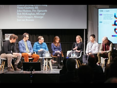 https://m.youtube.com/watch?v=P2JA5EgoDC0
I think we should think of this more and propose much better solutions. The GSUB stuff, especially with USE, is probably pretty decent. But we probably should start thinking about an "UPOS" (Universal Positioning) concept that would redo the way the typographic pieces are positioned in the canvas, in a much more flexible way.
This wouldn't necessarily mean a complete change of the paradigm — existing Unicode processing and script-specific, contextual and user-selectable GSUB processing would probably be kept. But once that is done, and the layout engine arrives at collections of typographic pieces to be arranged, instead of using the short-sighted GPOS, a more flexible solution could be used.
This could take into account things that happen across text lines, across different fonts, between the same font but at different sizes, across different instsnces of a variable font etc.
Maybe it would have a way to “re-run” some substitutions (e.g. try different ones from a GSUB Type 3 lookup) to arrive at a result that produces least clashes or best merges.
Either way — I don't think any short-term fix will be much good. The positioning aspect of text layout needs to be revamped comprehensively.
5 -
Ps. Of course a short-term fix is that:
1. Either you work on longer runs that are insensitive to sub-run user-selected features (like the Pythonic list notation in LibreOffice or hb-view allows),
2. Or you do your itemization including itemization on change of user-selected features but only for the purposes of GSUB shaping — and once you’re done with GSUB, you merge the runs as much as possible and do GPOS processing on longer runs that are insensitive to sub-run feature changes (and to other changes ideally, such as text color, underline etc.).
This would be a fix for this particular problem, but I’m not sure if it’s worth the effort to re-engineer an existing solution, because there are much larger fish to fry.0


Categories
- All Categories
- 47 Introductions
- 4K Typeface Design
- 495 Type Design Critiques
- 577 Type Design Software
- 1.1K Type Design Technique & Theory
- 671 Type Business
- 885 Font Technology
- 29 Punchcutting
- 539 Typography
- 125 Type Education
- 333 Type History
- 81 Type Resources
- 113 Lettering and Calligraphy
- 33 Lettering Critiques
- 80 Lettering Technique & Theory
- 569 Announcements
- 100 Events
- 116 Job Postings
- 170 Type Releases
- 182 Miscellaneous News
- 270 About TypeDrawers
- 54 TypeDrawers Announcements
- 114 Suggestions and Bug Reports