Is type hinting for screens still relevant? Should new type designers learn it?
Fredrick Brennan
Posts: 3
High DPI displays are becoming the norm, and this is resulting in font hinting being used far less frequently than before.
Consider the mainstay of legal documentation, 10 point (~3.5mm) Times (New Roman).
You can use this page to calculate the DPI of your device: http://dpi.lv/
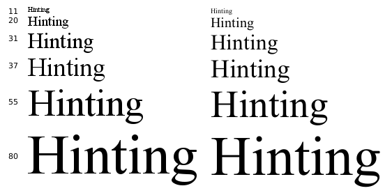
On an 80ppi screen, the glyph will be ~11pixels tall. Hinting is obviously needed.
On a 150ppi screen, the glyph will be ~20pixels tall. Hinting is obviously needed.
A MacBook Pro has a 227ppi screen. The glyph will be ~31pixels tall. Hinting may be needed depending on font.
I'm typing this on a Microsoft Surface Pro 4 with a 267dpi screen. The glyph will be ~37pixels tall. Hinting may be somewhat noticeable for some people or people trained to notice it.
Some believe ( http://prometheus.med.utah.edu/~bwjones/2010/06/apple-retina-display/ ) that 300ppi is the maximum perceivable ppi.
On a 401 ppi screen (such as the one in the iPhone 6), the glyph will be ~55pixels tall. Hinting won't be noticeable.
On a 576ppi screen (such as the one on the Samsung S7), the glyph will be ~80pixels tall. Hinting won't be noticeable. I actually have this phone, and can only see the individual pixels with a magnifying glass.
So my question for the type design community is: is hinting still relevant in 2016? Should new type designers learn it? I'm not exactly a new type designer, I know some things about hinting, but I'm wondering how much more time I should commit to studying it if it won't be used in 5 years.
If you are still using a low DPI display, you can get an idea of how hinting affects fonts on high DPI displays by rendering them at the pixel sizes above. Here's the string "Hinting" rendered in Times at those sizes, first hinted then unhinted. GIMP was used to make the image.
(Note: Your OS might upscale this image if you're using a high DPI display. Display it in Paint or Photoshop at 1px = 1px to see.)

(If this or similar has been posted here before, I apologize for not finding the thread :-( )
Consider the mainstay of legal documentation, 10 point (~3.5mm) Times (New Roman).
You can use this page to calculate the DPI of your device: http://dpi.lv/
On an 80ppi screen, the glyph will be ~11pixels tall. Hinting is obviously needed.
On a 150ppi screen, the glyph will be ~20pixels tall. Hinting is obviously needed.
A MacBook Pro has a 227ppi screen. The glyph will be ~31pixels tall. Hinting may be needed depending on font.
I'm typing this on a Microsoft Surface Pro 4 with a 267dpi screen. The glyph will be ~37pixels tall. Hinting may be somewhat noticeable for some people or people trained to notice it.
Some believe ( http://prometheus.med.utah.edu/~bwjones/2010/06/apple-retina-display/ ) that 300ppi is the maximum perceivable ppi.
On a 401 ppi screen (such as the one in the iPhone 6), the glyph will be ~55pixels tall. Hinting won't be noticeable.
On a 576ppi screen (such as the one on the Samsung S7), the glyph will be ~80pixels tall. Hinting won't be noticeable. I actually have this phone, and can only see the individual pixels with a magnifying glass.
So my question for the type design community is: is hinting still relevant in 2016? Should new type designers learn it? I'm not exactly a new type designer, I know some things about hinting, but I'm wondering how much more time I should commit to studying it if it won't be used in 5 years.
If you are still using a low DPI display, you can get an idea of how hinting affects fonts on high DPI displays by rendering them at the pixel sizes above. Here's the string "Hinting" rendered in Times at those sizes, first hinted then unhinted. GIMP was used to make the image.
(Note: Your OS might upscale this image if you're using a high DPI display. Display it in Paint or Photoshop at 1px = 1px to see.)

(If this or similar has been posted here before, I apologize for not finding the thread :-( )
Tagged:
0
Comments
-
Hinting is relevant if you’re selling fonts to people who still want hinted fonts.2
-
You also forgot the entire CJK market - glyphs only becomes stylistically distinguishable (we aren't even talking about looking nice - just being able to tell different design apart!) at 60+ pixels .0
-
Fredrick Brennan said:High DPI displays are becoming the norm
While this is becoming true in Europe and North America, it is not true worldwide. There are many regions where the majority of machines are low resolution.
Even in Europe and North America, consider large institutions - public libraries, hospitals, banks, government offices, courtrooms, schools - i.e. any organization that amortizes the value of hardware, thus has to keep machines around for 5+ years. These folks are still using ~96dpi desktop monitors.
I believe that the inflection point will be when 200+dpi monitors cost < $100 (thus are inexpensive in all geographies and for large institutions). At that point, existing low resolution devices will phase out rapidly, and we can worry less about hinting. Those monitors have fallen from >$1000 a few years ago to $500 today, but they're not a commodity yet.
2 -
Basic hinting isn’t difficult.
That is, alignment zones and stem widths.
Yes, it is helpful for type designers to know it—even if it makes no perceptible difference to the end reader.
Alignment zones help the type designer to implement overshoot, and formulating standard stem widths helps one structure a font, and a family with many weights.0 -
People have been predicting the end of hinting for many years. Yet it is still necessary. Please hint your fonts.1
-
I don’t. Never did it.
0 -
Some believe that 300ppi is the maximum perceivable ppi.
I highly recommend watching Kevin Larson's talk from ATypI São Paulo where he talks about resolution and contrast and addresses this exact question.
https://www.youtube.com/watch?v=bt3OnDeEVH4
As others have said, there is a long tail of low-PPI screens. Not hinting text fonts that will be used on low-PPI screens is a disservice to your readers.1 -
I've been TrueType hinting for nearly 20 years now, and my colleagues and I have been predicting the end of hinting for at least that long. There's certainly still a value in hinting.
However to go back to the original question of should new type designers learn it, that I'm not sure about. There's a lot of new type tech out there, and given that any designer's time is limited, I think an argument could be made that a "new" designer might be better off spending his/her time learning about variable OpenType fonts, or using color font tech. You can always sub out the hinting work to one of us old fogies.3 -
Something newbie designers should understand is that TrueType hinting is a lot easier than is used to be. Hinting in Glyphs is easy, keeps getting better, and designers only have to hint one master. Fontlab VI has a system similar to Glyphs, that does more, which will be great should it ever go into production. The days of spending a week hinting x and y axes and then adding deltas to clean up black-and-white rendering are mostly in the past.3
-
A more interesting question: is *manual* hinting still relevant?1
-
Its certainly true that for most situations, you would prefer to autohint, then only manually tune the exceptions that don't work as well. But depending on how you've hinted the font, you might need to understand a bit of hinting logic to cleanup the more complex characters.Simon Cozens said:A more interesting question: is *manual* hinting still relevant?0 -
Yes. There are certain situations where manual hinting (or tuned autohinting) is still necessary / relevant.Simon Cozens said:A more interesting question: is *manual* hinting still relevant?
0 -
Aaron, care to elaborate on which situations you refer to?1
-
With manual hinting quality being superior, what exceptions would there be for compromising and not using manual hinting?0
-
Not having the budget to pay for manual hinting.Michael Jarboe said:With manual hinting quality being superior, what exceptions would there be for compromising and not using manual hinting?3 -
It is relevant. Necessary. Because most (>80%) Chinese PCs do not have enough pixels even for a medium-complexity character, like 量 (liang, means quantity), in UI.
0 -
Aaron Bell said:
Yes. There are certain situations where manual hinting (or tuned autohinting) is still necessary / relevant.Simon Cozens said:A more interesting question: is *manual* hinting still relevant?
Care to distinguish between situations for manual and situations for auto-tuned? 0
0 -
There is also the subjectiveness of evaluating the result of hinting: e.g. preserving design shape risking distortion vs legibility/readability, etc. So one may never be truly happy with the result of autohinting without getting one's hand dirty doing it manually.
I also suspect that the demands just get stricter as auto- technology improves, and also you use manual hinting to tackle higher challenges. e.g. it used to be that you need to manually hint 20 glyphs of an English font with 100 glyphs. auto-hinting improves, but then you still have to manually hint 20 glyphs of a pan-European font with 1000 glyphs. Another 10 years later, you are doing CJK fonts with 10000 glyphs - most of the 10000 auto-hints well, still 20 don't.
Another 10 years later, you have 100,000 glyphs in your font, which includes Klingon and emoji's. Now you want to manually hints those little wrinkles on emoji's faces... Still 20 glyphs to manually hint...0 -
Is that due to the way hinting in Glyphs works, or because of variable fonts? Either way it seems odd to me, since hinting a light weight surely requires a different mindset than hinting a crowded black weight.James Puckett said:Hinting in Glyphs is easy, keeps getting better, and designers only have to hint one master.0 -
It’s the way Glyphs works. Hints are applied to horizontal nodes and strokes (paths) and the construction of those is the same in every master. If you’re only hinting for recent versions of Windows you’re probably only hinting the horizontal stems anyway, so that’s all you need. And if you do need more hinting control than this you’re probably going to use VTT anyway.Jasper de Waard said:
Is that due to the way hinting in Glyphs works, or because of variable fonts? Either way it seems odd to me, since hinting a light weight surely requires a different mindset than hinting a crowded black weight.James Puckett said:Hinting in Glyphs is easy, keeps getting better, and designers only have to hint one master.1 -
However, the hinting method demonstrated in VTT by MS at ATypI was the same method that Glyphs has had for a while, because Variable Fonts are also ones where the construction is the same in every master.James Puckett said:
It’s the way Glyphs works. Hints are applied to horizontal nodes and strokes (paths) and the construction of those is the same in every master. If you’re only hinting for recent versions of Windows you’re probably only hinting the horizontal stems anyway, so that’s all you need. And if you do need more hinting control than this you’re probably going to use VTT anyway.Jasper de Waard said:
Is that due to the way hinting in Glyphs works, or because of variable fonts? Either way it seems odd to me, since hinting a light weight surely requires a different mindset than hinting a crowded black weight.James Puckett said:Hinting in Glyphs is easy, keeps getting better, and designers only have to hint one master.Jasper de Waard said:
Either way it seems odd to me, since hinting a light weight surely requires a different mindset than hinting a crowded black weight.
I agree that we are yet to see the results of the new VTT Variable Fonts hinting in action. Has MS actually released that hinted Selawik?0 -
Hinting in FontLab VI also follows this same model0
-
I am curious about that can we combine hints WITH constraint solvers (especially for stroke width)?0
-
anyone making Webfonts that will be viewed/read on lower resolution screens, should invest time in learning about Hinting, as well as doing. Much of the hinting that was done in the past for black and white rendering, for controlling spacing, symmetry, diagonals, and deltas for perfect diagonals is no longer needed. Its all discussed here, in this longer thread.
Microsoft Visual TrueType 6.10 with Autohinter, available for download
http://typedrawers.com/discussion/1406/microsoft-visual-truetype-6-10-with-autohinter-available-for-download/p1
Hinting today is much easier, with much less code needed. I discuss that in the blog posts here.
https://blogs.msdn.microsoft.com/fontblog/
both VTT and TTF Autohint are both great tools to use to get a head start on hinting fonts for the screen. Autohinting does not take care of the details, however, and proofing and fine tuning must be done, to get the details right, and of course as with everything in type design, the details are important. Accents are a good example of where hinting may need fine tuning, at small sizes. & and Cap Q, are other examples of characters that Autohinters find difficult to get right on first pass.
there is a sample font that ships with VTT 6.10 that can be studied. I would also recommend taking a look at this brilliant font hinting exercise using TTFAutohint. (a labour of love)
Making Fonts: Proza Libre, by Jasper de Waard
http://ilovetypography.com/2016/07/14/making-fonts-proza-libre/
Hinting is not as scary as it was, but the details still need careful attention. do it once, do it right and your readers will thank you. Hinting for FV fonts, may be easier still, by hinting one master, with a basic set of controls, all font variations can use this one set of basic hinting controls.
2 -
You owe it to yourself to watch the Youtube video Greg references above - oddly titled "All Your Pixel Are Belong To Us". Presented by Kevin Larson from ATypi 2015 Sao Paulo.GregHitchcock said:Some believe that 300ppi is the maximum perceivable ppi.
I highly recommend watching Kevin Larson's talk from ATypI São Paulo where he talks about resolution and contrast and addresses this exact question.
https://www.youtube.com/watch?v=bt3OnDeEVH4
As others have said, there is a long tail of low-PPI screens. Not hinting text fonts that will be used on low-PPI screens is a disservice to your readers.
I was amazed to find that screen resolution doesn't quite work the way I thought it worked. A must-view.2 -
@Dave Crossland said:
Working on it right now. Note, though, that the variable hinted Selawik is intended as a test font for software, not necessarily as an example of the way to hint a font.
I agree that we are yet to see the results of the new VTT Variable Fonts hinting in action. Has MS actually released that hinted Selawik?
Why? We hinted it with the new light hinting strategy used as used by our light Latin autohinter in VTT, which only uses CVTs for vertical metrics: ascender, descender, baseline, cap height, x-height. Once we finished that, I realized that Selawik's design has constant vertical metrics across all weights, thus no varying CVTs, thus nothing to put in the cvar table. Pretty boring test font. So, I unnecessarily added stem CVTs to the lowercase just to have something that changes in a cvar table. Thus, this font makes a better test case than an exemplar.
It also has some other fun hinting-based features, but I don't want to give those away yet...
Got a few issues to work out still. When it's ready, I'll let you all know.
0 -
Hinting remains important because one needs to know when it's important, and what kind/level of hinting is appropriate to each situation, and understand the tradeoffs of time, effort and code size. Situations calling for extensive manual hinting are fewer, but are not yet vanished.
Side note:
That's a reference to a popular geek meme originating in 1989.Richard Fink said:
You owe it to yourself to watch the Youtube video Greg references above - oddly titled "All Your Pixel Are Belong To Us"....
1 -
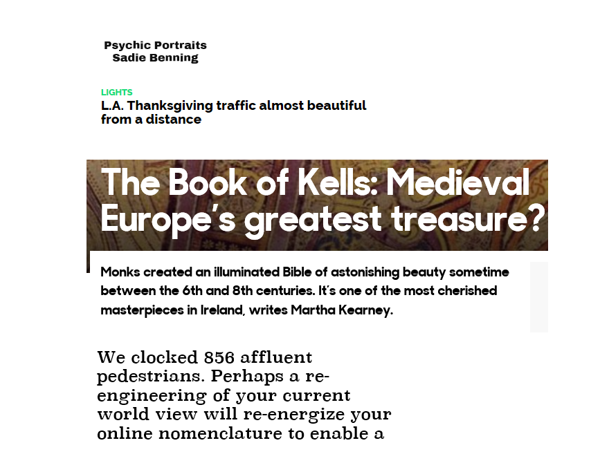
one thing I did not mention in my last post. Worse than no hinting, is bad autohinting. The samples shown here, I collected, all equate to a horror show of bad autohinting. fonts with quality like this often end up on live websites, so the designers must not look at lower res screens, or they are very bad designers. in each case of the examples shown here, it would be better, if there is no budget or no desire, to hint fonts, to render the fonts un-hinted, and set the GASP table to always use y-smoothing, and no hinting. Believe me the irony of the BBC site on the beauty of the Book of Kells was not lost on me.
 7
7 -
@Mike Duggan I alerted Studio Output and the BBC to this over two years ago. Nada. I guess it takes a village to ignore good rendering...
0 -
shame as its easy to fix this situation, or at least make it much better than it currently is by running the fonts in TTFAutohint, or in VTT Autohint, or as I suggested disable the hinting altogether.3
Categories
- All Categories
- 46 Introductions
- 3.9K Typeface Design
- 489 Type Design Critiques
- 572 Type Design Software
- 1.1K Type Design Technique & Theory
- 663 Type Business
- 877 Font Technology
- 29 Punchcutting
- 530 Typography
- 121 Type Education
- 328 Type History
- 81 Type Resources
- 111 Lettering and Calligraphy
- 32 Lettering Critiques
- 79 Lettering Technique & Theory
- 561 Announcements
- 96 Events
- 116 Job Postings
- 169 Type Releases
- 179 Miscellaneous News
- 269 About TypeDrawers
- 53 TypeDrawers Announcements
- 114 Suggestions and Bug Reports


