Barlow - A headline grotesk for the EFF

jeremy tribby
Posts: 292
Hi, all, this is my first post here, though I've met some of you online and in person.
I'm very new to type design, but I dove in after we hosted a Crafting Type event at the Electronic Frontier Foundation office in San Francisco with Dave Crossland and Thomas Phinney. Since then I've read a lot of books, and went to my first TypeCon this year. At EFF I am a product designer and web developer (though I come from a fine art background, having studied drawing and art history), and we're about to launch a new website, which I'd like to see come along with a new typeface -- called Barlow.
The font is in very early stages, even though it has a few weights now. It has a free, open source license (OFL 1.1), and currently lives at https://github.com/jpt/barlow where you can download the source Glyphs file and the OTFs.

At EFF we do a lot of work around rights and freedom in the digital world. This typeface is named after John Perry Barlow, our ailing cofounder, as a tribute. We currently use a modified DIN Engschrift in our logo, and use it for our headlines. We don't want to make too radical a change, but we really want to use something open source if we can -- which causes the commercial saturation of multi-weight gothics to become a bit more limited. We will use this mostly on the web, at 24px-72px, with words in title case for headlines.
The only requirement I have is that, at ~Medium/DemiBold, the words ELECTRONIC FRONTIER FOUNDATION must look a bit like the current DIN. We are redesigning our website, but not rebranding entirely. It would nice to start using our own font in our logotype, however. I don't like the square bowls of BPR on DIN, so I've rounded them more like the ATF titling gothics.
As I worked on this I thought about Interstate and Highway Gothic and DIN as public signage for the highway, and what it might look like if we had one of those fonts for Barlow's highway, the information superhighway?") So initially, I drew something on DIN Engschrift's grid. I didn't use any one specific reference, but am well familiar with typefaces like the above, older stuff like Alternate Gothic #2, Alternate Gothic #3, Condensed Title Gothic #11, Futura Condensed, newer stuff like Garage Gothic, Ultramagnetic, Italian Plate, Scout, Heroic, Rubik, Cervo, and so many others no so far off. I try not to let influence dominate choice but let's be honest, there are a ton of fonts in this category drawn on the exact same grid and they are baked into my brain at this point.
So initially, I drew something on DIN Engschrift's grid. I didn't use any one specific reference, but am well familiar with typefaces like the above, older stuff like Alternate Gothic #2, Alternate Gothic #3, Condensed Title Gothic #11, Futura Condensed, newer stuff like Garage Gothic, Ultramagnetic, Italian Plate, Scout, Heroic, Rubik, Cervo, and so many others no so far off. I try not to let influence dominate choice but let's be honest, there are a ton of fonts in this category drawn on the exact same grid and they are baked into my brain at this point.
Even though we're moving from DIN, we'd like to have excellent legibility for our German-speaking friends. So I tried keeping lowercase and uppercase pretty similar. It works at light weight but at black, the font started to do something I didn't like, and that a few of the above fonts suffer from, which is become far too condensed as they gain weight. So as I played more and more, the lowercase began to resemble DIN less, and maybe something like FB Titling Gothic more, and the black caps became a bit blockier.
I will probably round the corners slightly. And maybe do a double-decker "a" if I can make the black weight work. There is no kerning yet.
It's hard to say whether or not this font will get used due to the time and budget constraints that come with non-profit work, but this is my first effort at a real typeface, and I think it's pretty good so far. Not great, but I can't put my finger on all the reasons why because my eye simply isn't good enough as a type designer yet. Hence: critique!
The spacing is done with the very impressive HT Letterspacer (I was previously using Glyphs arithmetic on side-bearings to use William Tracy's method in Letters of Credit), which I am hoping to contribute to when I have more time, but Lukas Schneider was kind enough to agree to donate LS Cadencer to EFF, which we will evaluate this week (it is quite a tool from what I've seen in the demo). Maybe a little of each Very interesting time for auto spacing tools that make it easy to work on a few weights at a time.
Anyway, I've included a proof at the most boring, "Regular" weight! The fonts are generated from two master with a few brace layers at Medium and Demibold.
Any feedback is greatly appreciated -- thanks! As I type this, I realize that the lowercase "a" (and all letters based on it) have optical corrections that make them too tall and pointy!
I'm very new to type design, but I dove in after we hosted a Crafting Type event at the Electronic Frontier Foundation office in San Francisco with Dave Crossland and Thomas Phinney. Since then I've read a lot of books, and went to my first TypeCon this year. At EFF I am a product designer and web developer (though I come from a fine art background, having studied drawing and art history), and we're about to launch a new website, which I'd like to see come along with a new typeface -- called Barlow.
The font is in very early stages, even though it has a few weights now. It has a free, open source license (OFL 1.1), and currently lives at https://github.com/jpt/barlow where you can download the source Glyphs file and the OTFs.
At EFF we do a lot of work around rights and freedom in the digital world. This typeface is named after John Perry Barlow, our ailing cofounder, as a tribute. We currently use a modified DIN Engschrift in our logo, and use it for our headlines. We don't want to make too radical a change, but we really want to use something open source if we can -- which causes the commercial saturation of multi-weight gothics to become a bit more limited. We will use this mostly on the web, at 24px-72px, with words in title case for headlines.
The only requirement I have is that, at ~Medium/DemiBold, the words ELECTRONIC FRONTIER FOUNDATION must look a bit like the current DIN. We are redesigning our website, but not rebranding entirely. It would nice to start using our own font in our logotype, however. I don't like the square bowls of BPR on DIN, so I've rounded them more like the ATF titling gothics.
As I worked on this I thought about Interstate and Highway Gothic and DIN as public signage for the highway, and what it might look like if we had one of those fonts for Barlow's highway, the information superhighway?
Even though we're moving from DIN, we'd like to have excellent legibility for our German-speaking friends. So I tried keeping lowercase and uppercase pretty similar. It works at light weight but at black, the font started to do something I didn't like, and that a few of the above fonts suffer from, which is become far too condensed as they gain weight. So as I played more and more, the lowercase began to resemble DIN less, and maybe something like FB Titling Gothic more, and the black caps became a bit blockier.
I will probably round the corners slightly. And maybe do a double-decker "a" if I can make the black weight work. There is no kerning yet.
It's hard to say whether or not this font will get used due to the time and budget constraints that come with non-profit work, but this is my first effort at a real typeface, and I think it's pretty good so far. Not great, but I can't put my finger on all the reasons why because my eye simply isn't good enough as a type designer yet. Hence: critique!
The spacing is done with the very impressive HT Letterspacer (I was previously using Glyphs arithmetic on side-bearings to use William Tracy's method in Letters of Credit), which I am hoping to contribute to when I have more time, but Lukas Schneider was kind enough to agree to donate LS Cadencer to EFF, which we will evaluate this week (it is quite a tool from what I've seen in the demo). Maybe a little of each
Anyway, I've included a proof at the most boring, "Regular" weight! The fonts are generated from two master with a few brace layers at Medium and Demibold.
Any feedback is greatly appreciated -- thanks! As I type this, I realize that the lowercase "a" (and all letters based on it) have optical corrections that make them too tall and pointy!
0
Comments
-
If this is your first font, is not bat a all... is 10x better than my first one
There are a few details that I will inspect later when I have more time....
Ona quick view, I notice that the spacing is consistent (thanks to the autospacer!) but your parameter decisions can certainly be improved. You black can (maybe) be a little tighter, and your light should really be much more looser (compare to light weights fonts from FontFont, they are exceptionally in the way the set them very loosely).
- Heavy:
/A and /X can be a little wider, so they are not all scrambled together as they are now. They will fell better if you give them more room.
/F and /L look wider if compared to /H (you can also say that H is narrow compared to /L/F)
/N is also a bit narrow
/y needs more love
/z needs to be redone, it does not work
Your solution for the /e crossbar does not goes along with the rest of the alphabet... it stand out very much, since its the only letter you employed this trick... make it bolder, or use the same "thining" trick in other letter
/space can be narrow
You have some kerning, but you need some more, like /Yo and /To for example
- Thin:
Everything needs ample spacing
The /i dot is way to bold
/g tails looks shot/small
You may also need to have a 3re master, or a {bracket trick} someplace near the regular/semibold/medium, so you can have more control over the transitions and the diagonals.
1 -
PabloImpallari said:If this is your first font, is not bat a all... is 10x better than my first one
Thank you, this is a very encouraging thing to say. I am a fan of your work / involvement in the libre space, and we have looked at your Encode Sans and Libre Baskerville for sites at EFF.
Technically, my first font was a pixel font I made as a teenager (the same font used for my school's parking permits") ) but this is my first real one. Things like your font testing tools definitely make it easier for those of us just starting now.
) but this is my first real one. Things like your font testing tools definitely make it easier for those of us just starting now. You have some kerning, but you need some more, like /Yo and /To for example
There isn't actually any kerning yet -- just negatives in the side bearings. Those autospacing tools really are great, even if I'm not quite good enough to use them correctly yet I will take a look at FontFont's work -- previously I had avoided looking at FF DIN to not end up with letters too similar, but I'm glad to know I have a good reference to look at for spacing.You may also need to have a 3re master, or a {bracket trick} someplace near the regular/semibold/medium, so you can have more control over the transitions and the diagonals.
I was debating this. I have a few glyphs using the bracket trick now, but I have used so many that I may as well move to an entire third master. I suppose the only downside to another master is a larger file size once variable fonts become commonly used in the future?
I will take your advice on the lettering. The short /g tail was the only intentional decision, but now that I re-evaluate, it seems to only look good at display sizes on the lighter weights, so I will work on that a bit!
Thank you very much for the guidance, Pablo!
0 -
I've taken @PabloImpallari's advice and updated at github, and attached a new proof for most recent point of critique
I kept the brace layers since some are at medium some at demibold, instead of a full third master. not sure how I feel about the new /z.0 -
I have further widened the A and F, so attaching a new one. I decided to add a third master, which means it has some work, but I think this is worthwhile.
question: is the decender of /g too long vertically at lighter weights? if you look at /n/o/n .. alignment seems weird. maybe o is too tall, the overshoots too much, or do /n and similar letters need legs that have overshoots extending slighly below the x-axis? often I don't know what I'm really seeing or just imagining, honestly.
(^ the above problem was that I had too big an overshoot on /c/e/o).0 -
Lots of issues with weight of diagonals.
I would try blunt ends at the angles of /Z/.
Widen apexes of /A/ and /M/. That will also allow you to raise the /A/ crossbar a bit.
The hardest part of a straight-sided sans is making the transition from straight to curve smooth. There are still issues with that. In the bold (see "aesq" in "Kafkaesque"), /e/ and /s/ are all curvy and fluid while /a/ and /q/ have stiff straight parts to the bowls.
Is the top of /T/ thicker than the top of /E/?
Middle arms of /E/F/ seem a little puny to me.
Most terminals are forced into horizontal or vertical, but that's not true for /t/ and /S/. In general /S/ feels much more relaxed than other letters.
Don't know what's going on with the space character, but fix that so the running text specimens can be more fairly judged.
/O/ is narrow.0 -
I had a look at your file. There are a lot wrong kerning pairs that actually fix spacing problems. /n and /o never should have kerning between each other. For now, only add kerning if it needs more then 40 units all other pairs need to go.
I think the Light is quite a bit to loosely spaced.
I don’t think, adding a middle master at this point was a good idea. You have much bigger problems than is. A lot glyph need outline and spacing refinements and fix the few that really need it with brace layers as you did before. You loose a bit control but save so much work.
Some shapes are overly geometrics (the light /n) and others could use a bit more (the bold /r).
Watch for the alignment indicators. I found several glyphs that do not stick to the vertical metrics lines.
Why is the bold /a and /o different on the left side? Stick to the shape of the /a.
First, you had to much overshoot, now you have not enough.
So much so far.0 -
Thank you, Craig and Georg! I will work on your suggestions.
I see now that there was a problem -- I forgot to remove the stolen optical kerning from indesign from the font; I had only put that in there as a test at one point. it is gone now so I can actually respace.
For now, I have reverted on git back to before I added the third master, removed the kerning, and have respaced - attached a new proof.
I will be able to work on getting the overshoots right this time. Will update when there's something new to look at.
0 -
@Georg Seifert (or anyone!) in Glyphs is it possible to have something like a third master but for spacing only? that way I could keep the thin and ultralight more tight.0
-
Stems aren't consistent in the bold. Try my "Close but no cigar" script. Watch your stems particularly at the top of e.g /a/e/s in the thin; when you only have 22 units to play with, a 1 unit difference is 5% of the stem width and it shows.
Diagonal weight (especially /N) needs to be thinner. There's an optical correction that needs to happen with /w and /v, which is not often mentioned: the internal widths of a /w need to be slightly thinner than the external ones, and downstrokes need to be slightly thicker than upstrokes to appear consistent.
In the thin, increase `paramDepth` and `paramArea` to get more consistent spacing between rounds and straights.
To me, the roundness of /P and /R in the thin (and the sides of the /s) looks funny when everything else is straight-sided. Your /C/D etc. are much squarer than DIN, so your /P/R should be too. Could the /P/R bowls stand to be a bit wider? And maybe try splaying the leg of the /R further out; right now to me it doesn't really look like it's supporting the bowl at all.
0 -
I will check out your script! Great. And that is a very good point about relative sizing. It's hard to remember when working on letters large on a screen. Now that I am printing more during the process, things are improving.Simon Cozens said:Stems aren't consistent in the bold. Try my "Close but no cigar" script. Watch your stems particularly at the top of e.g /a/e/s in the thin; when you only have 22 units to play with, a 1 unit difference is 5% of the stem width and it shows.To me, the roundness of /P and /R in the thin (and the sides of the /s) looks funny when everything else is straight-sided. Your /C/D etc. are much squarer than DIN, so your /P/R should be too. Could the /P/R bowls stand to be a bit wider? And maybe try splaying the leg of the /R further out; right now to me it doesn't really look like it's supporting the bowl at all.
For me, this means that my C and D need to become rounder, not the other way around. DIN is too square already, but you're right, I was more square. Started to change this in /D but I think I made it too round.
I have respaced and gotten rid of the kerning. I squared up /e/c/o at black to look better alongside /n/d/b/p/q.
Spacing has been a pain with the autospacer and the brace layers -- seems like I need to do all of the brace layers manually. Hopefully Lukas's tool supports that.. Anyway I have increased the params as you have suggested, thank you!
/d/a/b are still not right at the top.
And I have not yet even begun on Craig and Georg's specific criticisms, which I have no reason to disagree with, so will try to implement.
0 -
When I look at "Orwellian," the diagonal parts of the curves on the "a" feel heavier than any other parts/strokes on those letters.0
-
Wow. @Simon Cozens your "Close But No Cigar" script is great. That gave me a lot to take care of. Seemed to only do it for the light weight (or maybe I actually did black weight stems correctly?)
Worked on the /a for a bit.
@Georg Seifert I took most your advice except for a couple things (round /s/S which I am not sure best way to resolve yet) and as for feeling overly geometric in parts.. I like that about the /n. but I tried still to correct very slightly. I do need to give the black /e some thought and other round (/c/o/) blacks some thought as well.
@Craig Eliason Are the diagonals looking any better?
@Thomas Phinney hmm, yes. I've made a correction. not sure if it's the right choice. but the midnight oil burned out long ago and I'll reevaluate soon.
black weight maybe looking odd spacing wise..
0 -
The current middle master in much tighter as the interpolation between thin and black would suggest. So you can make the Thin much tighter and get to similar results then you have now.jeremy tribby said:@Georg Seifert (or anyone!) in Glyphs is it possible to have something like a third master but for spacing only? that way I could keep the thin and ultralight more tight.0 -
I agree with Georg, the spacing of the Light master is too loose.
The Light and the Black master look like two different typeface design to me. The Light letters have a narrow proportion, while the Black letters are really wide. I would decide on one proportion and try keep the appearance similar in the other master. Coming from DIN Engschrift, I would probably make the Black much narrower.
Check the weights of your stems in the curves. In a for example, vertical stems are 22 units, but in the curves they get wider up until 24 units, finally hitting 21 in the horizontal part. The normal progression would be to keep the curve thickness decreasing gradually from vertical to horizontal width (OK, maybe it is a bit hard to decrease gradually between 22 and 21 units
The caps look too timid (narrow) for my taste next to the lowercase letters. For example in "Surveillance Drones", my fingers itch to make the S and D a good deal wider. Here is a quick demonstration:
Maybe I overexaggerated ...2 -
@Jens Kutilek If I do make the black narrower, then I will need a third master around DemiBold. It becomes too condensed a font at the heavy weights if I make the black very narrow with two masters.
I am adjusting some of my curves based on your suggestion / illustration. Even if I end up moving a font unit or two, that is better than nothing.
As for the wider letters... I agree you went too wide, but maybe they can stand to widen up a smaller amount. Not too much though, I'd like to keep this looking very good for German
Thanks for the help!0 -
the latest. I made the black lowercase a bit more upright to "look" more narrow without actually becoming any narrower, and to fit with the light weight better. if I do actually narrow the black weight, I will need a third master, and it's not time for that yet, I agree with Georg on this. but eventually I might need one.
Spacing still look loose? Maybe a little bit. How are the diagonals?
 0
0 -
already an update with tighter spacing. better? /r needs more space but also is /v too wide?

0 -
OK wow I just got LS Cadenculator working, tried to make a custom CUST based on a few different fonts with similar-enough letter-sides, and that made spacing with LS Cadencer very effective.

0 -
Keep adjusting letter widths. Looking at Drones for example, doesn't the o look more meager than the n? They may be mathematically the same but optically they aren't because of the more enclosed o counter. Doesn't the e look reined in compared to the wider ranging s? Doesn't it seem odd that the cap D appears narrower than the lowercase o?
I'd work on just one master for now. Get the widths of n and o perfect with your intentions and with each other, then evaluate the widths of every letter surrounded by those control characters.
0 -
Just to be clear... are we talking about maybe ~1-30 font units difference at the light weight for lowercase? maybe slightly more for caps? Looking at the letters I agree with you, but I don't want to over-do it based on your advice.Craig Eliason said:Keep adjusting letter widths. Looking at Drones for example, doesn't the o look more meager than the n? They may be mathematically the same but optically they aren't because of the more enclosed o counter. Doesn't the e look reined in compared to the wider ranging s? Doesn't it seem odd that the cap D appears narrower than the lowercase o?I'd work on just one master for now. Get the widths of n and o perfect with your intentions and with each other, then evaluate the widths of every letter surrounded by those control characters.
Also good advice. Frankly I think I've made the black weight worse (except for /X/W/N/a/g) since I started trying to make all these adjustments at once.0 -
@Jens Kutilek While I'd prefer wider letters, you are right, light and black felt too different. So I sat with all this for a while and redrew both weights after quite some modification. Started by making black based more directly on light, and as a result, black is much less round. I fine tuned a bit.. Had to make light a little wider to compensate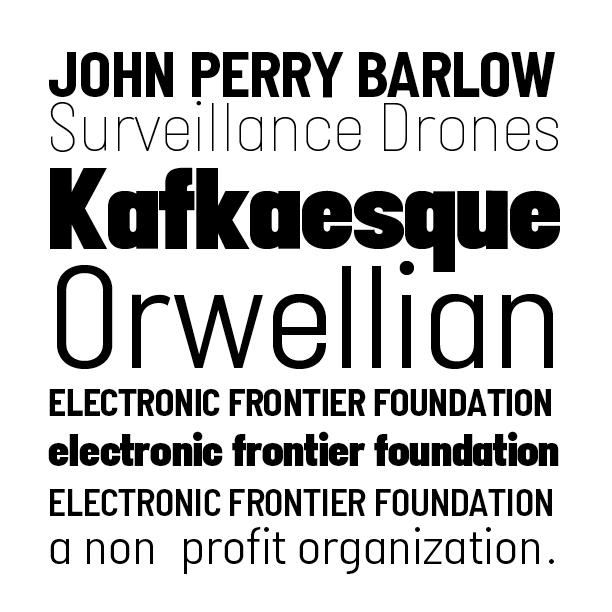
Still some letters to tend to. Diagonals in particular were done hastily but specific feedback would be helpful.
How do the overshoots look?
0 -
(also as a result of the redraw on black there is only a couple of brace layers, instead of almost a full third layer). but I think it's an improvement to the font and to the transitions.0
-
angles are hopefully looking a little better... though not so sure about /W.. made the downstroke heavier, not sure if by the right amount. having a lot of trouble with the black /N.
are /e/c/o still too round?
0 -
0
-
have a look at the width of the F and R (in FRONTIER). The F seems to be much wider. But try to make R, O and N a bit wider instead to making the F narrower, or adjust both a bit.
The r v pair is to close now.
And isn't the light o to wide now?0 -
0
-
Your overshoots are too small. Look at /a in particular, where the bowl on the left looks shorter than the vertical on the right. Throughout, your "circular" characters appear to hover above the baseline and below the x-height.0
-
@Jack Jennings thank you, looking at /k/a in the black weight more closely I see the problem on the /a very clearly. is it ok for thin and black masters to have different overshoots or will that cause problems in interpolation?0
-
-
@jeremy tribby
>This typeface is named after John Perry Barlow, our ailing cofounder, as a tribute.
It's warming that Barlow is having a font named after him. Better that than a flavor of ice cream. And I'm sorry to hear of his health problems.
For the information of Typedrawersians in general - and with a special shout-out to old hippies like me - John Perry Barlow is not only the co-founder of the EFF (along with Mitch Kapor), but years ago he teamed up with boyhood friend Bob Weir, to become a lyricist for the Grateful Dead. He's the cowriter, along with Weir, of many fan favorites like "Casady" and "Estimated Prophet". He was also the first person to apply the term "Cyberspace" to the internet.
He's been called the "Thomas Jefferson of Cyberspace" having written A Declaration of the Independence of Cyberspace, a very widely read essay, posted on over 20,000 sites. It's in some ways dated - as anything about the web in 1996 is bound to be - but its voice will always be strong. Required reading for History Of The Web 101.
1


Categories
- All Categories
- 47 Introductions
- 4K Typeface Design
- 495 Type Design Critiques
- 577 Type Design Software
- 1.1K Type Design Technique & Theory
- 671 Type Business
- 885 Font Technology
- 29 Punchcutting
- 539 Typography
- 125 Type Education
- 333 Type History
- 81 Type Resources
- 113 Lettering and Calligraphy
- 33 Lettering Critiques
- 80 Lettering Technique & Theory
- 569 Announcements
- 100 Events
- 116 Job Postings
- 170 Type Releases
- 182 Miscellaneous News
- 270 About TypeDrawers
- 54 TypeDrawers Announcements
- 114 Suggestions and Bug Reports