LeBrush

peggo (Pedro González)
Posts: 60

Few days ago I release at MyFonts my most recent type design project called "LeBrush" which was based on real brush lettering in traditional Roman calligraphic style, I decide to develop it in 10 typographic weights
- Thin
- ExtraLight
- Light
- Book
- Classic (specially focused on "Titling Movie" design)
- Medium
- Bold
- ExtraBold
- Dark
- ExtraDark
It was inspired on the classic Roman proportion “Capitalis Monumentalis” better knowed Trajan Column. The “LeBrush classic" fits exactly the traditional 9,5 nib widhts to define its capital heights specially developed to make users easily design ‘Movie titling’ raphics, books & magazines covers and posters.
Professional typographer/designers and pro-Users can freely design logotypes, labels and even printed stuff using opentype options and decorate it with the complementary extra sets.
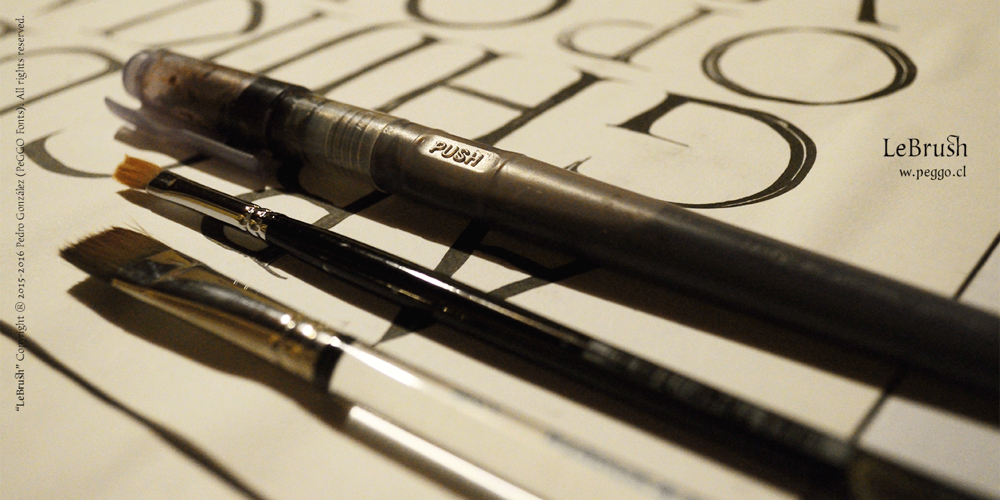

Professional typographer/designers and pro-Users can freely design logotypes, labels and even printed stuff using opentype options and decorate it with the complementary extra sets.




3
Comments
-
Gran laburo. Hermosa.
1 -
Muchas gracias Pablo... y tú lo has dicho muy bien.. porque ha sido "literalmente" muchísimo laburo.. haha... saludos...PabloImpallari said:Gran laburo. Hermosa. 0
0

Categories
- All Categories
- 47 Introductions
- 4K Typeface Design
- 497 Type Design Critiques
- 591 Type Design Software
- 1.1K Type Design Technique & Theory
- 674 Type Business
- 906 Font Technology
- 29 Punchcutting
- 544 Typography
- 129 Type Education
- 333 Type History
- 82 Type Resources
- 114 Lettering and Calligraphy
- 33 Lettering Critiques
- 81 Lettering Technique & Theory
- 579 Announcements
- 101 Events
- 116 Job Postings
- 175 Type Releases
- 186 Miscellaneous News
- 270 About TypeDrawers
- 54 TypeDrawers Announcements
- 114 Suggestions and Bug Reports