Bifurcated serif, clean up and condensed version

Pascal Barry
Posts: 31
Hi all, I have a client who wants this incomplete font polished up and missing characters designed (J,X,&, and punctuation). It will just be uppercase, no numbers. They also want a condensed version.
Does anyone know of a similar font (regular and condensed serifs that would be a good reference point)?
Also, if anyone can add to this list of things I need to do to tidy up what I'm starting with:
- Remove inconsistencies in weight in vertical, horizontal and diagonal bars.
- H is too narrow
- C/G, O/Q have different counters
- E /F are inconsistent
- serifs are inconsistent
- Z is too wide
Finally, any tips in general on how to approach this job would be really appreciated. I will be working on this solidly from today as I have a deadline of 6 weeks.
Thanks and look forward to reading your comments. 
1
Comments
-
The inconsistencies in the stroke weight of those triangular serifs (compare /F, /C, /L) and stems (compare rounds in /C, /G, /P, verticals in /D, /F) will have to go. The shadowing logic (right side of the stroke is heavier) is broken in /O and /V for no good reason. The thin diagonal of /K and the tail of /Q are out of character.
I would recommend adopting the drop-like triangular serifs as in /S, and making the flat serifs (e.g. on the foot of /A) thinner.
1 -
Capitals should either tend toward width variety (eg Trajan) or towards width similarity (eg Bodoni), depending on the genre of the alphabet. This does both. I'd think you would want to follow the latter course with this, in which case at the least G and O are too wide.0
-
Thanks for those comments, Christian and Craig. Here's where I'm at with A–Z:

0 -
That's a vast improvement over the previous image!
The serifs of /C/G/T feel a bit timid to me. And the white glint in the ball terminals is much finer than the rest of the font's structure; I'd strengthen it a bit. Nice /Q! Is /Z perhaps a bit too wide?
Maybe you can convince your client to allow you to expand it at least to include numbers, punctuation, and the most basic of accented letters? It's not really a font without that, and given the work you've already put in, it wouldn't be such a big endeavor anymore.
0 -
Maybe look at Goudy's work?Pascal Barry said:
Does anyone know of a similar font (regular and condensed serifs that would be a good reference point)?
0 -
Does anyone know of a similar font (regular and condensed serifs that would be a good reference point)?
In the mid-90s, Ed Benguiat and Tony Stan did a series of 'handtooled' (inline) versions of ITC faces.
1 -
The teeny tiny slivers of white in some of the serifs are bothering me. I think they either need to be stronger (on par with the white highlight strokes elsewhere) or gone (solid black).
0 -
The serifs and on /C/E/F/G/S/T/Z had been bothering me as well. The cuts are too small, I agree. It looked weird taking them out all together, so I've made them larger. The Z I also thought was maybe too wide so pulled it in a touch.
Thanks John for the link to the ITC hantooled font, that's a great reference. I wanted to lose the rounded ends on the cuts and shape them like the ITC example, but have been told to keep them. I've also been looking at Goudy Handtooled and started thinking the cuts in the characters should be closer to the left side. In the image below I've moved them over a touch on the top line of characters.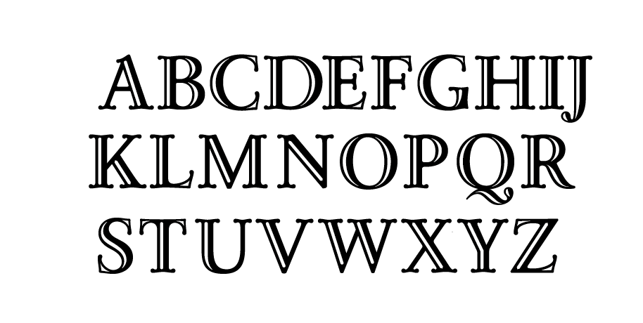 0
0 -
The foot of the 'G' stands out as a black spot to me.0
-
I agree with @Beau Williamson. That shape has more in common with the bottom of the I that in does the bowl of the D. Maybe make the incision blunt at the end. Like the I incision with a curve.0
-
Yeah, you're right about the /G... I will definitely look at that again.
I have a question about the W - mainly, is it working? Is it balanced, in harmony? The second V is more narrow and the inside join on the second vertex is quite a bit higher. Dealing with this big serifs, I didn't want to W too wide.
0 -
Should the white cut-outs be more organic (at least in the terminals) like the serifs, instead of perfectly cigar-shaped?
0 -
@Pascal Barry just curious to know about how you started drawing them. Did you start with the black first and then layered the white on top, also are the white areas negative space or it takes on the color of the background? thanks0
-
So the original, basic design (posted in green at the top) was developed by a signwriter apparently and it's a bit of a mish mash of styles and badly drawn, but as it's been used in designs in the past the brief was to move it along, clean it up etc but stay true to the original feel. One of the things they want to keep is the rounded ends on the negative space. I did push to taper the endings more organically throughout, but to no avail!
@abi yes, I'm drawing the full character then for now adding the white cuts on top. The client want to use the highlight, ie, with cuts, on top of a fill, 'normal', font. So then they can change the colour of the cuts independently of the general background the type is on.1 -
@Pascal Barry thats interesting. So if you're layering the white on top, how do you measure the width of the stroke so its uniform all across the letters? When i mean width of the stroke, the black outline as a result of the white fill. So are you eyeballing that part till it looks right or it's measured? Also, wouldn't be easier if you started with a black outline stroke and then added the white, sort of like it's layered, black stroke > black fill > white fill, this way you get more control over what you can do with the white fill because it won't affect the black outline if that makes sense. [GIF] explaining what I'm trying to say, please ignore the excessive nodes, just a quick rough. Not questioning your drawing methods but I've been curious to know how people drew stuff like this with an engraved effect.0
-
I think I'm doing it how you describe already, looking at your GIF!1
-
@Pascal Barry oh okay cool, thanks for clearing that up.0
-
Thanks to all who commented with advice and ideas. This first phase is finished, but hopefully the client will want to expand it to include numbers and lowercase.

 4
4 -
Nice!
 No cuts on the punctuation, though? The dots look large enough.
3 -
Ha! Yes, that is so obvious and stands out so much now you mention it. It amazes me how you can develop these blindspots to designs you're working on. thanks!2


![[GIF]](https://typedrawers.com/home/leaving?allowTrusted=1&target=http%3A%2F%2Fi.imgur.com%2FjeU5D2E.gif)
Categories
- All Categories
- 47 Introductions
- 4K Typeface Design
- 495 Type Design Critiques
- 577 Type Design Software
- 1.1K Type Design Technique & Theory
- 671 Type Business
- 885 Font Technology
- 29 Punchcutting
- 539 Typography
- 125 Type Education
- 333 Type History
- 81 Type Resources
- 113 Lettering and Calligraphy
- 33 Lettering Critiques
- 80 Lettering Technique & Theory
- 569 Announcements
- 100 Events
- 116 Job Postings
- 170 Type Releases
- 182 Miscellaneous News
- 270 About TypeDrawers
- 54 TypeDrawers Announcements
- 114 Suggestions and Bug Reports