Draw with strokes only (similar to Illustrator) in Glyphs or RF?
Comments
-
@GeorgS
Still nothing. It's not the Glyphs file because I see the same thing with a new file. Tell me if I'm missing something still:
1. Start Glyphs.
2. File > New.
3. Open "A" in a tab.
4. Draw a shape with the pen.
5. Select the contour.
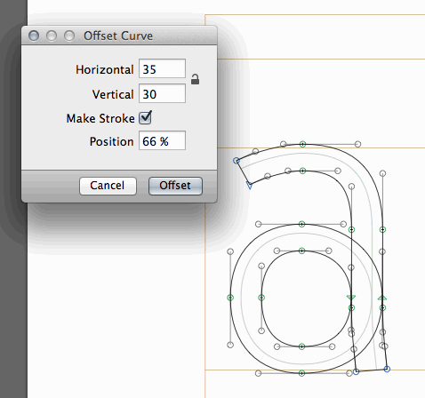
6. Filter > Offset Curve. Choose some values and hit Okay (shape's curve will offset).
7. View > Show Expand Paths Preview.
This should show the expanded path but it doesn't on my system. (OSX 10.6.8, Glyphs 1.3.7)0 -
I just tried a demo version of glyphs, for me it’s working not like above, but instead.
1. Draw
2. Filter > Offset Curve > Choose a value – and then.. CANCEL
3. View > Show Expand Paths Preview
It then shows the preview of what the Offset Curve filter would bring with the values selected.
I guess, if you do like that Craig, it shows a preview of another Offset Curve on Top of the first one, since you clicked OK.
I think this works pretty good, and I might buy Glyphs just for this purpose (if this job goes through). The thing is, I would need to create different weights from the same skeleton drawings and I think using Glyphs will save a lot of time for me.
Main problem is I have to get used the the “feel” in the drawing tool. Both RoboFont and Glyphs drawing tool feels a little strange at first, when used to FontLab.")
What is somewhat confusing is that these two things have different names. From a usability point of view maybe the preview should be called Offset Curve Preview, or just be a check box inside the actual filter?
0 -
What is somewhat confusing is that these two things have different names. From a usability point of view maybe the preview should be called Offset Curve Preview, or just be a check box inside the actual filter?
The preview plugin was just a quick implementation. If you have a look at the content of the plugin you find a file "GlyphsExpandPathsPreviewTool.py" and this contains 20 lines of code that draws the preview.
I will have a look at it later and improve it. E.g. add some more options to the offset curve filter and add the possibility to run it on extort, just like the rounding corners filter.2 -
The user and all related content has been deleted.0
-
Late to the party here. Those little yellow "new discussion" highlights seem to be gone.
The typographically clueless people at Vanilla decided that it should be done by just emboldening the thread title. For every forum they host. And they did not announce this. Users are berating them in the support forum. On the upside, they keep spambots away pretty well.0 -
The lates development:
1 -
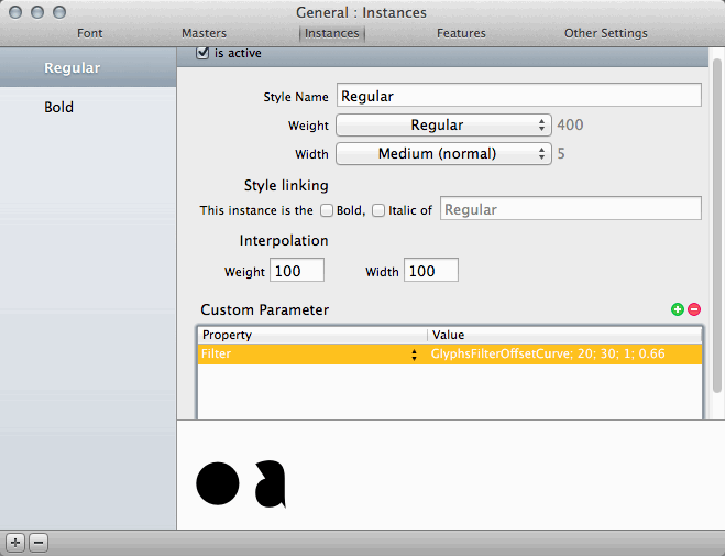
I draw the left outline and with two instances and some custom parameters I get two fonts that have the "a"s like this.
(the rounded corners are from an another custom property)
So if you want to make a line based font, draw the skeleton, set up the instances and you get fonts with different stroke widths on export.
@lettersfromswe Would that be something you are looking for?1 -
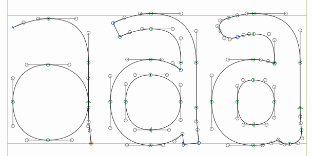
Looks good, Georg. In future versions it would be great if sharp corners, such as the apex of A, are flattened rather than extending to a point.0
-
So if you want to make a line based font, draw the skeleton, set up the instances and you get fonts with different stroke widths on export.
Oh YES! That is exactly what I’m looking for. It’s working to get it really thin as well? Like 4/1000 em units?
@lettersfromswe Would that be something you are looking for?
I noticed however that in Glyphs “Metrics Window” you don't actually see the letters with a stroke, is that true? I think I need to space the font while seeing the actual curves with at least one setting of the stroke width. It’s a lot of alternate letters and decorative elements that needs to be spaced in this project.0 -
What happens if you disable View menu > Fill Preview?0
-
Now it worked in the upper preview, where I can see a thin line.0
-
OK. This thread could now be closed.
Georg has pretty much built in the exact features I need in Glyphs. I’m thankful and impressed.
This will probably save me hundreds of hours.1 -
And the result is:
http://blog.lettersfromsweden.se/post/32872628106/monoline-script-for-rodeo-magazine
Thanks Georg for making a wonderful update to Glyphs making this script so easy to create.1 -
...0
-
"Well, if you want to draw a monoline font you really want the lines to be equal width"
Actually, I still want the verticals to be a tad heavier than the horizontals to make the lines appear to be equal weight. Plus you still need optical compensation at the joins of straights to curves.
Don't get me wrong, it's a cool feature, I'm just saying that for high-end type design, you would still need to convert to outlines and fix things, downstream.2 -
Thanks for stating the obvious Thomas ;-)
But you misread my statement, probably because I accidently deleted the screen shot showing what happened in Robofont. The thing I was referring to was something completely different than optical corrections.1


![[Deleted User]](https://secure.gravatar.com/avatar/4a64fb71566d0b4e56fb2a244524664c/?default=https%3A%2F%2Fvanillicon.com%2F83f6992ca487b67bd3dd7df96e236fc1_200.png&rating=g&size=200)


Categories
- All Categories
- 46 Introductions
- 3.9K Typeface Design
- 489 Type Design Critiques
- 572 Type Design Software
- 1.1K Type Design Technique & Theory
- 660 Type Business
- 875 Font Technology
- 29 Punchcutting
- 529 Typography
- 121 Type Education
- 328 Type History
- 80 Type Resources
- 111 Lettering and Calligraphy
- 32 Lettering Critiques
- 79 Lettering Technique & Theory
- 560 Announcements
- 95 Events
- 116 Job Postings
- 169 Type Releases
- 179 Miscellaneous News
- 269 About TypeDrawers
- 53 TypeDrawers Announcements
- 114 Suggestions and Bug Reports