Draw with strokes only (similar to Illustrator) in Glyphs or RF?

Göran Söderström
Posts: 117
Is it possible to draw with strokes only (open countours) and apply thickness to them visually in either Glyphsapp or RoboFontEditor?
I can‘t seem to find it working in FontLab, or?
I can‘t seem to find it working in FontLab, or?
1
Comments
-
Frederik Berlaen has shown a preview of an interactive outliner tool in this video: I don't think it's available yet.
I think I may have seen a demo of something similar for Glyphs, but I can't remember for sure.
In FontLab, you can use the Expand effect from Tools > Actions... > Effects.0 -
It's available here : https://github.com/typemytype/1
-
In Glyphs, the built-in "Offset Curves" filter does this. In my testing you need to make sure you have nodes at extrema first. And there's no settings for terminations, "brushes," etc. as in FontLab, though x and y offset can be separately specified and the preview is live.0
-
It's available
Duh. I'm a little slow sometimes.0 -
I want it “Live” – not afterward.
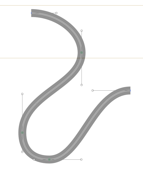
Yeah, Robofont has exactly what I was looking for. Just tried it with a demo version of RoboFont and was exactly like I wanted, but the stroke wasn't consistent all the time, see screen shot*. The outlined stroke was neither visible in spacing center.
0 -
Shit, I might have to buy Robofont just so I can finally work on the script fonts I never finish because working in Illustrator makes me even more hateful than usual.2
-
Yeah! I was actually thinking of getting RoboFont just because of this feature, but if it’s not working easy I have to rethink it. I would really like to see the result in Spacing Center aswell, and above “problem” should work I think.0
-
but the stroke wasn't consistent all the time
Put a node in the middle of each of those S-shaped segments so that the curve of each segment doesn't change directions, and I bet it will work. (I saw the same thing in Glyphs.)0 -
But that totally ruins the whole idea of drawing these shapes for me, that extra node is something I could put as a last final stage, but after I put it there, the curve is not as flexible as it was without it.
I don’t think it’s needed according to the spec either, at least FontLab have never complained about these kind of shapes.0 -
It may or may not be needed for the spec, but it is, I gather, needed for the math on which the stroke expansion depends.
In Fontlab if you use the cutting tool and draw from one off-curve point across the segment to the next off-curve point, your new node would be placed so that the serpentine curve pretty much retains its shape. Not sure if Glyphs or RoboFont have such a tool.
I'm a bit surprised that these programs don't have a function for placing that intermediate node automagically (or maybe they do and I just don't know about it).0 -
Yo can do something similar using Inkscape "Path effects", and them export to EPS
And if you mix Path effects and Spiro, you get all the flexibility you want http://www.youtube.com/watch?v=3OaLZuFZxdk 0
 -
I just made a small plugin that gives a preview of the Offset Curve filter:
GlyphsExpandPathsPreviewTool.glyphsReporter
Double click the plugin and then restart Glyphs. You can enable it in the View menu. You have to use the Offset Outline Filter at least once for each master as it uses the same values.
Please post any issues you may find.0 -
I would suggest posting a query about it on the RoboFont user forum. Maybe the limitations you've pointed out are things Frederik could/would fix.0
-
Georg, haven't tried Glyphs yet, but how does Glyphs handle my example above? In a similar way as RoboFont? Meaning you have to put an extra node in the diagonal curve in order to make the stroke look even?
I’m guessing everybody would prefer that the stroke thickness was even all around, just like in Illustrator.0 -
here is a screenshot of a similar path in Glyphs.

To improve the inflection points, I automatically insert a point. I will try to improve that.
So if you later on want to expand the path, you need to add them manually. With the next version you can add inflection points by shift clicking with the draw tool (the same as to add extremes).3 -
The Outliner extensions for RoboFonts will always preserve your drawing, so bad drawing will end up with bad/worse expanded paths. Expand the path and the point structure will be very logical, only adding joining segments (square, but, round) for outside corners and a straight line for inside corners.
I really believe that a designer should be in control of his outlines, in what ever state they are.
Illustrator does correct the outline path by adding points in the expanded path which is great but that is not a type design tool, neither is Inkscape. Nevertheless one can always use Illustrator or Inkscape to draw and copy/paste the paths into RoboFont.
Should a type design tool correct design decisions, by adding points?
What if one build an interpolation-design-space based on skeletons and the tool is adding pseudo random points?
One of the design/programming principles of RoboFont is that is doesn't contain any design related knowledge: like adding uncontrolled points.3 -
The insertion of points is just an option that helps improve the bolding of curves with inflections.0
-
It's interesting how this particular function highlights the difference in philosophy between these two programs.0
-
Just to make things clear. The Offset Path filter works exactly like Frederik explained it. Only the preview filter adds the points to get a nicer result.0
-
Georg, that plugin isn't working for me. I see the menu option but selecting it has no effect, even though I have set values in the offset filter.0
-
@Craig
Can you have a look at the console? (put in Glyphs in the search field)0 -
I really believe that a designer should be in control of his outlines, in what ever state they are.
Yes I agree to that. But in this particular case I don’t agree Why? Well, if you want to draw a monoline font you really want the lines to be equal width plus you want the freedom to move the curves around freely to try out stuff. If you add that extra node, the freedom is gone.
Is there really such a problem if the tool would always create a monoline? Do you think people would complain when a tool is making their drawing easier? I don‘t think so. I think the opposite.Should a type design tool correct design decisions, by adding points?
If I choose the outline stroke and set a width, that is also part of my design decision. When the stroke thickness change uncontrolled, it sort of ruins that, in my opinion
Perhaps, a check box to switch this off or on?
Lastly, you guys are doing a great job with your new tools. I feel I have to say that too so it doesn't sound as I only complain.1 -
Just to make things clear. The Offset Path filter works exactly like Frederik explained it. Only the preview filter adds the points to get a nicer result.
What does this mean? Only the preview has a precise stroke thickness? And when I expand I get a similar result like in RoboFont?
If the preview works, why can’t the expanded result also work? I don’t get it. Is it very hard technically?0 -
One of the design/programming principles of RoboFont is that is doesn't contain any design related knowledge: like adding uncontrolled points.
But it does show you when an italic has the wrong angle, I read on Twitter yesterday, so sometimes RoboFont contain design related knowledge 0
0 -
@GeorgS
Nothing happens in the console at the moment when I use the expand path filter nor when I try to view the expand paths preview.
On startup of Glyphs I do see multiple console messages about "objc[6820]: Class __ARCLite__ is implemented in both /Applications/Glyphs.app/Contents/MacOS/../Frameworks/AGRegex.framework/Versions/A/AGRegex and ..." and then a bunch of locations within PlugIns within the Glyphs.app bundle.
There is also one message "objc[6820]: Class GSSegmentPen is implemented in both /Applications/Glyphs.app/Contents/MacOS/../Frameworks/GSFontTools.framework/Versions/A/GSFontTools and /Applications/Glyphs.app/Contents/MacOS/../Frameworks/GlyphsCore.framework/Versions/A/GlyphsCore."
Don't know if that's relevant or not.0 -
If the preview works, why can’t the expanded result also work? I don’t get it. Is it very hard technically?
I added the option to the preview plugin but will add it to the Offset Path filter, too.0 -
@Craig
And what about the macro window? Is there something?
If that does not help, could you send me the .glyphs file?0 -
@GeorgS
This shows up in the macro window:__Font GSFont <0x11e45e840>: Millennial OS (319)
__FontMaster.userData()0 -
Georg, the script works fine on my computer.0
-
@Craig
Did you run the Offset Curve filter on this font? You have to actually hit OK to get the effect.0
Categories
- All Categories
- 46 Introductions
- 3.9K Typeface Design
- 489 Type Design Critiques
- 572 Type Design Software
- 1.1K Type Design Technique & Theory
- 663 Type Business
- 876 Font Technology
- 29 Punchcutting
- 530 Typography
- 121 Type Education
- 328 Type History
- 81 Type Resources
- 111 Lettering and Calligraphy
- 32 Lettering Critiques
- 79 Lettering Technique & Theory
- 561 Announcements
- 96 Events
- 116 Job Postings
- 169 Type Releases
- 179 Miscellaneous News
- 269 About TypeDrawers
- 53 TypeDrawers Announcements
- 114 Suggestions and Bug Reports


