Em Alignments and Vertical Space?

Wes Adams
Posts: 59
After scratching my head for a while, I'll pose a question about vertical alignments, namely, why in today's practice is it common for the type image to be so large on the body that adequate linespacing necessitates additional leading?
Up until a point and at least through to the 17th century linespacing was built into the face. The practice was evidently standard enough. Vervliet for example, assuming all type is set solid, measures the span of several lines to determine size.
Naturally there are implications of legibility, particularly with regard to x-height. To that point, the proportion that matters most is the relationship of the extenders. As far as I can tell a large x-height which is also large on the body is really a matter of economy, at least in metal type. Even in cases cited for their innovation the result often falls short of elegance, as in Van Krimpen's Sheldon.
There are some advantages to using spaces native to a body in typographic layouts. Doing so means the margins scale along with the type, maintaining page proportion across sizes. Granted, indents and column gutters might easily enough be indexed to leading instead. At a certain point it feels a bit arbitrary.
I'd very much like to know what means one would today use in determining the image size on an Em. Is it at all common to optimize for a size in which the type might be set solid? I assume there must be some other consideration I've overlooked.
Also of interest, when did leading type become common and why?
Tagged:
4
Comments
-
Wes Adams said:when did leading type become common and why?
Unfortunately, I did not make a note of it, but I recall reading a text by a German technology historian recently who spoke of leading as being introduced (or maybe made commonplace?) during the nineteenth century, after machines had been developed that could easily cast the lead strips necessary for, well, leading.
Thinking about this, if you are a leading manufacturer, you need to have a customer base that is using standard sizes of measurements. Wide adoption of typographic points was also a nineteenth-century thing, happening at slightly different times in each country (there were also competing points systems from which to choose from).
I presume that any large printing house in the nineteenth century that was casting its own type (there were several dozen such in-house foundries in Germany at this time, for instance) could also cast its own leading in whatever size and length was needed. Presumably the same would have been the case prior to the Industrial Revolution as well.1 -
Hi Wes,
Up until a point and at least through to the 17th century linespacing was built into the face.
I know that you’re familiar with my research, so I’ll keep it brief here (you can read much more related info in my dissertation when this will be published by Leiden University later this year).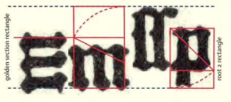
Moxon writes in Mechanick Exercises that ‘By Body is meant, in Letter-Cutters, Founders and Printers Language, the Side of the Space contained between the Top and Bottom Line of a Long Letter.’ Moxon’s definition is annotated by Davis and Carter as being ‘Not a good definition because letters are often cast on a body larger than it need be. It is the dimension of type determined by the body of the mould in which it was cast (from the punchcutter’s point of view: “is intended to be cast”).’ The reason for casting letters on a larger body was to incorporate some extra distance between lines, of course.
For me the question how the body was calculated is especially interesting. By identically mapping the relation between letter parts (using geometric constructions) in gothic and roman type, the (differences in) proportions between the two models when using the same body in Moxon’s terms could be determined. The image below shows van den Keere’s Gros (or Gras) Canon Romain (left) and the Gros Canon textura.
This system could be extrapolated for the calculation of the additional line spacing, or the body in Davis’ and Carter’s terms. I have researched the bodies of several early Renaissance roman types and for instance in case of Jenson’s archetypal model the body can be defined by extending the ‘m-square’-based calculation by including the left or right serif.
One could perhaps argue that by including the serif for this purpose the whole distilled structure is therefore a bit arbitrary. However, the stroke endings of textura type and the serifs of roman type were part of the overall patterning, as shown by unitizing Le Bé’s Double Canon Romain:
3 -
Would it be correct to suspect that the contemporary practice of leading types is a holdover from the mechanical days?Dan Reynolds said:after machines had been developed that could easily cast the lead strips necessary for, well, leading.
Thinking about this, if you are a leading manufacturer, you need to have a customer base that is using standard sizes of measurements.
Indeed, Frank's research confirms that during type's first artisanal period linespacing as a virtue of the body was both proportional and intentional. Burnhill convincingly argues a similar point in his Type Spaces.The reason for casting letters on a larger body was to incorporate some extra distance between lines, of course.
It seems odd that one might be content to leave linespace to chance after so painstakingly defining horizontal metrics. Is there a reason for doing so?0 -
I cannot make a statement about how the contemporary practice of leading type came about. I just don’t know. My first look would be to how compositors set texts with photo-type systems though (which in turn could have been influenced by earlier tech, of course … I just mean that I would go backwards in small steps, if I was on a search of my own).Wes Adams said:
Would it be correct to suspect that the contemporary practice of leading types is a holdover from the mechanical days?Dan Reynolds said:after machines had been developed that could easily cast the lead strips necessary for, well, leading.
Thinking about this, if you are a leading manufacturer, you need to have a customer base that is using standard sizes of measurements.1 -
Would it be correct to suspect that the contemporary practice of leading types is a holdover from the mechanical days?
Yes, in which the term mechanical includes typewriters.
Almost all text processing software, from the humblest plain text editor to the most advanced page layout app, includes by default extra interline spacing, whether expressed in font data vertical metrics ('LineGap') or as default leading as a percentage of type size. To actually solid set type to the body height takes some doing in a lot of software. If, for instance, in MS Word you format a paragraph for single line spacing, what you are actually getting is the sum of the vertical metrics in the font data, including any LineGap. In InDesign, you can set your preferences for leading to be 0% of type size, but the default is 20% (and I always change mine to 25%).
I think the expectation of type being cast to the body height and linespacing added by default is now so widespread that fonts designed to be solid set would look odd. Indeed, Perpetua, which seems always to have been cast small on the body, does look weirdly small relative to other types of the same nominal size.
1 -
I agree. It does look odd, and I've noticed it in my personal experience. Since virtually every digital font is large on the body, substituting one that is not requires two extra steps (increasing size and removing leading). I presumed the standard must yield some advantage. I know early punch cutters dealt with a more limited character set, does a larger image yield some greater flexibility?John Hudson said:Almost all text processing software, from the humblest plain text editor to the most advanced page layout app, includes by default extra interline spacing, whether expressed in font data vertical metrics ('LineGap') or as default leading as a percentage of type size.
Do you proof at 25% as well? It would seem difficult to anticipate which software would do what.0 -
Why would you need that? Leading could function fine even if it weren't unitized to the point system of the type with which it's used, couldn't it?Dan Reynolds said:
Thinking about this, if you are a leading manufacturer, you need to have a customer base that is using standard sizes of measurements. Wide adoption of typographic points was also a nineteenth-century thing, happening at slightly different times in each country (there were also competing points systems from which to choose from).0 -
Leading could function fine even if it weren't unitized to the point system of the type...
Copyfitting became an issue later but I might surmise that a typographer would want to have each column and page end at the same point. If there were several people handsetting a book at the same time, as in chapters, consistency would be easier if both lead and type had the same basis (points).1 -
I recall that back in the 1980s some styles of Univers were available in different sizes on the same body. But I don’t recall which system, I would have to pore through a lot of old specimen books to find out.1
-
Other than “chance” it is thus also left up to the typographer to adjust — the ideal linespace is a function of not just the type design but also the typography, namely line lengths. (Whereas spacing doesn’t really change much depending on outside factors within a given font size — except if you want to track something out for emphasis or so, and you can still do that even in metal.) So I wonder if the move to “externalize” leading from the typeface itself perhaps had anything to do with typographic usage scenarios becoming more varied.Wes Adams said:It seems odd that one might be content to leave linespace to chance after so painstakingly defining horizontal metrics. Is there a reason for doing so?
3 -
Also, the early Emigre fonts were quite small on the body, IIRC, which gave them a classy look, straight out of the box.1
-
That is true to an extent and perhaps on a case by case basis. When setting columns of same sized text with differing depths, few would be tempted to alter the baseline. It seems that externalizing leading ensures a solid set is never acceptable. There one might offer a recommendation.Nina Stössinger said:Other than “chance” it is thus also left up to the typographer to adjust — the ideal linespace is a function of not just the type design but also the typography, namely line lengths.
Out of curiosity, do you proof with different line-heights? It seems like that might complicate matters early on.0 -
Craig Eliason said:
Why would you need that? Leading could function fine even if it weren't unitized to the point system of the type with which it's used, couldn't it?Dan Reynolds said:
Thinking about this, if you are a leading manufacturer, you need to have a customer base that is using standard sizes of measurements. Wide adoption of typographic points was also a nineteenth-century thing, happening at slightly different times in each country (there were also competing points systems from which to choose from).
I guess it could, if you did not have the same system of leading that would eventual come into place for letterpress printing (i.e., 1 pt, 2 pt, 3 pt, 4 pt etc).0 -
What hasn't been mentioned yet is diacritics. They also influence the size of letters on the em. In all languages that use accented uppercase letters, or lowercase letters with accents on their ascenders like lacute or hcircumflex, solid setting is not feasible (or would mean a greatly different thing than setting the same font solid in English).
I'd argue that the optimal line spacing for an actual typeset text also for a large part depends on the language (frequequency of caps, ascenders, diacritics) and, to a lesser extent, even on the actual text contents.
3 -
Thanks, Jens. I was about to say the same thing. Define solid.

6 -
[dup]
0 -
The user and all related content has been deleted.2
-
The reason for casting letters on a larger body was to incorporate some extra distance between lines, of course.
This is the generally embraced reason, but actually there could have been another one too. As Jens stated ‘What hasn’t been mentioned yet is diacritics. They also influence the size of letters on the em.’
My geometric reconstructions are not meant to indicate that the early punchcutters looked for ‘ideal’ proportions such as the golden ratio (the term is from later date anyway) but needed to control proportions within a prefixed body: the mould was defining the borders and by controlling the relation between roman and gothic type, the outcome (x-height, X-height, lengths of ascenders/descenders) on a certain body size was predictable. One needs this if one is making type for the first time in history and wants for instance to expand business from the North of Europe to the South of Europe. As soon as the proportions are settled, one can copy these without requiring (knowledge of) the original standardization. One can eyeball as much as one likes within such established patterns and if the technical restrictions become less, like in digital type, one can eyeball even more freely.
In line with this it is quite possible that room was left by the early Renaissance punchcutters on the type body for in case extra space would be required for for instance (possible, i.e., yet unknown to the type/mould manufacturers) diacritics. The digital type designer normally will use 1000 of 2048 units for top ascender to bottom descender (Moxon’s definition). By using the full amount, this assures that there is enough resolution left for defining the small stuff, like superior and inferior figures. The ‘real’ body (Davis’ and Carter’s definition) is actually defined by the WinAscent/WinDescent and related ‘hhea‘ entries. The values here will roughly correspond with the extra 20 percent InDesign adds as line spacing. Probably for Vietnamese even more is needed (that was certainly out of the scope of the Renaissance punchcutters). In case the additional space on the body was not required, it was not uncommon to cast type on a smaller body using a different mould.
1 -
When setting columns of same sized text with differing depths, few would be tempted to alter the baseline.
The practice of maintaining a consistent baseline grid across columns, pages, etc. is actually relatively recent, I believe. Or at least the “rule” that it is somehow wrong not to.
In printing of the mid-twentieth century and earlier, there are plenty of examples of “feathering” columns or pages of text with one or two lines different in order to match the same depth and achieve tight lockup.
4 -
That's a very good point. I suppose I was thinking of the mid-twentieth on. Early books set in one size naturally do as well. Do you suppose the origin is mainly Swiss? I was reared on Müller-Brockman and it seems I have that bias.Kent Lew said:
In printing of the mid-twentieth century and earlier, there are plenty of examples of “feathering” columns or pages of text with one or two lines different in order to match the same depth and achieve tight lockup.
With multiple sizes, adjusting leading certainly lends itself to alignment. For instance in captions etc.0


![[Deleted User]](https://secure.gravatar.com/avatar/4a64fb71566d0b4e56fb2a244524664c/?default=https%3A%2F%2Fvanillicon.com%2F83f6992ca487b67bd3dd7df96e236fc1_200.png&rating=g&size=200)

Categories
- All Categories
- 47 Introductions
- 4K Typeface Design
- 495 Type Design Critiques
- 577 Type Design Software
- 1.1K Type Design Technique & Theory
- 670 Type Business
- 884 Font Technology
- 29 Punchcutting
- 538 Typography
- 125 Type Education
- 332 Type History
- 81 Type Resources
- 113 Lettering and Calligraphy
- 33 Lettering Critiques
- 80 Lettering Technique & Theory
- 569 Announcements
- 100 Events
- 116 Job Postings
- 170 Type Releases
- 182 Miscellaneous News
- 270 About TypeDrawers
- 54 TypeDrawers Announcements
- 114 Suggestions and Bug Reports