Roijer

peggo (Pedro González)
Posts: 60
"Roijer" started as a handmade lettering logotype designed for "Peter Röijer" vintage perfume brand. Started now as a titling serif typeface. The main idea is create unconventional uppercase groups as similar as close to the personalized oldstyle lettering design do.
As a first step, I started with uppercase only, doing two models on each glyph, in letter one go into UC-box and other into the lc-box, as you can see the 1st couple 'R' below here.


As a first step, I started with uppercase only, doing two models on each glyph, in letter one go into UC-box and other into the lc-box, as you can see the 1st couple 'R' below here.
1
Comments
-
Use the last R for the initial also, change the mid bar of the E to something simpler and it's a good 'un.
1 -
0
-
I'm already explain to Stephen Coles why I keep this nickname according to the rulesJames Todd said:…and also change your username to your real first and last name in compliance with our rules.[...] (Alternatively, you may use a trade name if that obviously identifies you, but please also link from your profile page to a professional site that correlates with the name.) [...]
0 -
btw, the traditional 'E' it will be into uppercase box and the unconventional alternative will be into the lowercase box 'e'Miles Newlyn said:Use the last R for the initial also, change the mid bar of the E to something simpler and it's a good 'un.
0 -
Why are you showing for critique the logotype instead of the typeface itself?1
-
Hi Craig Eliason, I started to show the process in a chronological way and the first step was a logotype that become a complete typeface that properly works into logotype design.Craig Eliason said:Why are you showing for critique the logotype instead of the typeface itself?
2 -
-
-
Hi Pedro: the tail in the /J seems light compared to other serifs, I think it should be bolder. The same applies for the tails in the alternate /E /C /Y. And maybe the standard /S
The lower lobe of boths /B have different contrast angle to all other rounds /P /R etc...
2 -
I think the swash Y needs reworking, the way the left stem joins the right stem is not working well for me1
-
Maybe experimenting with the structure in Delphin's /y/ might be worth trying.Dave Crossland said:I think the swash Y needs reworking, the way the left stem joins the right stem is not working well for me1 -
I tried and compared previous with this new changes (not an excuse but may be weight issues occur because I'm designing this as display font but you're right about weight details.... I need to keep in mind that this is a logo font and need to be visible even at very small sizes). applied same correction to 'ß (eszett)' ...Thank you in advance Pablo.PabloImpallari said:Hi Pedro: the tail in the /J seems light compared to other serifs, I think it should be bolder. The same applies for the tails in the alternate /E /C /Y. And maybe the standard /S
The lower lobe of boths /B have different contrast angle to all other rounds /P /R etc...
Oh thank you Dave.. I think soft transition works better now.Dave Crossland said:I think the swash Y needs reworking, the way the left stem joins the right stem is not working well for me
Craig Eliason good idea... I sketch something near to that model... and see that's looks interesting I think the 2nd 'y' one look more legible to me than 3rd 'y' (at least to our americas culture).
And by the way, I add a new alternative for 'J'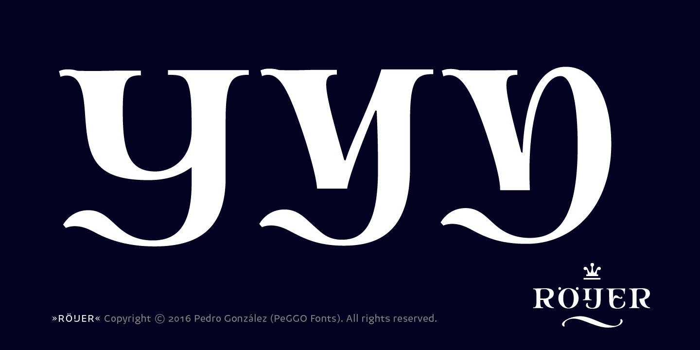

Thank all you guys for your eyes on this.1 -
Adding now alternate 'I' into the lowercase box following the main idea on alt 'J' but with a smaller head and a more flat baseline.

0 -
I like those alts with semidetached tildes. The «wrinkled noses» of /E etc don't quite do it for me, but I guess you're bound by the logo there.
The /ẞ looks quite swashy for a base letter. I'd trim away the fiddly bits for the base version and maybe semi-detach the top for the swash version.
0 -
Hi Christian, did you mean 'Z' on the second part of your comment?Christian Thalmann said:I like those alts with semidetached tildes. The «wrinkled noses» of /E etc don't quite do it for me, but I guess you're bound by the logo there.
The /ẞ looks quite swashy for a base letter. I'd trim away the fiddly bits for the base version and maybe semi-detach the top for the swash version.0 -
Hm? I was talking about /ẞ, not /Z. But upon closer inspection, the swashy /Z is really a bit over the top for my taste as well.
1 -
Put a secõd tilde õ top?
1 -
Christian Thalmann said:Hm? I was talking about /ẞ, not /Z. But upon closer inspection, the swashy /Z is really a bit over the top for my taste as well.

Agree on that.. the middle link looks better, and make a traditional 'Z' and make accessible this alt via Stylistic Set.
I think a better option could be if a regular 'I' with that tilde above it appear instead of that alternate one.Frode Bo Helland said:What happens if you need an Ĩ?
0 -
-
This is both juicy and classy. Rare combination – kudos!
1 -
Thank you Hrant..Hrant H. Papazian said:This is both juicy and classy. Rare combination – kudos! ... I hope to back on this project soon, mean while I'll leave it in a oak barrel for a little time, cuz I'll be bussy on distribution of my most recent launched font "LeBrush". 0
 -
"Röijer" finally was launched two days ago via MyFonts! I would like to thanks to all of you who help me improve this beautiful project and make this looks better.
If you want to see how is looking the complete font family you can visit my store at MyFonts: http://www.myfonts.com/fonts/peggo/roijer/
Even so, I will post the complete graphic stuff on the corresponding threat here on TD.
Best whishes.


8 -
Congrats.
Love the slashed OS zero! :-)1 -
I really liked your project, congratulations.
0 -
Congrats, have you tried playing with the tail of R to drop it passed the baseline ? I know its unconventional, but the tail just looks squashed, could be a cool alt, just to make some logotypes a little unconfirmed and more expressive ... ?1
-
Like the " Benguiat " look in some of the forms, but it would be cool to see that tail brought out or something on that R, like a serif gothic look.1
-
Thank you Hrant... I used to be a fan of that kind of solution for slashed zero (with an inverted slash), in order to avoid confusions between Ø (norgwenian oslash) or diameter symbol ∅ (e.g. used in photography) and so on.Hrant H. Papazian said:Congrats.
Love the slashed OS zero! :-)
Thank you Rafaeiro..I really liked your project, congratulations. I really enjoy to discover new ways to solve every part of this project, it really was so fun.
On next part of this project may be do many of this kind of creative solutions and many more new ones too, like same extension on "R, K, Q" and may be an alternative extended "L" I need to sketch to decide new features for this typeface design, I will take note from your suggestion.Simon Dunford said:Congrats, have you tried playing with the tail of R to drop it passed the baseline ? I know its unconventional, but the tail just looks squashed, could be a cool alt, just to make some logotypes a little unconfirmed and more expressive ... ?
I have planned to extend this to a wider family with lowercase and try an italic, I'm not sure what could it be but this is just the first step of a bigger project indeed.
Thank you Simon.1


 Add new alternative of "L" version into the 'l' box


Categories
- All Categories
- 47 Introductions
- 4K Typeface Design
- 495 Type Design Critiques
- 576 Type Design Software
- 1.1K Type Design Technique & Theory
- 670 Type Business
- 884 Font Technology
- 29 Punchcutting
- 537 Typography
- 124 Type Education
- 332 Type History
- 81 Type Resources
- 113 Lettering and Calligraphy
- 33 Lettering Critiques
- 80 Lettering Technique & Theory
- 569 Announcements
- 100 Events
- 116 Job Postings
- 170 Type Releases
- 182 Miscellaneous News
- 270 About TypeDrawers
- 54 TypeDrawers Announcements
- 114 Suggestions and Bug Reports