Curvature Combs
Wei Huang
Posts: 99
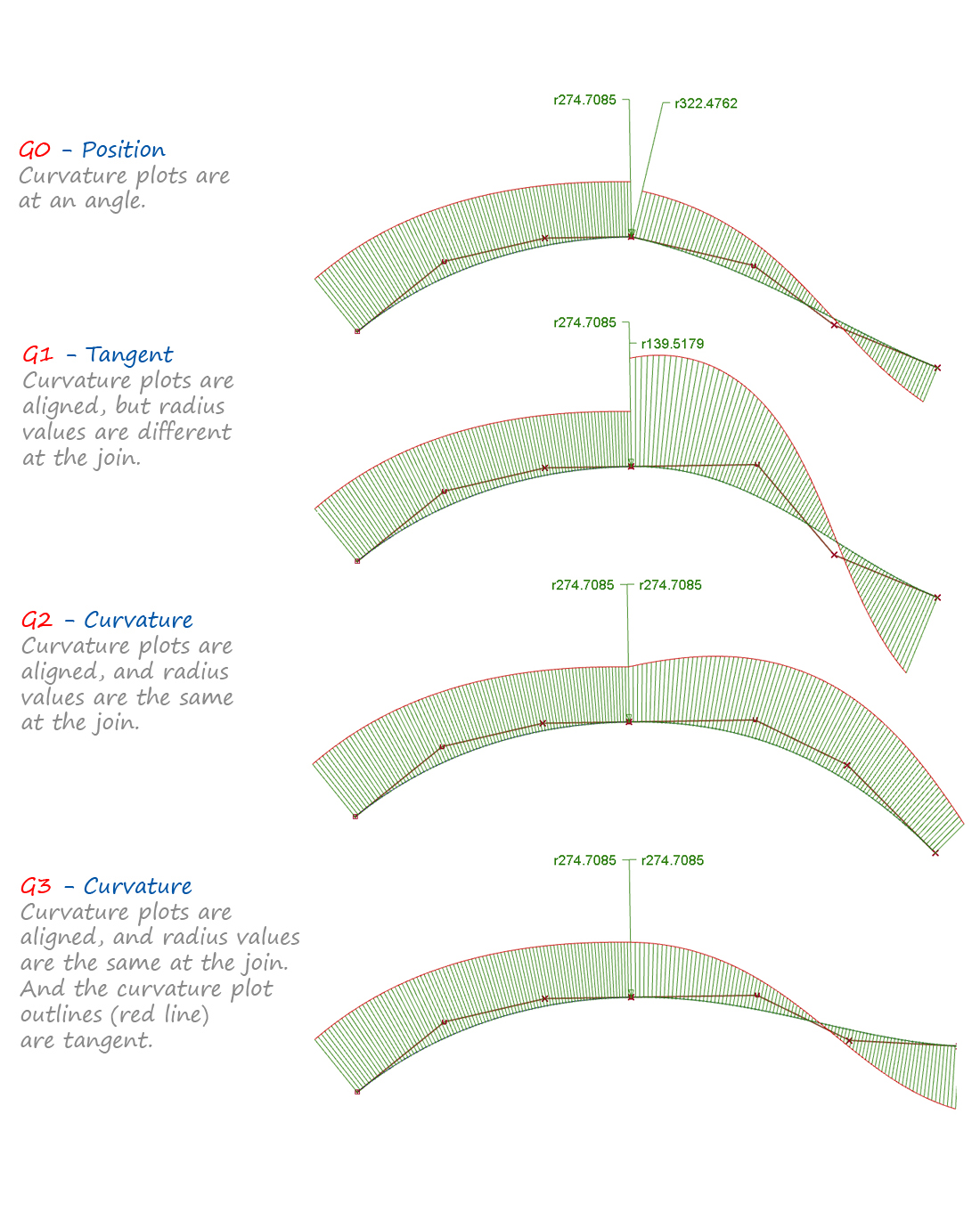
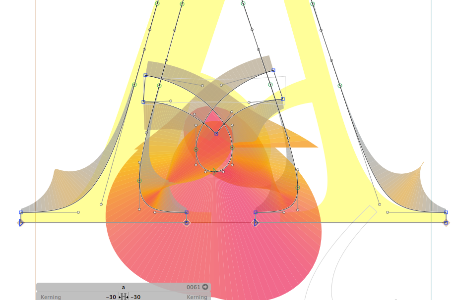
I'm curious about this as a visualisation tool. Currently it's available in Glyphs and Robofont with Yanone's Speedpunk plugin and also natively in Fontlab 6.
What are your experiences with it? Has it made you better at drawing? Did it irrevocably change the way you see, for better or worse (imagine something like this but for curves!)?
Image from Alias

What are your experiences with it? Has it made you better at drawing? Did it irrevocably change the way you see, for better or worse (imagine something like this but for curves!)?
Image from Alias

Tagged:
1
Comments
-
I find it gets in the way of seeing the curve. I gave up on it very quickly.1
-
Fair enough, I tried it for a day and found it disconcerting, I ended up looking more at the comb than the curve and I when I tried to adjust to 'correct' the comb, the curve itself didn't look right?0
-
I find it can be helpful in finding the inflection point in an s-curve.
As a way to gauge the smoothness of a curve, it's kind of like a magnifying glass. It enables you to see things that might not be visible with the naked eye, in which case they may not matter. But it makes a good "second opinion". Sometimes if you've been staring at a curve for too long you start to not see things. A bit like how you shouldn't proofread your own writing.4 -
I found SpeedPunk very helpful toward understanding curve quality. Now that I have an eye for it, I don't use it much anymore. I still use RMX Harmonizer regularly as part of my workflow when drawing glyphs, though.
6 -
Agree with Christian re. SpeedPunk. I find it useful for checking / getting a different perspective on a curve (which doesn’t have to be ‘right’, just shows the same thing in a different way and can help to see some things); but I also tend to think of it like training wheels, the goal needs to be not having to use it.
5 -
To me the goal is to learn to see the curve. If SpeedPunk helps you grasp that more than it distracts that seeing, give it a try but still learn to see.2
-
I do not use it in my own work, but I think it is a great learning/teaching tool. I expect to use it a lot in beginner type design classes, as a way of showing students where there is a problem, helping explain it, and determine when it is fixed.0
-
The user and all related content has been deleted.0
-
I bought Speedpunk and have started to use it out but I still don't understand when it's useful, I've been having trouble with round italic glyphs, and for that reason I thought maybe it could show me where my issues might be.
But apart from seeing different curve tangent radii (and even then I don't know whether that's important, my curve looks fine when they're not lined up, and when I line them up it's not the way I want it? I think this might be because I'm still bad at drawing these kinds of shapes though!) I don't know how to use it still. I'd like to get the most I can out of this tool.
If anyone could post examples of these in use (CombsInUse.com) that would be much appreciated. cc @Mark Simonson and @Jackson Cavanaugh as I saw you both quoted on @yanone 's website.
2 -
I've found Speedpunk to be very useful as a teaching tool. I think the idea of it is that as it teaches you to get better at recognising smooth curves, you need it less and less. If your eye is already trained to recognise good curves, then absolutely you don't need it; but right now I still need it.
I think it's helped me to become more aware of when my curves are contiguous and when they aren't, and I'm starting more and more to be able to tell when things aren't correct without turning on Speedpunk; I'm still using it to check my intuition, and to help me correct things when they're close but not quite right. Like Christian, I also use RMX Harmonizer to do the correction automatically when it's obvious how to fix the problem.
As with every tool, it's a good servant but a bad master, and I still need to get better at knowing when to ignore it.
One feature I wish it had would be the ability to ignore pathological situations. I know it has the fader, but even with that enabled, I find its treatment of obvious discontinuities to be really distracting, and almost make it unusable for the rest of the glyph. This is what I mean:
2 -
I agree that the fader does a bad job at getting rid of these excesses. It would make more sense if it truncated the combs at a certain radius rather than just fading out in a narrow sector.
BTW, I would recommend trying to recreate your shape using vertical and horizontal tangents; the current construction is going to be hard on the autohinter. Here's what my /c looks like in Cormorant: Although the teardrop terminal is oriented diagonally, it is built with horizontals and verticals. The same goes for the rest of the shape.
2 -
In fact I consider Speedpunk very useful tool, not magical solutions and sometimes visually chaotic, and if developers could allow us to see the behave between specific (selected) portion of the curve would be even more useful.

0 -
I've just treated it like a an audit tool - Only on when I'm looking at batches of glyphs to quickly check vectors for errors and consistency. Not sure yet if it's actually useful to me, but I do a lot of work on the train going to and from work, so all my fellow passengers will think I'm doing some kind of weird rocket science.4
-
Related:
That said, some people don't have the "eye" that others do, and need more help.
0
Categories
- All Categories
- 46 Introductions
- 3.9K Typeface Design
- 489 Type Design Critiques
- 572 Type Design Software
- 1.1K Type Design Technique & Theory
- 663 Type Business
- 876 Font Technology
- 29 Punchcutting
- 530 Typography
- 121 Type Education
- 328 Type History
- 81 Type Resources
- 111 Lettering and Calligraphy
- 32 Lettering Critiques
- 79 Lettering Technique & Theory
- 561 Announcements
- 96 Events
- 116 Job Postings
- 169 Type Releases
- 179 Miscellaneous News
- 269 About TypeDrawers
- 53 TypeDrawers Announcements
- 114 Suggestions and Bug Reports


